Designed by: PepsiCo Design & Innovation
Country: United States

Pablo Paez

pablo1

Designed by Fluotype | Country: Argentina

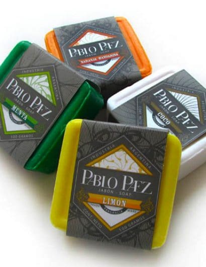
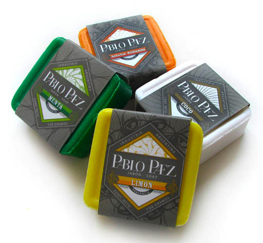
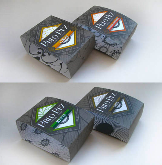
“We created all the brand identity, from the logo to the labels, for this new soap and cosmetics brand. The client wanted something edgy, colorfull and a bit masculine. He had a low budget for printing, so we kept the label’s shape quite simple.

Something that the client liked very much was the shapes we created for each fragance, and the way these shapes turned into patterns.”
pablo2

Get the latest packaging design inspiration in your inbox:

Popular designs

Inverey: A Unique Barrel-Aged Scottish Gin Packaging Design

Inverey stands out with its image that captures the essence of the rugged Highland countryside. Breaking away from the norm, the label design does not feature the traditional tartan. Instead, it presents an organised structure of intertwining circles, rhombuses, four-pointed stars and dots born out of their intersection.

Designed by: PepsiCo Design & Innovation
Country: United States

Pablo Paez

pablo1

pablo1

Designed by Fluotype | Country: Argentina

“We created all the brand identity, from the logo to the labels, for this new soap and cosmetics brand. The client wanted something edgy, colorfull and a bit masculine. He had a low budget for printing, so we kept the label’s shape quite simple.

Something that the client liked very much was the shapes we created for each fragance, and the way these shapes turned into patterns.”

pablo2

Previous slide
Next slide
Get the latest on packaging design in your inbox: