Designed by: PepsiCo Design & Innovation
Country: United States

Packaging and Brand Identity Design Of The Fellowship

Designed by: Free The Birds 

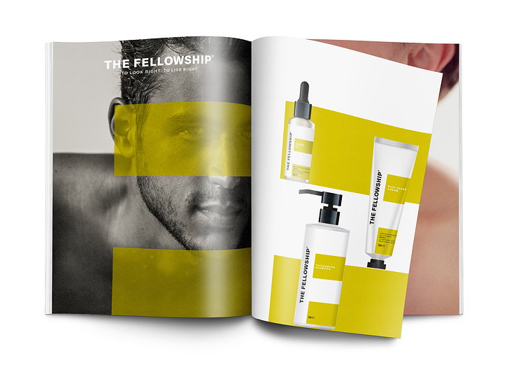
London-based creative agency Free The Birds has designed the packaging and brand identity of The Fellowship. Andrew Cooper, model and entrepreneur, and marketer Duncan Morris have launched their latest brand to “disrupt more traditional notions around masculinity.” 

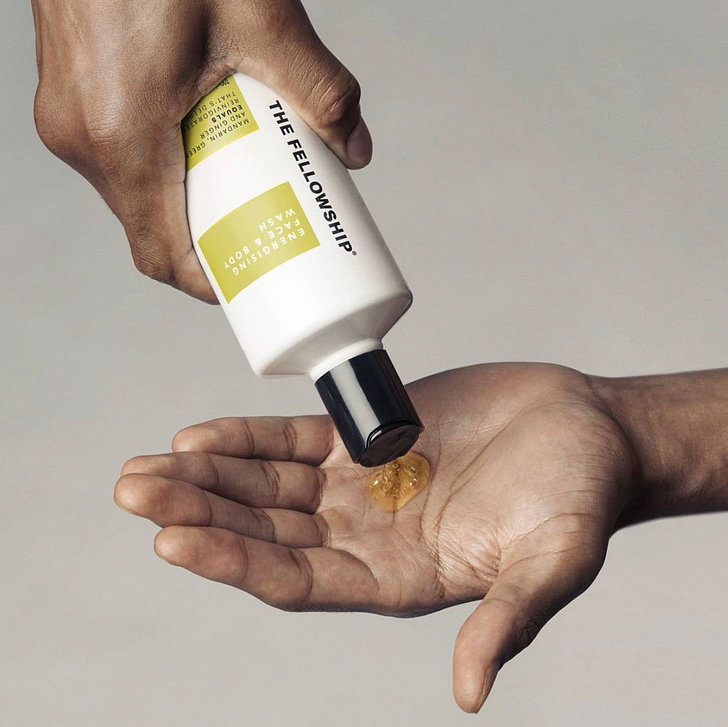
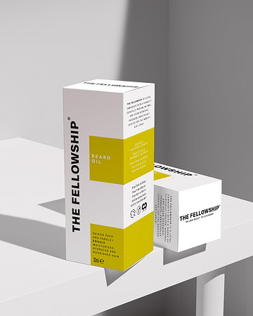
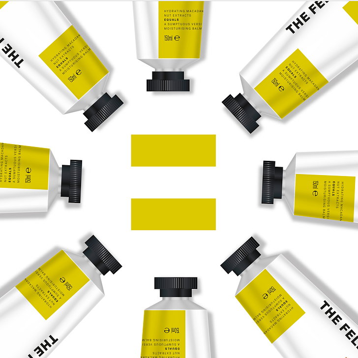
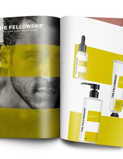
To highlight The Fellowships’ ambition, Free The Birds has used a chartreuse color palette, moving away from the traditional rich and heavy shades associated with the category. 

Packaging and Brand Identity Design Of The Fellowship

“The tradition with men’s grooming products is to opt for grays, blacks and browns. But notions of masculinity are changing, and with that, our gendered preconceptions of color,” explained Nick Vaus, Creative Director and Partner at Free The Birds. “The bright, accented color palette we’ve chosen conveys just the sense of modernism that The Fellowship and its target customers embody, and also ensures the products catch the eye of the customer straight away, which is particularly important for new brands entering this competitive category.”

The valiant brand identity of The Fellowship was showcased to the world last week with the launch of the brand’s ‘Essential Founders’ Kit.’

The kit comes loaded with shampoo, conditioner, body wash, body cream and moisturizer. 

Get the latest packaging design inspiration in your inbox:

Popular designs

Designed by: PepsiCo Design & Innovation
Country: United States

Packaging and Brand Identity Design Of The Fellowship

The_Fellowship_06_thumb

Designed by: Free The Birds 

London-based creative agency Free The Birds has designed the packaging and brand identity of The Fellowship. Andrew Cooper, model and entrepreneur, and marketer Duncan Morris have launched their latest brand to “disrupt more traditional notions around masculinity.” 

To highlight The Fellowships’ ambition, Free The Birds has used a chartreuse color palette, moving away from the traditional rich and heavy shades associated with the category. 
Packaging and Brand Identity Design Of The Fellowship

“The tradition with men’s grooming products is to opt for grays, blacks and browns. But notions of masculinity are changing, and with that, our gendered preconceptions of color,” explained Nick Vaus, Creative Director and Partner at Free The Birds. “The bright, accented color palette we’ve chosen conveys just the sense of modernism that The Fellowship and its target customers embody, and also ensures the products catch the eye of the customer straight away, which is particularly important for new brands entering this competitive category.”

The valiant brand identity of The Fellowship was showcased to the world last week with the launch of the brand’s ‘Essential Founders’ Kit.’

The kit comes loaded with shampoo, conditioner, body wash, body cream and moisturizer. 

Previous slide
Next slide
Get the latest on packaging design in your inbox: