Designed by: PepsiCo Design & Innovation
Country: United States

Packaging And Branding Of Farmland Foods

Designed by: Onfire Design | Country: New Zealand

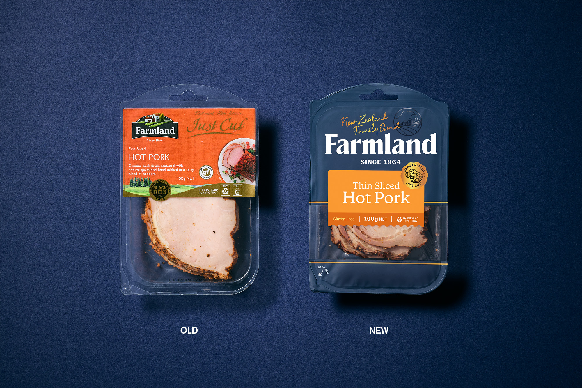
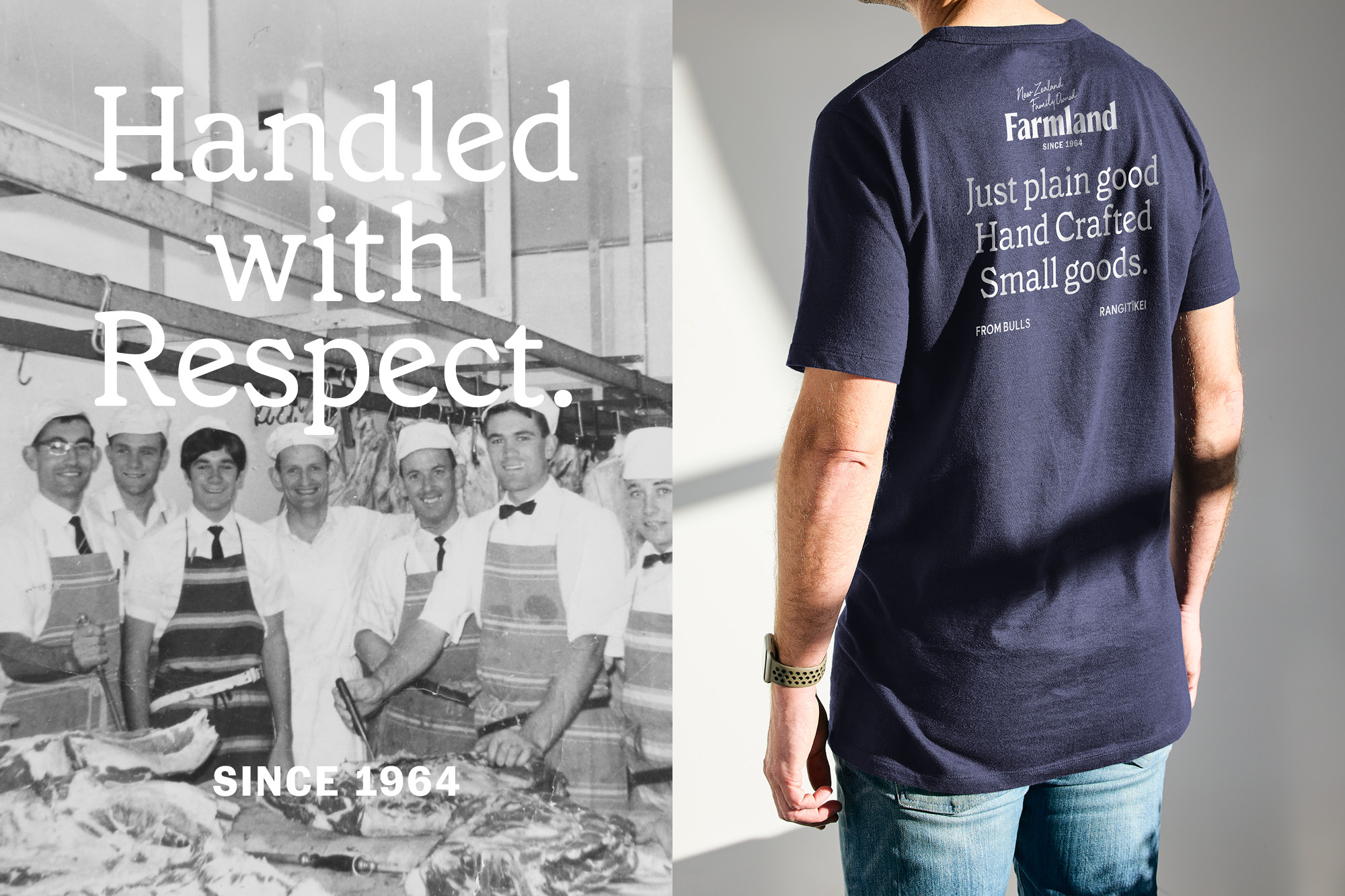
One of New Zealand’s premier smallgoods producers, Farmland Foods, began as a small butcher’s shop in 1964. While the company is known for its wide range of food products: the earlier packaging did not do justice to the brand name.

Onfire Design, a New Zealand-based branding and packaging agency, took up the challenge to work on the “confusing mixture of messaging and statement.”

The design agency mentions the following:

“A new brand strategy was developed. Focusing on the family-based business, the brands’ new goal is to bring people together around the dinner table – delivering products that are ‘just plain good since 1964’. The new packaging design language illustrates this intention through New Zealand born humble simplicity and sheer pride in the products they make.

Packaging And Branding Of Farmland Foods

The packaging

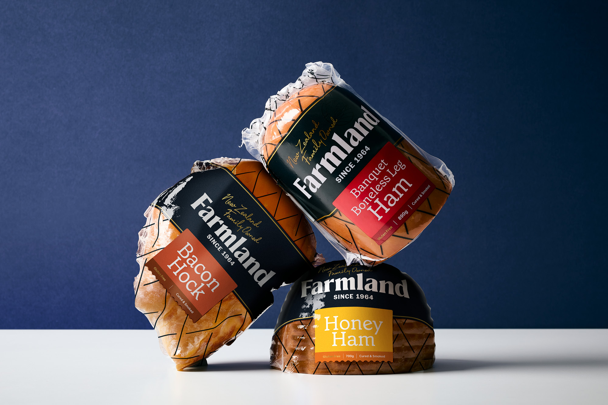
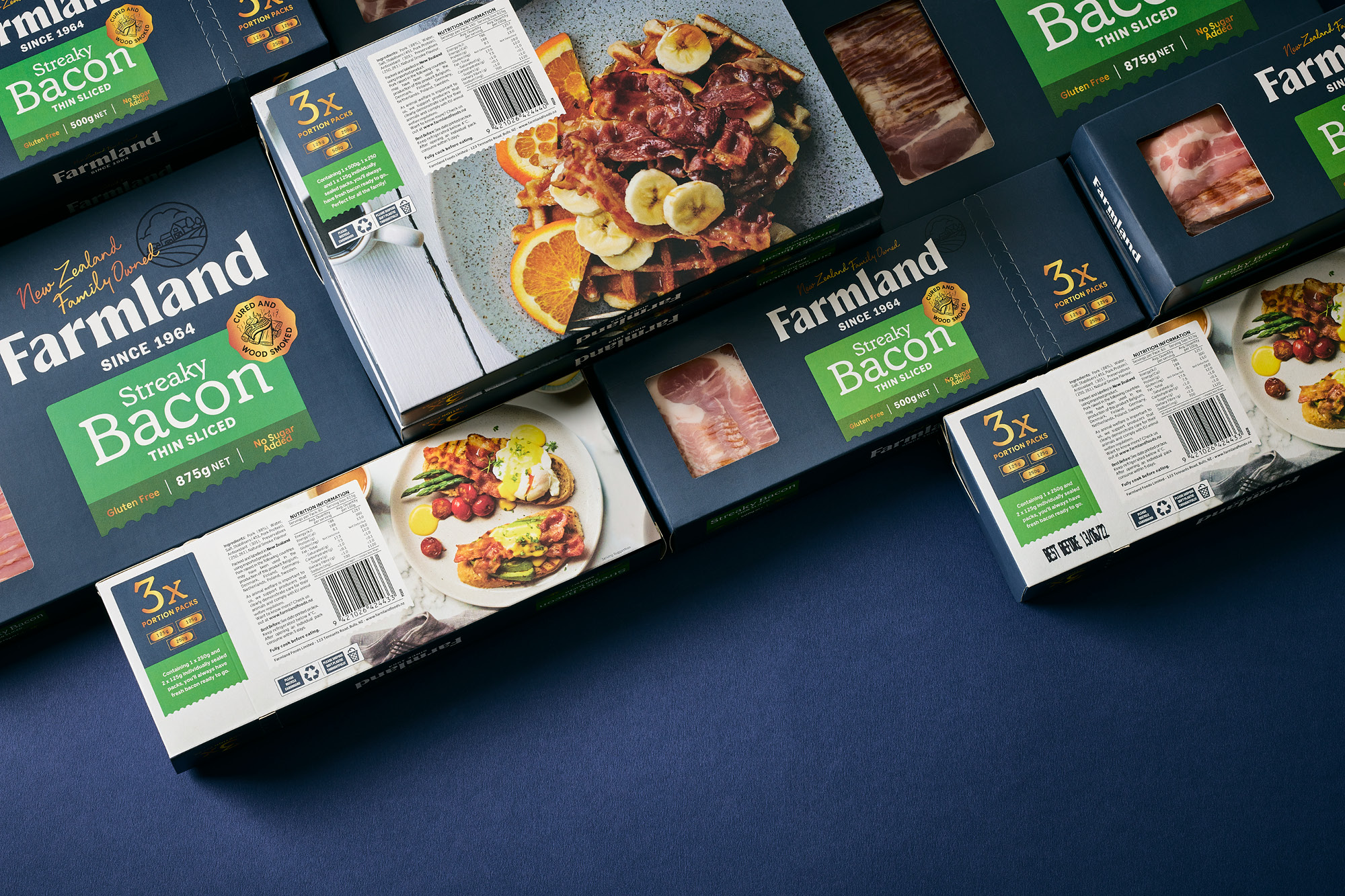
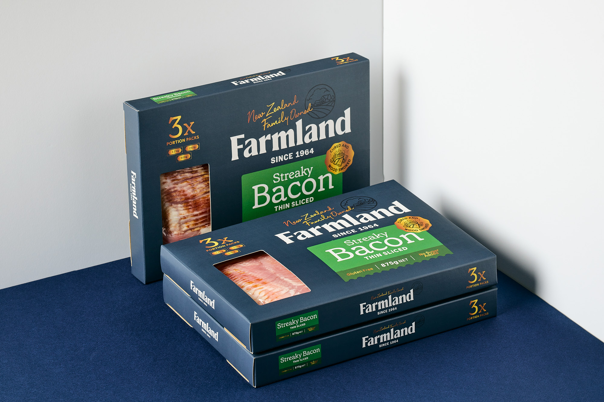
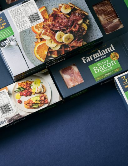
Onfire Design worked on the packaging to simplify the “product navigation and product hierarchy” with bright-colored stickers. Blue, the new brand color, has been used beautifully with gold embellishments to allow the range of products to stand out when they sit on the shelf.

“The final result is an expansive range of consumer-based small goods which owns a stand-out color across various category sectors. Which in this instance is not easily achieved. It is a color that has strong links to the family’s past heritage, adherence to traditional craft and honoring the product they have been handling since 1964.

Get the latest packaging design inspiration in your inbox:

Popular designs

Designed by: PepsiCo Design & Innovation
Country: United States

Packaging And Branding Of Farmland Foods

Onfire-Design-Farmland-4

Designed by: Onfire Design | Country: New Zealand

One of New Zealand’s premier smallgoods producers, Farmland Foods, began as a small butcher’s shop in 1964. While the company is known for its wide range of food products: the earlier packaging did not do justice to the brand name.

Onfire Design, a New Zealand-based branding and packaging agency, took up the challenge to work on the “confusing mixture of messaging and statement.”

The design agency mentions the following:

“A new brand strategy was developed. Focusing on the family-based business, the brands’ new goal is to bring people together around the dinner table – delivering products that are ‘just plain good since 1964’. The new packaging design language illustrates this intention through New Zealand born humble simplicity and sheer pride in the products they make.

Packaging And Branding Of Farmland Foods

The packaging

Onfire Design worked on the packaging to simplify the “product navigation and product hierarchy” with bright-colored stickers. Blue, the new brand color, has been used beautifully with gold embellishments to allow the range of products to stand out when they sit on the shelf.

“The final result is an expansive range of consumer-based small goods which owns a stand-out color across various category sectors. Which in this instance is not easily achieved. It is a color that has strong links to the family’s past heritage, adherence to traditional craft and honoring the product they have been handling since 1964.

Previous slide
Next slide
Get the latest on packaging design in your inbox: