Designed by: PepsiCo Design & Innovation
Country: United States

Packaging Design Concept: Boflour Green Banana Flour

Designed by: ihapstudio | Country: Thailand

The Covid-19 pandemic changed the minds of the people in many different ways. People around the world, now more than ever, are inclined to buy health-related products that heal the body and the mind. Boflour, a Thailand-based company, boasts of producing products that heal the body and the mind.

ihap mentions:

Green bananas are full of fiber which is good for people with digestive and bowel problems. It is especially beneficial for people with IBS and constipation. It is loaded with potassium, which acts as a vasodilator… Green bananas need to be cooked for better absorption of nutrients. If our health is good our mind will be good too. That’s the thing we believe.”
Packaging Design Concept: Boflour Green Banana Flour

The packaging

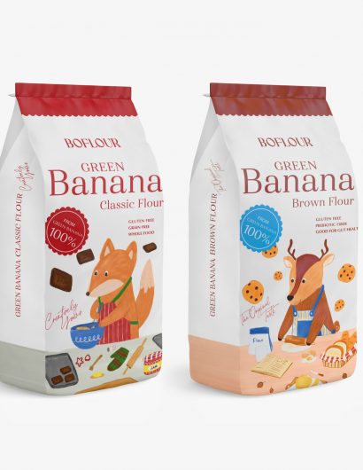
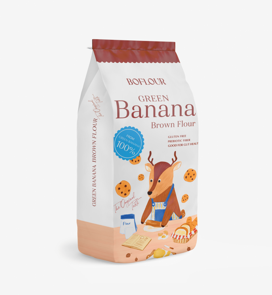
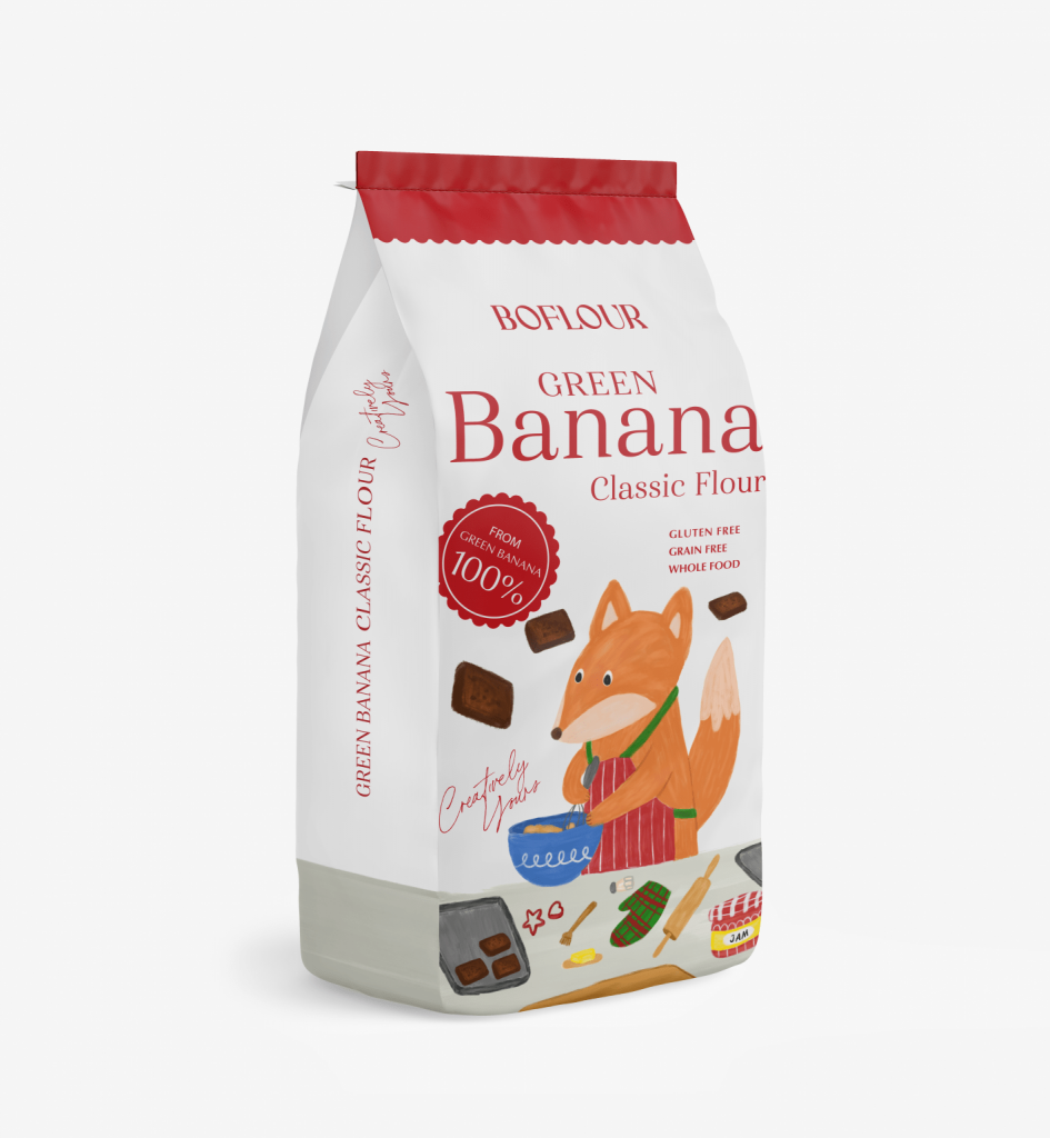
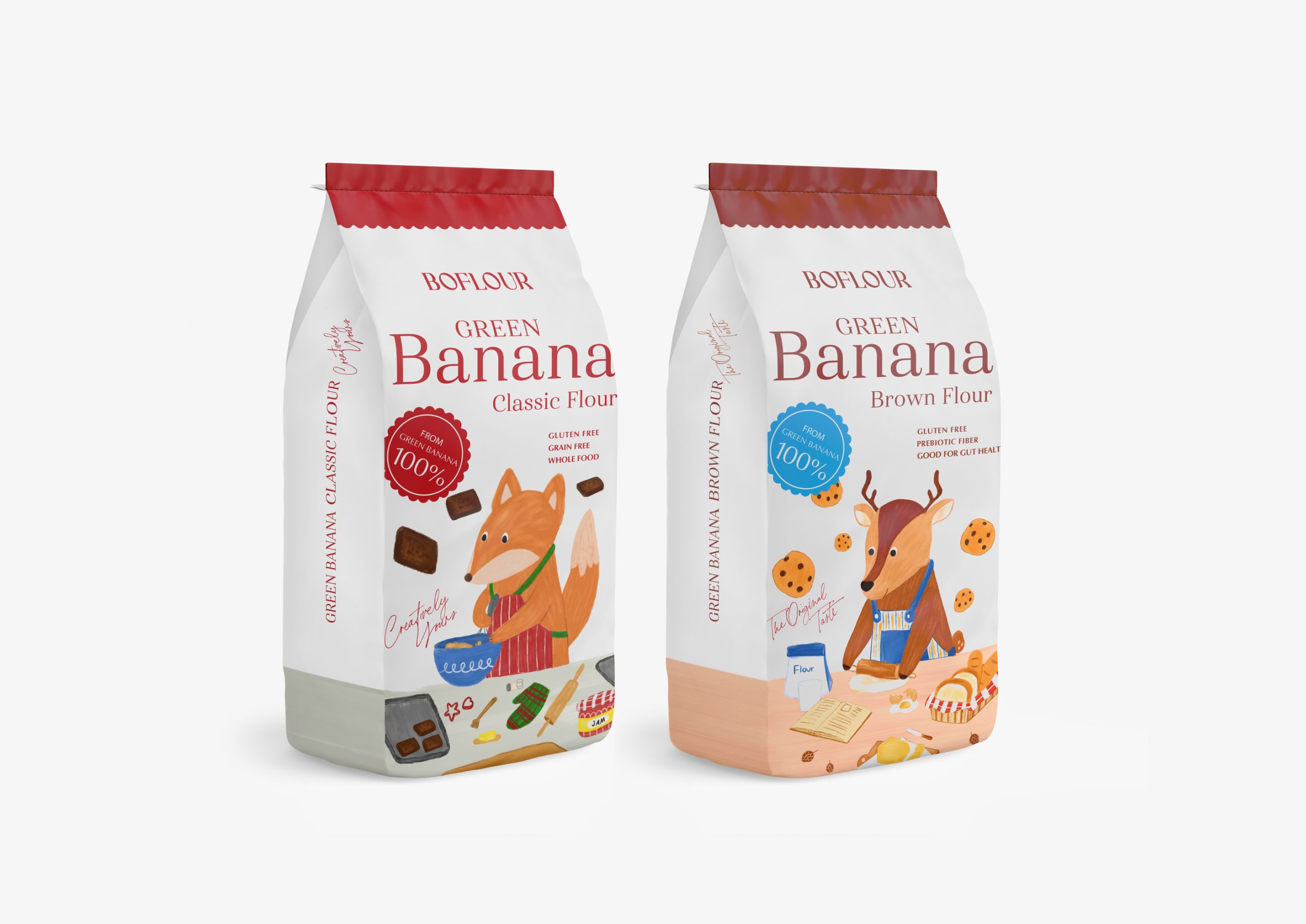
With watercolor illustrations and cute little animals preparing cookies and brownies, the packaging has the ability to strike a chord with the customers.

We used the watercolor illustration style to make the mood of a storybook. Create the visual of a cute animal that enjoys making brownies and cookies that depend on the function of the flour. We choose the fox and little deer because both of them represent clever and lively. And make a difference from the flour’s packaging in the market that we are different from their brand position with the process, value, and emotion of the brand being.”

Get the latest packaging design inspiration in your inbox:

Popular designs

Tropicana’s Branding & Packaging Redesign by Sunhouse

Tropicana rejuvenates its brand with Sunhouse, blending modern iconicity and heritage. The redesign emphasizes Tropicana’s legacy, highlighting its unique story and craftsmanship, making it stand out as the original, superior orange juice.

Creating a Strong Brand Identity: The Journey of Living Things Packaging Design

“Developing Living Things packaging involved multiple design stages, feedback, and refinement. With extensive market research, collaboration with brand strategist Jose Debate and design agency Studio Nari, we created a strong, recognizable brand identity appealing to health-conscious, trend-setting millennials and Gen Z.”

Designed by: PepsiCo Design & Innovation
Country: United States

Packaging Design Concept: Boflour Green Banana Flour

sBoflour-Packaging

Designed by: ihapstudio | Country: Thailand

The Covid-19 pandemic changed the minds of the people in many different ways. People around the world, now more than ever, are inclined to buy health-related products that heal the body and the mind. Boflour, a Thailand-based company, boasts of producing products that heal the body and the mind.

ihap mentions:

Green bananas are full of fiber which is good for people with digestive and bowel problems. It is especially beneficial for people with IBS and constipation. It is loaded with potassium, which acts as a vasodilator… Green bananas need to be cooked for better absorption of nutrients. If our health is good our mind will be good too. That’s the thing we believe.”
Packaging Design Concept: Boflour Green Banana Flour

The packaging

With watercolor illustrations and cute little animals preparing cookies and brownies, the packaging has the ability to strike a chord with the customers.

We used the watercolor illustration style to make the mood of a storybook. Create the visual of a cute animal that enjoys making brownies and cookies that depend on the function of the flour. We choose the fox and little deer because both of them represent clever and lively. And make a difference from the flour’s packaging in the market that we are different from their brand position with the process, value, and emotion of the brand being.”

Previous slide
Next slide
Get the latest on packaging design in your inbox: