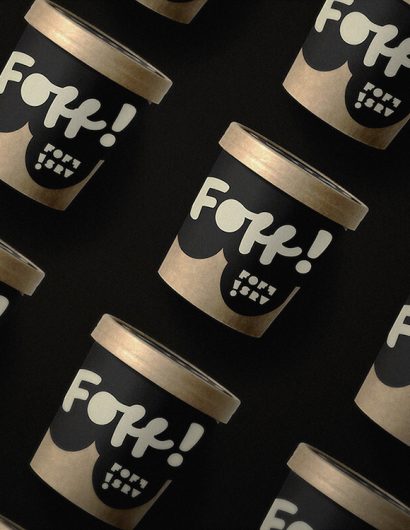
Designed by: Jade Ratcliffe Creative | Country: Canada
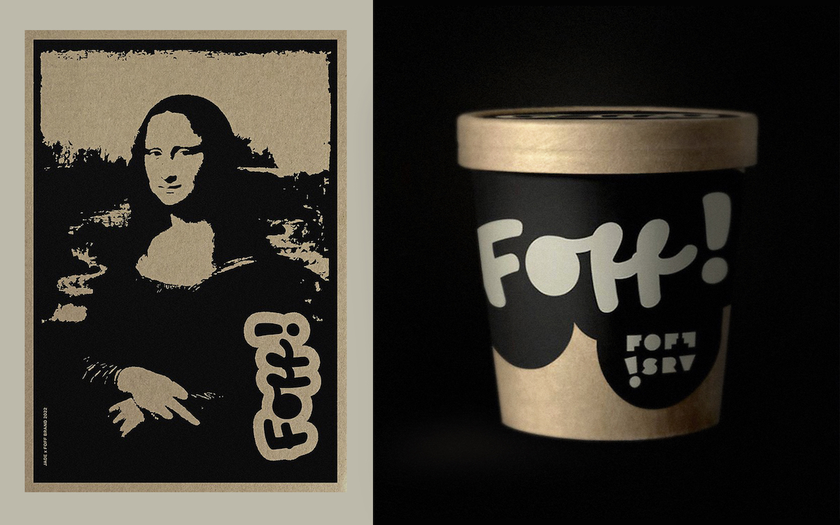
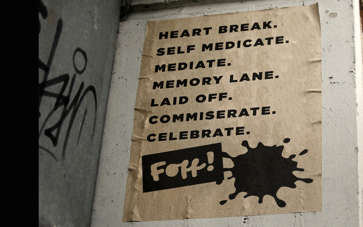
Foff, a lifestyle and designer streetwear company, recently launched its ice cream brand. Just like it’s crazy streetwear, the new line of ice cream promises to be “perverted.” The packaging design was created with the company’s brand identity in mind.
The combinations of various flavors make the ice cream unique, thereby setting the brand apart from the crowd.
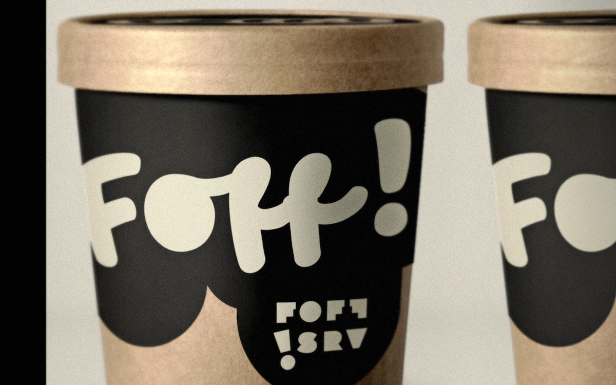
“‘foff srv’ (soft serve in pints) comes in ever-changing, flavor combinations such as: ‘bean through it’ (coffee swirl + black caramel crumble), ‘sea u next Tuesday’ (sea salt pretzel + chocolate cookie) and ‘Chips on my shoulder”’ (chocolate chip cookie + salt and vinegar chips).”
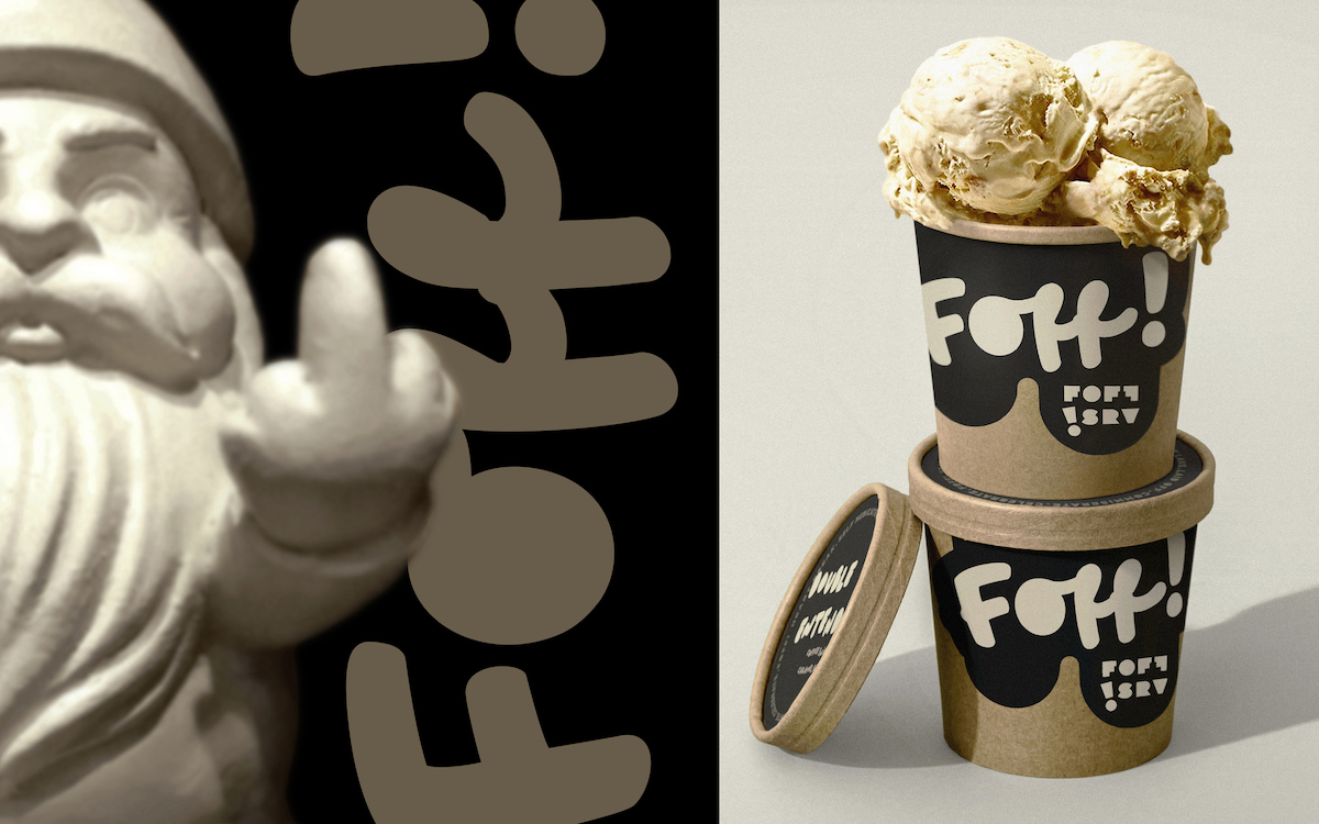
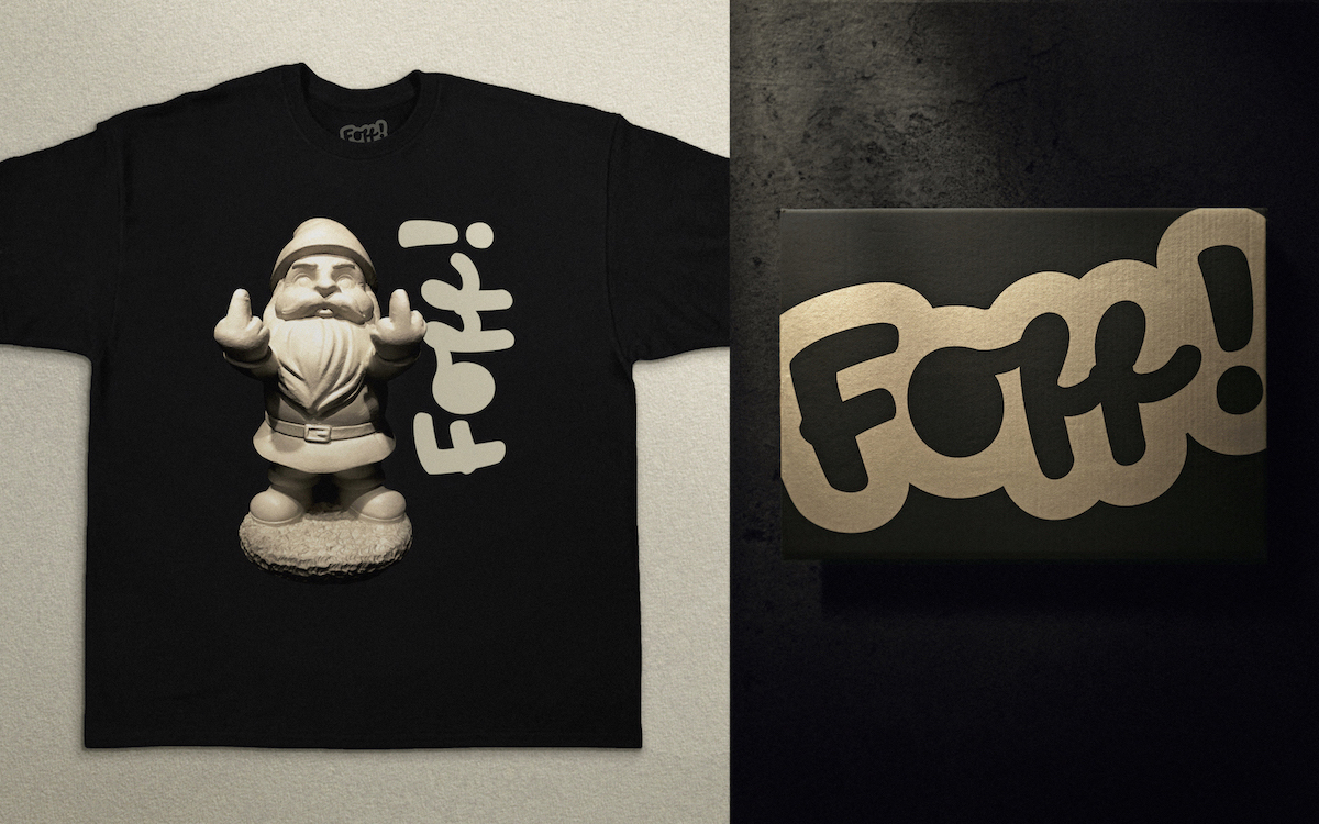
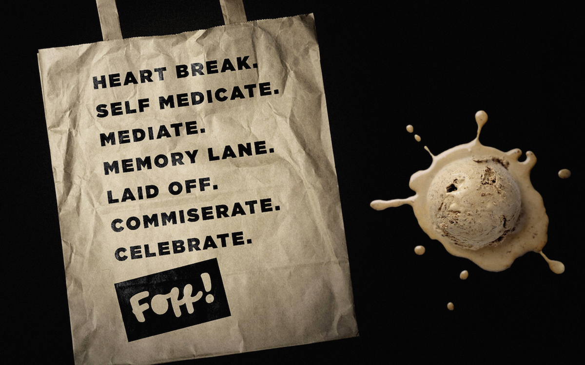

The packaging
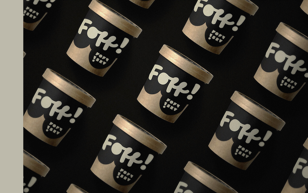
Foff teamed up with the Vancouver-based design agency, Jade Ratcliffe Creative, to create the packaging design of the brand’s new line of ice creams. The black-and-gold color palette is in line with the brand image.
“The brains behind foff! Is artist and creative director jade ratcliffe who is known for creating indelible brands such as dussault apparel, betterwith ice cream, open sundaes, original cupcakes and perverted. Jade explains that he knows these efforts might not save the planet but foff! Is committed to doing as little harm as possible. He believes “The dessert category provides a bit of debaucherous fun but is totally superfluous. Therefore I feel it is even more important not to add to the worlds problems wherever possible. You can be a good time, punk rock, $h!T disturber without being a total a$$hole.”


