


Design: Katerina Theodosiadou | Country: Italy
Packaging designs are one of the key elements of branding and marketing. Just like other visual elements of a brand, packaging designs play a crucial role in establishing brand awareness. Often, it plays a decisive role in a customer’s purchasing decision. Brands today focus on building loyal fans through the creation of varied brand assets. Gone are the days when merely building a consumer base would suffice. And Frosty Dream has done exactly that with its latest branding.
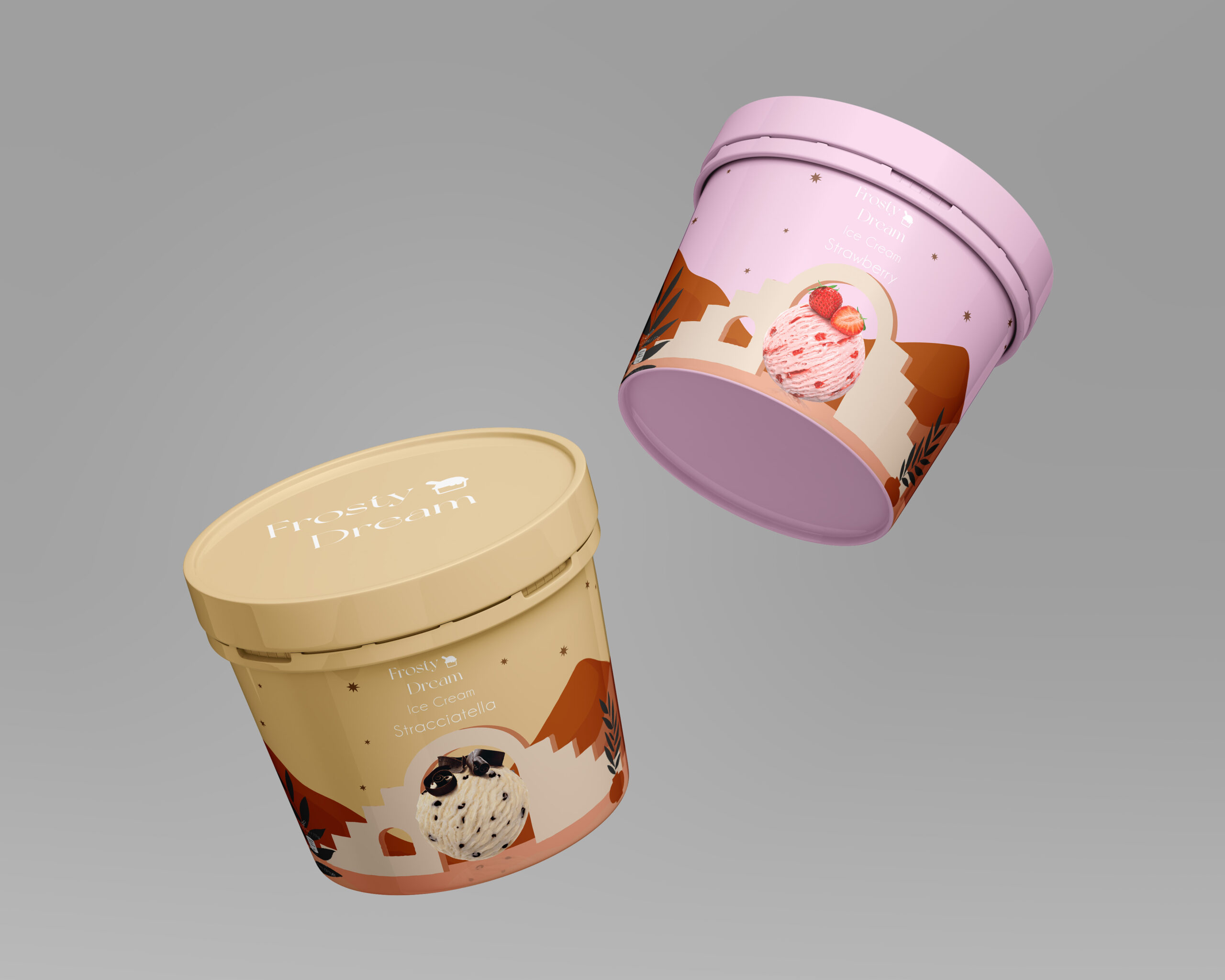
The Italian ice cream company focused on promoting itself as a loveable and memorable brand through its latest packaging redesigns.


Six Frosty Dream ice creams have been redesigned, namely Mango, Blueberry, Chocolate, Triple Chocolate, Stracciatella, and Strawberry. The colors match the ice creams, making the design more appealing to the customers. Two key elements make the packaging design of Frosty Dream different from its competitors, attractiveness, and uniqueness.
A product must attract customers from the shelf of a store and communicate what they can expect from the brand. The pastel colors are easy on the eyes, attracting the customers instantly. Since the colors match the flavors of the ice cream, customers know what the brand is about.
The choice of colors makes the packaging stand apart from the crowd. While pastel colors are now trending, using them for ice cream packaging is unheard of. The new packaging has the power to impact the marketplace.


