


Designed by: Design Happy | Country: UK
Cannabotech approached the London-based branding and packaging design agency Happy Design to create compelling designs for their “range of CBD and Mushroom wellness products.” Cannabotech is known for its products which combine the medicinal properties of cannabidiol (CBD) and medicinal mushrooms.
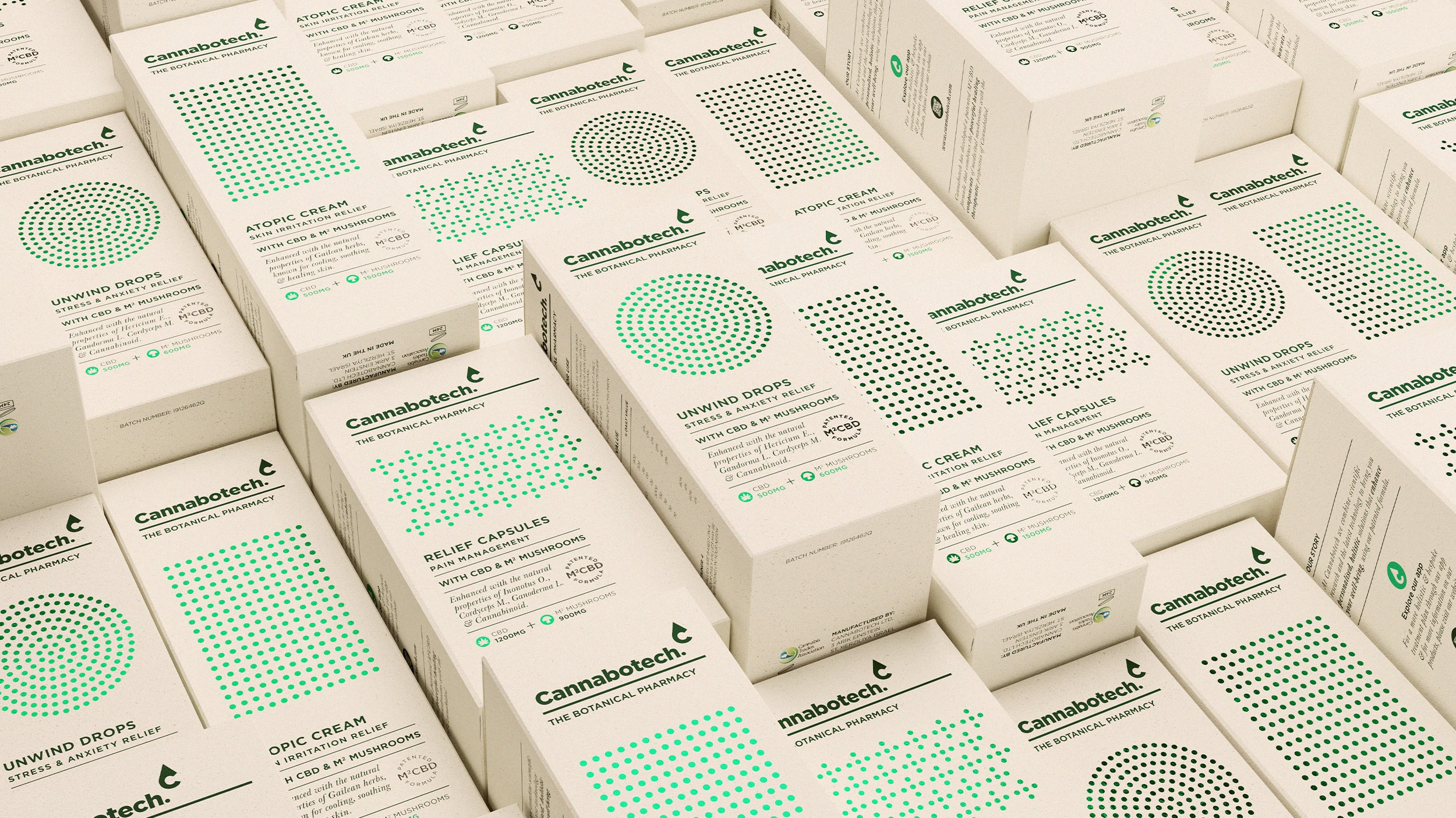
Design Happy mentions:
“Wanting to be recognized as the Botanical Pharmacy, Cannabotech combines the latest technology with power of nature and modern science to provide personalized, holistic, wellness solutions. These products are targeted at people who are looking for effective and natural products that promotes balance to their body and mind to enhance their well-being.”


While it is true that a substantial part of the market that deals with CBD-based products lack credibility, Cannabotech has been successful in establishing itself as a reliable brand. However, communicating the reliability quotient of the brand without using typical design ideas was a challenge for the design agency.
“By taking inspiration from the Botanical Pharmacy, we developed a high science, binary language through detailed dot patterning that categorizes the range whilst an earthy card stock softened the science with a natural aesthetic. This combination, supported by the high quality print finishes, helps to elevate its premium credentials.”


