


Designed by: Céu Design | Country: Brazil
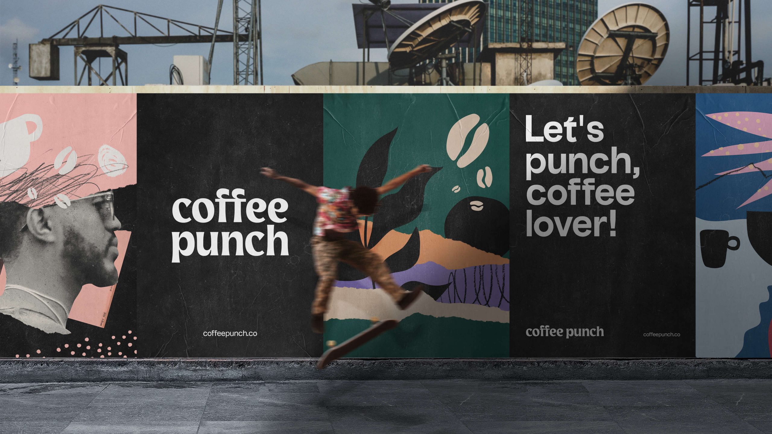
Coffee Punch, the specialty coffee brand, was born out of the experience and love of its founders. The product packaging symbolizes the love and enthusiasm with which the brand owners formed the company. The focus behind the packaging was to let the consumers know that Coffee Punch transcends the set boundaries of complex rituals associated with specialty coffees.
The design house mentions:
“The intention was to expand the potential of coffee and take it forward to professionals and enthusiasts, transforming the sector, creating opportunities, and providing an extra dose of adrenaline (or caffeine) in people’s lives, all this by unlinking specialty coffees from complex rituals and bringing the brand an approach of dynamism, movement and attitude, making it happen!”


The challenge, as per the design agency, was to “produce packaging with high visual impact” but in the simplest way possible. To achieve the desired result, Céu Design created “a black package with logo printed in silkscreen.”
“This flexible language allowed the brand to expand to different materials through messages and graphics.”


