Designed by: PepsiCo Design & Innovation
Country: United States

Packaging Design Of Frenzy Feel Good Coffee

1

Designed by: Sophia Georgopoulou | Design | Country: Greece

When Athens-based design agency, Sophia Georgopoulou | Design, started working on the branding and packaging design of Frenzy Feel Good Coffee, they quickly realized that standing apart in a sea of competitors was going to be difficult. Since Greece has a strong coffee culture, brands have to put in extra effort to differentiate themselves from their competitors.

Talking about the creative concept, the design house mentions:

“When creating the identity, it was clear that what we wanted was something simple, direct and recognizable. We wanted a characteristic, ownable brand sign. This would provide the basis for alternative branded expressions that convey precisely the philosophy of the place and its owners. The name itself, vibrant, full of energy, passion and a welcome measure of craze, was a good place to start.

Packaging Design Of Frenzy Feel Good Coffee

The Packaging

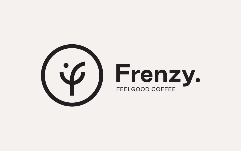
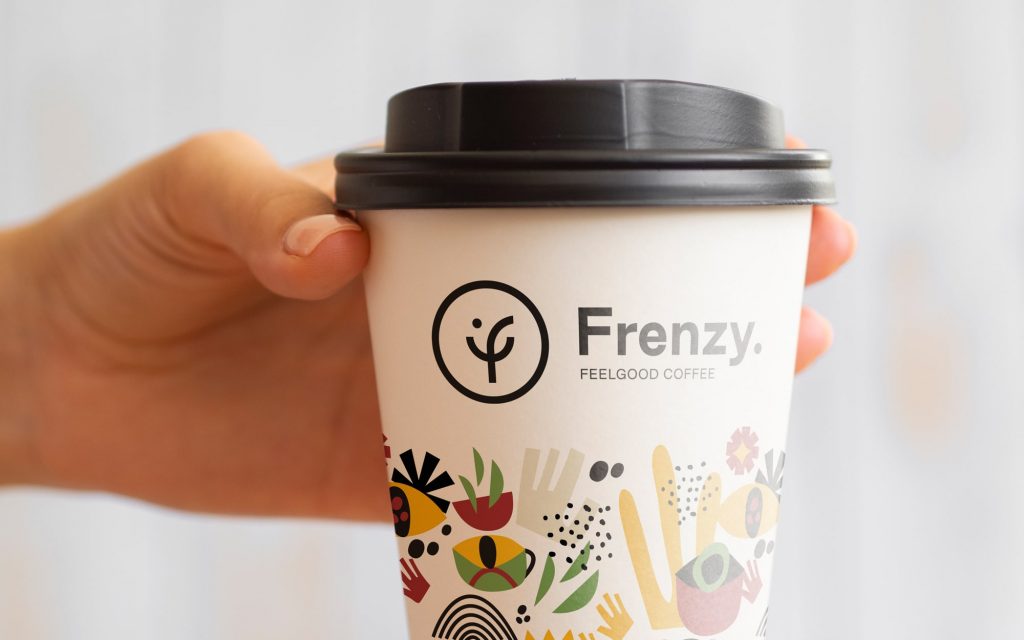
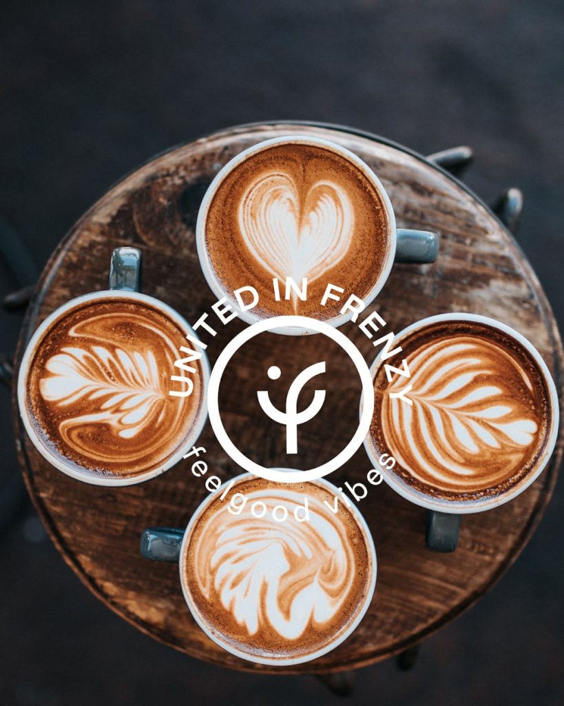
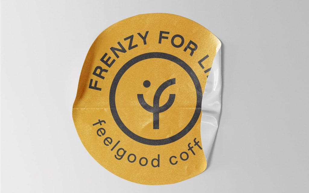
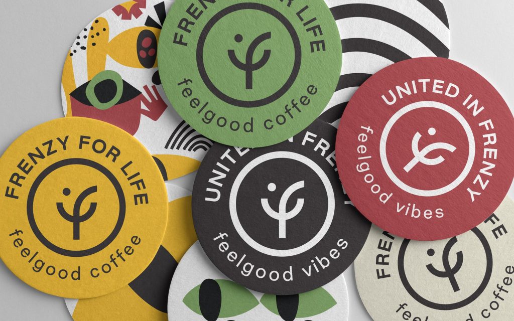
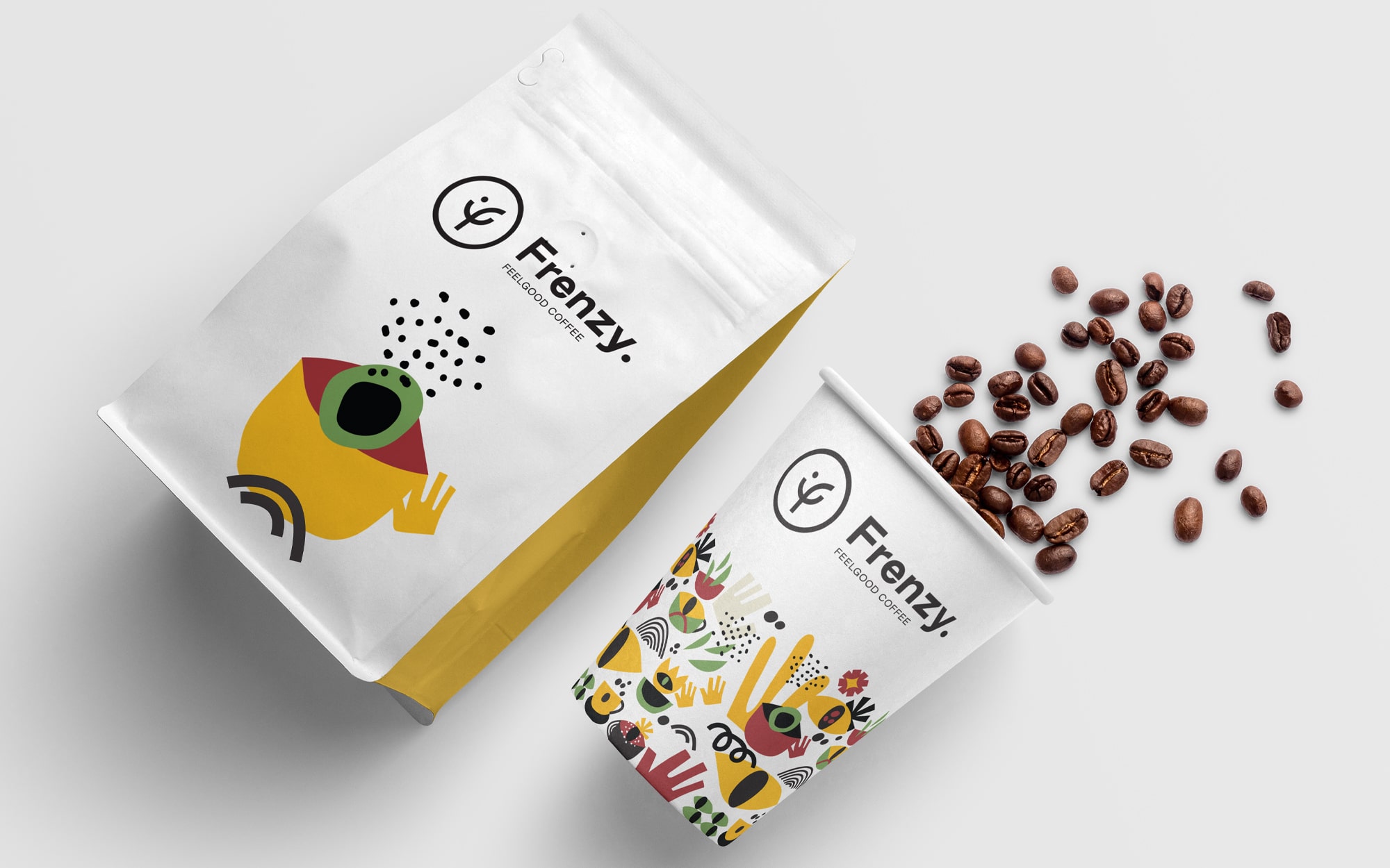
The curved initial ‘f’ resembles a smile, making it easier for the customers to associate with the brand. The color palette has been inspired by the origins of coffee, including “the plant, the beans, and its packs.”

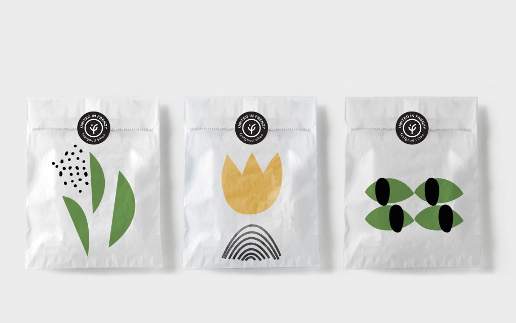
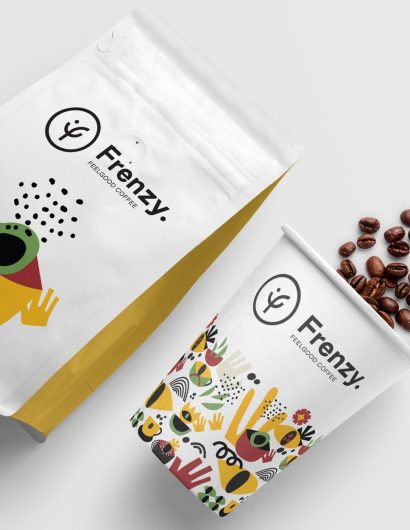
“All the original artwork created as brand expressions have followed a deliberately primal path, with raw, flat shapes broken down to their basic building blocks – to reflect the primal passion that goes along with the idea of frenzy and the obsession with great coffee and good times…”


1

Get the latest packaging design inspiration in your inbox:

Popular designs

Pure Persian Honey

When we look closely at honey packaging, they are almost all in the usual format, and the ultimate in creativity is that

Designed by: PepsiCo Design & Innovation
Country: United States

Packaging Design Of Frenzy Feel Good Coffee

1
A

Designed by: Sophia Georgopoulou | Design | Country: Greece

When Athens-based design agency, Sophia Georgopoulou | Design, started working on the branding and packaging design of Frenzy Feel Good Coffee, they quickly realized that standing apart in a sea of competitors was going to be difficult. Since Greece has a strong coffee culture, brands have to put in extra effort to differentiate themselves from their competitors.

Talking about the creative concept, the design house mentions:

“When creating the identity, it was clear that what we wanted was something simple, direct and recognizable. We wanted a characteristic, ownable brand sign. This would provide the basis for alternative branded expressions that convey precisely the philosophy of the place and its owners. The name itself, vibrant, full of energy, passion and a welcome measure of craze, was a good place to start.

Packaging Design Of Frenzy Feel Good Coffee

The Packaging

The curved initial ‘f’ resembles a smile, making it easier for the customers to associate with the brand. The color palette has been inspired by the origins of coffee, including “the plant, the beans, and its packs.”

“All the original artwork created as brand expressions have followed a deliberately primal path, with raw, flat shapes broken down to their basic building blocks – to reflect the primal passion that goes along with the idea of frenzy and the obsession with great coffee and good times…”

1
Previous slide
Next slide

Explore more great package design

Get the latest on packaging design in your inbox: