


Designed by: Rewot | Country: Italy
“Penicillin cures, but wine makes people happy,” —Sir Alexander Fleming, physician and microbiologist known for discovering penicillin.
Where would you expect to find the best wines in the world? Well, three countries: France, Spain, and Italy. Today, we will focus on a 115-year-old Italian winery and its latest product.
Established in 1907 as a consortium of grape producers, Cantina di Santa Croce today has the capacity to process 170,000 quintals of grapes annually.
Il Primo (first) is an organic product by Cantina di Santa Croce. According to their official website, “The true return to the origins… with the most advanced and modern technologies of the Winery, from certified organic vineyards, to preserve the natural qualities and characteristics of the grapes… These wines are rich in freshness and sapidity, and they will match and satisfy even the most demanding palates.”
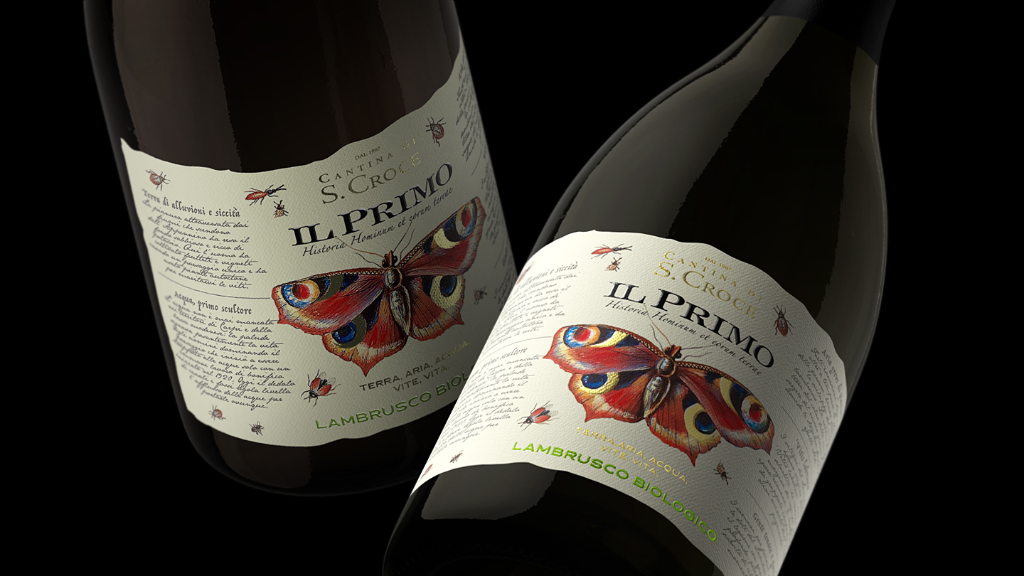
The winemakers approached Rewot, an Italy-based creative agency, to create a unique and attractive visual identity for Il Primo.
“Through the label of their “PRIMO” (First) organic wine, Cantina Santa Croce required us to use a new language to convey not only the concept of BIO, but also the respect for the territory which is inextricably linked with the company.”


The natural beauty of the landscape and the company’s century-old heritage are linked through beautiful butterflies and insects.
“The metamorphosis of the visual identity is completely different from the current wine scene. The colors, the illustrations of butterflies and insects and the naturalistic layout are the key elements of this illustrated tale, in which nature and elegance are the background to the world of Cantina Santa Croce and their production method. To frame everything, delicate details in gold foil and a texture that make the label refined and genuine at the same time.”


