Designed by: PepsiCo Design & Innovation
Country: United States

Packaging Design Of Little Cow & Cookies By Snow Donuts

Designed by: Snow Donuts | Country: Netherlands

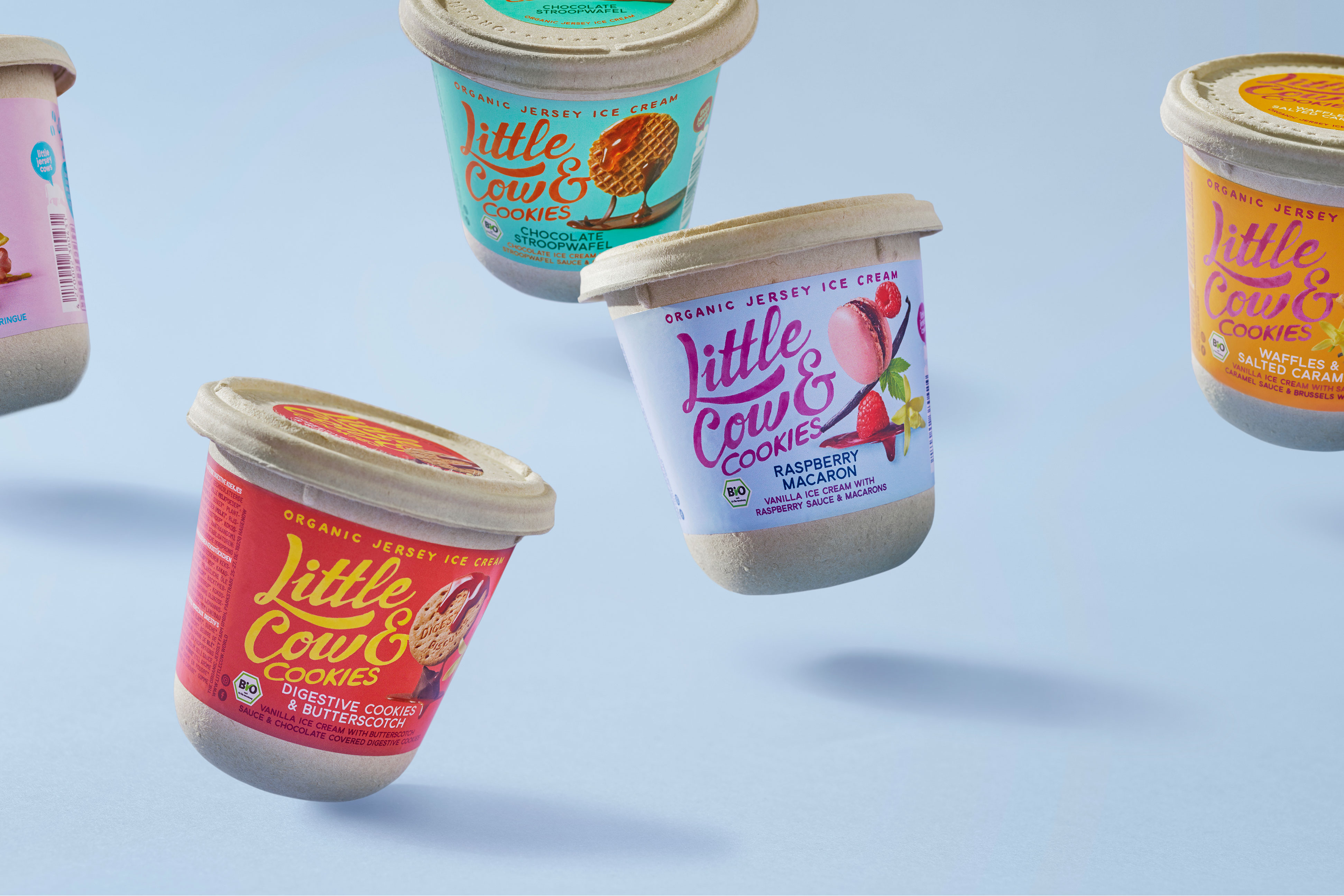
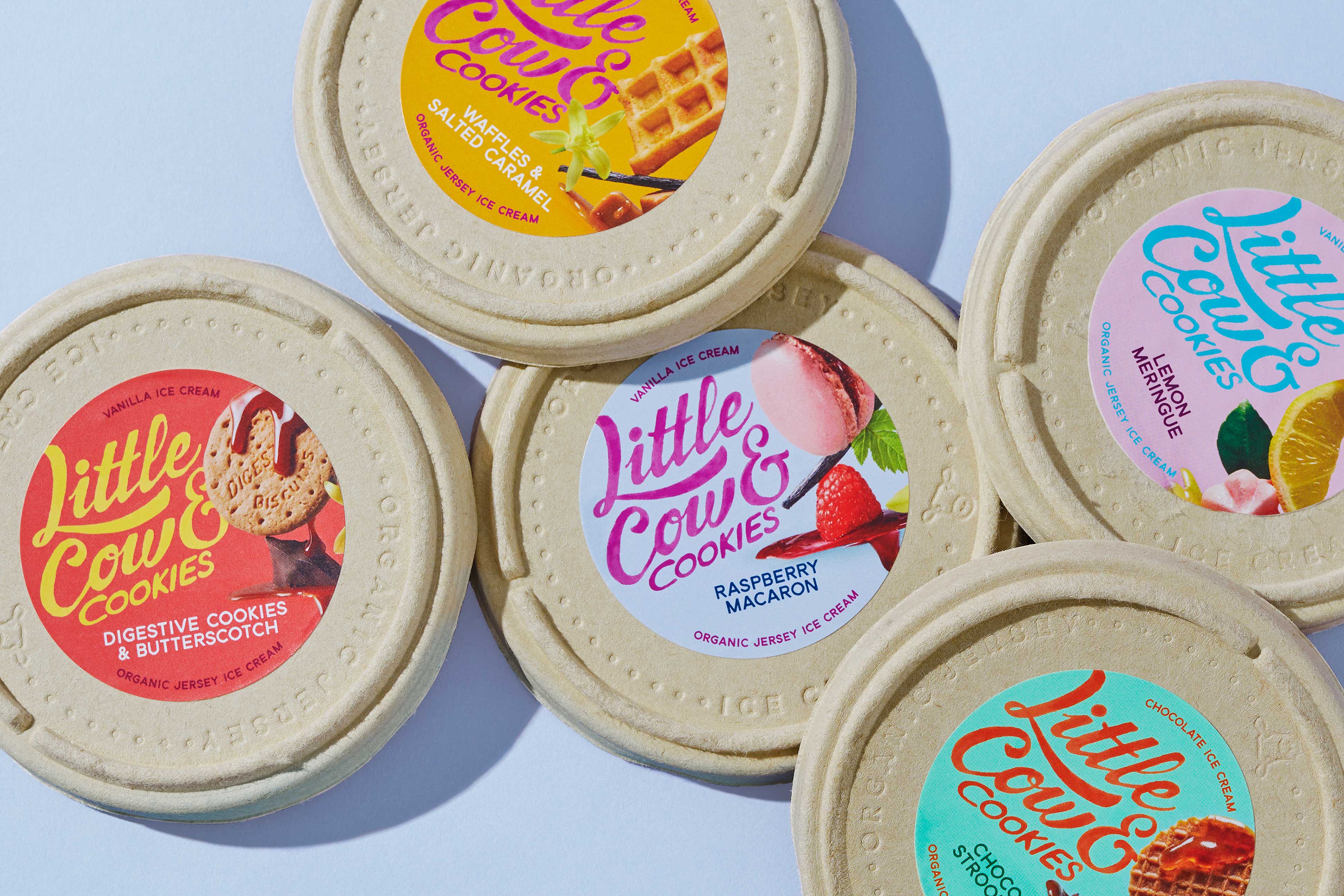
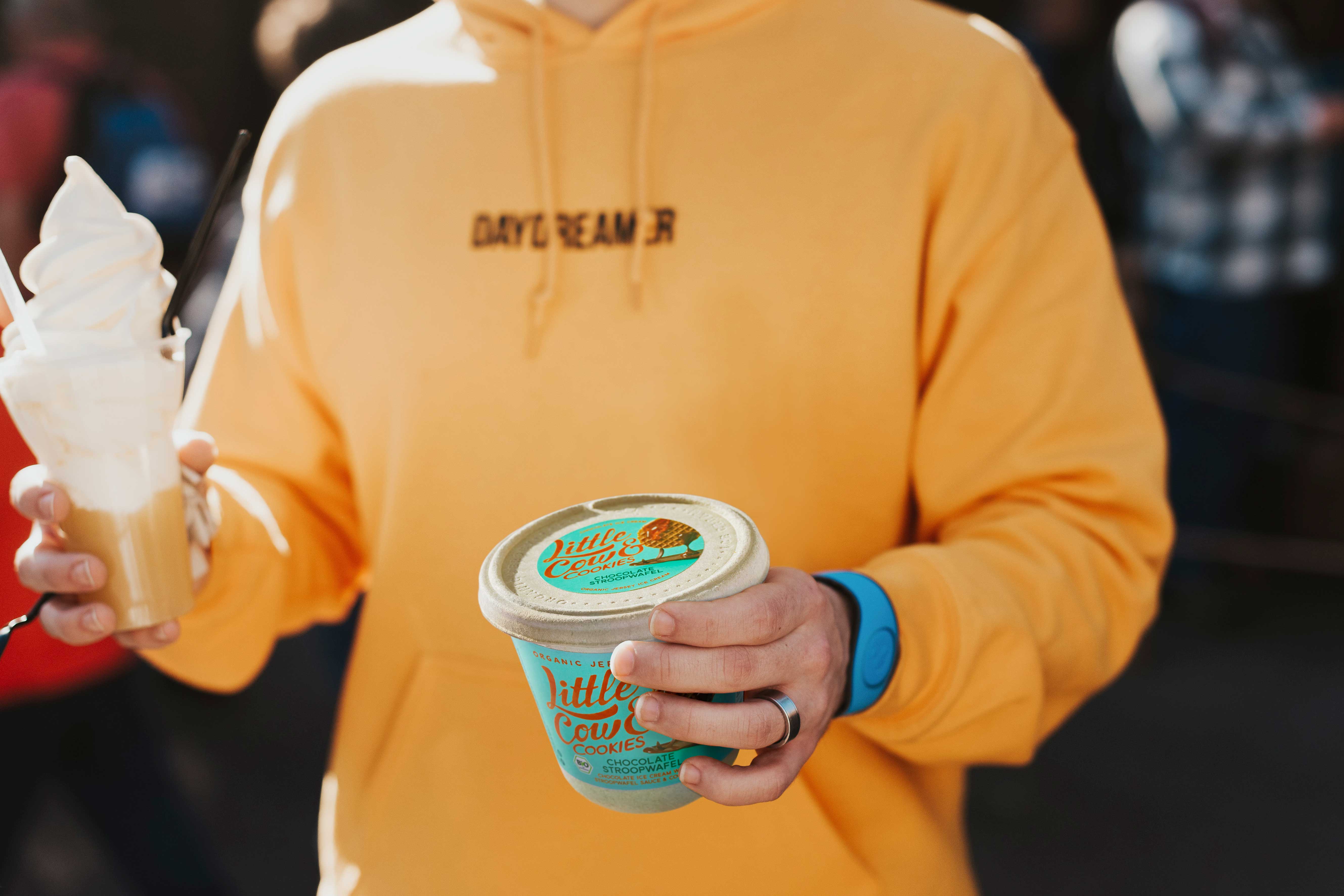
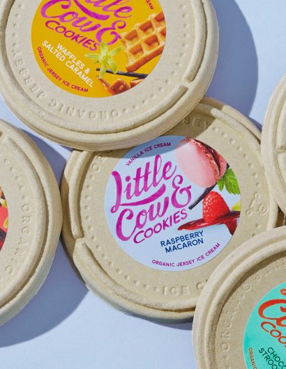
Little Cow & Cookies proudly presents its unique mix of ice cream made with milk from Jersey cows and organic cookies derived from the pages of conventional European recipe books to its customers. The mix is presented in a biodegradable tub, highlighting the brand’s eco-friendly attitude.

The Jersey cows are well raised in a healthy environment. Furthermore, all the ingredients for the products are locally sourced.

Known for their cheeky characters, our Jersey cows are a lot of fun to be around. We raise them responsibly on our outstretched pastures where they dine on healthy, fresh grass and herbs and roam far and wide. Delicious ice cream is made from the creamy milk of these cows. Everything local: the organic ice cream, the organic cookies and of course the beautiful packaging.

Packaging Design Of Little Cow & Cookies By Snow Donuts

The packaging

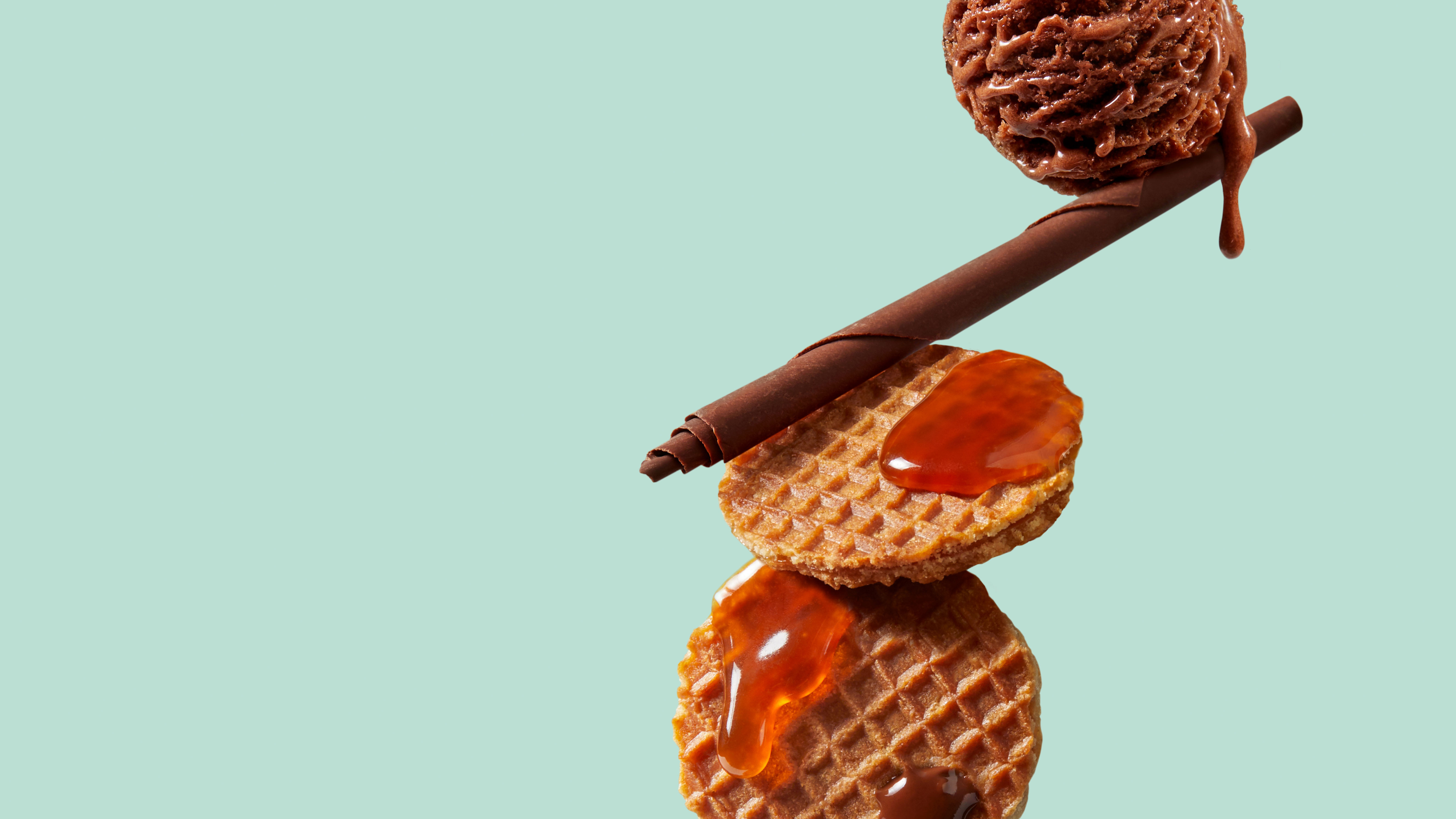
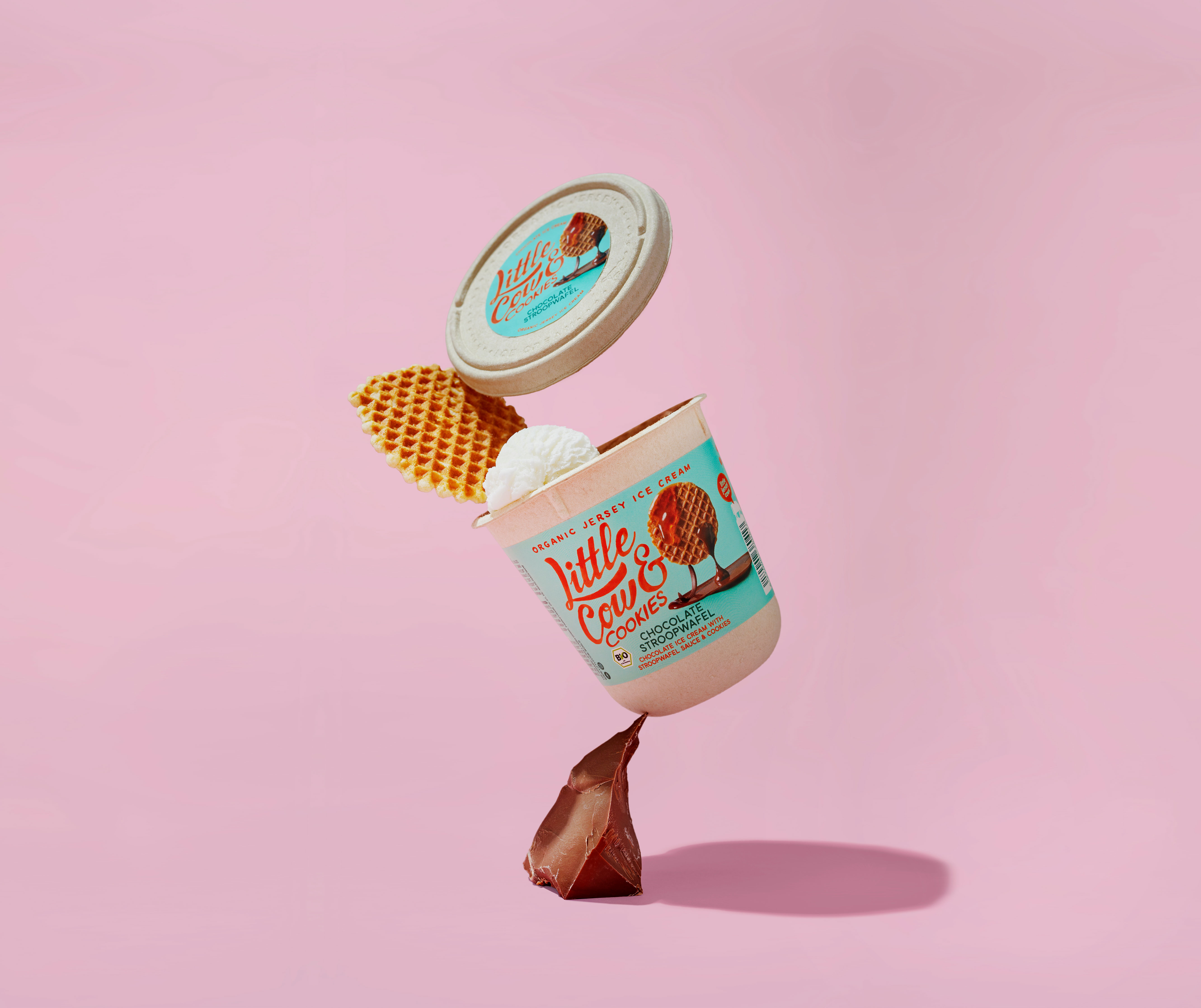
The simple packaging designs created by the Den Hag-based design agency, Snow Donuts, have been inspired by still-life paintings. These types of paintings make everyday objects look more lifelike than usual. The color palette, along with the wordmark, makes the packaging attractive and relevant, increasing the shelf value of the product.

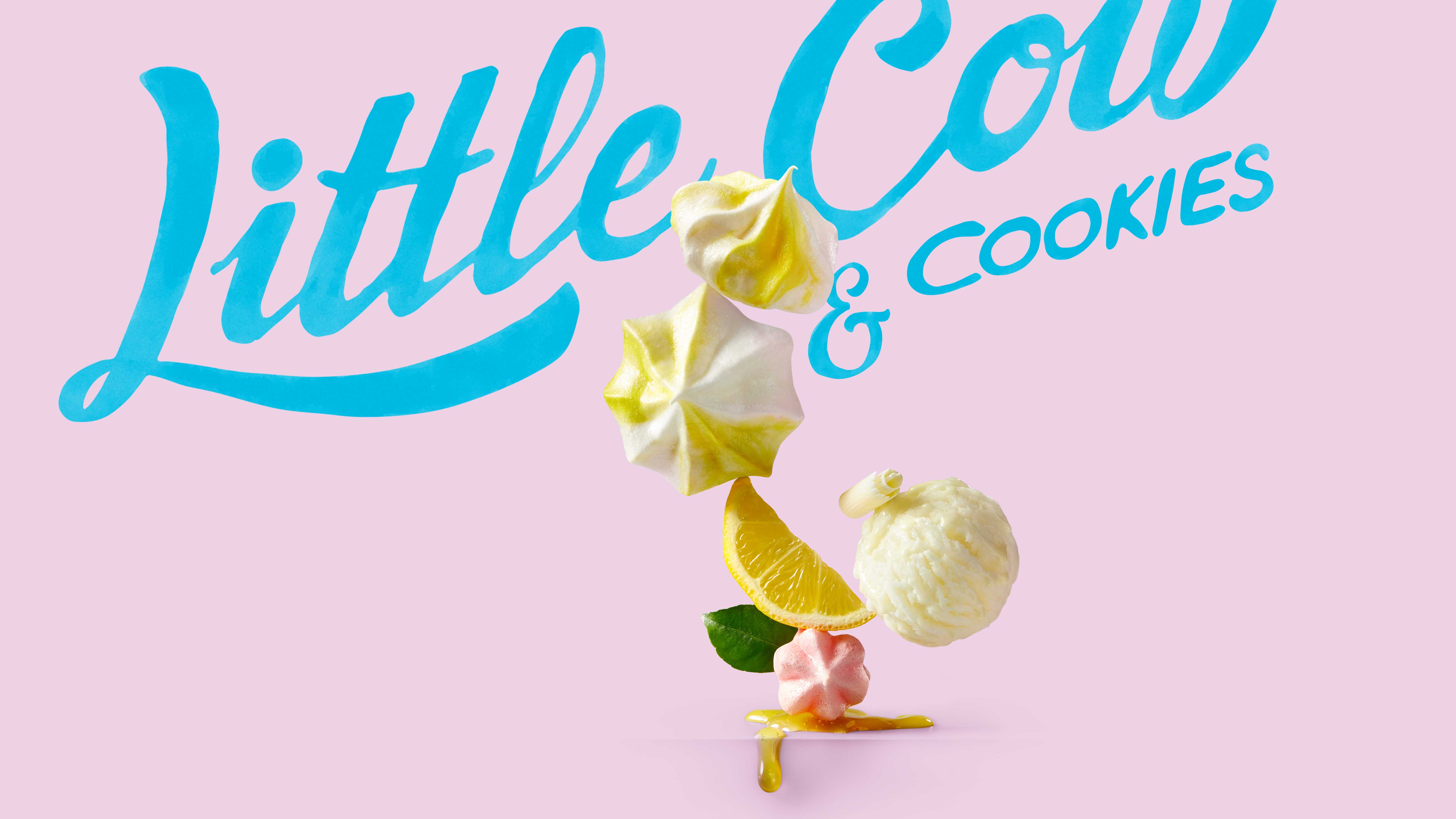
“At the heart of the Little Cow & Cookies brand & packaging design, is the unique and colorful photography. We took cues from still life painting, where seemingly ordinary objects appear much more intense than usually. And even enhanced it further by having the ingredients balance on top of each other in a display of magic realism.

Get the latest packaging design inspiration in your inbox:

Popular designs

Over the wave

This Kombucha originates in Lombok, Indonesia, where its paradise beaches attract hundreds of surfers eager to ride the waves. When you surf,

Burma Love Rebrand

Love at First BiteAs an extension of the Burma Superstar restaurant in San Francisco, Burma Love Foods gives diners an opportunity to

Far Out Bar

Description: Far Out Bar is a cutting-edge packaging design project created for High Life Farms’ macrodose THC chocolate bars. This project involved

Designed by: PepsiCo Design & Innovation
Country: United States

Packaging Design Of Little Cow & Cookies By Snow Donuts

6-World-Brand-Design-SNOW-DONUTS-Little-Cow-and-Cookies-Lids-Top-View

Designed by: Snow Donuts | Country: Netherlands

Little Cow & Cookies proudly presents its unique mix of ice cream made with milk from Jersey cows and organic cookies derived from the pages of conventional European recipe books to its customers. The mix is presented in a biodegradable tub, highlighting the brand’s eco-friendly attitude.

The Jersey cows are well raised in a healthy environment. Furthermore, all the ingredients for the products are locally sourced.

Known for their cheeky characters, our Jersey cows are a lot of fun to be around. We raise them responsibly on our outstretched pastures where they dine on healthy, fresh grass and herbs and roam far and wide. Delicious ice cream is made from the creamy milk of these cows. Everything local: the organic ice cream, the organic cookies and of course the beautiful packaging.

Packaging Design Of Little Cow & Cookies By Snow Donuts

The packaging

The simple packaging designs created by the Den Hag-based design agency, Snow Donuts, have been inspired by still-life paintings. These types of paintings make everyday objects look more lifelike than usual. The color palette, along with the wordmark, makes the packaging attractive and relevant, increasing the shelf value of the product.

“At the heart of the Little Cow & Cookies brand & packaging design, is the unique and colorful photography. We took cues from still life painting, where seemingly ordinary objects appear much more intense than usually. And even enhanced it further by having the ingredients balance on top of each other in a display of magic realism.

Previous slide
Next slide

Explore more great package design

Get the latest on packaging design in your inbox: