Designed by: PepsiCo Design & Innovation
Country: United States

Packaging Design: ShakePlus Dietary Supplement

Designed by: MarkaWorks | Country: Turkey

ShakePlus, a Netherlands-based natural dietary supplement brand, is known for creating products that help customers lose and maintain weight. ShakePlus products do not harm health in any way since the company avoids using any unnatural ingredients. The brand uses fresh strawberries, coffee, and cocoa in their products making the them healthy and tasty.

ShakePlus teamed up with MarkaWorks, an Antalya-based design agency, to create compelling packaging designs for the brand.

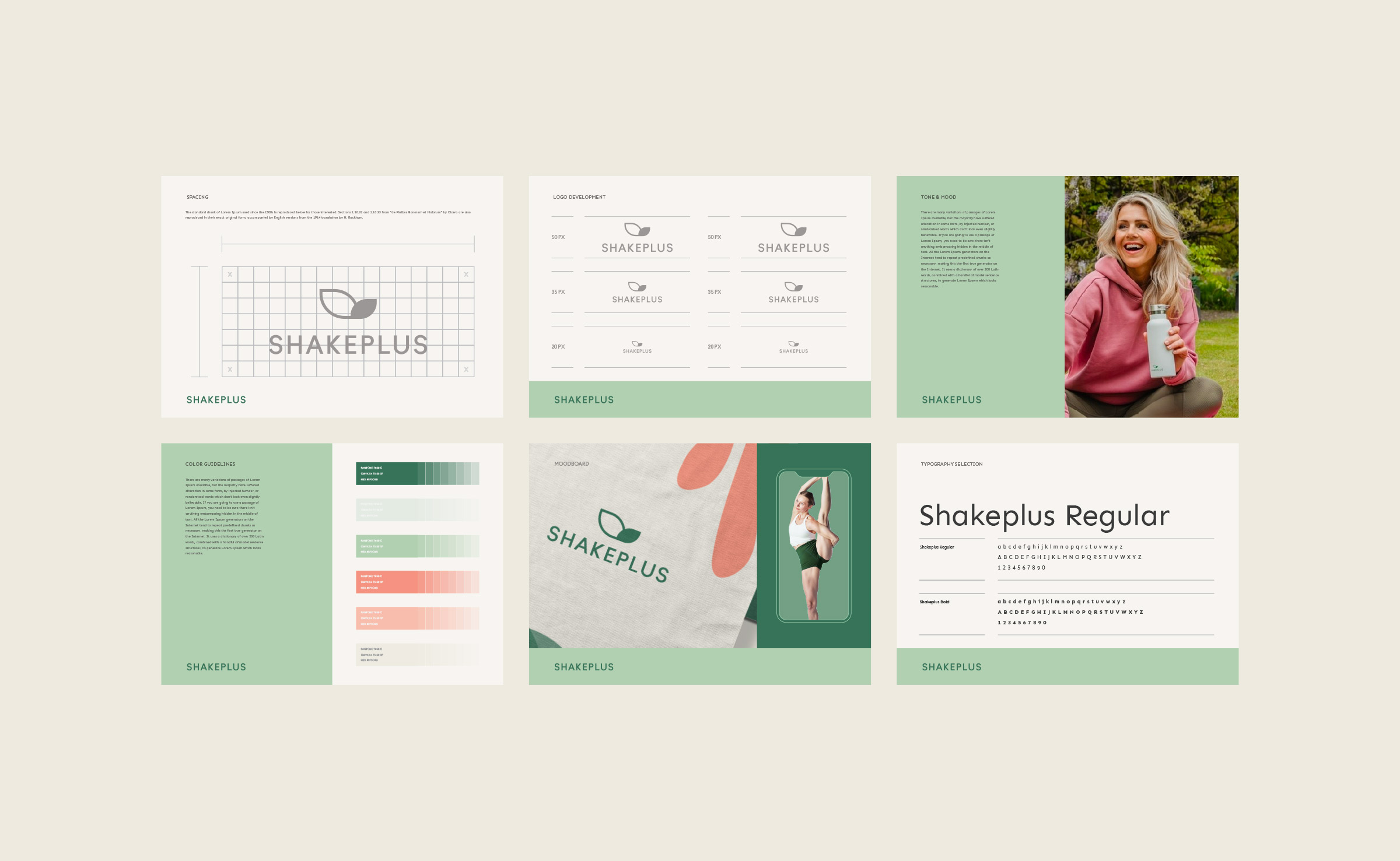
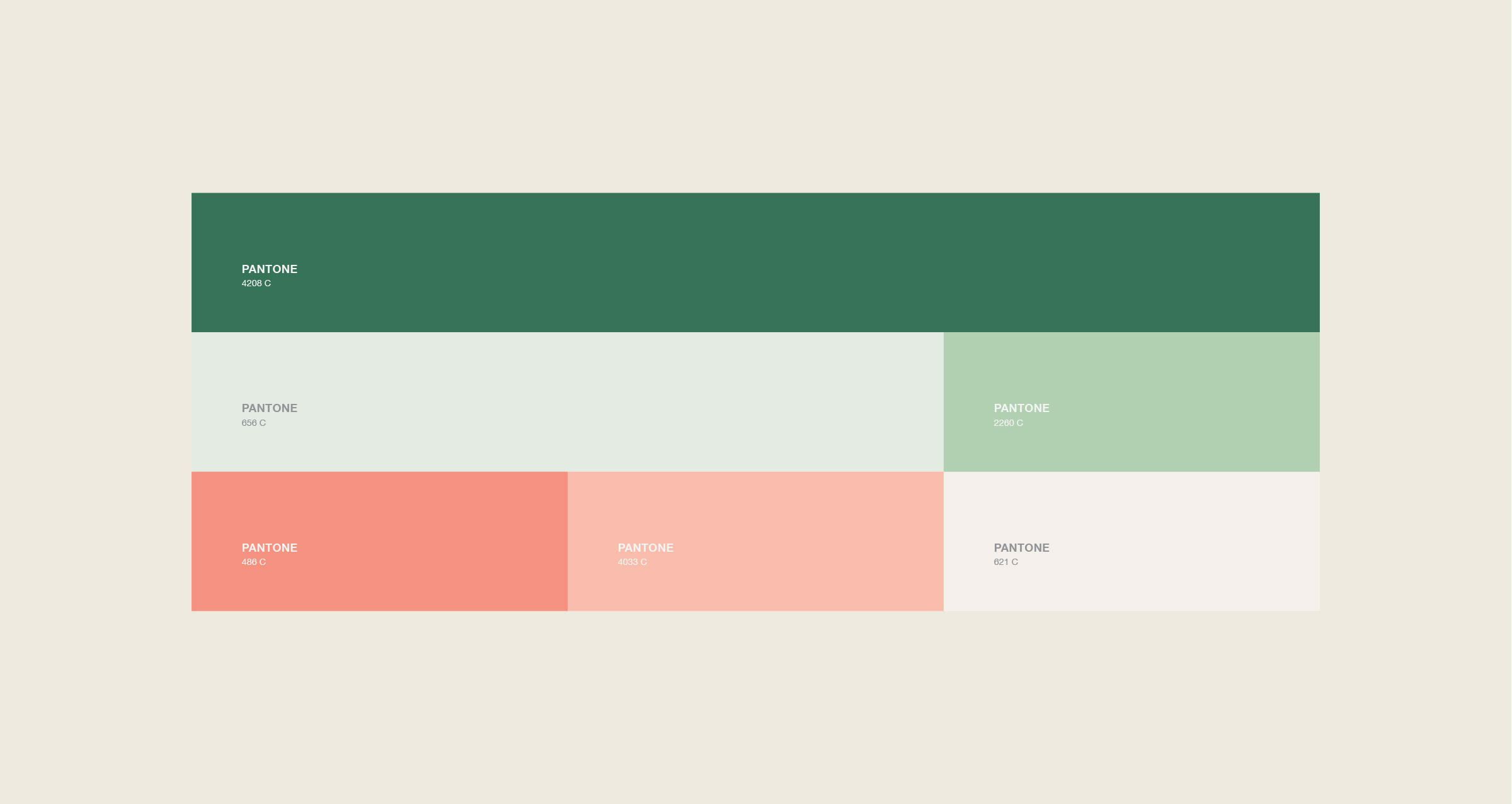
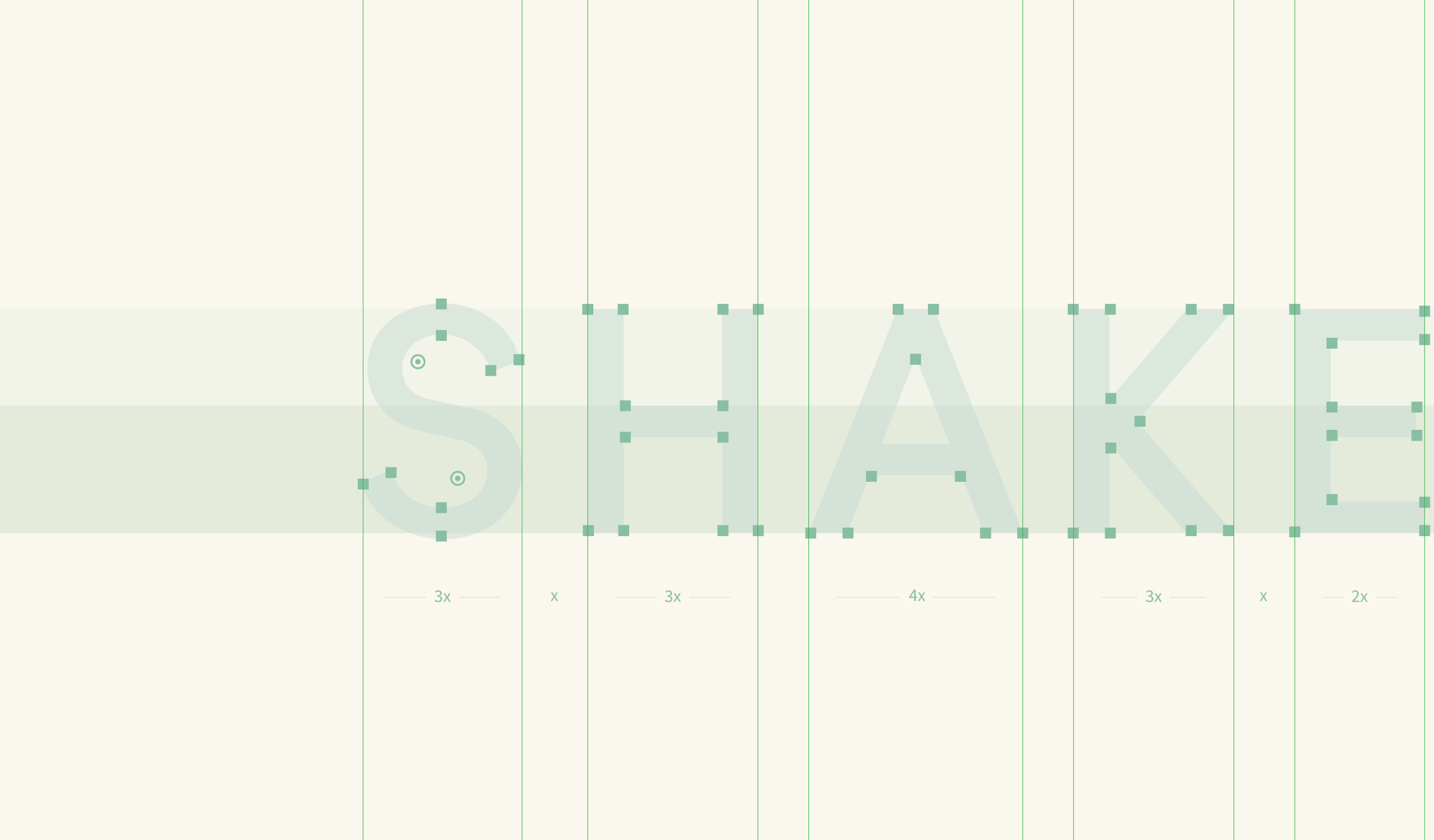
It was decided to use a classic font type for a timeless look and convenience. At the same time, to show the naturalness of the products, we created a color palette out of green and fruit-associated color shades. To be exact, we used the colors of the products and ingredients that the ShakePlus products are made of.”

Packaging Design: ShakePlus Dietary Supplement

The packaging

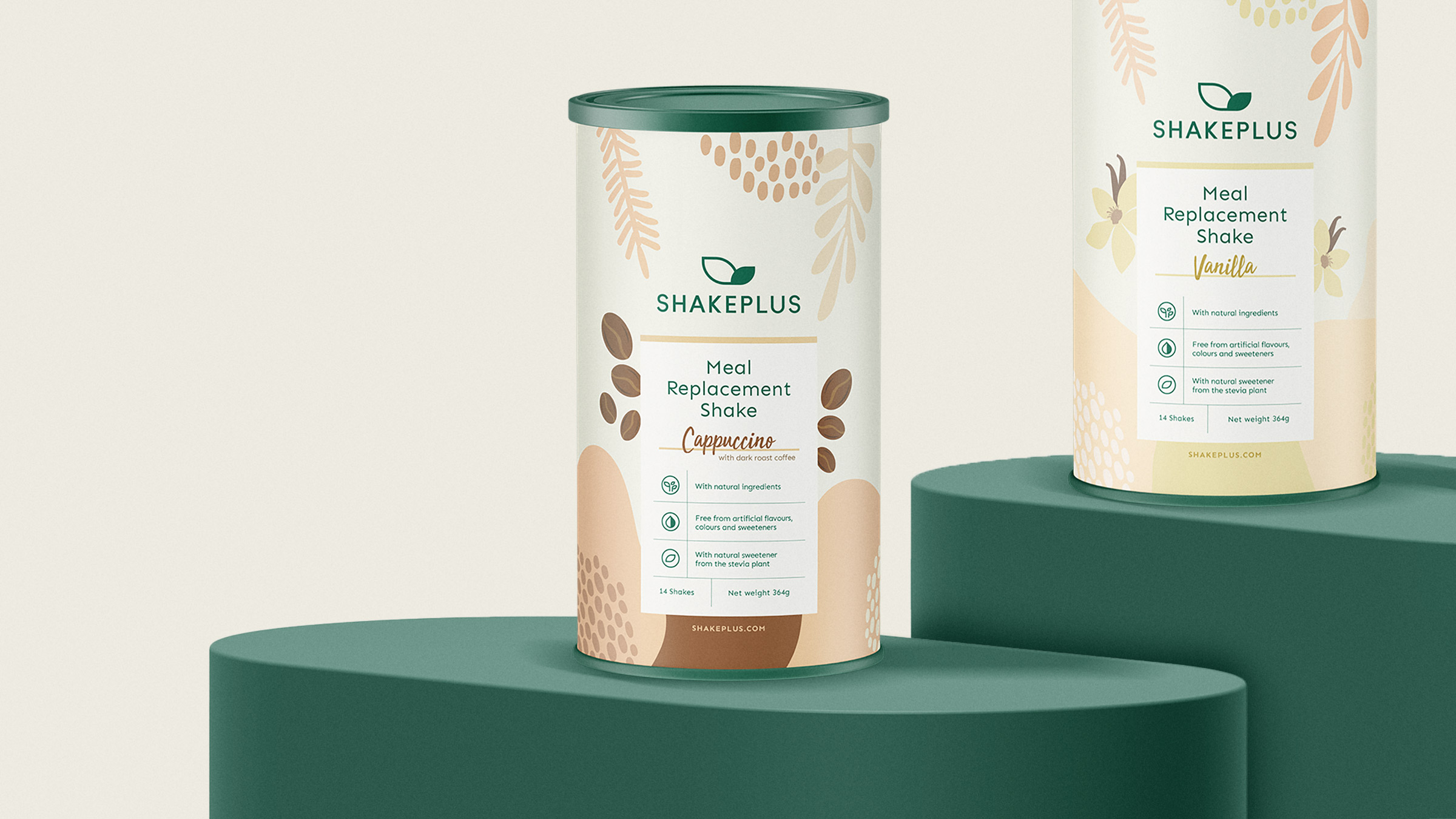
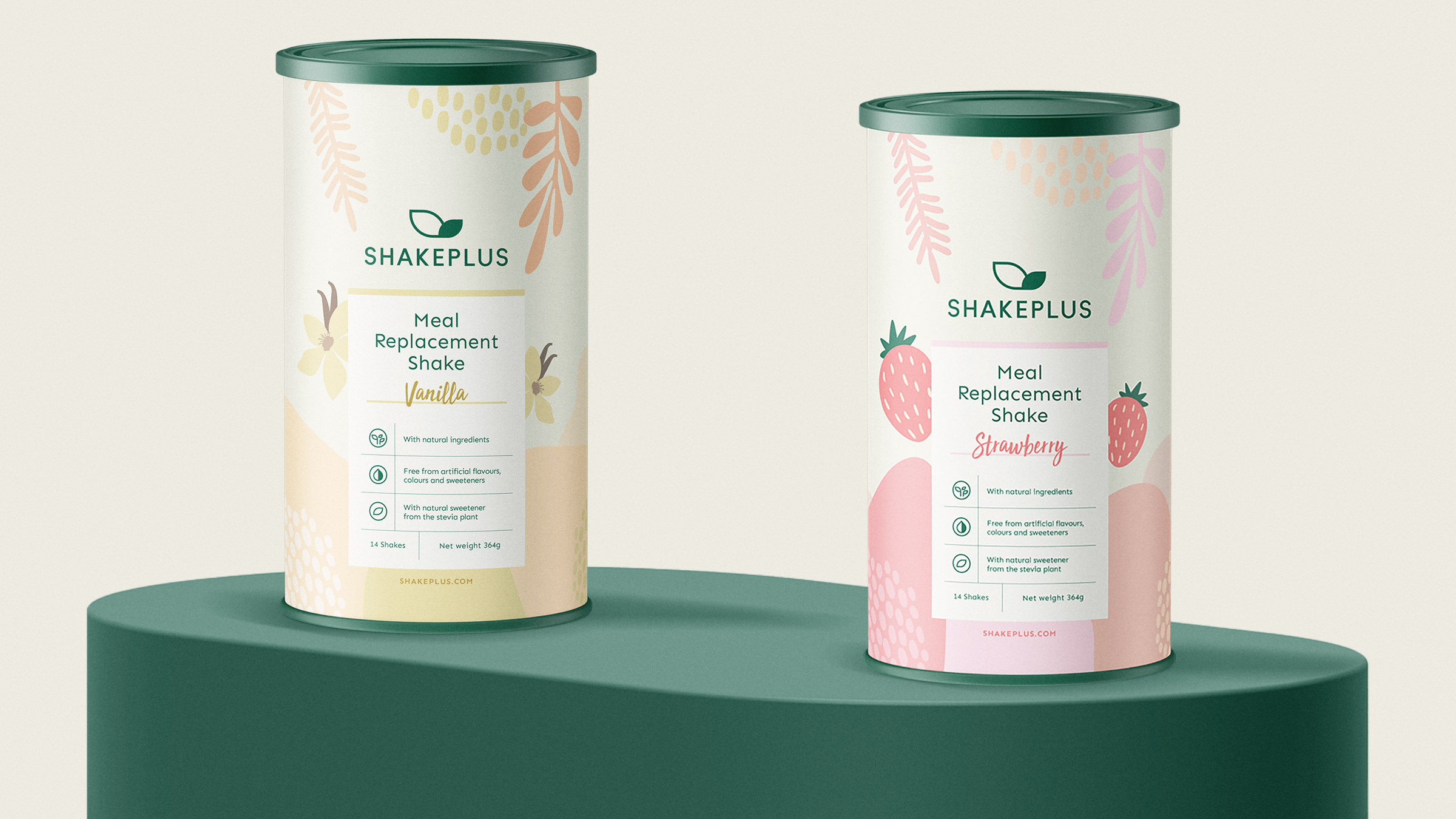
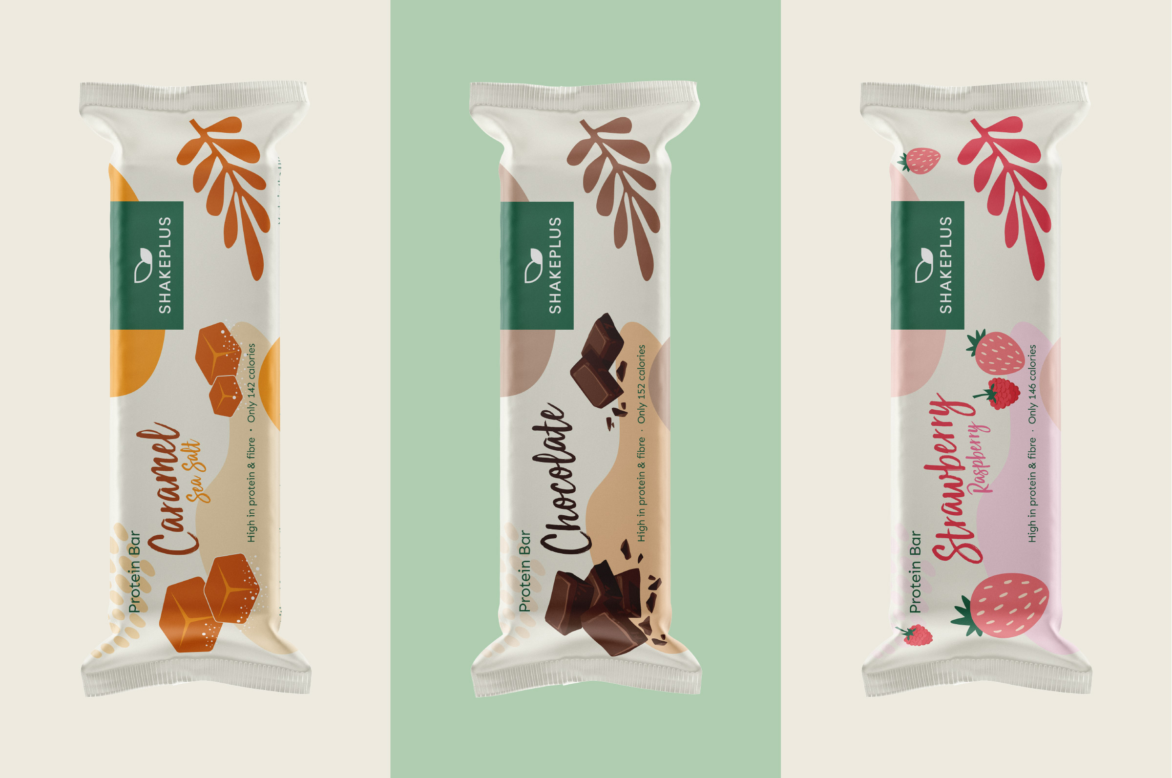
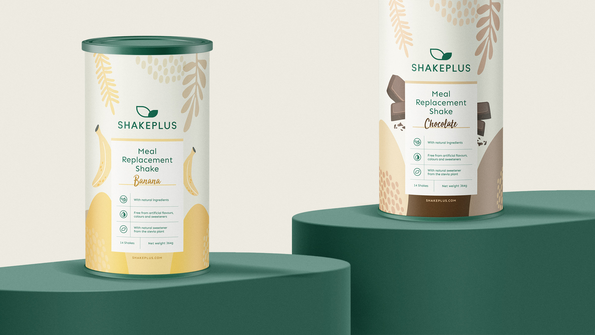
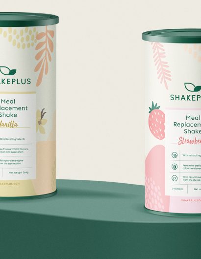
MarkaWorks based its packaging design ideas on the aroma of each product. Varied illustrations and symbols are used on the label that connects the content with the flavors. The simple layouts and color schemes make the packaging designs stand apart from its competitors.

For the packaging labels, we used a simple layout, including icons for better understanding. We used cursive font for the names of the flavors, to highlight them and draw the attention of the viewers.

Get the latest packaging design inspiration in your inbox:

Popular designs

Burma Love Rebrand

Love at First BiteAs an extension of the Burma Superstar restaurant in San Francisco, Burma Love Foods gives diners an opportunity to

Over the wave

This Kombucha originates in Lombok, Indonesia, where its paradise beaches attract hundreds of surfers eager to ride the waves. When you surf,

Pure Persian Honey

When we look closely at honey packaging, they are almost all in the usual format, and the ultimate in creativity is that

Designed by: PepsiCo Design & Innovation
Country: United States

Packaging Design: ShakePlus Dietary Supplement

11

Designed by: MarkaWorks | Country: Turkey

ShakePlus, a Netherlands-based natural dietary supplement brand, is known for creating products that help customers lose and maintain weight. ShakePlus products do not harm health in any way since the company avoids using any unnatural ingredients. The brand uses fresh strawberries, coffee, and cocoa in their products making the them healthy and tasty.

ShakePlus teamed up with MarkaWorks, an Antalya-based design agency, to create compelling packaging designs for the brand.

It was decided to use a classic font type for a timeless look and convenience. At the same time, to show the naturalness of the products, we created a color palette out of green and fruit-associated color shades. To be exact, we used the colors of the products and ingredients that the ShakePlus products are made of.”
Packaging Design: ShakePlus Dietary Supplement

The packaging

MarkaWorks based its packaging design ideas on the aroma of each product. Varied illustrations and symbols are used on the label that connects the content with the flavors. The simple layouts and color schemes make the packaging designs stand apart from its competitors.

For the packaging labels, we used a simple layout, including icons for better understanding. We used cursive font for the names of the flavors, to highlight them and draw the attention of the viewers.

Previous slide
Next slide

Explore more great package design

Get the latest on packaging design in your inbox: