Designed by: PepsiCo Design & Innovation
Country: United States

Packaging Design: Zlaten Rozhen Wine

Designed by: the Labelmaker | Country: Bulgaria

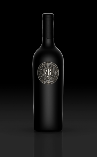
Located in Struma Valley, Bulgaria, Zlaten Rozhen winery boasts of being situated in one of the finest regions in the country. The founders combined their passion for wine and vintage cars to establish a car museum called Zlaten Rozhen Classic Cars Collection. Inspired by the new venture, the family decided to launch a new wine—Zlaten Rozhen.

“At the same time, they came up with the idea of ​​celebrating this new family venture with a very special wine and I was commissioned to do the design work. This time we all decided that we didn’t want a classic paper label – we wanted to look for a different solution that would make the design itself much more individual and special. So we came up with the idea of ​​using a metal wine label, which wasn’t something new to me as I had already done some designs of flexible metal labels and even received a Pentaward for one of them.

Packaging Design: Zlaten Rozhen Wine

The packaging

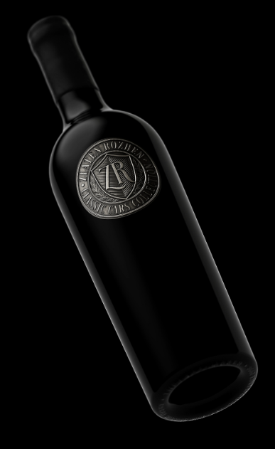
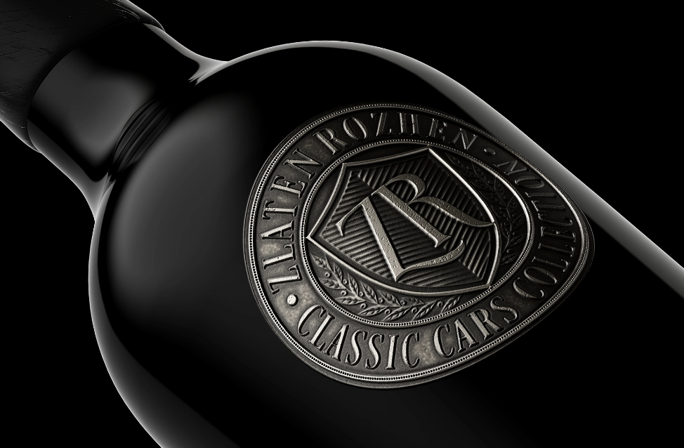
Zlaten Rozhen combined their efforts with the Labelmaker, a Sofia-based label design company, to create packaging designs that would highlight the founders’ passion for wine and vintage cars. The uniqueness of the packaging lies in the use of metal as opposed to conventional paper labels.

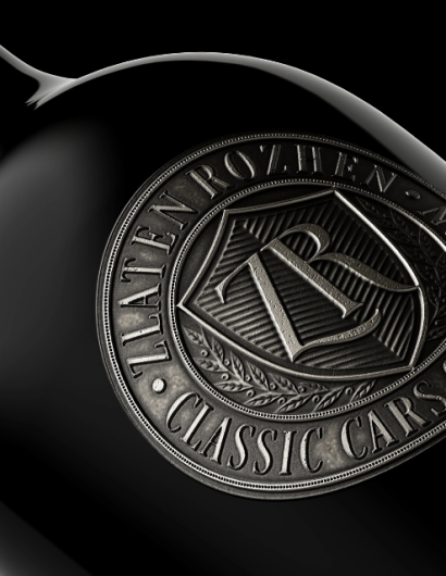
“It was different this time as I was absolutely convinced that we should do a cast metal wine label, which is very specific in terms of both design and production. I’ll start with the design work.

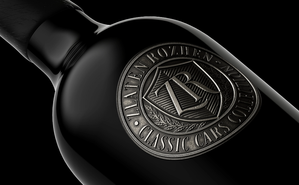
I decided to make a classic oval label. My original idea for it was to reach 2-3 millimeters thickness. I really wanted it to have different levels of embossing on it to help me highlight the more important elements. I spent a lot of time wondering exactly what color it should be – I started with copper, then silver and finally, of course, gold. It turned out that we all like a more austere, clean and even conservative look, so we settled on silver. Here I ran into the other problem. I didn’t want a plain silver finish – I wanted a scratch patina, I was looking for an authentic look and bold character.”

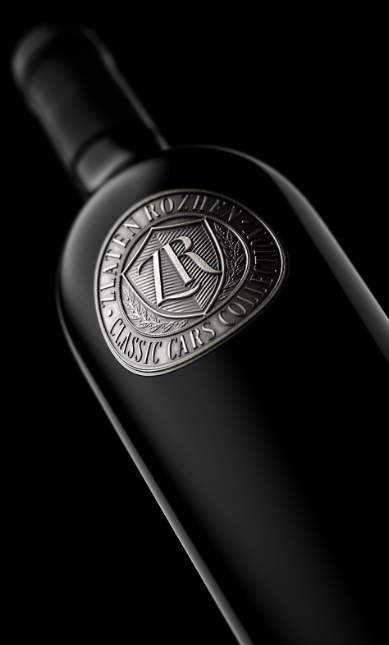
“…Solid, masculine, classy, ​​this new design gave a unique visual answer to the wishes of the Osikovsky family to unite under one roof their two greatest passions – wine and cars.

Get the latest packaging design inspiration in your inbox:

Popular designs

Designed by: PepsiCo Design & Innovation
Country: United States

Packaging Design: Zlaten Rozhen Wine

Zlaten Rozhen 1

Designed by: the Labelmaker | Country: Bulgaria

Located in Struma Valley, Bulgaria, Zlaten Rozhen winery boasts of being situated in one of the finest regions in the country. The founders combined their passion for wine and vintage cars to establish a car museum called Zlaten Rozhen Classic Cars Collection. Inspired by the new venture, the family decided to launch a new wine—Zlaten Rozhen.

“At the same time, they came up with the idea of ​​celebrating this new family venture with a very special wine and I was commissioned to do the design work. This time we all decided that we didn’t want a classic paper label – we wanted to look for a different solution that would make the design itself much more individual and special. So we came up with the idea of ​​using a metal wine label, which wasn’t something new to me as I had already done some designs of flexible metal labels and even received a Pentaward for one of them.

Packaging Design: Zlaten Rozhen Wine

The packaging

Zlaten Rozhen combined their efforts with the Labelmaker, a Sofia-based label design company, to create packaging designs that would highlight the founders’ passion for wine and vintage cars. The uniqueness of the packaging lies in the use of metal as opposed to conventional paper labels.

“It was different this time as I was absolutely convinced that we should do a cast metal wine label, which is very specific in terms of both design and production. I’ll start with the design work.

I decided to make a classic oval label. My original idea for it was to reach 2-3 millimeters thickness. I really wanted it to have different levels of embossing on it to help me highlight the more important elements. I spent a lot of time wondering exactly what color it should be – I started with copper, then silver and finally, of course, gold. It turned out that we all like a more austere, clean and even conservative look, so we settled on silver. Here I ran into the other problem. I didn’t want a plain silver finish – I wanted a scratch patina, I was looking for an authentic look and bold character.”

“…Solid, masculine, classy, ​​this new design gave a unique visual answer to the wishes of the Osikovsky family to unite under one roof their two greatest passions – wine and cars.

https://www.youtube.com/watch?v=uuKYN3SB19g

Explore more great package design

Get the latest on packaging design in your inbox: