Designed by: PepsiCo Design & Innovation
Country: United States

Van Heertum Design VHD Creates Wholesale Packaging Of Friandries Chocolates

Designed by: Van Heertum Design VHD | Country: Netherlands

The Tilburg-based design agency, Van Heertum Design VHD, is known for creating artworks that match a brand’s mission and values. The design agency “created a special XL wholesale packaging range” for Friandries  “to suit an exclusive cooperation between them and HANOS International (an international culinary wholesaler).”

“At Friandries they don’t just make chocolates, they play with different ingredients, color and taste and create the ultimate chocolate experience for the adventurous chocolate lover.

Chocolate is art. But instead of imitating the old masters, at Friandries they get their inspiration from the street. Bonbons, chocolate bars and truffles are no longer the stately portraits with classic techniques, but eye-catching shapes and colors. Modern art, industrial design, graffiti, the scents, and colors of a city in motion.” 
Van Heertum Design VHD Creates Wholesale Packaging Of Friandries Chocolates

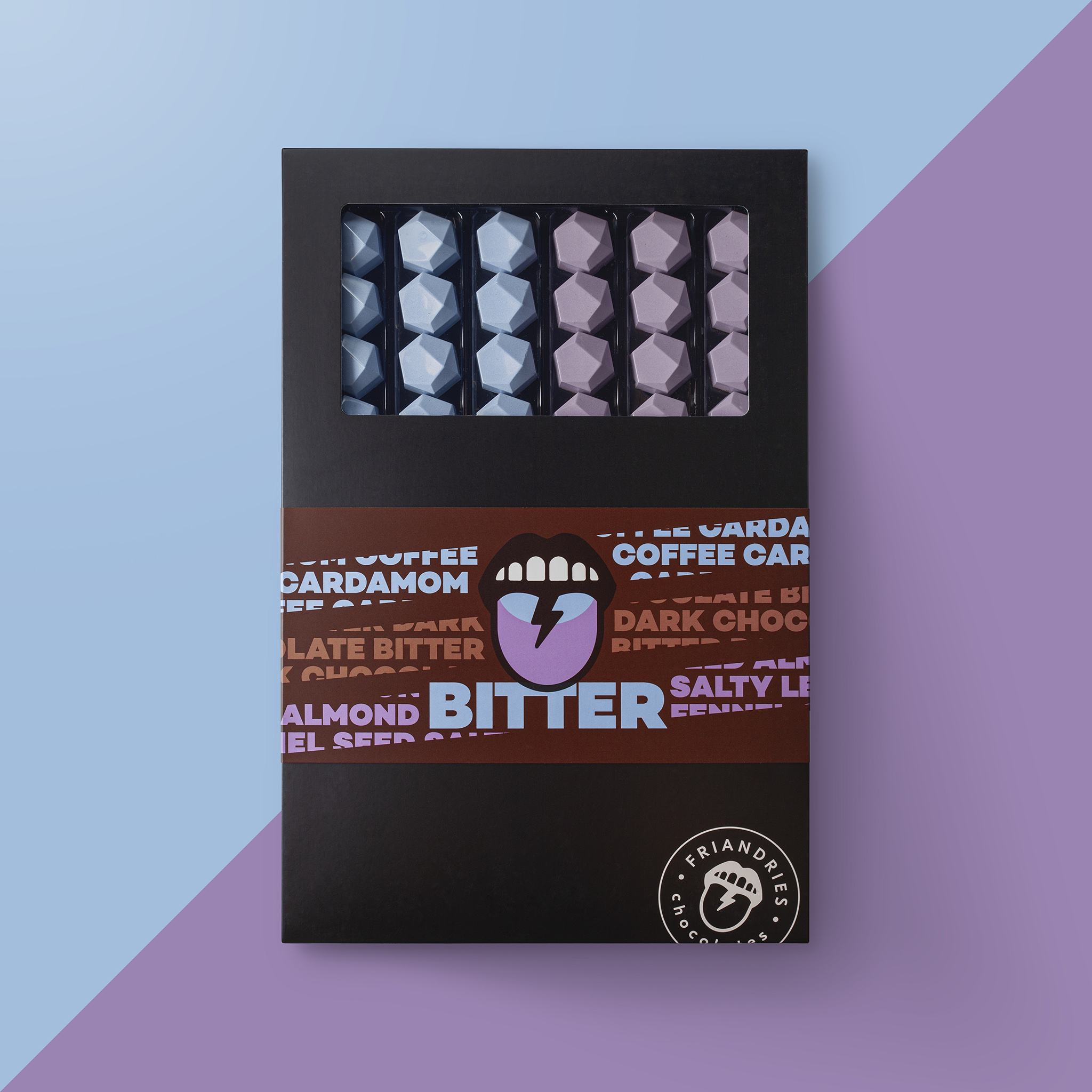
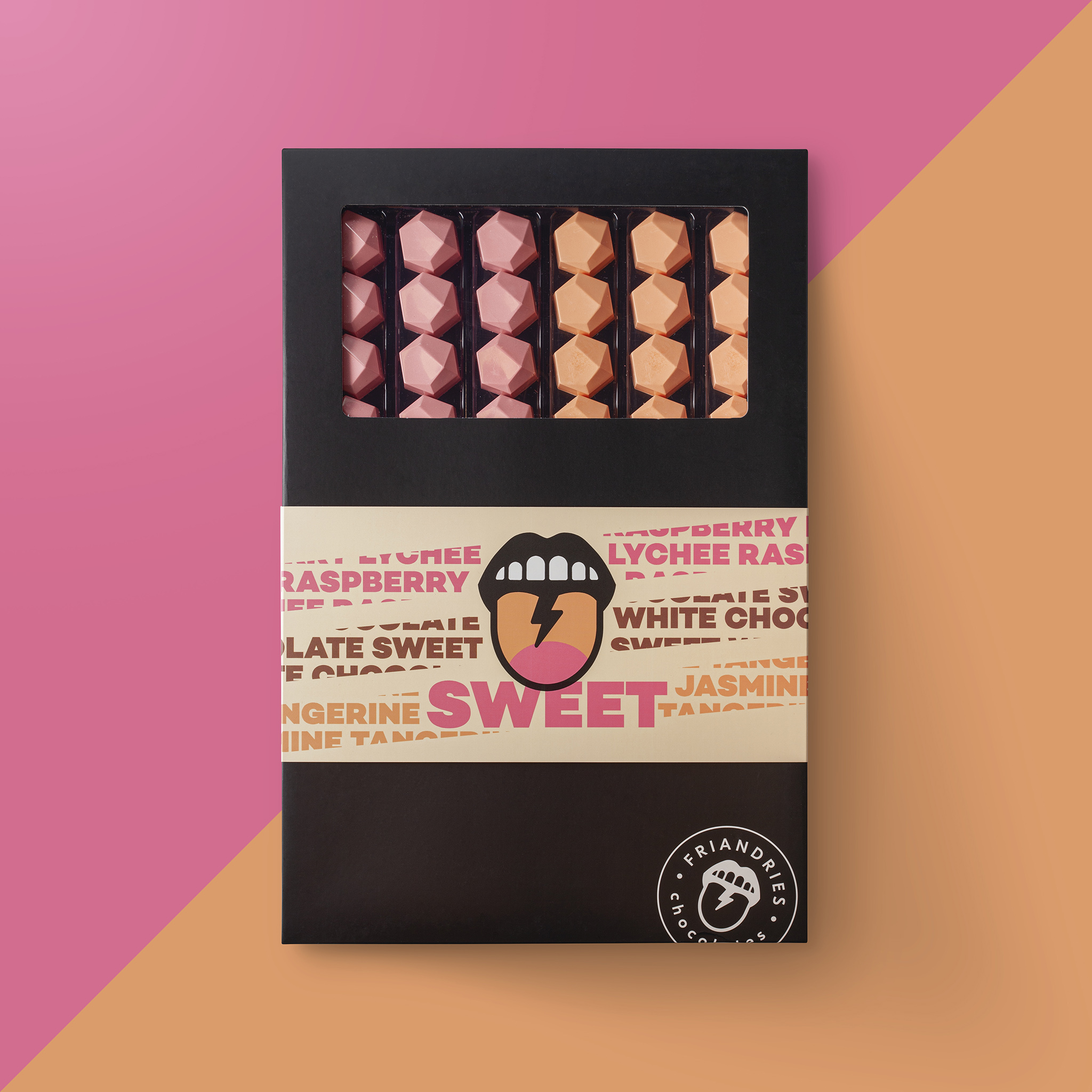
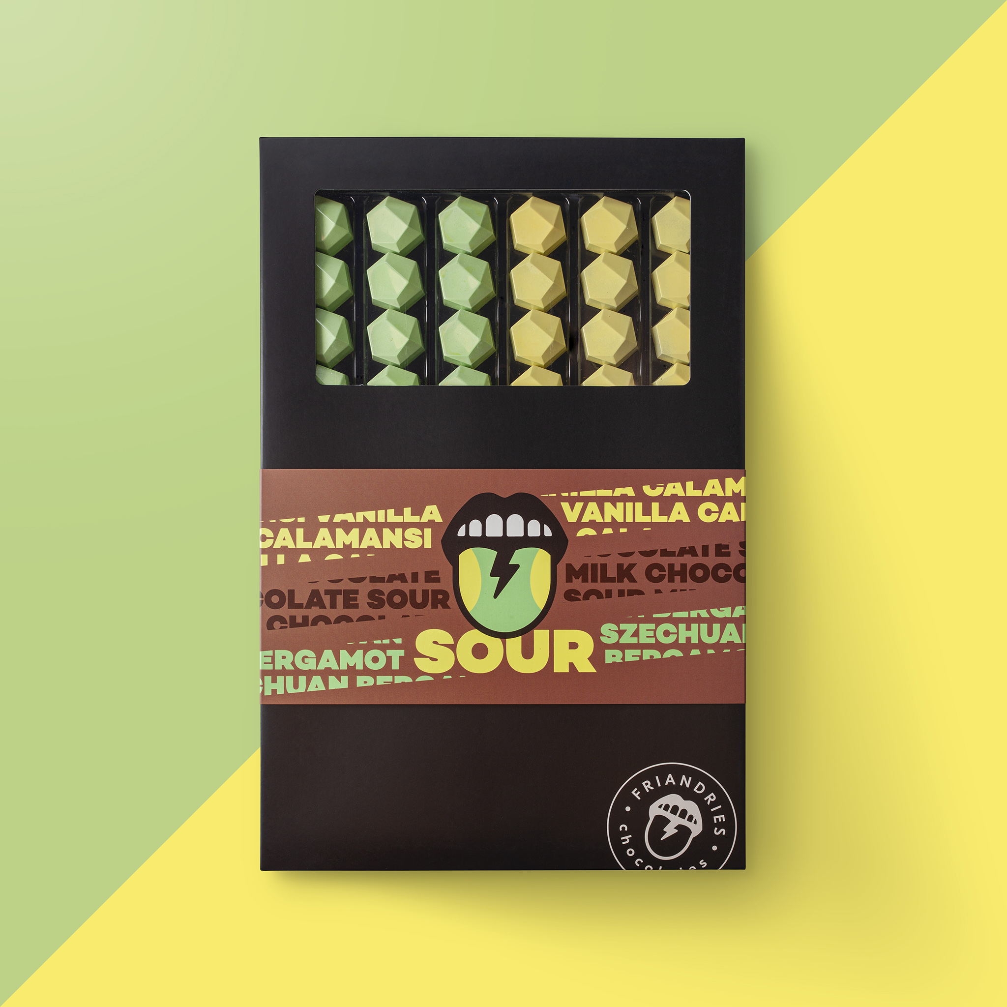
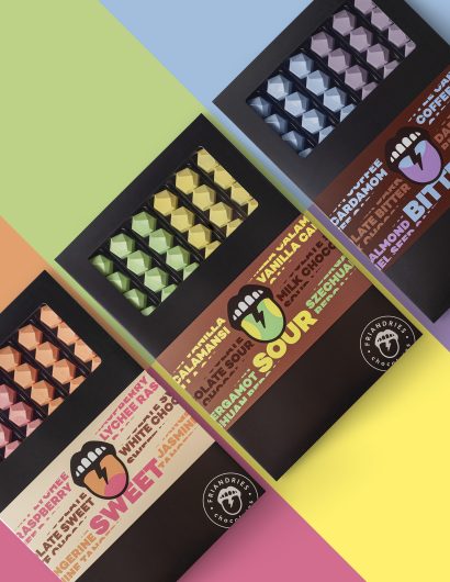
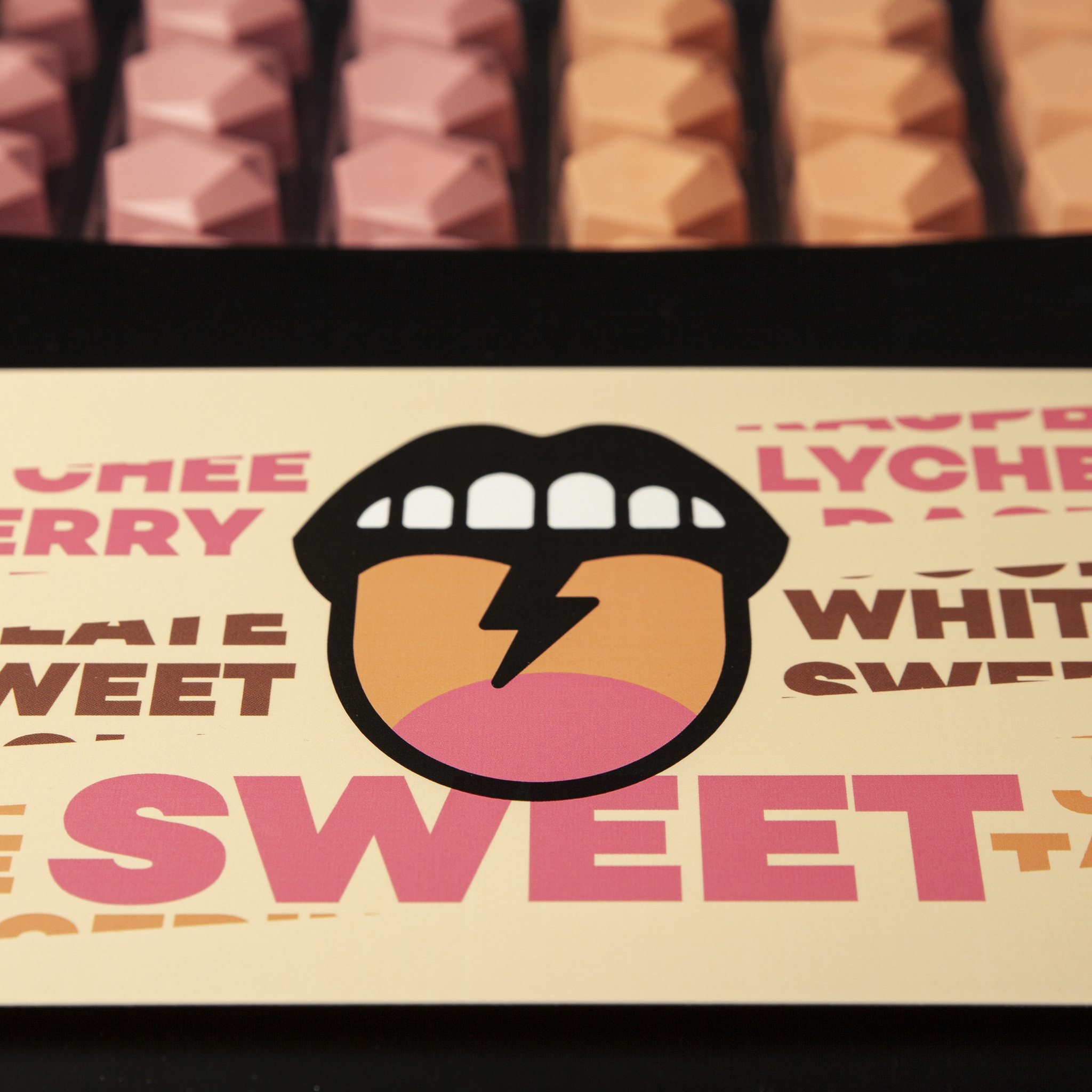
The packaging highlights the “6 different flavors in 3 different taste categories; sweet, sour and bitter.” The selection of different colors matches the corresponding flavors in the box. The centerpiece of the packaging design is a tongue that symbolizes a customer’s love for chocolate.

“These different taste categories were the inspiration for the design where the mouth and tongue are the central eyecatcher. The funky tongue is central to the design and shows the taste buds for that taste category. The base of the boxes is black to give the colorful chocolates as much standout as possible. The boxes are closed with a colorful sleeve featuring the tongue. The ingredients are worked into the design by text in corresponding colors.


Get the latest packaging design inspiration in your inbox:

Popular designs

Studio La Regina Revamps Packaging Design for 7 Colli Amaro

Studio La Regina has transformed the packaging of 7 Colli, an artisan amaro with a loyal following, to support its distribution expansion. The new design features a sleek cylindrical bottle and a striking label with a deep black background, gold foil text, and a distinctive, multi-colored number 7.

Designed by: PepsiCo Design & Innovation
Country: United States

Van Heertum Design VHD Creates Wholesale Packaging Of Friandries Chocolates

Friandries-04-v2

Designed by: Van Heertum Design VHD | Country: Netherlands

The Tilburg-based design agency, Van Heertum Design VHD, is known for creating artworks that match a brand’s mission and values. The design agency “created a special XL wholesale packaging range” for Friandries  “to suit an exclusive cooperation between them and HANOS International (an international culinary wholesaler).”

“At Friandries they don’t just make chocolates, they play with different ingredients, color and taste and create the ultimate chocolate experience for the adventurous chocolate lover.

Chocolate is art. But instead of imitating the old masters, at Friandries they get their inspiration from the street. Bonbons, chocolate bars and truffles are no longer the stately portraits with classic techniques, but eye-catching shapes and colors. Modern art, industrial design, graffiti, the scents, and colors of a city in motion.” 
Van Heertum Design VHD Creates Wholesale Packaging Of Friandries Chocolates

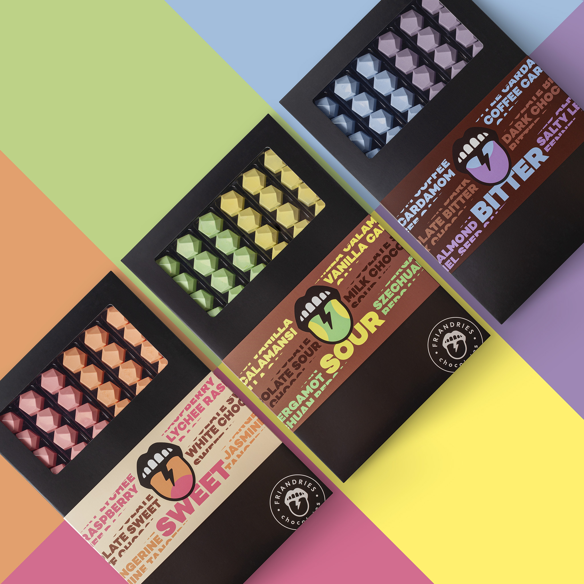
The packaging highlights the “6 different flavors in 3 different taste categories; sweet, sour and bitter.” The selection of different colors matches the corresponding flavors in the box. The centerpiece of the packaging design is a tongue that symbolizes a customer’s love for chocolate.

“These different taste categories were the inspiration for the design where the mouth and tongue are the central eyecatcher. The funky tongue is central to the design and shows the taste buds for that taste category. The base of the boxes is black to give the colorful chocolates as much standout as possible. The boxes are closed with a colorful sleeve featuring the tongue. The ingredients are worked into the design by text in corresponding colors.

Previous slide
Next slide
Get the latest on packaging design in your inbox: