Designed by: PepsiCo Design & Innovation
Country: United States

Packaging Redesign: Asda Just Essentials

Designed by: OurCreative | Country: UK

Asda Just Essentials is known for its low-cost packaged foods; however, the brand’s visual language did not match its reputation. Asda approached OurCreative, intending to redesign the packaging so that the customers would be tempted to buy into the range.

“The objective was to shake up the category and re-invent the visual language for opening price point design.

The existing design felt tired, stale and dull. The white, value design held negative brand perceptions, with customers feeling ashamed to buy into the range. The new design needed to feel simple, honest and optimistic, setting a strong foundation for Asda’s quality perception, starting at the bottom shelf.”

Packaging Redesign: Asda Just Essentials

The packaging

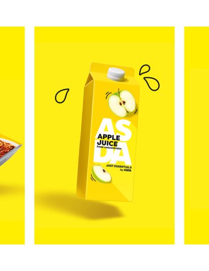
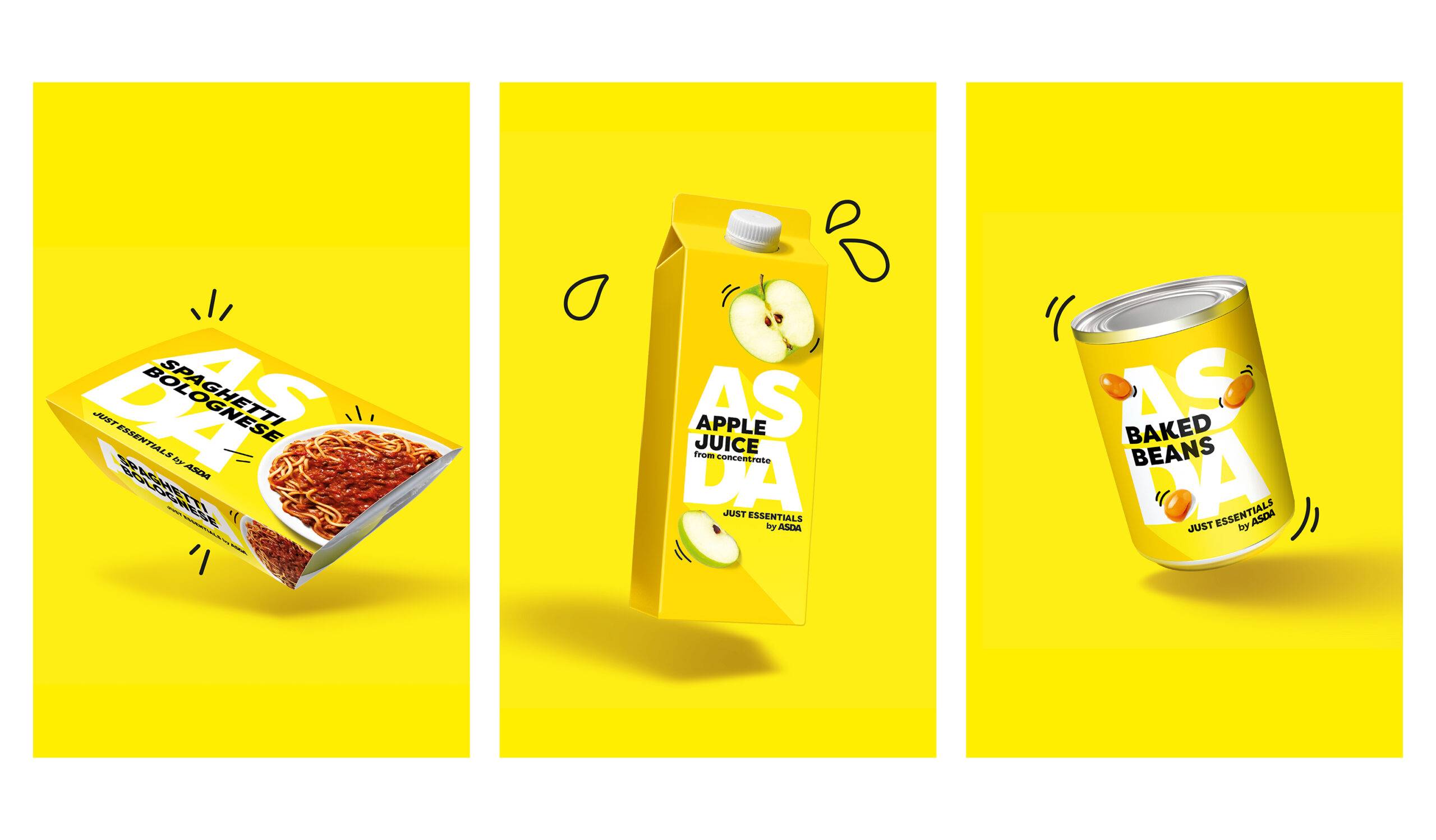
Asda approached OurCrative, a Leeds-based branding agency, to create packaging redesigns that would reflect the company’s honesty and simplicity. The branding agency created packaging illustrations using sunshine yellow to highlight the brand’s warm and friendly character, thereby increasing its shelf value.

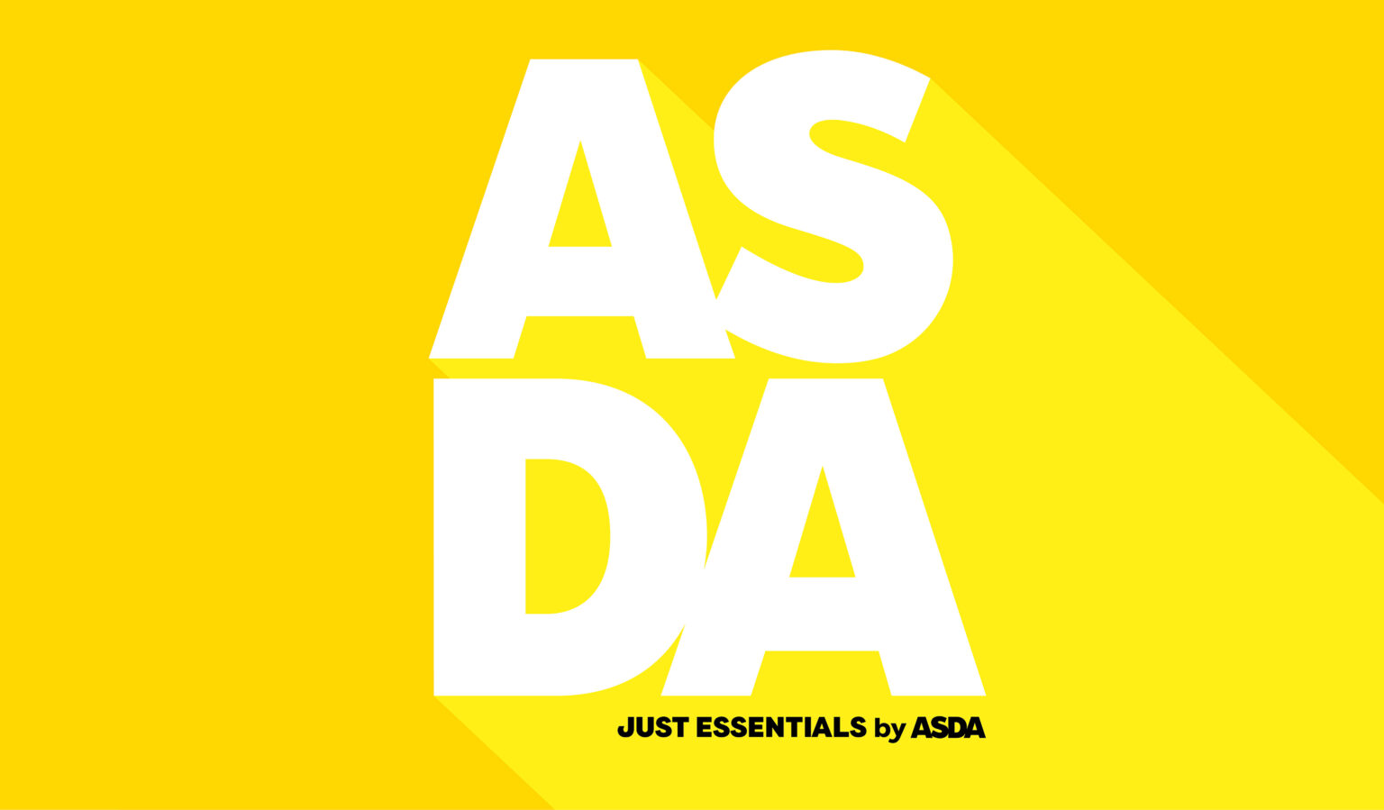
Putting the Asda brand mark front and center of the design reinforces that this is not a range to be ashamed of. The joyous, sunshine yellow feels optimistic and shines off shelf in contrary to the typical white category code. The combination of clean typography feels utilitarian yet friendly, with the brand sign-off and playful illustration style adding warmth and humor to what could have been a soulless design.

Get the latest packaging design inspiration in your inbox:

Popular designs

Studio La Regina Revamps Packaging Design for 7 Colli Amaro

Studio La Regina has transformed the packaging of 7 Colli, an artisan amaro with a loyal following, to support its distribution expansion. The new design features a sleek cylindrical bottle and a striking label with a deep black background, gold foil text, and a distinctive, multi-colored number 7.

Tropicana’s Branding & Packaging Redesign by Sunhouse

Tropicana rejuvenates its brand with Sunhouse, blending modern iconicity and heritage. The redesign emphasizes Tropicana’s legacy, highlighting its unique story and craftsmanship, making it stand out as the original, superior orange juice.

Unique Whisky Packaging Design Celebrates 40-Year Legacy

Stckmn crafted ‘The Only Drop,’ a unique whisky packaging celebrating liquid and cask unity. Featuring handcrafted paper pulp sculptures and transparent bottle designs, the project fetched £18,750 at auction, aiding Scottish youth.

Designed by: PepsiCo Design & Innovation
Country: United States

Packaging Redesign: Asda Just Essentials

Web

Designed by: OurCreative | Country: UK

Asda Just Essentials is known for its low-cost packaged foods; however, the brand’s visual language did not match its reputation. Asda approached OurCreative, intending to redesign the packaging so that the customers would be tempted to buy into the range.

“The objective was to shake up the category and re-invent the visual language for opening price point design.

The existing design felt tired, stale and dull. The white, value design held negative brand perceptions, with customers feeling ashamed to buy into the range. The new design needed to feel simple, honest and optimistic, setting a strong foundation for Asda’s quality perception, starting at the bottom shelf.”
Packaging Redesign: Asda Just Essentials

The packaging

Asda approached OurCrative, a Leeds-based branding agency, to create packaging redesigns that would reflect the company’s honesty and simplicity. The branding agency created packaging illustrations using sunshine yellow to highlight the brand’s warm and friendly character, thereby increasing its shelf value.

Putting the Asda brand mark front and center of the design reinforces that this is not a range to be ashamed of. The joyous, sunshine yellow feels optimistic and shines off shelf in contrary to the typical white category code. The combination of clean typography feels utilitarian yet friendly, with the brand sign-off and playful illustration style adding warmth and humor to what could have been a soulless design.

Previous slide
Next slide
Get the latest on packaging design in your inbox: