Designed by: PepsiCo Design & Innovation
Country: United States

Packaging Redesign For Danish Juice Brand Rebæl By Everland

Designed by: Everland | Country: Denmark

Rebæl, a Danish juice maker, overhauled its look to show its rebellious spirit. Be it the packaging designs or the products, Rebæl is known for its uncompromising works of art. Emil and Tom, the founders of Rebæl, aim to create a taste experience completely different from similar products available in the market.

“Rebæl makes art from fruits. No matter the beverage, Rebæl always strives to make it unlike anything else, uncompromising and artistic. Scandinavian boutique design agency Everland helped with a fitting rebel brand universe.

Rebæl is the tale of the energetic entrepreneur and the sophisticated sommelier. Since 2016, founders Emil and Tom have shared a love for the creative process and ambition to create a taste experience “extraordinaire”.
Packaging Redesign For Danish Juice Brand Rebæl By Everland

The packaging redesign

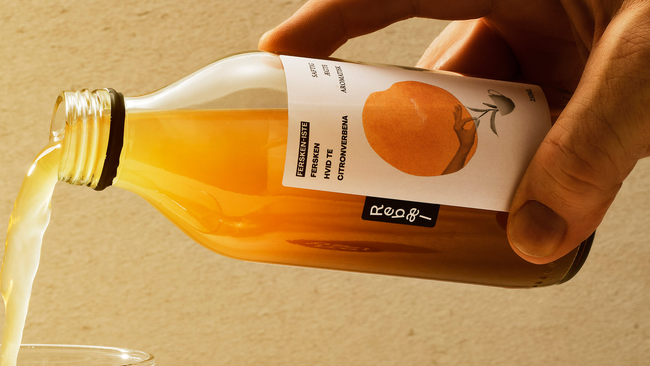
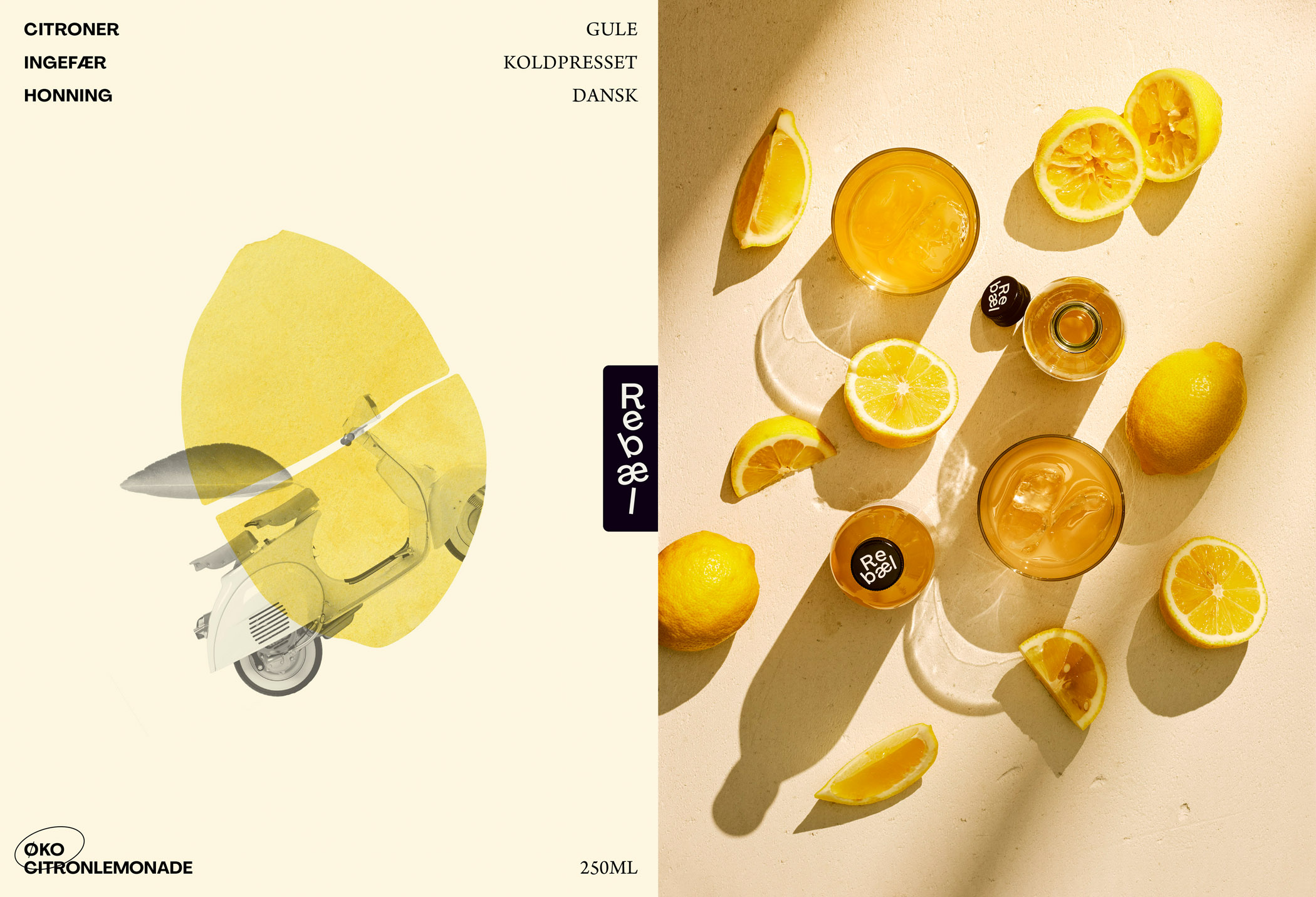
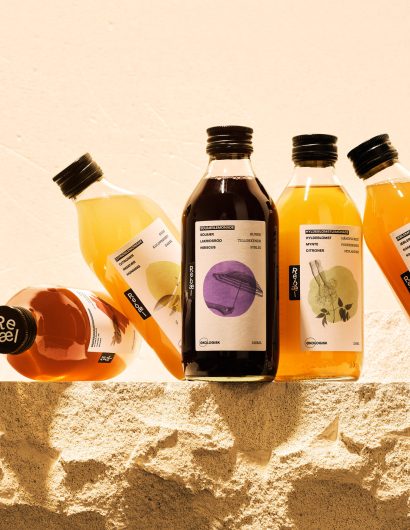
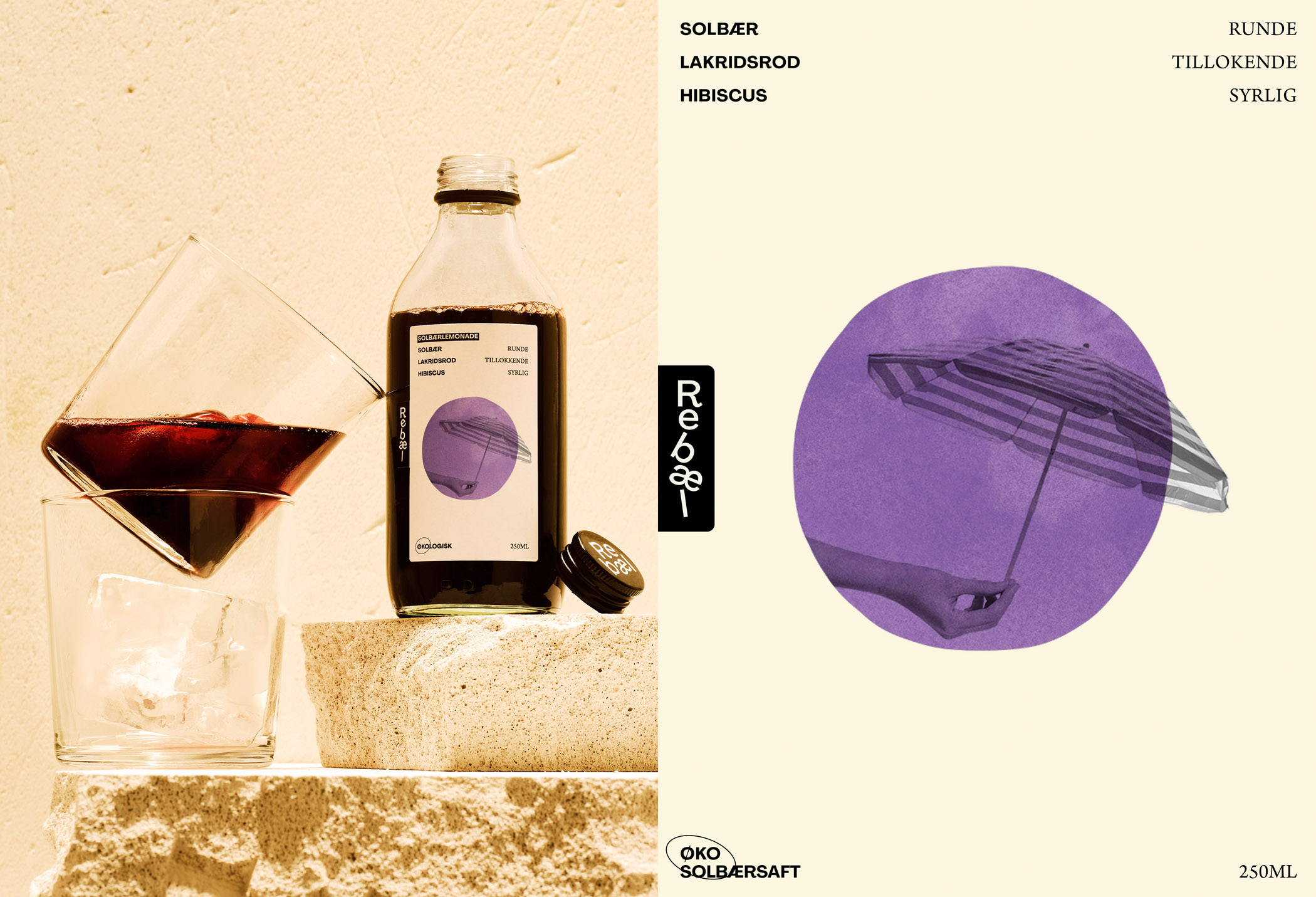
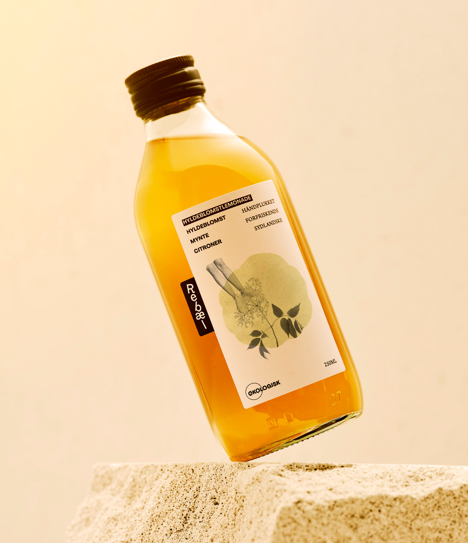
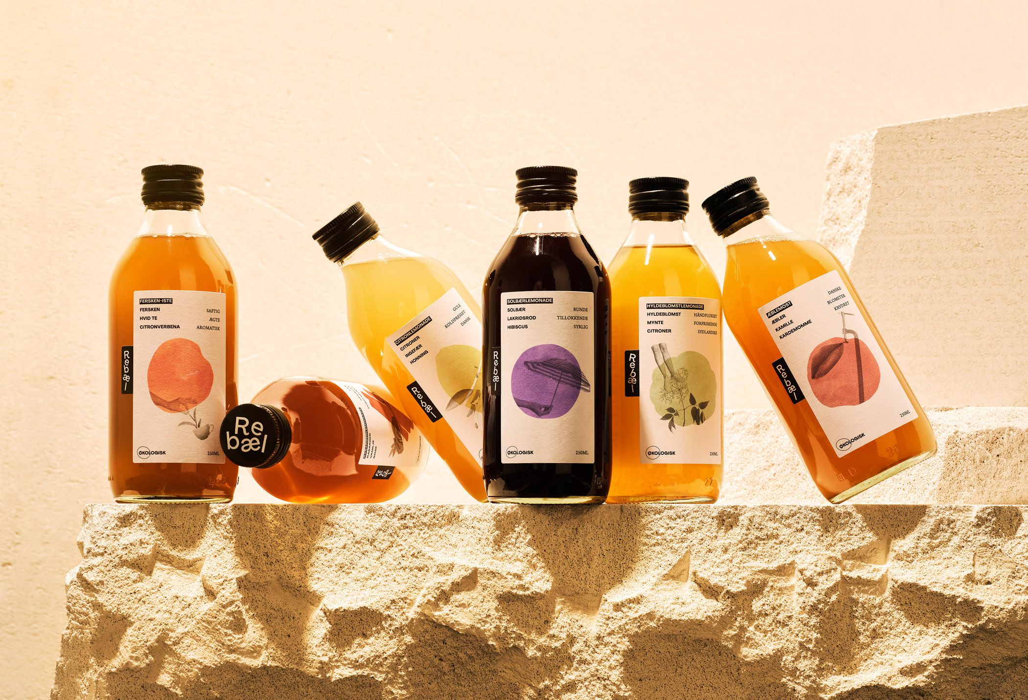
The Danish juice company teamed up with Everland, a Copenhagen-based creative agency, to create a packaging system that would highlight the rebellious spirit of the brand. The branding and the packaging designs challenge the mainstream in multiple ways.

Because the process is never the same, you get a different result each time. That goes for collages on the label, reflecting the culinary experience bottled up inside, and sparking associations. Even the letters in the logo can be stacked as seems fitting. It is rebellious and stands out in the category.

Jonathan Faust, Design Director at Everland, mentions the following:

“The Rebæl brand design is alive, complex, yet straightforward. It reflects the flavors and fits the occasion. Only a true rebel would dare to embrace this design universe.”

Get the latest packaging design inspiration in your inbox:

Popular designs

The Bra Guru

Most women are wearing the wrong size bra and that is a fact. The Bra Guru® is the first and only professional

The Port Vodka Lemon Water

Overview: In response to my client’s vision for a Cape Cod themed beverage brand, I embarked on the journey to create The Port

Far Out Bar

Description: Far Out Bar is a cutting-edge packaging design project created for High Life Farms’ macrodose THC chocolate bars. This project involved

Designed by: PepsiCo Design & Innovation
Country: United States

Packaging Redesign For Danish Juice Brand Rebæl By Everland

Rebael_04

Designed by: Everland | Country: Denmark

Rebæl, a Danish juice maker, overhauled its look to show its rebellious spirit. Be it the packaging designs or the products, Rebæl is known for its uncompromising works of art. Emil and Tom, the founders of Rebæl, aim to create a taste experience completely different from similar products available in the market.

“Rebæl makes art from fruits. No matter the beverage, Rebæl always strives to make it unlike anything else, uncompromising and artistic. Scandinavian boutique design agency Everland helped with a fitting rebel brand universe.

Rebæl is the tale of the energetic entrepreneur and the sophisticated sommelier. Since 2016, founders Emil and Tom have shared a love for the creative process and ambition to create a taste experience “extraordinaire”.
Packaging Redesign For Danish Juice Brand Rebæl By Everland

The packaging redesign

The Danish juice company teamed up with Everland, a Copenhagen-based creative agency, to create a packaging system that would highlight the rebellious spirit of the brand. The branding and the packaging designs challenge the mainstream in multiple ways.

Because the process is never the same, you get a different result each time. That goes for collages on the label, reflecting the culinary experience bottled up inside, and sparking associations. Even the letters in the logo can be stacked as seems fitting. It is rebellious and stands out in the category.

Jonathan Faust, Design Director at Everland, mentions the following:

“The Rebæl brand design is alive, complex, yet straightforward. It reflects the flavors and fits the occasion. Only a true rebel would dare to embrace this design universe.”

Previous slide
Next slide

Explore more great package design

Get the latest on packaging design in your inbox: