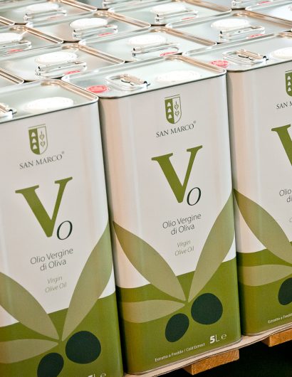
Designed by: Mol Design Studio | Country: Italy
Oleificio San Marco recently reimagined its packaging for its successful range of olive oil. The Salento-based company is among the few Italian brands that are known for their superior quality olive oil. With their latest packaging redesign, Oleificio San Marco “wanted to obtain a more professional” look.
Ruffano-based design agency, Mol Design Studio, mentions:
“…The bottles were also very different from the cans and the client wanted to obtain a more professional, unique and modern image. Something that for them will be “avant garde” and timeless. For this, the first thing that we did was to create a totally new color palette that has as its source of inspiration the light brown shades of the “salentine” land, the green and silver leaves of the olive trees and the yellow sun of the countryside.”
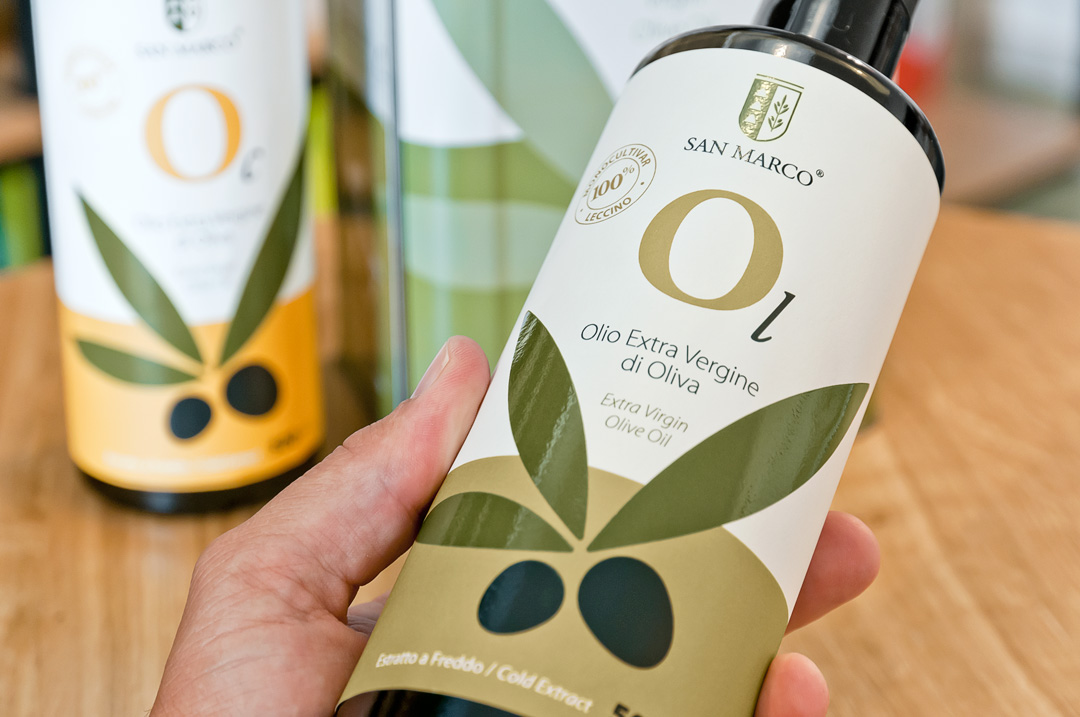
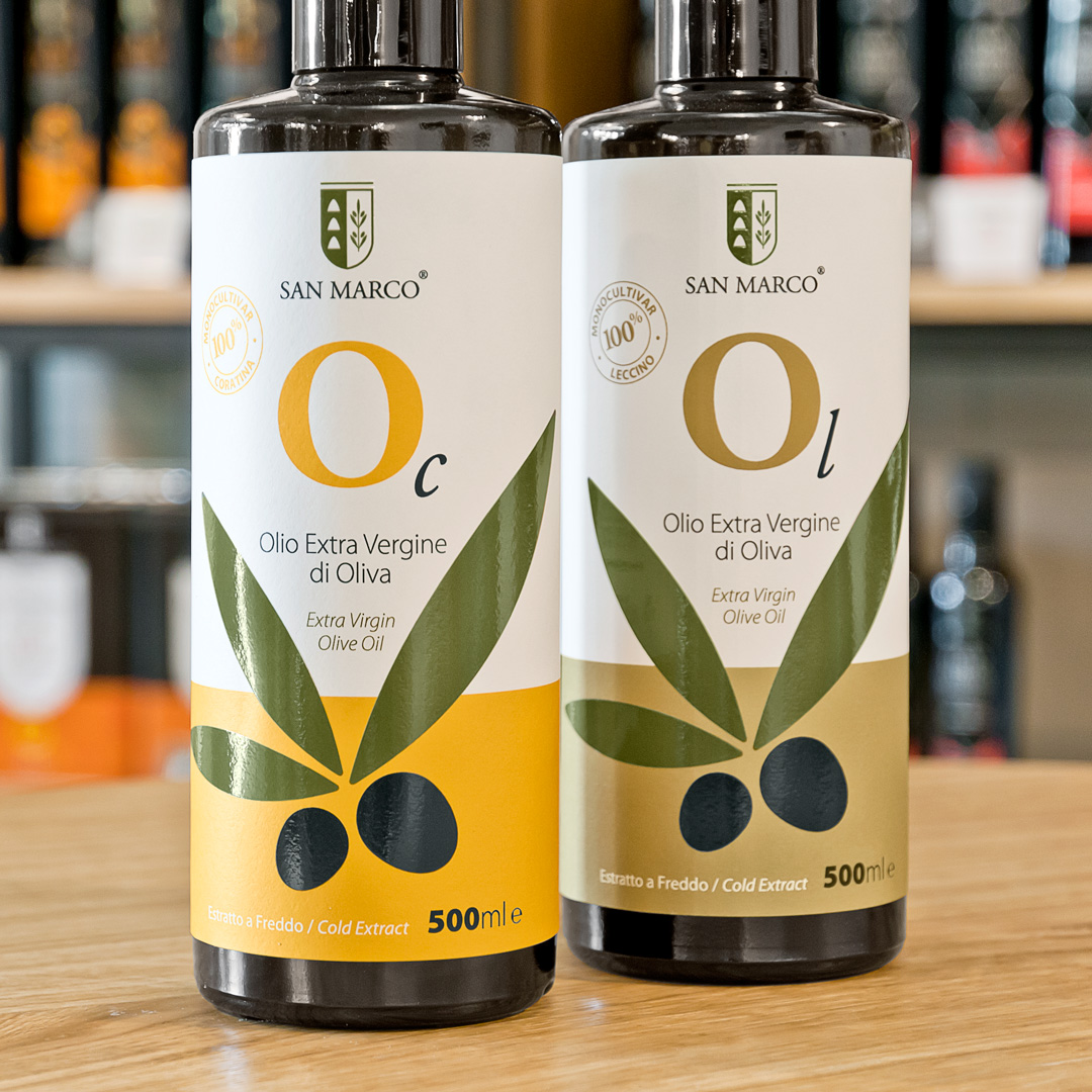
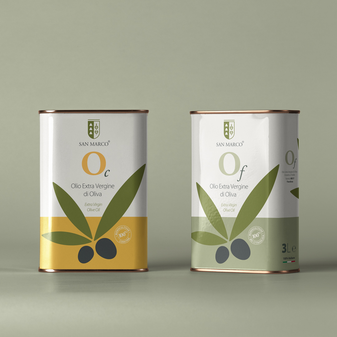
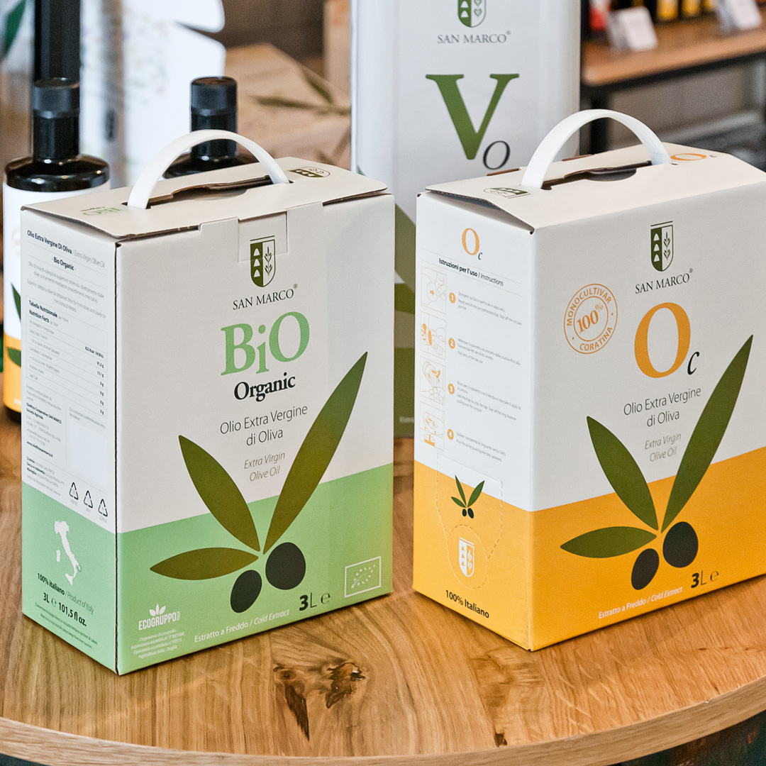
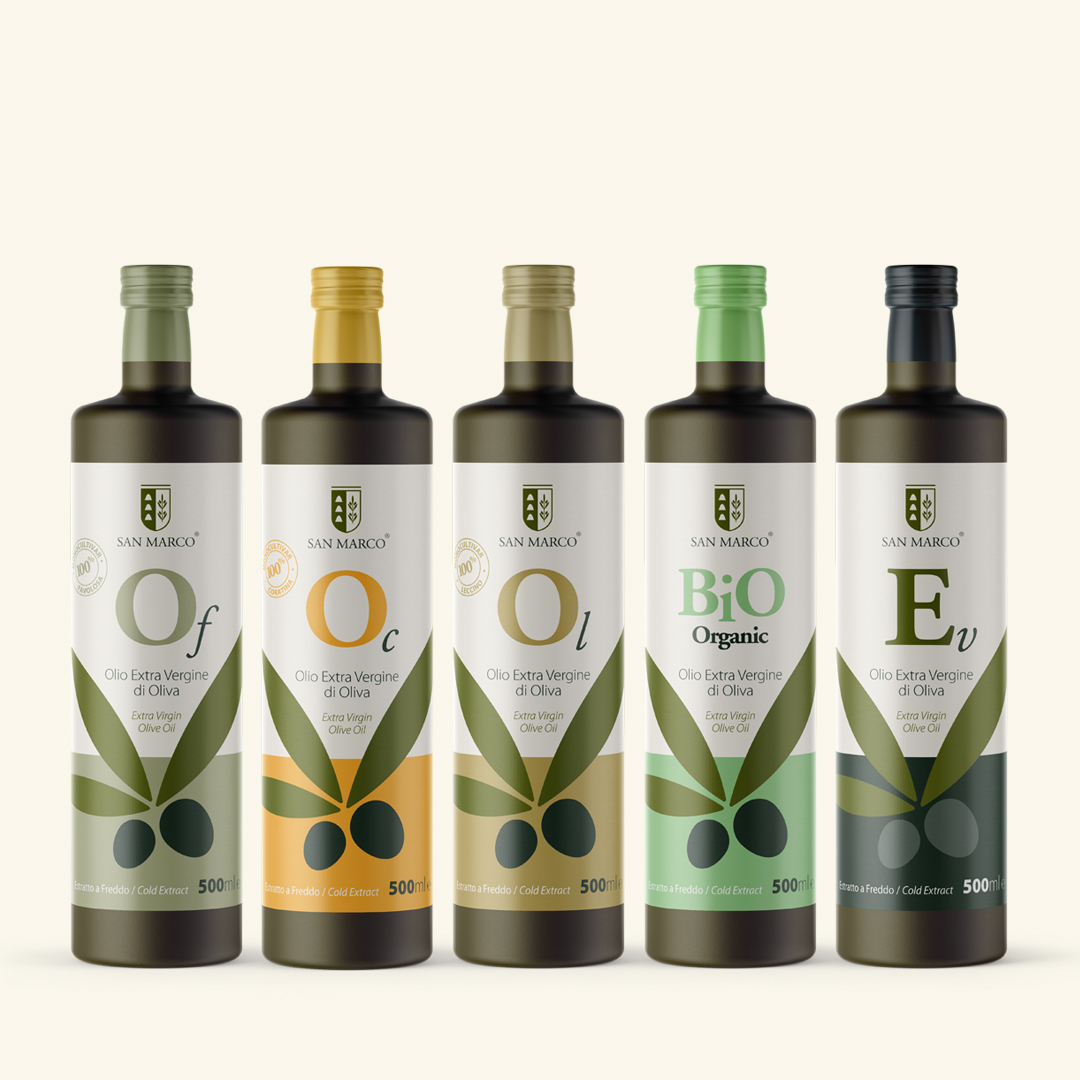
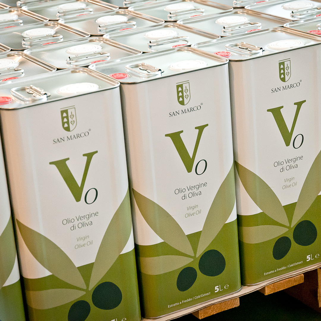
Each variety is assigned a unique color, making it easier for the consumers to choose their favorite variety of oil. While the Bio Extra Virgin bottle is labeled with pastel light green, Normal Extra virgin comes in a dark grey sticker. Similarly, Leccino, Coratina, and Favolosa varieties come in light brown, pastel yellow and silvery green labels respectively.
“All these are design considerations that pursuits not only to help the consumer in the selection of products, but also a visual cleanliness in the presentation of the Extra Virgin Olive Oil.”
“This new image gives to the “Oleificio San Marco” a unique and recognizable presentation in the market.”


