Designed by: PepsiCo Design & Innovation
Country: United States

Packaging Redesign: Pique Teas

Designed by: WhatCameNext | Country: Australia

Pique boasts of creating some of the best bioavailable drinks on the planet. Pique’s range of teas is among the best products that the brand creates. The ingredients for Pique teas are crafted by artisans and fine-tuned by technology.

Pique wanted to reach a wider audience and share their multifaceted story through their packaging redesigns. While the old designs communicated the essence of the brand, it was not enough to attract new customers.

Pique had began to establish itself within the health and wellness space. They had a core, loyal following but were on a mission to reach a wider audience. Key to the brand was a complex multi-faceted story of exquisite ingredient sourcing, a deep appreciation of multi-generational craft and artisanship which was then brought together by top-of-their-field scientists to create a tasty range of cutting-edge wellness solutions.

Packaging Redesign: Pique Teas

The packaging

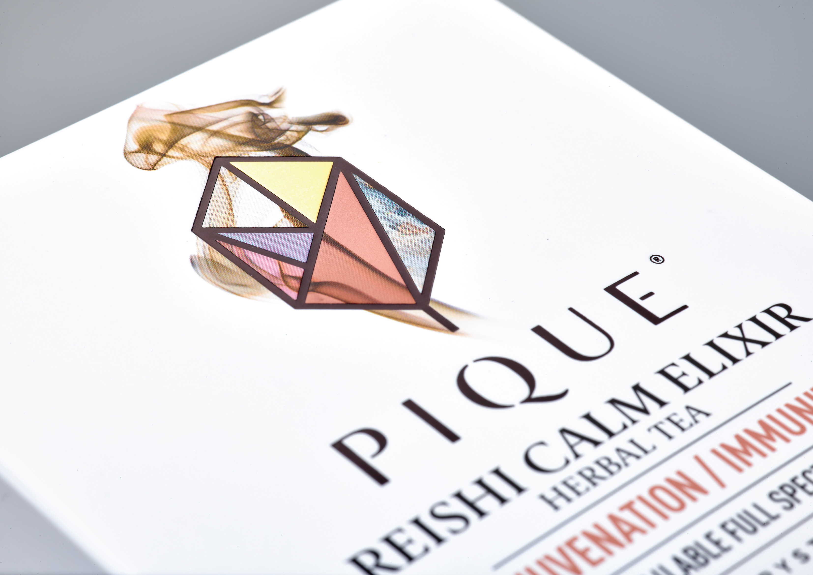
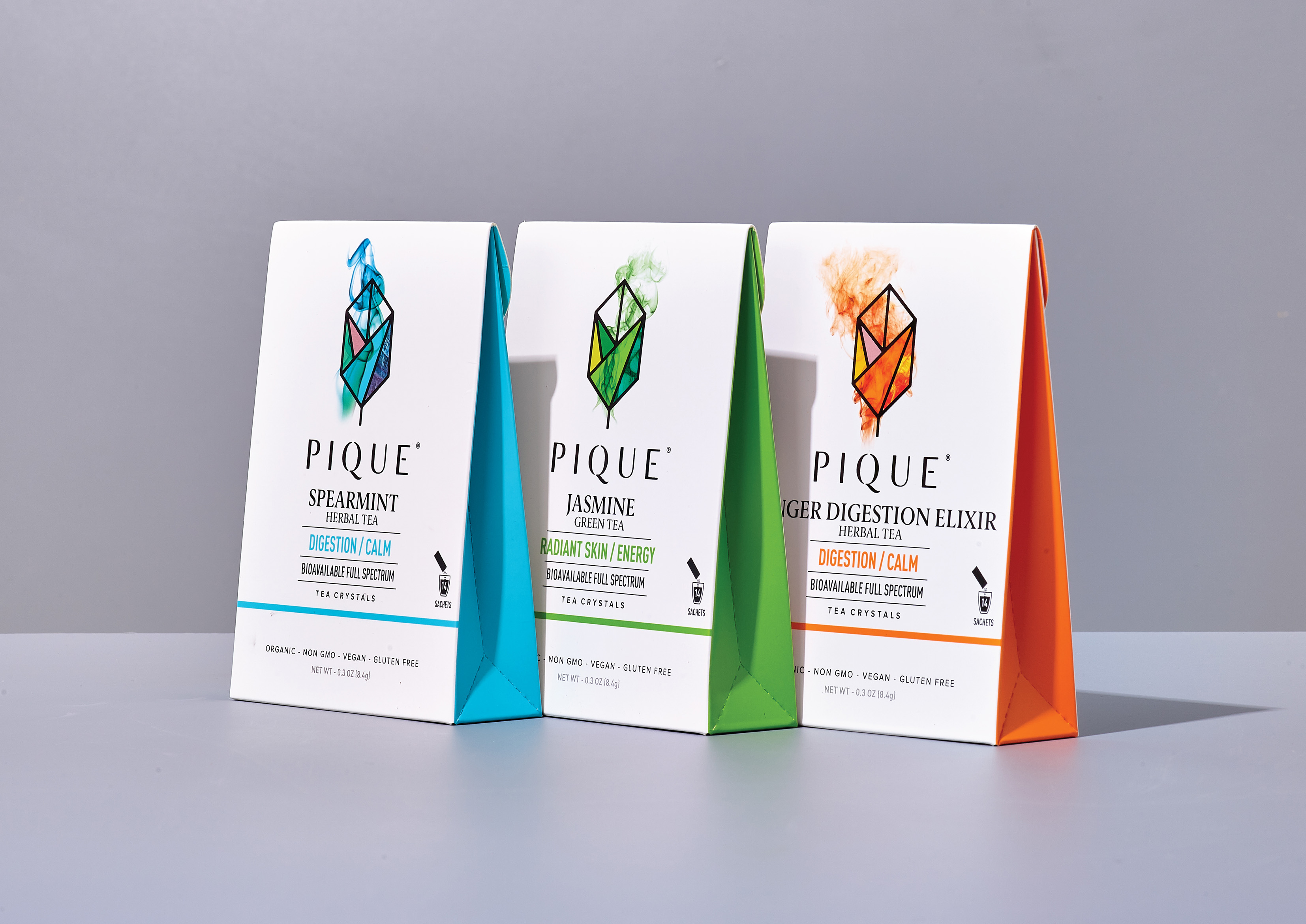
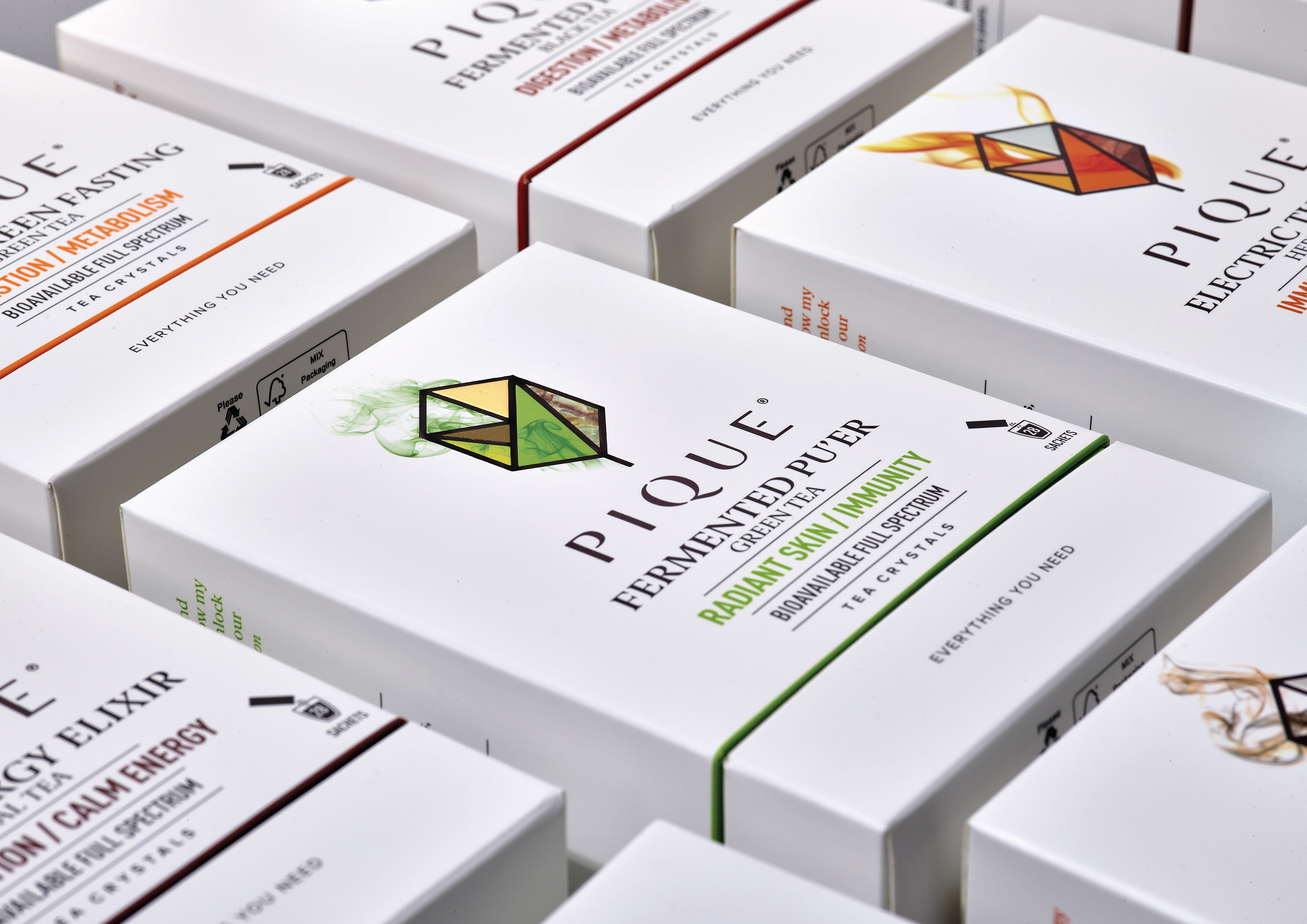
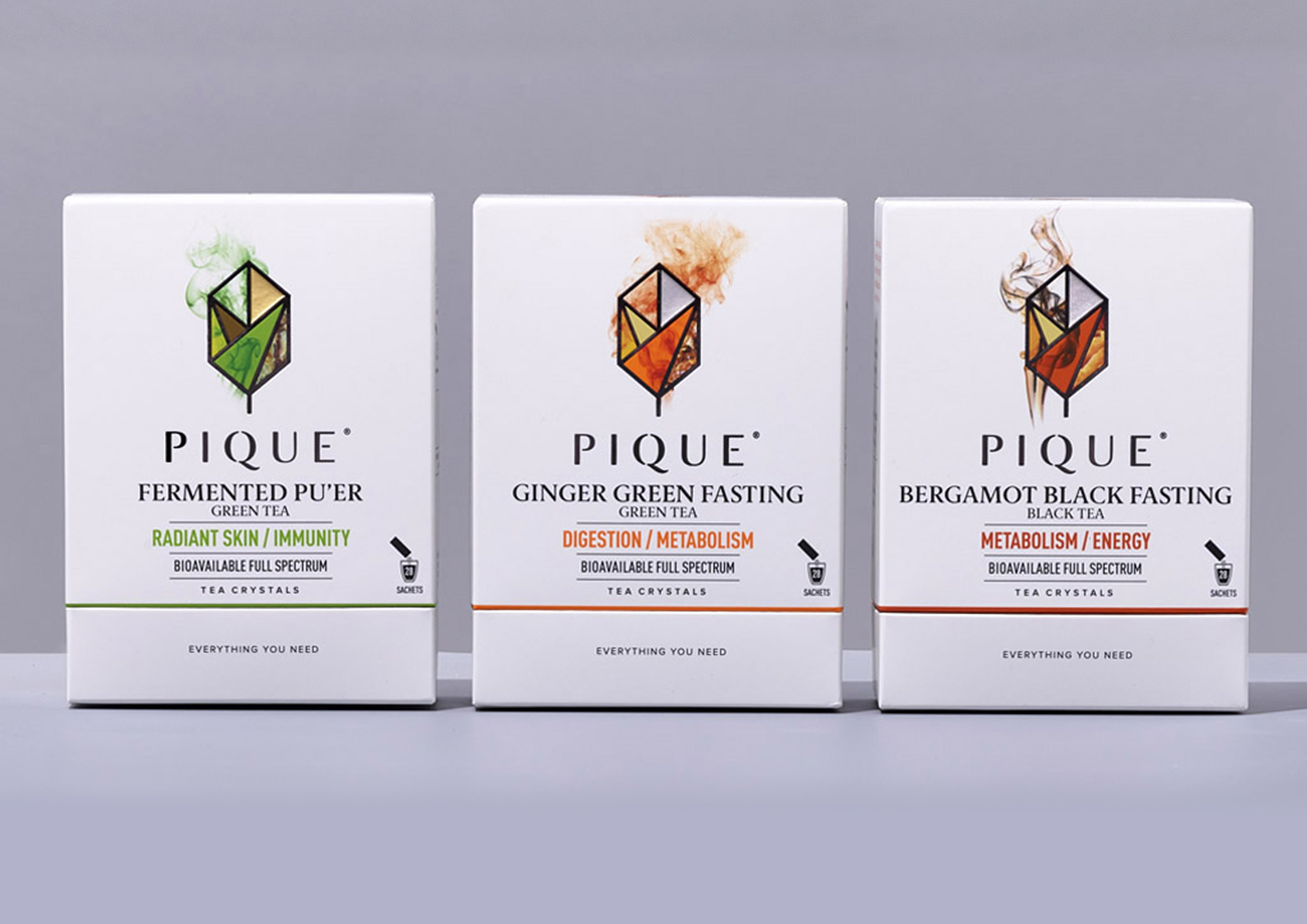
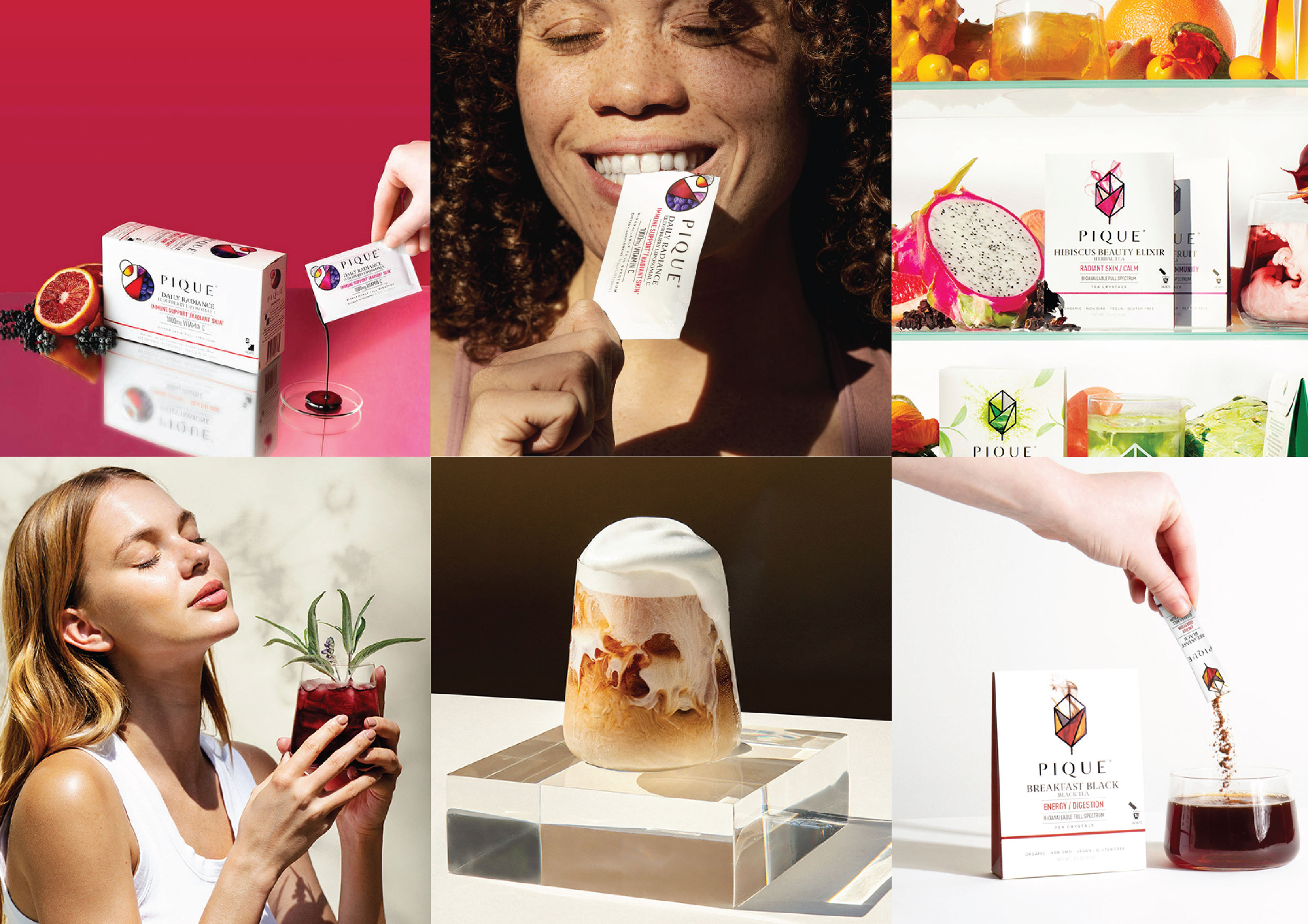
Pique combined their efforts with WhatCameNext, a Sydney-based design agency, to highlight its multidimensional story through packaging redesigns. Each product was assigned a unique identity with seven facets that portrayed the different pillars of the brand.

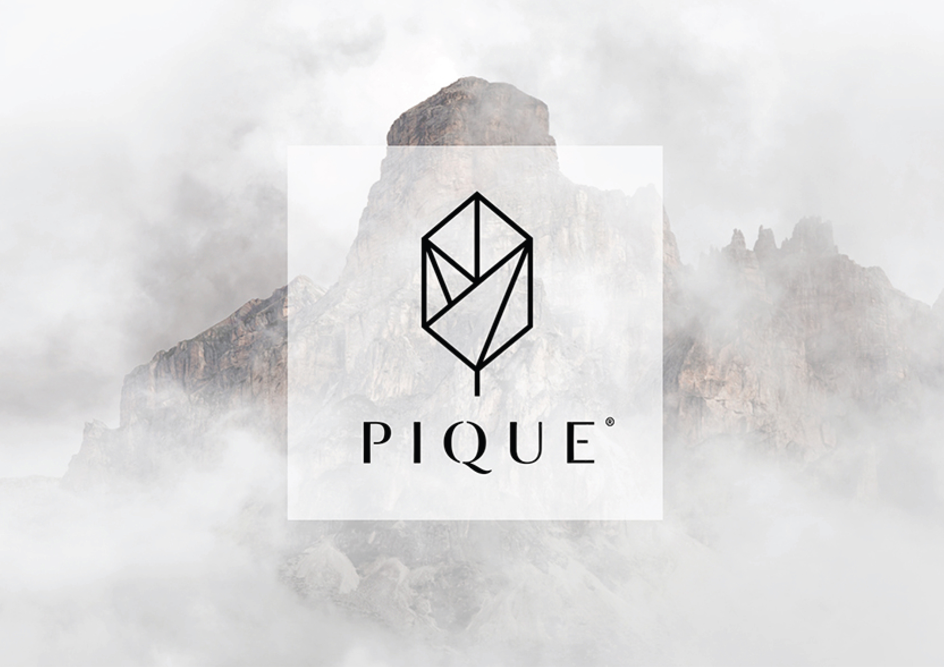
“The brand’s multidimensional story led us to create a range of geometric crystal symbols for the brand identity. Each product range was given its own identity shape that then related to the product form (a geometric leaf for tea, a circle for the liposomal products and so on). These scientific shapes each were given seven facets. These facets represented the 7 pillars of the brand story but also enabled each product to individually tell their sourcing, ingredient and benefit stories all while being held within a strong, iconic form. This created an exquisite library of icons, each one unique, but clearly from the brand heart.” 

Get the latest packaging design inspiration in your inbox:

Popular designs

The Bra Guru

Most women are wearing the wrong size bra and that is a fact. The Bra Guru® is the first and only professional

Burma Love Rebrand

Love at First BiteAs an extension of the Burma Superstar restaurant in San Francisco, Burma Love Foods gives diners an opportunity to

Designed by: PepsiCo Design & Innovation
Country: United States

Packaging Redesign: Pique Teas

Designed by: WhatCameNext | Country: Australia

Pique boasts of creating some of the best bioavailable drinks on the planet. Pique’s range of teas is among the best products that the brand creates. The ingredients for Pique teas are crafted by artisans and fine-tuned by technology.

Pique wanted to reach a wider audience and share their multifaceted story through their packaging redesigns. While the old designs communicated the essence of the brand, it was not enough to attract new customers.

Pique had began to establish itself within the health and wellness space. They had a core, loyal following but were on a mission to reach a wider audience. Key to the brand was a complex multi-faceted story of exquisite ingredient sourcing, a deep appreciation of multi-generational craft and artisanship which was then brought together by top-of-their-field scientists to create a tasty range of cutting-edge wellness solutions.

Packaging Redesign: Pique Teas

The packaging

Pique combined their efforts with WhatCameNext, a Sydney-based design agency, to highlight its multidimensional story through packaging redesigns. Each product was assigned a unique identity with seven facets that portrayed the different pillars of the brand.

“The brand’s multidimensional story led us to create a range of geometric crystal symbols for the brand identity. Each product range was given its own identity shape that then related to the product form (a geometric leaf for tea, a circle for the liposomal products and so on). These scientific shapes each were given seven facets. These facets represented the 7 pillars of the brand story but also enabled each product to individually tell their sourcing, ingredient and benefit stories all while being held within a strong, iconic form. This created an exquisite library of icons, each one unique, but clearly from the brand heart.” 

Previous slide
Next slide
Get the latest on packaging design in your inbox: