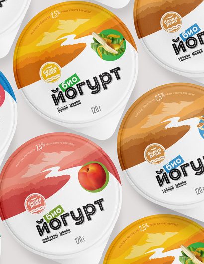
Designed by: Alexey Lysogorov | Country: Kyrgyzstan
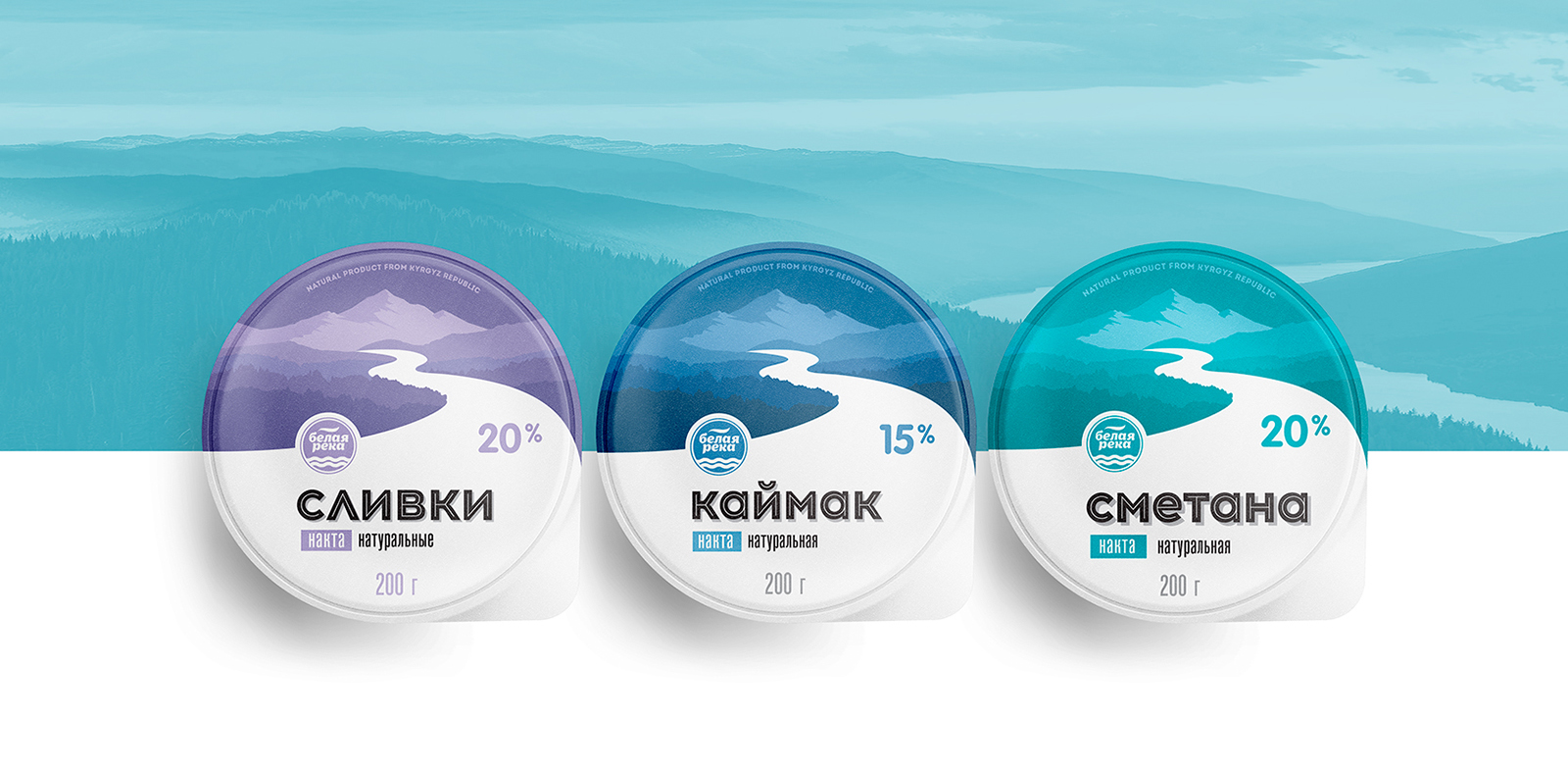
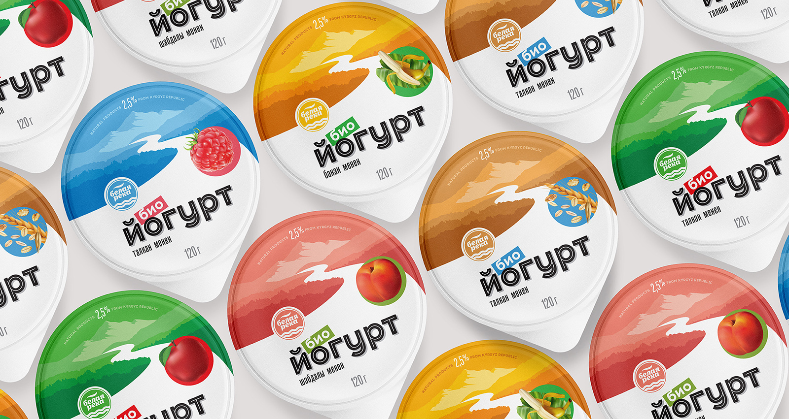
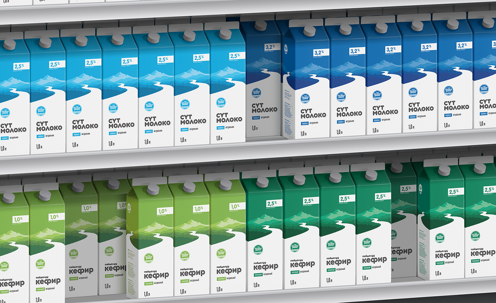
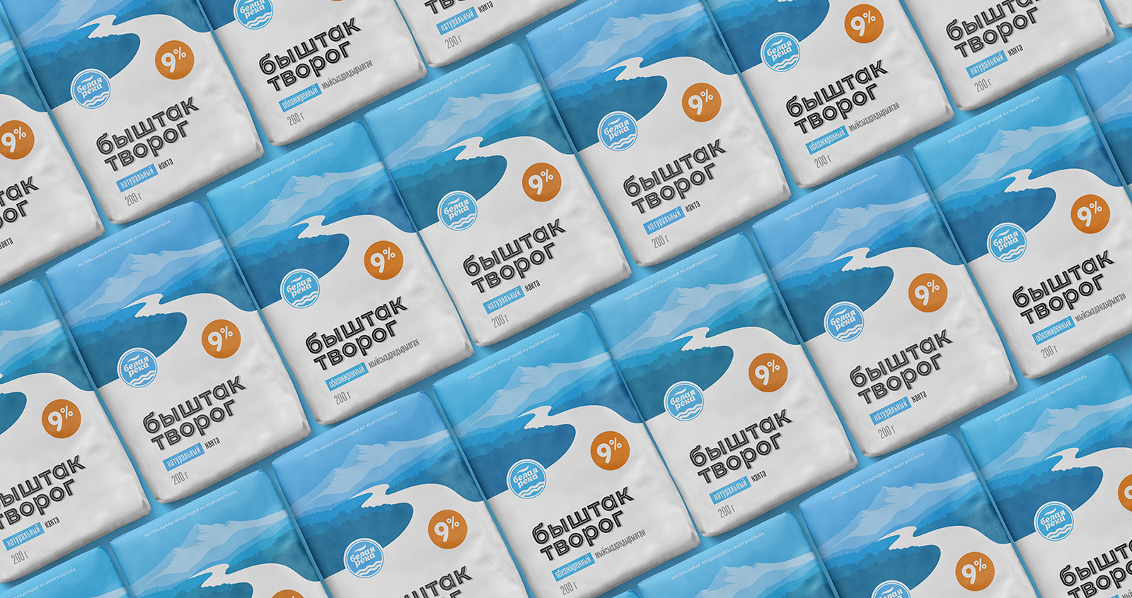
White River Dairy recently completely overhauled its look, which includes various lines of products. The dairy brand’s products will now be available in paper packaging, tetra packs, and plastic cups.
“… The design concept is based on the author’s vector illustration, which fully reflects the meaning of the trademark. This is a literal correspondence to the name, where the White River appears in the most beautiful form: showing both positive patriotism (the attractiveness of the country of origin, Kyrgyzstan is a mountainous country with large rivers), and the main message of the brand: “naturalness in every product of the brand.”
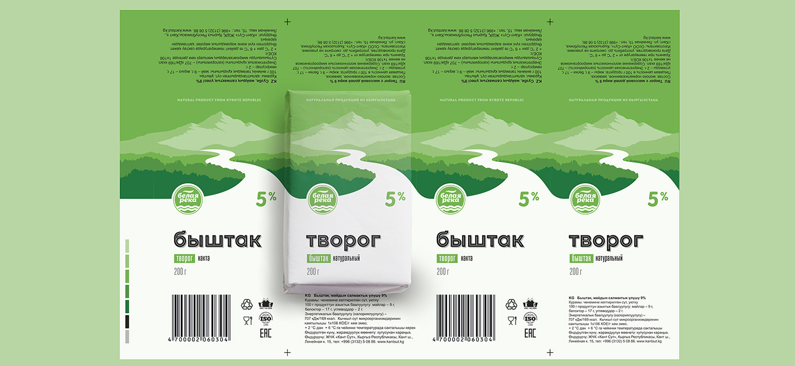
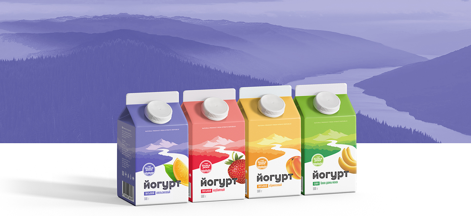
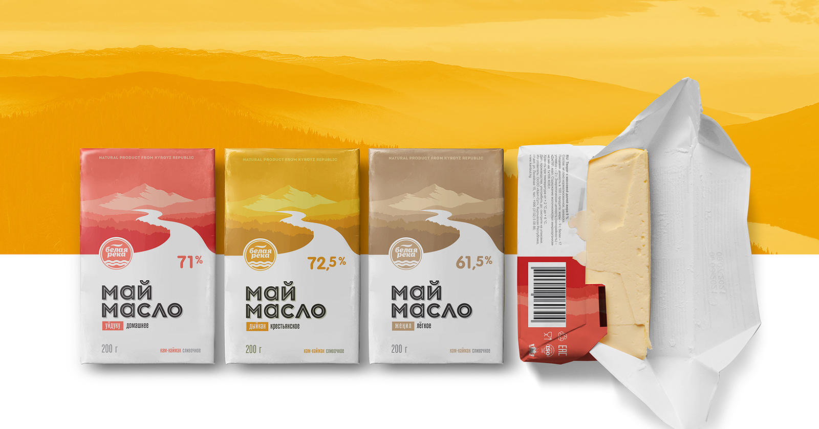
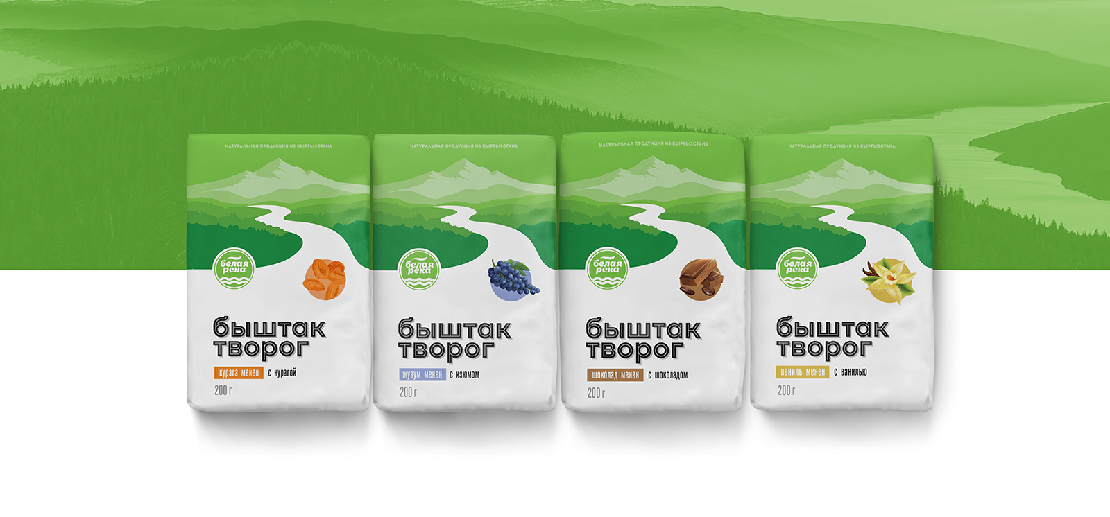
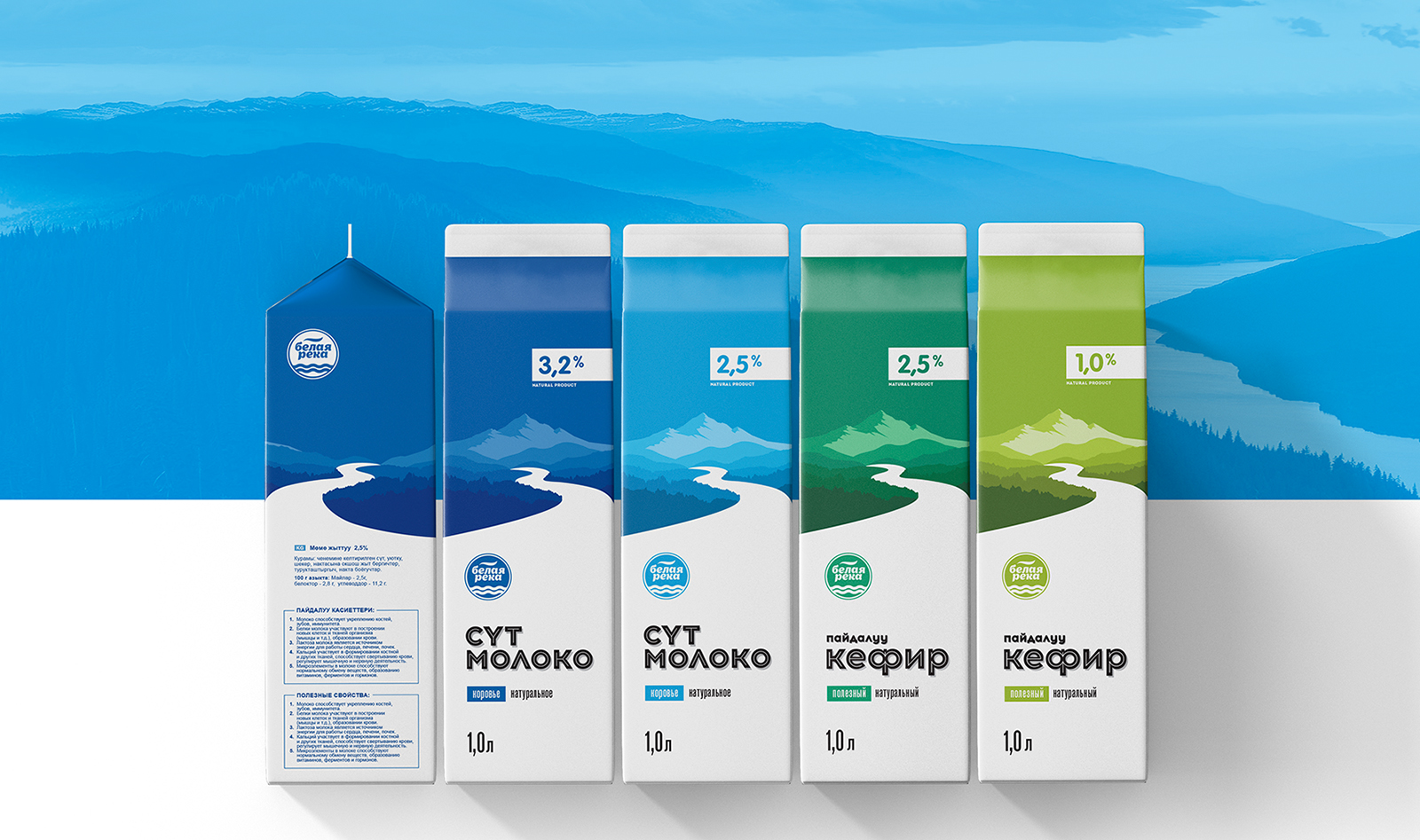
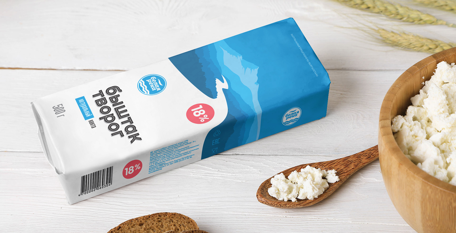
The packaging
White River Dairy teamed up with Alexey Lysogorov, a Bishkek-based design artist, to create a packaging system that would highlight the company’s values. One of the prime features of the design is the white bottom with a multi-colored top.
“The design favorably emphasized the contrasting display of goods on store shelves. A common white bottom in the design, and a multi-colored bright top of all packages. Brand products are now easy to read (texts on a white background) and easily recognizable (a white river fills the shelf space widely). Even without showing the brand’s logo, it’s easy to see what brand represents them. The bright pinnacle of the tonal landscape perspective is most appealing to any viewer and quickly appealed to the consumer. Hidden packaging design feature inside typography: A white river flows inside all letters of product names!”


