Designed by: PepsiCo Design & Innovation
Country: United States

PanPan

panpan1

Designed by Rocío Martinavarro | Country: Spain

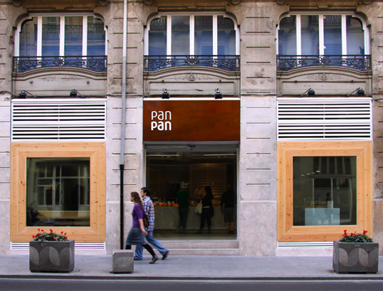
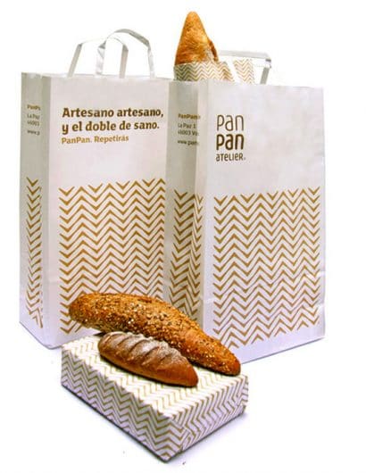
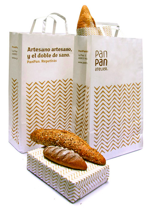
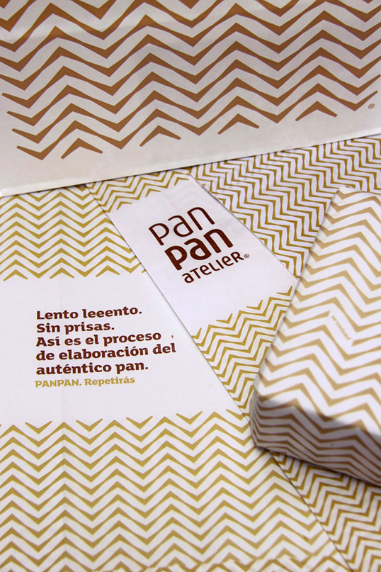
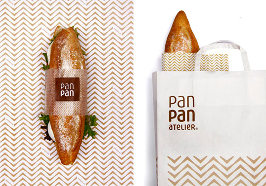
“Visual Identity for a new artisan bakery chain in Valencia, Spain. Contemporary reinterpretation of the traditional ear of wheat, the bread’s main ingredient, to form a pattern that is easily recognizable. The brand instantly stands out among the average bakeries that use literal illustrations of wheat in their visual identity. The ear wheat pattern also reminds of antique artisan techniques such as woven esparto baskets, used to display the bread, or opus spicatum, used to build stone ovens in the past.

The naming concept of PanPan is based on word repetition in order to emphasize authenticity. Bread bread, as in real bread. This system is carried throughout most packaging materials under one slogan with double meaning: “PanPan. You will repeat”.
panpan2

panpan3

panpan4

panpan5

Get the latest packaging design inspiration in your inbox:

Popular designs

Designed by: PepsiCo Design & Innovation
Country: United States

PanPan

panpan1

panpan1

Designed by Rocío Martinavarro | Country: Spain

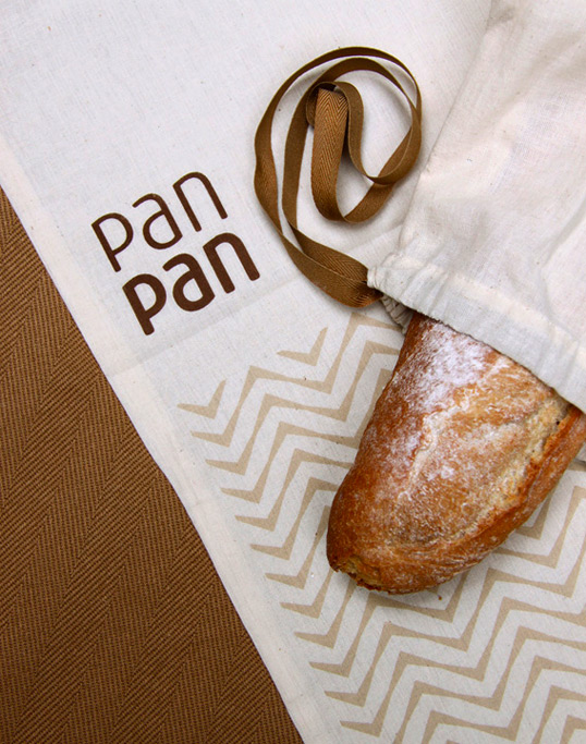
“Visual Identity for a new artisan bakery chain in Valencia, Spain. Contemporary reinterpretation of the traditional ear of wheat, the bread’s main ingredient, to form a pattern that is easily recognizable. The brand instantly stands out among the average bakeries that use literal illustrations of wheat in their visual identity. The ear wheat pattern also reminds of antique artisan techniques such as woven esparto baskets, used to display the bread, or opus spicatum, used to build stone ovens in the past.

The naming concept of PanPan is based on word repetition in order to emphasize authenticity. Bread bread, as in real bread. This system is carried throughout most packaging materials under one slogan with double meaning: “PanPan. You will repeat”.
panpan2

panpan3

panpan4

panpan5

Explore more great package design

Get the latest on packaging design in your inbox: