Designed by: PepsiCo Design & Innovation
Country: United States

Paul Sapin

Paul Sapin

Designed by Neumeister | Country: Sweden

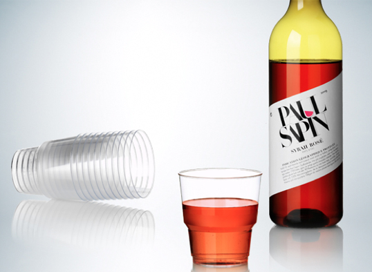
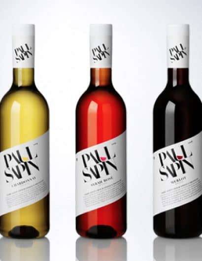
Input: When Paul Sapin launched their series of wine, white, red and rosé, in PET-bottles the awaited success did not occur – although reviews were good. What was the problem? Neumeister was approached to take a look at the packaging design.

Output: Easy to go”, is the main idea. Classic design with a modern approach. Old meets new, in the same way as the product; traditional French wine, produced in a traditional way, but with a whole new packaging concept. And the twisted label as an eye catcher.

Outcome: Relaunched spring 2010.”

Paul Sapin

Paul Sapin

Get the latest packaging design inspiration in your inbox:

Popular designs

Burma Love Rebrand

Love at First BiteAs an extension of the Burma Superstar restaurant in San Francisco, Burma Love Foods gives diners an opportunity to

Pure Persian Honey

When we look closely at honey packaging, they are almost all in the usual format, and the ultimate in creativity is that

Over the wave

This Kombucha originates in Lombok, Indonesia, where its paradise beaches attract hundreds of surfers eager to ride the waves. When you surf,

Designed by: PepsiCo Design & Innovation
Country: United States

Paul Sapin

paulsapin1

Paul Sapin

Designed by Neumeister | Country: Sweden

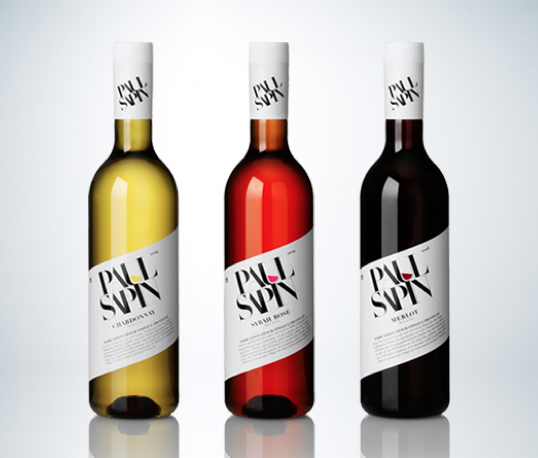
Input: When Paul Sapin launched their series of wine, white, red and rosé, in PET-bottles the awaited success did not occur – although reviews were good. What was the problem? Neumeister was approached to take a look at the packaging design.

Output: Easy to go”, is the main idea. Classic design with a modern approach. Old meets new, in the same way as the product; traditional French wine, produced in a traditional way, but with a whole new packaging concept. And the twisted label as an eye catcher.

Outcome: Relaunched spring 2010.”
Paul Sapin

Paul Sapin

Previous slide
Next slide

Explore more great package design

Get the latest on packaging design in your inbox: