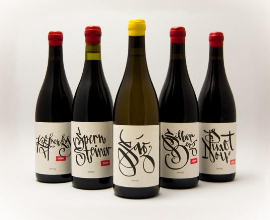
Designed by László Mihály Naske | Country” Hungary
“Handmade’ still confers an air of high esteem on objects, which is why I was pleased that, when Péter Wetzer commissioned me to design labels for his craft wines, he wanted a calligraphed theme. And when he gave me carte blanche to choose the shape of the letters as I saw fit, I was thrilled. I find the match between the wine and its label very pleasing; substance is truly aligned with style in this case, since what could fit a handcrafted wine more than a label drawn by hand? I started out with some quite bold arrangements but the client’s preferences won out to yield a more straightforward label which actually makes much more sense: A winemaker’s philosophy is better served by a more traditional composition that nevertheless manages to incorporate novel elements.”