Designed by: PepsiCo Design & Innovation
Country: United States

Pharmasept Witnesses 25 Percent Jump In Sales After Rebranding

Designed by: 2yolk | Country: Greece

Advertisers and branding experts know that children easily remember ads and catchy taglines. Most ad campaigns are designed around getting the attention of the children because they have the potential to be the best ambassadors. Pharmasept, one of the leading pharmaceutical companies in Greece, realized how important it was to win the approval of the little ones after their branding failed to strike a chord with the children.

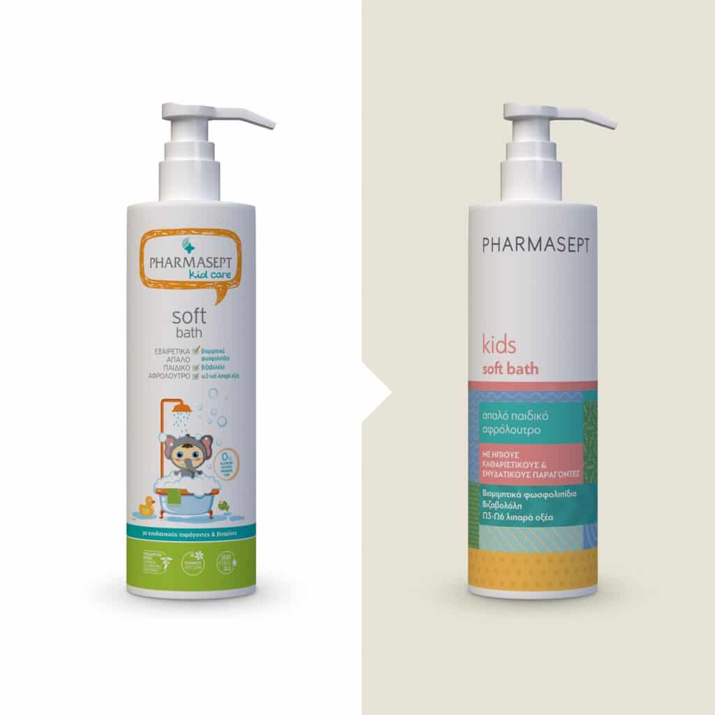
Pharmasept is known for high-quality products across Greece. The leading pharmaceutical company boasts of having the best-selling infant hygiene and care products among an array of other superior items. While Pharmasept Kids Line became popular with mothers, it failed to attract the children. The branding was deemed too “childish.”

Several studies point toward the fact that technology combined with other factors has led children to reach puberty faster than seen in previous generations.

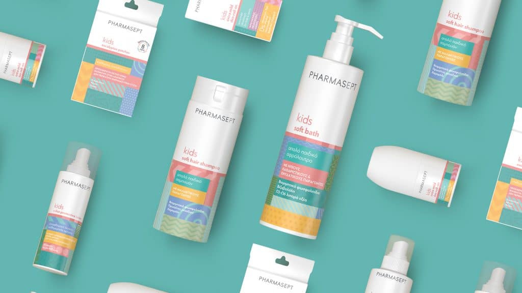
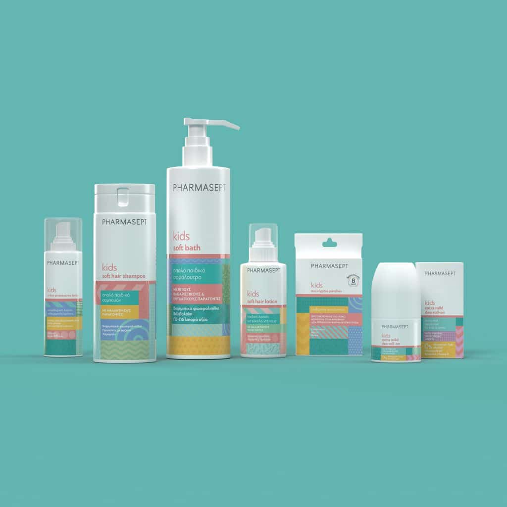
Keeping these evolving trends in mind, 2yolk, a branding and design agency came up with a unique solution. The branding and design agency created rebranding strategies that would attract children while maintaining the fun and youthfulness of the brand.
Pharmasept Witnesses 25 Percent Jump In Sales After Rebranding

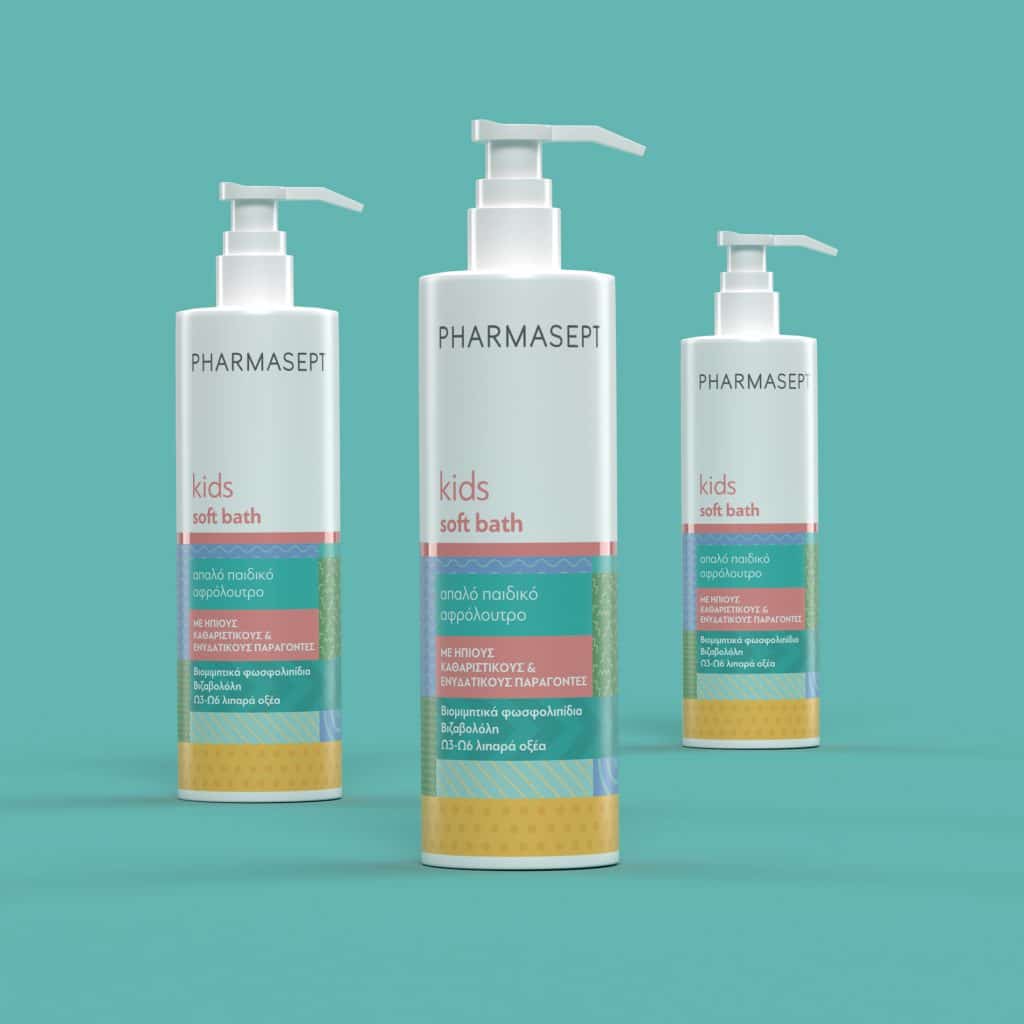
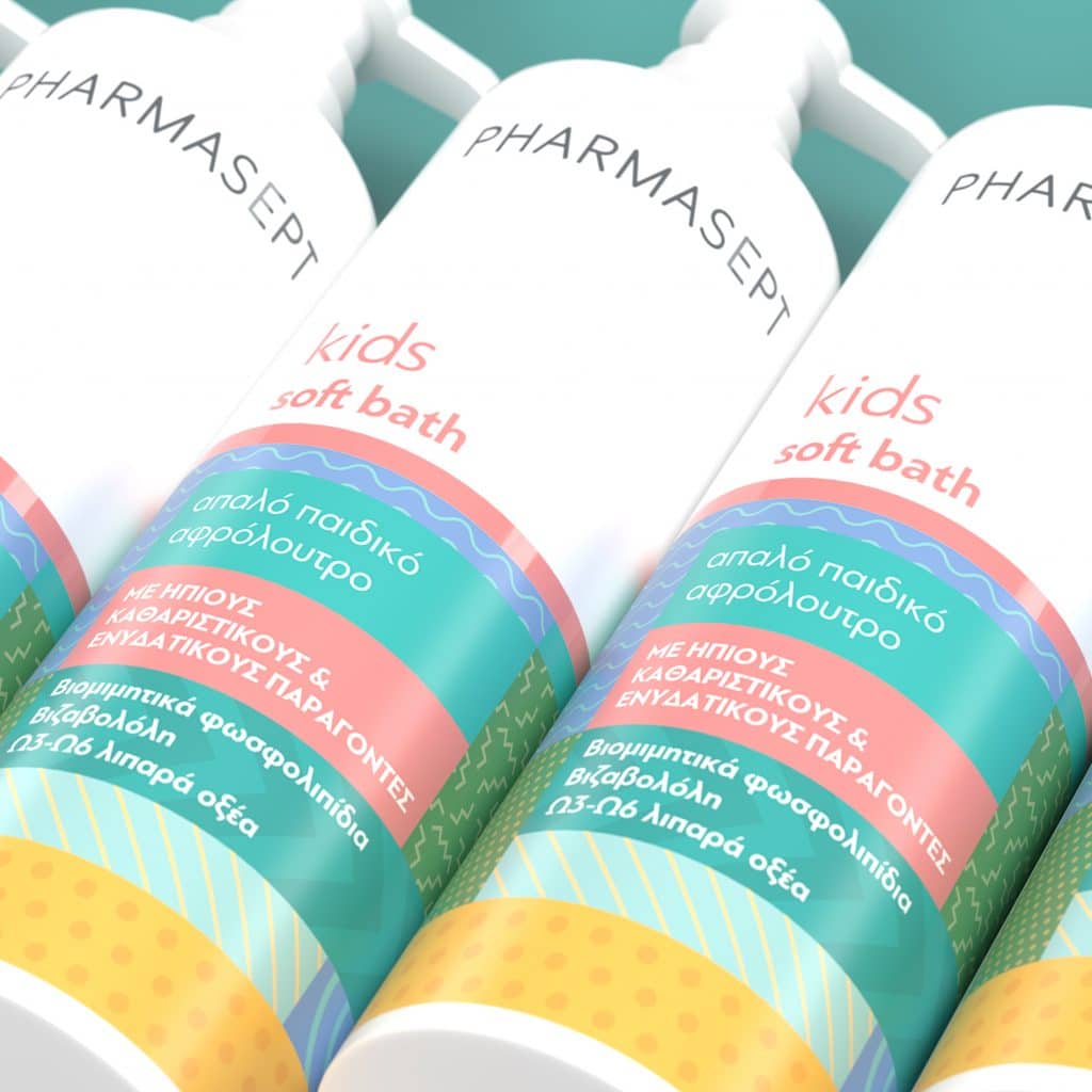
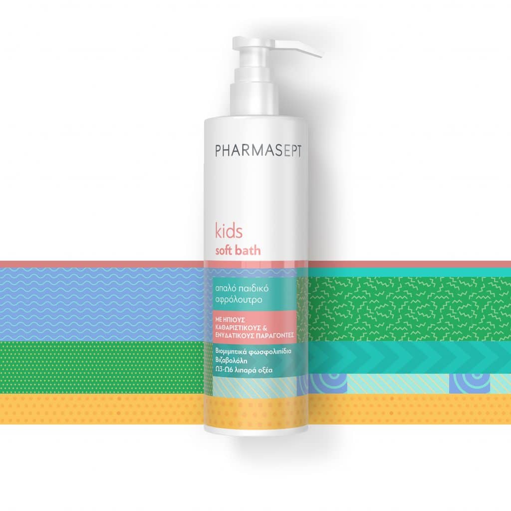
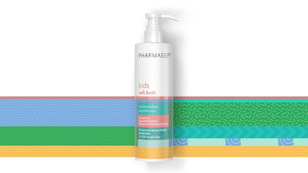
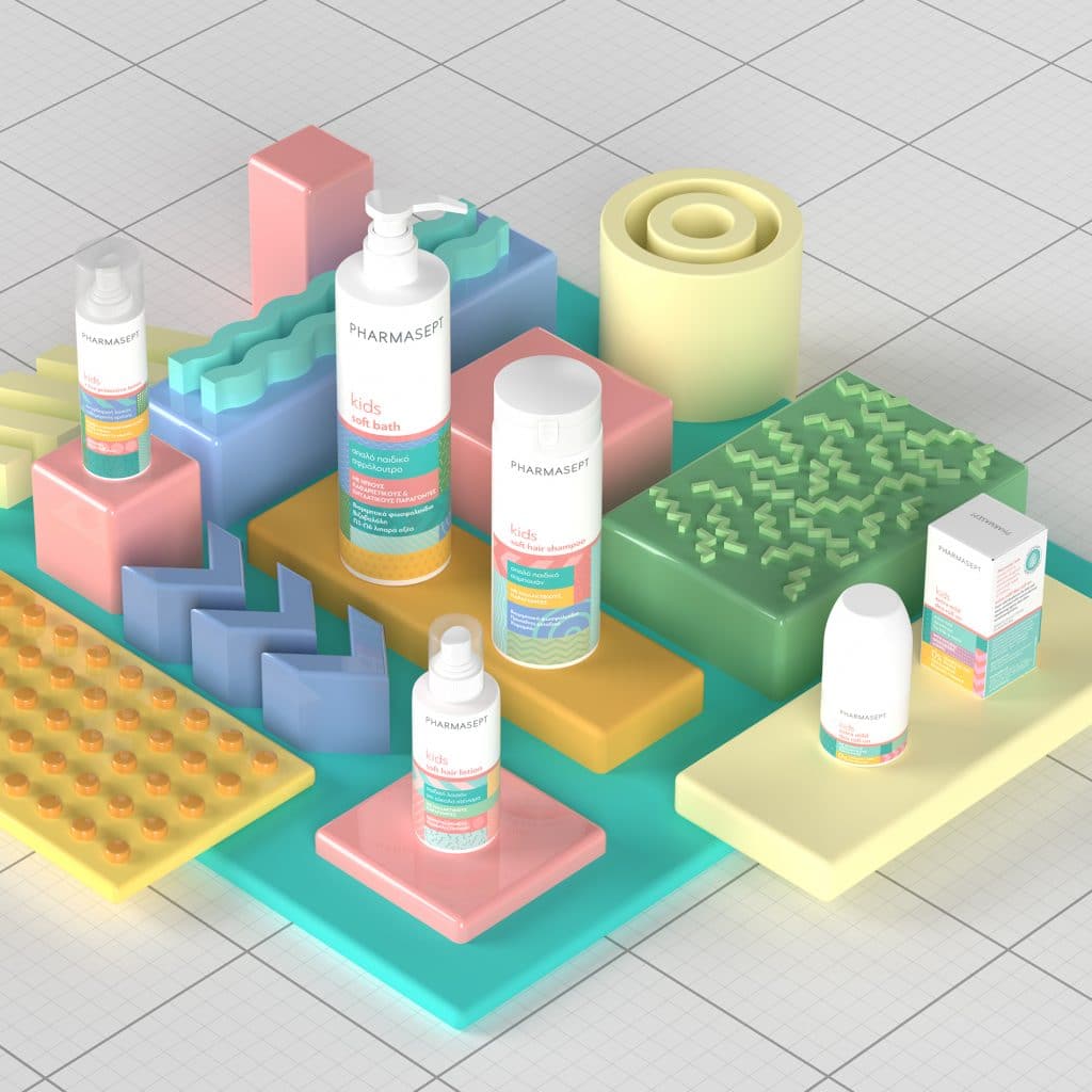
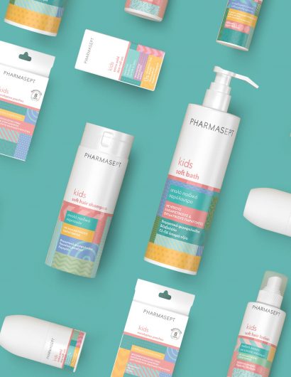
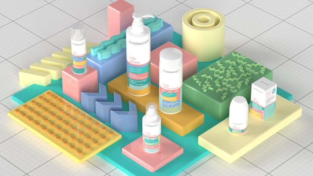
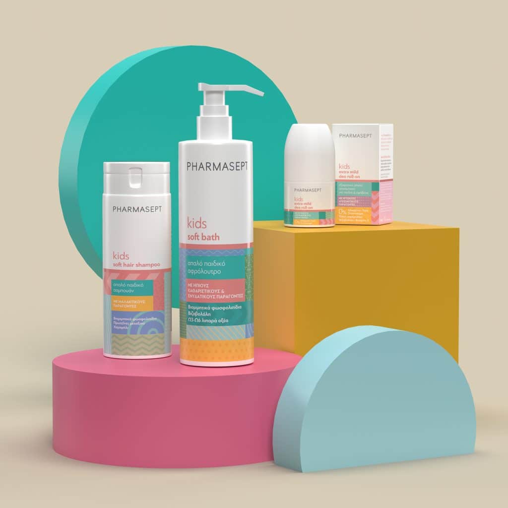
Influenced by the Memphis Group design movement of the 80s, 2yolk combined colors and motions that would attract the children instantly. While new shades and layerings were added, 2yolk maintained the brand’s dominant hues, namely blue and purple.  

Pharmasept kids product rebranding turned out to be a success as the company witnessed a 25 percent increase in sales in the first-semester post-launch.

Get the latest packaging design inspiration in your inbox:

Popular designs

Innovative Design and Packaging of Teeling Whiskey Crystal Malt

Explore the innovative packaging design of Teeling Whiskey Crystal Malt. A dark screen printed bottle with a Marque™ aluminum label, textural dimension, and a seamless diamond pattern, embodies the brand’s commitment to unconventional expressions.

Designed by: PepsiCo Design & Innovation
Country: United States

Pharmasept Witnesses 25 Percent Jump In Sales After Rebranding

03_ARTBOARD_PHARMASEPT LAND1920X1080 (10)

Designed by: 2yolk | Country: Greece

Advertisers and branding experts know that children easily remember ads and catchy taglines. Most ad campaigns are designed around getting the attention of the children because they have the potential to be the best ambassadors. Pharmasept, one of the leading pharmaceutical companies in Greece, realized how important it was to win the approval of the little ones after their branding failed to strike a chord with the children.

Pharmasept is known for high-quality products across Greece. The leading pharmaceutical company boasts of having the best-selling infant hygiene and care products among an array of other superior items. While Pharmasept Kids Line became popular with mothers, it failed to attract the children. The branding was deemed too “childish.”

Several studies point toward the fact that technology combined with other factors has led children to reach puberty faster than seen in previous generations.

Keeping these evolving trends in mind, 2yolk, a branding and design agency came up with a unique solution. The branding and design agency created rebranding strategies that would attract children while maintaining the fun and youthfulness of the brand.
Pharmasept Witnesses 25 Percent Jump In Sales After Rebranding

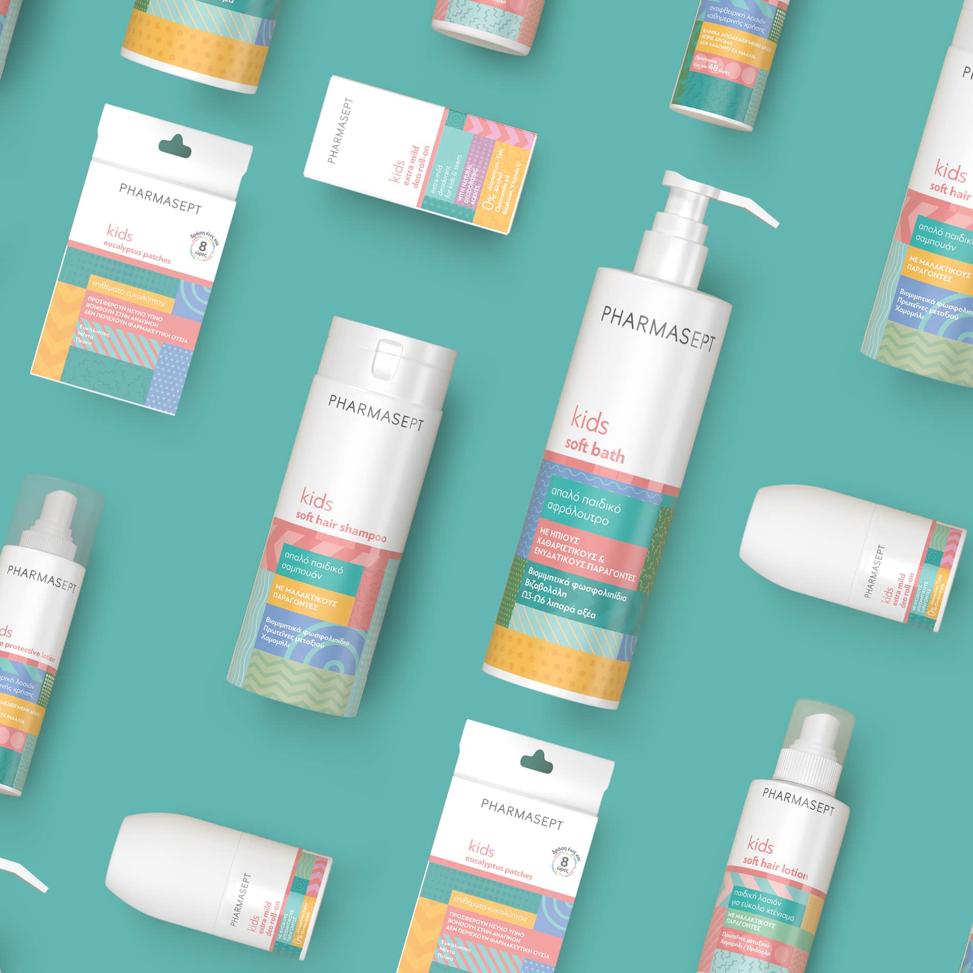
Influenced by the Memphis Group design movement of the 80s, 2yolk combined colors and motions that would attract the children instantly. While new shades and layerings were added, 2yolk maintained the brand’s dominant hues, namely blue and purple.

Pharmasept kids product rebranding turned out to be a success as the company witnessed a 25 percent increase in sales in the first-semester post-launch.

Previous slide
Next slide
Get the latest on packaging design in your inbox: