Designed by: PepsiCo Design & Innovation
Country: United States

Philab

Philab

Designed by Chris Trivizas | Country: Greece

“Philab is a Greek cosmetic production company. Its philosophy is based on the principles of efficacy, quality and safety.

Given the company’s name, the source of inspiration for its logo was the Greek letter Φ’ [Phi] which stands for the divine proportions, the ‘golden ratio’ 1.618, named after the sculptor Phidias. The absolutely symmetrical shape of the capital Φ’ was moulded in such a manner so as to resemble the shape of a round bottom test tube of a chemical lab. The deep purple reconciles the power of red with the power of blue.

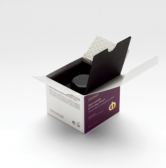
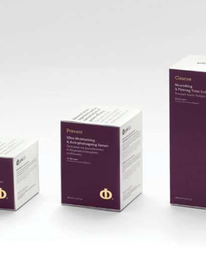
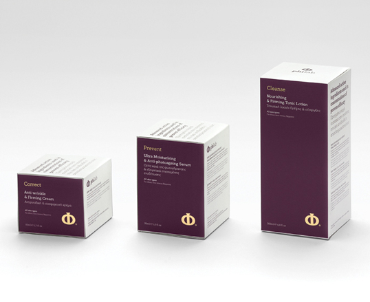
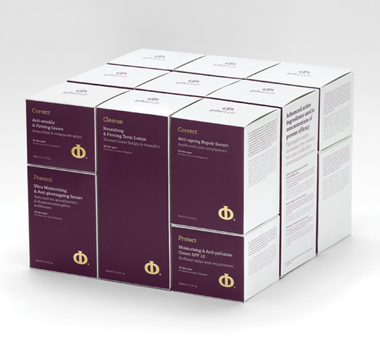
The number Φ’ shows the harmony within an object. The sides of the products’ packages that were created follow the golden ratio Φ’, exactly. If AC>BC then AB/AC=AC/BC. The bisection C equals the golden ratio Φ’ (=1,618), because AB/AC and AC/BC=1,618. The packaging of the products was designed according to this mathematical formula. Thus, if we put the two smaller packages together, we create a package with the exact dimensions of the third package. On the shelf, the packages create a perfect shape, enchanting the natural harmony which is the core of the products’ design.

The isosceles triangle in which the ratio of the longer to the shorter side equals Φ’ is called a ‘golden triangle’. Every isosceles triangle with a 36º acute angle is ‘golden’. The products were divided into 4 categories. For each category we created a pattern, which reflects the function of the product line, as follows:

Cleanse: The pattern ‘wave’ was created by rotating the ‘golden’ triangle. It represents a wave, thus symbolising the element of water, the basis of cleansing.

Protect: The pattern ‘cube’, designed by multiple ‘golden’ triangles, is a closed shape, one that can enclose, cover, protect. It is a geometrical ‘hug’, a basic symbolism of protection.

Prevent: The pattern ‘simplicity’ is a simple pattern, based on the ‘golden’ triangle. It represents the products’ characteristics, which are easy to use and work just like that, to put it simply.

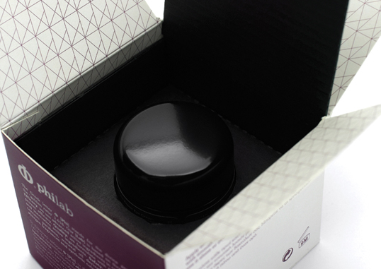
Correct: The pattern ‘nature’ is essentially a tree. By using the ‘golden’ triangle repeatedly, we created a ‘forest’ of triangles, in order to powerfully connect this product line with nature and the way nature heals and cures itself.”

Philab

Philab

Philab

Get the latest packaging design inspiration in your inbox:

Popular designs

Designed by: PepsiCo Design & Innovation
Country: United States

Philab

lovely-package-philab1

Philab

Designed by Chris Trivizas | Country: Greece

“Philab is a Greek cosmetic production company. Its philosophy is based on the principles of efficacy, quality and safety.

Given the company’s name, the source of inspiration for its logo was the Greek letter Φ’ [Phi] which stands for the divine proportions, the ‘golden ratio’ 1.618, named after the sculptor Phidias. The absolutely symmetrical shape of the capital Φ’ was moulded in such a manner so as to resemble the shape of a round bottom test tube of a chemical lab. The deep purple reconciles the power of red with the power of blue.

The number Φ’ shows the harmony within an object. The sides of the products’ packages that were created follow the golden ratio Φ’, exactly. If AC>BC then AB/AC=AC/BC. The bisection C equals the golden ratio Φ’ (=1,618), because AB/AC and AC/BC=1,618. The packaging of the products was designed according to this mathematical formula. Thus, if we put the two smaller packages together, we create a package with the exact dimensions of the third package. On the shelf, the packages create a perfect shape, enchanting the natural harmony which is the core of the products’ design.

The isosceles triangle in which the ratio of the longer to the shorter side equals Φ’ is called a ‘golden triangle’. Every isosceles triangle with a 36º acute angle is ‘golden’. The products were divided into 4 categories. For each category we created a pattern, which reflects the function of the product line, as follows:

Cleanse: The pattern ‘wave’ was created by rotating the ‘golden’ triangle. It represents a wave, thus symbolising the element of water, the basis of cleansing.

Protect: The pattern ‘cube’, designed by multiple ‘golden’ triangles, is a closed shape, one that can enclose, cover, protect. It is a geometrical ‘hug’, a basic symbolism of protection.

Prevent: The pattern ‘simplicity’ is a simple pattern, based on the ‘golden’ triangle. It represents the products’ characteristics, which are easy to use and work just like that, to put it simply.

Correct: The pattern ‘nature’ is essentially a tree. By using the ‘golden’ triangle repeatedly, we created a ‘forest’ of triangles, in order to powerfully connect this product line with nature and the way nature heals and cures itself.”
Philab

Philab

Philab

Explore more great package design

Get the latest on packaging design in your inbox: