Designed by: PepsiCo Design & Innovation
Country: United States

Phyto Nectars Packaging Design

Designed by: Mid-Air Studio | Country: UK

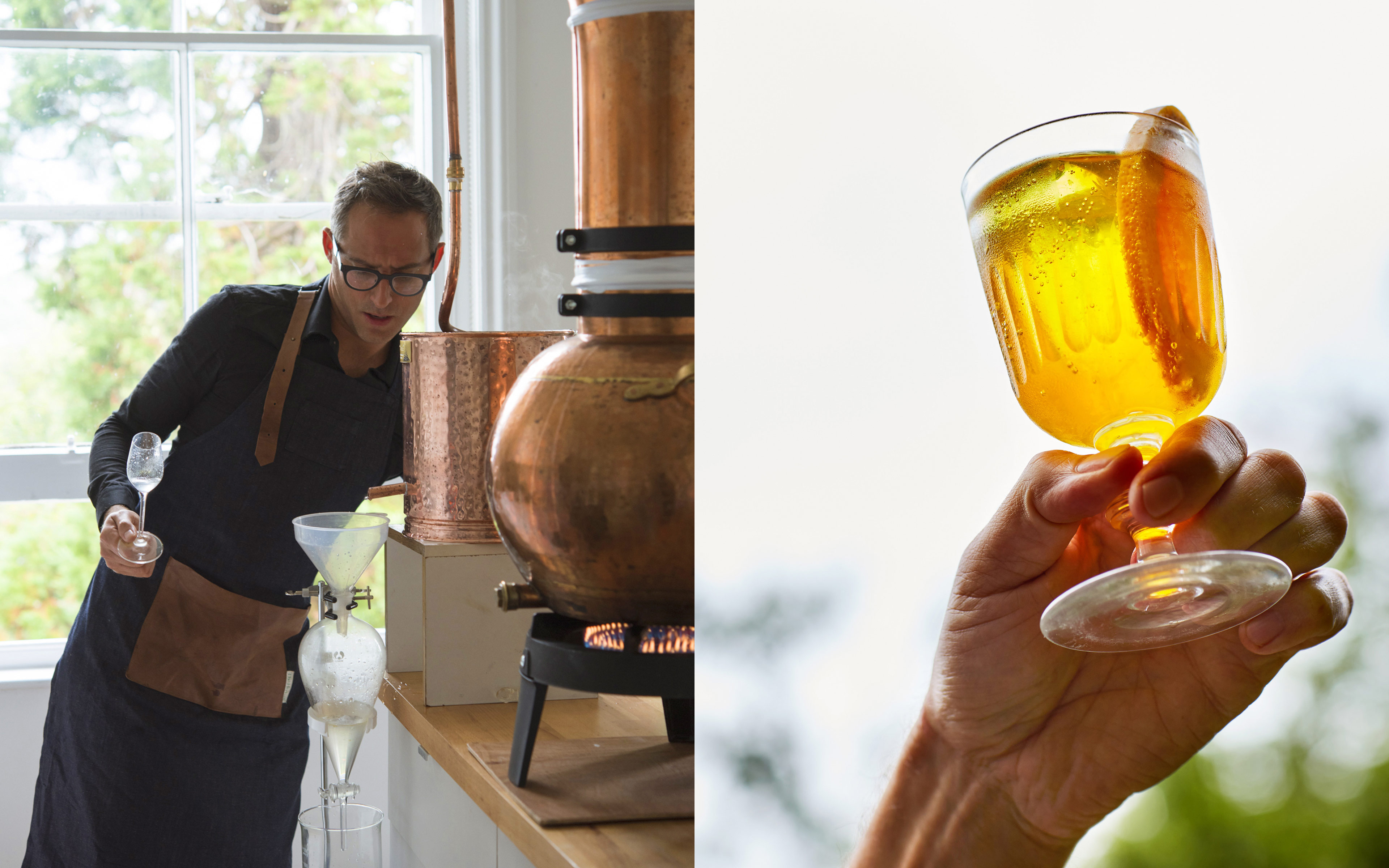
Conceived by Katia Narain Phillips, author and wellness expert, and Michael Isted, Phyto nutritionist at The Herbal, Phyto Nectars is a brand that is involved with creating health-based products. Phyto Nectars specializes in blending mushroom extracts with various herbs which support and foster beauty, immunity, and relaxation.

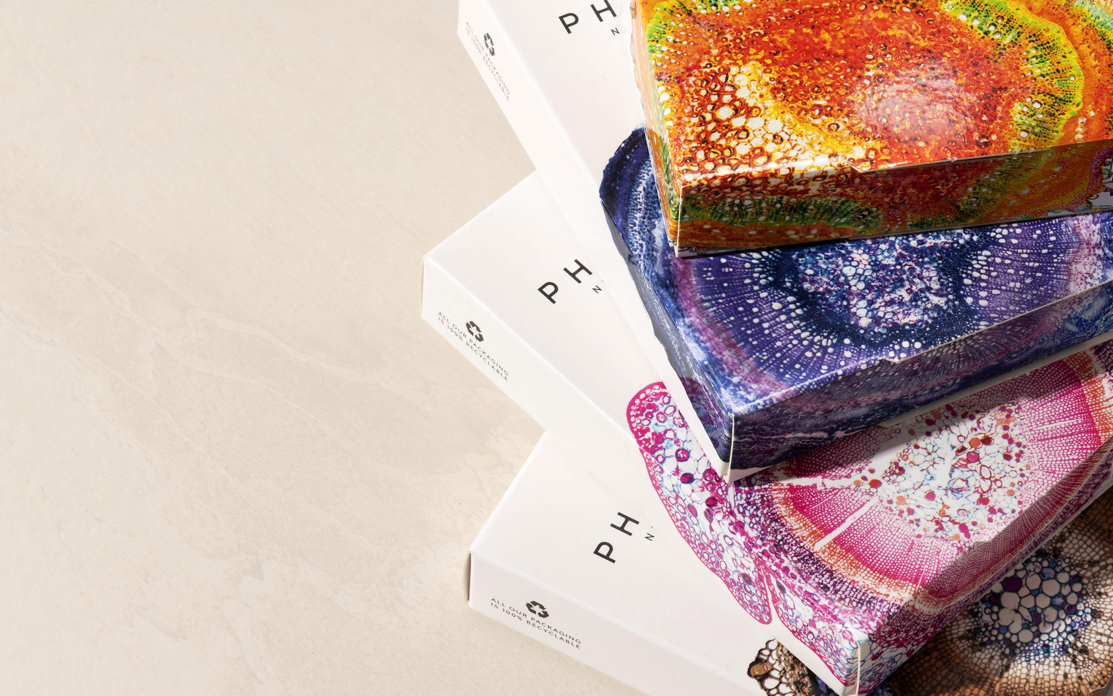
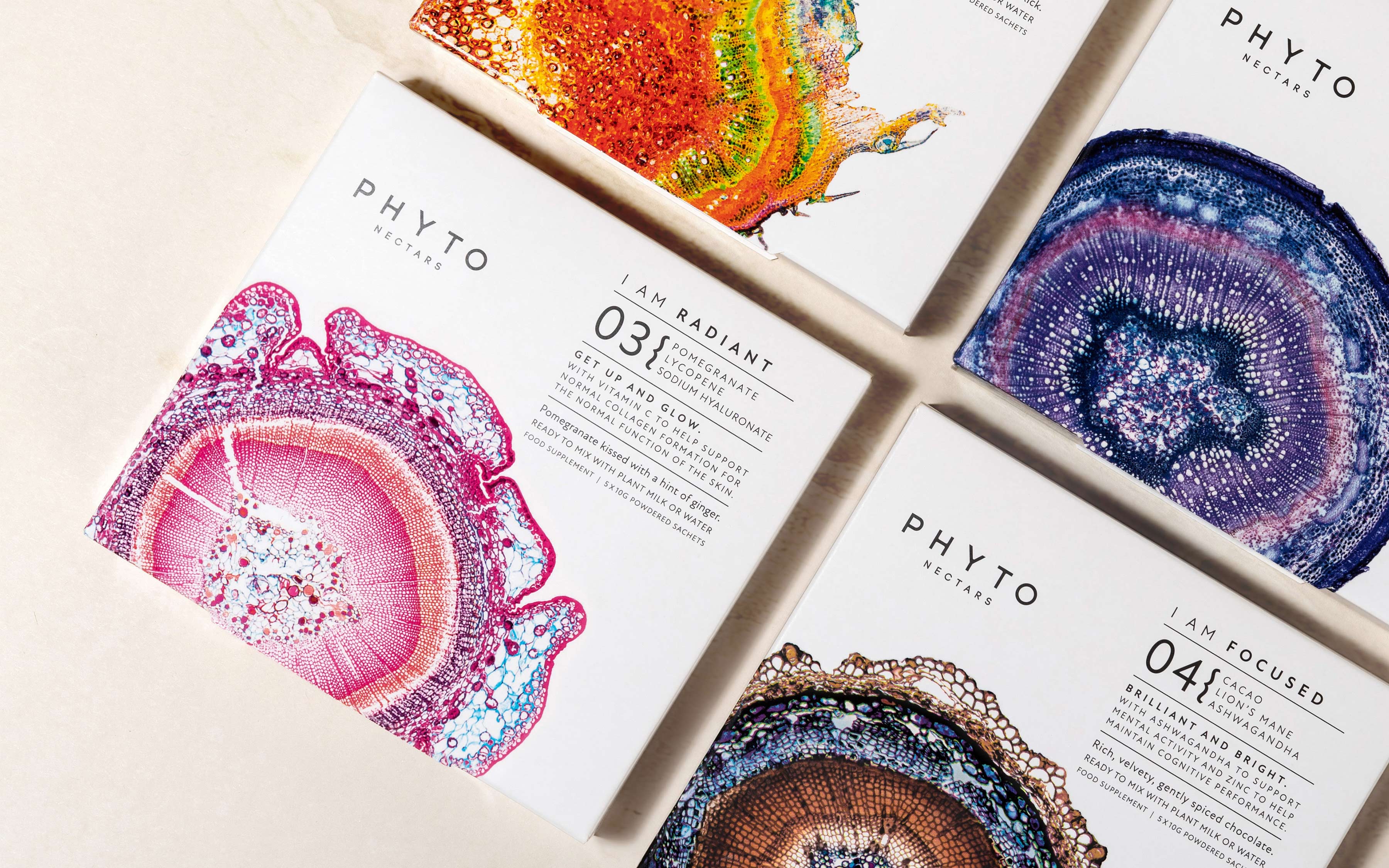
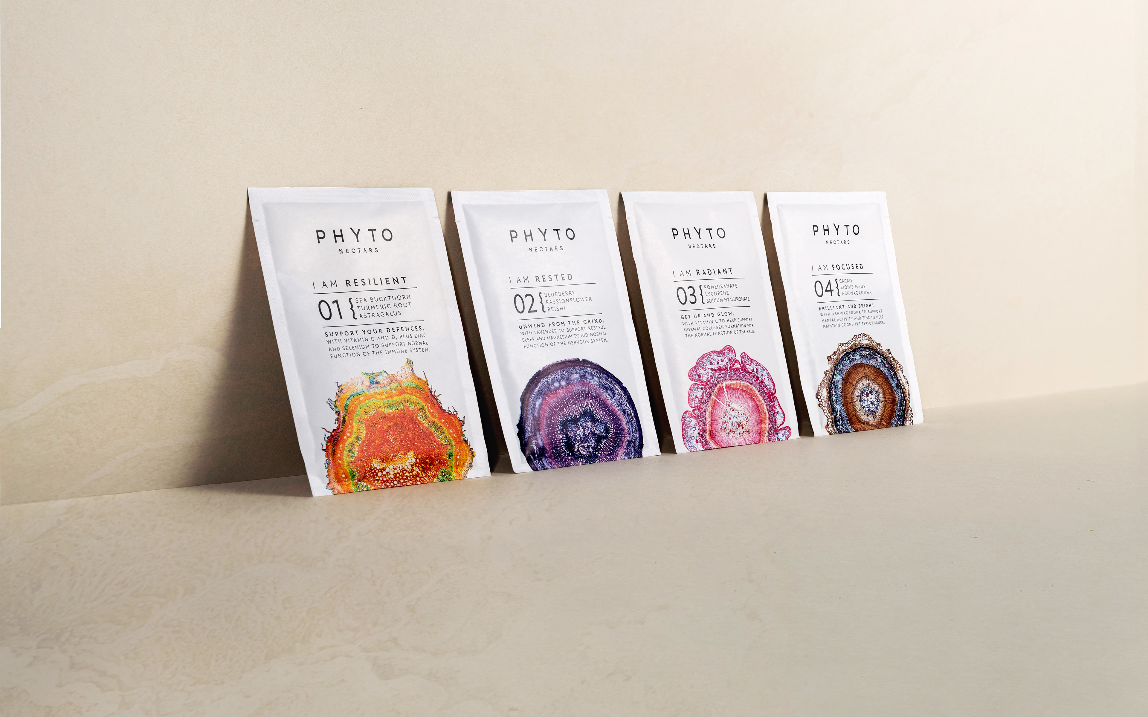
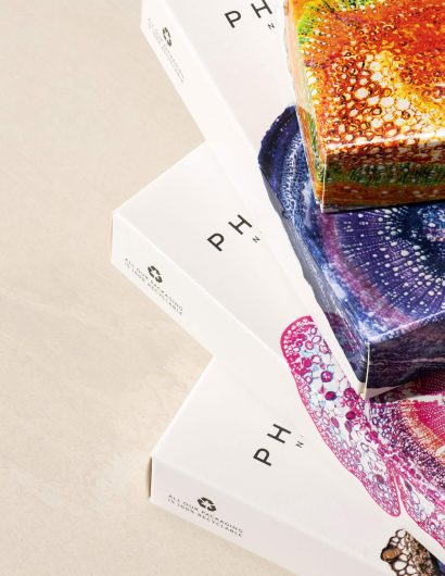
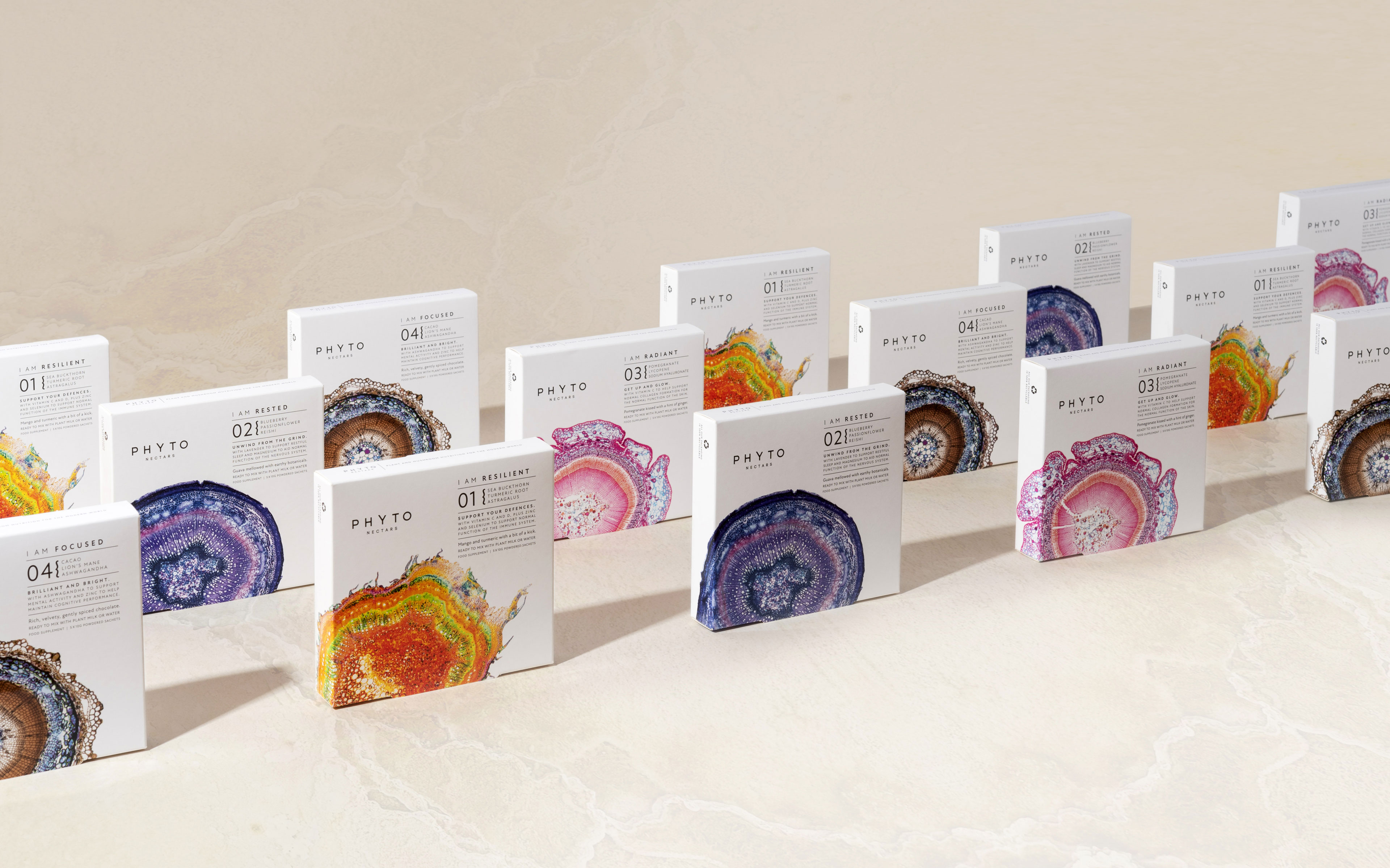
The packaging designs focus on highlighting “a series of plant stem cross-section micrographs.”

This concept of magnification and attention to detail is intended to convey the beautiful complexity of the blends, the mindful ritual of the experience and the vibrant potency of plants.”
Phyto Nectars Packaging Design

The packaging

While the packaging is simple, the complexity of the stem cross-section micrographs is breathtaking. Phyto Nectars combined its efforts with the UK-based design agency, Mid-Air Studio, to create these ethereal designs, which are both captivating and sophisticated.

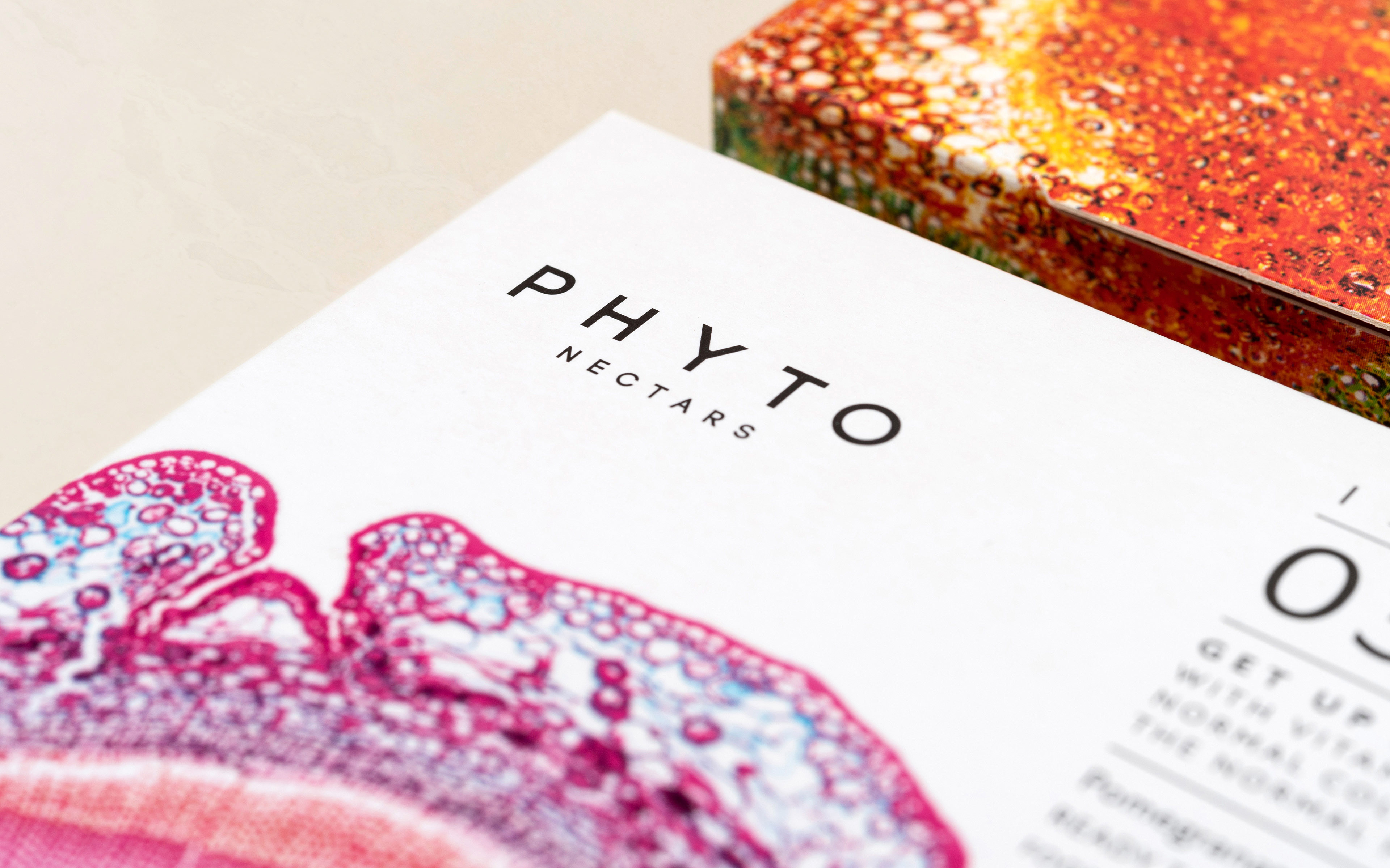
“The organic, vibrant imagery is offset with a more formal typography style, New Atten typeface (inspired by listening to David Attenborough’s narration) was chosen to tie into the concept. Again, seeking to balance the natural and dynamic with an element of precision and control.”

“The packaging is printed with a soft touch finish on recycled board with spot UV varnish applied to the micrographs and plant symbols on back of pack.”

Get the latest packaging design inspiration in your inbox:

Popular designs

Tropicana’s Branding & Packaging Redesign by Sunhouse

Tropicana rejuvenates its brand with Sunhouse, blending modern iconicity and heritage. The redesign emphasizes Tropicana’s legacy, highlighting its unique story and craftsmanship, making it stand out as the original, superior orange juice.

Unique Whisky Packaging Design Celebrates 40-Year Legacy

Stckmn crafted ‘The Only Drop,’ a unique whisky packaging celebrating liquid and cask unity. Featuring handcrafted paper pulp sculptures and transparent bottle designs, the project fetched £18,750 at auction, aiding Scottish youth.

Creating a Strong Brand Identity: The Journey of Living Things Packaging Design

“Developing Living Things packaging involved multiple design stages, feedback, and refinement. With extensive market research, collaboration with brand strategist Jose Debate and design agency Studio Nari, we created a strong, recognizable brand identity appealing to health-conscious, trend-setting millennials and Gen Z.”

Designed by: PepsiCo Design & Innovation
Country: United States

Phyto Nectars Packaging Design

10_PN_fan-closen-up_3840x2400px

Designed by: Mid-Air Studio | Country: UK

Conceived by Katia Narain Phillips, author and wellness expert, and Michael Isted, Phyto nutritionist at The Herbal, Phyto Nectars is a brand that is involved with creating health-based products. Phyto Nectars specializes in blending mushroom extracts with various herbs which support and foster beauty, immunity, and relaxation.

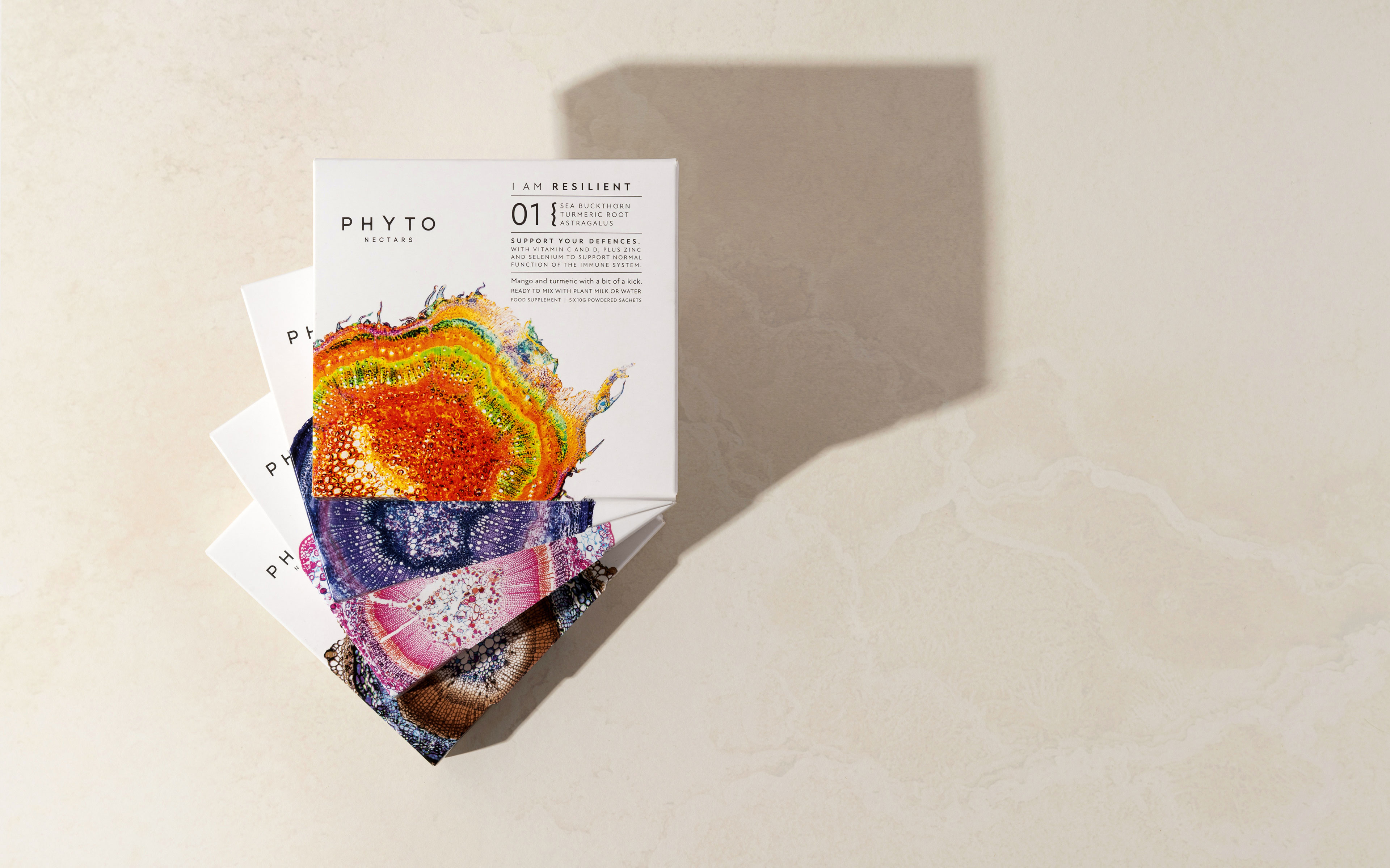
The packaging designs focus on highlighting “a series of plant stem cross-section micrographs.”

This concept of magnification and attention to detail is intended to convey the beautiful complexity of the blends, the mindful ritual of the experience and the vibrant potency of plants.”
Phyto Nectars Packaging Design

The packaging

While the packaging is simple, the complexity of the stem cross-section micrographs is breathtaking. Phyto Nectars combined its efforts with the UK-based design agency, Mid-Air Studio, to create these ethereal designs, which are both captivating and sophisticated.

“The organic, vibrant imagery is offset with a more formal typography style, New Atten typeface (inspired by listening to David Attenborough’s narration) was chosen to tie into the concept. Again, seeking to balance the natural and dynamic with an element of precision and control.”

“The packaging is printed with a soft touch finish on recycled board with spot UV varnish applied to the micrographs and plant symbols on back of pack.”

Previous slide
Next slide
Get the latest on packaging design in your inbox: