Designed by: PepsiCo Design & Innovation
Country: United States

PICNIC

PICNIC

Designed by TAXI | Country: Canada

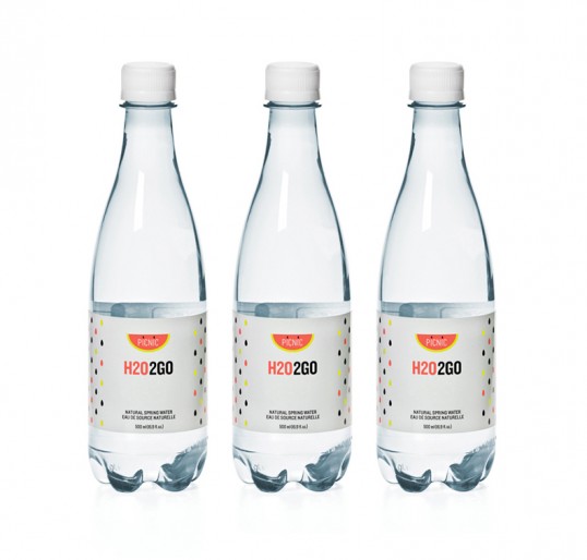
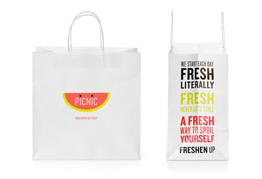
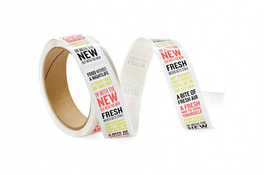
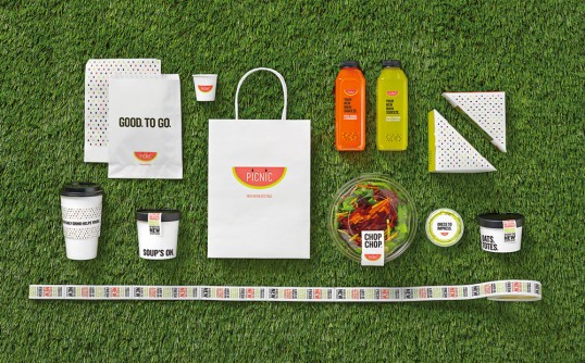
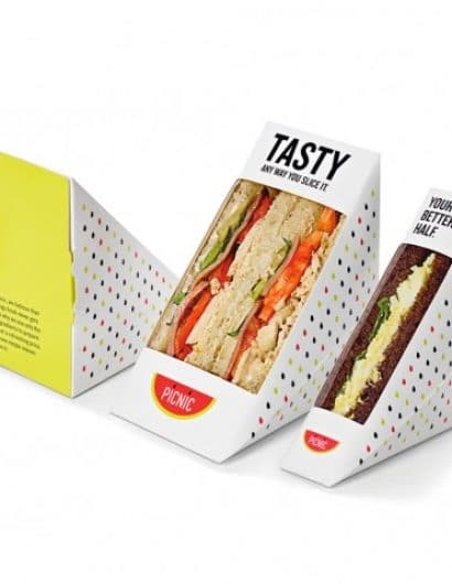
“The challenge: When our client came to us he knew Toronto was hungry for a grab-and-go lunch spot that focused on fresh, quality food. He came to us with a big ask and a clean slate: create a retail brand from scratch that breaks through the competitive quick-serve food service category.

The approach: Busy people want food that’s delicious, unpretentious, and affordable, so we gave them a PICNIC. It’s a brand name that stands for the kind of quality and charm you’d find in your own wicker basket on a sunny day in the park. And drawing inspiration from a classic picnic staple, the watermelon, we developed collateral pieces as fresh and fun as the food.”

PICNIC

PICNIC

PICNIC

PICNIC

Get the latest packaging design inspiration in your inbox:

Popular designs

Pure Persian Honey

When we look closely at honey packaging, they are almost all in the usual format, and the ultimate in creativity is that

Far Out Bar

Description: Far Out Bar is a cutting-edge packaging design project created for High Life Farms’ macrodose THC chocolate bars. This project involved

Over the wave

This Kombucha originates in Lombok, Indonesia, where its paradise beaches attract hundreds of surfers eager to ride the waves. When you surf,

Designed by: PepsiCo Design & Innovation
Country: United States

PICNIC

lovely-package-picnic-2

PICNIC

Designed by TAXI | Country: Canada

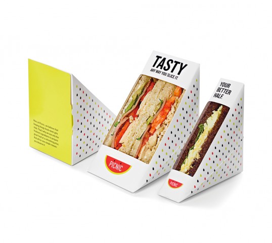
“The challenge: When our client came to us he knew Toronto was hungry for a grab-and-go lunch spot that focused on fresh, quality food. He came to us with a big ask and a clean slate: create a retail brand from scratch that breaks through the competitive quick-serve food service category.

The approach: Busy people want food that’s delicious, unpretentious, and affordable, so we gave them a PICNIC. It’s a brand name that stands for the kind of quality and charm you’d find in your own wicker basket on a sunny day in the park. And drawing inspiration from a classic picnic staple, the watermelon, we developed collateral pieces as fresh and fun as the food.”
PICNIC

PICNIC

PICNIC

PICNIC

Previous slide
Next slide

Explore more great package design

Get the latest on packaging design in your inbox: