Designed by: PepsiCo Design & Innovation
Country: United States

Pizza Nova Branding And Packaging Design

Designed by: Concrete | Country: Canada

Founded in 1963 by an Italian immigrant family, Pizza Nova began its journey from Lawrence Avenue East, west of Kennedy Road in Toronto, Canada. What began as a modest family business; turned into a giant in a few years! Today, the company boasts of serving its delicious pizza in more than 140 locations across Canada.

“…While the growing chain operates in the highly competitive fast-food sector, they have never compromised the authenticity and quality of their product. As the next generation takes over the stewardship of the company, Pizza Nova felt that their existing brand identity no longer effectively represented the quality of their product.

Pizza Nova Branding And Packaging Design

The packaging

Pizza Nova teamed up with Concrete, a Toronto-based creative agency, to overhaul its visual identity. From branding to packaging to the website, the Canadian design agency created a uniform look that would attract new customers and keep the old ones hooked.

Concrete undertook a complete overhaul of the visual identity that involves all aspects of the brand: packaging, uniforms, signage and website.”

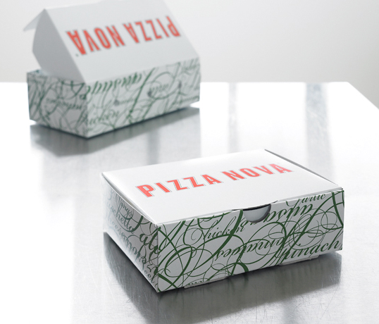
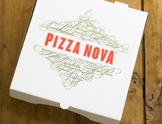
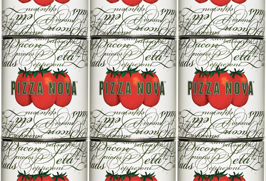
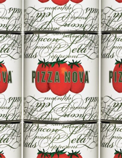
The outer cover of the packaging is white, while the wordmark in red finds its place on the top. The cursive typeface, which braces the side of the packaging, looks attractive and stylish.

Get the latest packaging design inspiration in your inbox:

Popular designs

Tropicana’s Branding & Packaging Redesign by Sunhouse

Tropicana rejuvenates its brand with Sunhouse, blending modern iconicity and heritage. The redesign emphasizes Tropicana’s legacy, highlighting its unique story and craftsmanship, making it stand out as the original, superior orange juice.

Creating a Strong Brand Identity: The Journey of Living Things Packaging Design

“Developing Living Things packaging involved multiple design stages, feedback, and refinement. With extensive market research, collaboration with brand strategist Jose Debate and design agency Studio Nari, we created a strong, recognizable brand identity appealing to health-conscious, trend-setting millennials and Gen Z.”

Studio La Regina Revamps Packaging Design for 7 Colli Amaro

Studio La Regina has transformed the packaging of 7 Colli, an artisan amaro with a loyal following, to support its distribution expansion. The new design features a sleek cylindrical bottle and a striking label with a deep black background, gold foil text, and a distinctive, multi-colored number 7.

Designed by: PepsiCo Design & Innovation
Country: United States

Pizza Nova Branding And Packaging Design

pn1

Designed by: Concrete | Country: Canada

Founded in 1963 by an Italian immigrant family, Pizza Nova began its journey from Lawrence Avenue East, west of Kennedy Road in Toronto, Canada. What began as a modest family business; turned into a giant in a few years! Today, the company boasts of serving its delicious pizza in more than 140 locations across Canada.

“…While the growing chain operates in the highly competitive fast-food sector, they have never compromised the authenticity and quality of their product. As the next generation takes over the stewardship of the company, Pizza Nova felt that their existing brand identity no longer effectively represented the quality of their product.

Pizza Nova Branding And Packaging Design

The packaging

Pizza Nova teamed up with Concrete, a Toronto-based creative agency, to overhaul its visual identity. From branding to packaging to the website, the Canadian design agency created a uniform look that would attract new customers and keep the old ones hooked.

Concrete undertook a complete overhaul of the visual identity that involves all aspects of the brand: packaging, uniforms, signage and website.”

The outer cover of the packaging is white, while the wordmark in red finds its place on the top. The cursive typeface, which braces the side of the packaging, looks attractive and stylish.

Previous slide
Next slide
Get the latest on packaging design in your inbox: