Designed by: PepsiCo Design & Innovation
Country: United States

Plan(e)t Plant-Based Ice Cream Packaging Design

Designed by: Sophia Georgopouloulan | Design | Country: Greece

Consumers are growing more and more health conscious every day. Gone are the days when brands could attract customers by glamorizing their products through TV and print commercials. Today, brands have to do more to attract customers. Health-conscious customers today prioritize brands that are sustainable and environmentally friendly.

The food sector has seen a massive shift in recent years. The growing trend of customers relying on healthy food products has grown massively. While “the food universe witnesses a massive shift towards sustainability and ethics,” the ice cream category has remained largely unaffected.

Sophia Georgopouloulan | Design, the creative agency behind the branding and packaging of Plan(e)t Ice Cream, mentions the following about the food category remaining unaffected:

One of the main reasons: it’s really hard to crack the combo of planet-friendliness and pleasure – the core driver behind ice cream. Plan(e)t Foods though have managed to do exactly that: 100% plant-based ice cream, a carbon-negative footprint and natural flavors to die for. Just wow! The tagline says it all: Dairy-free, pleasure-full. The eco-packaging derived exclusively from sugarcane, perfectly complements their proposition.
Plan(e)t Plant-Based Ice Cream Packaging Design

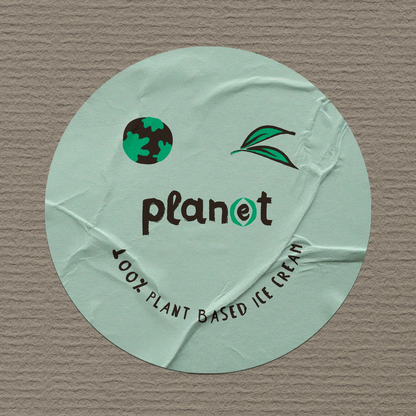
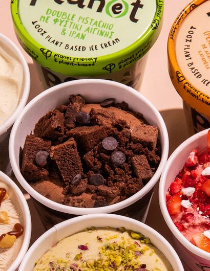
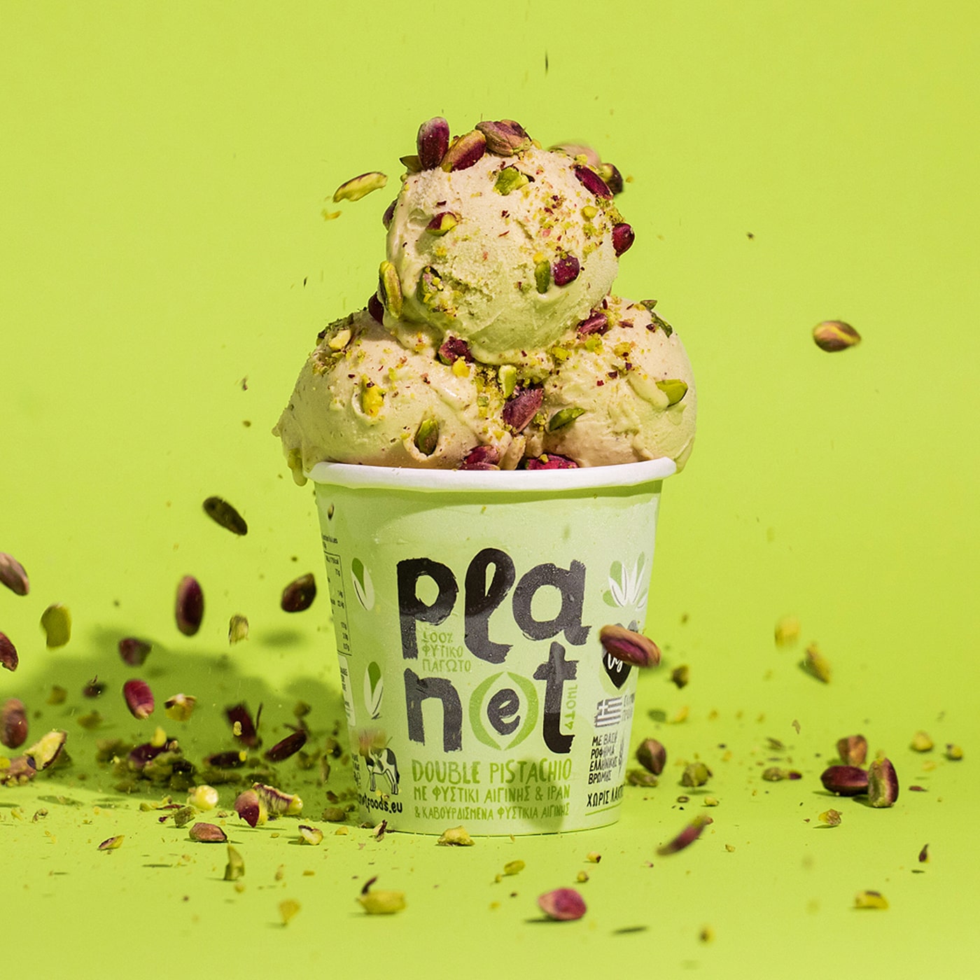
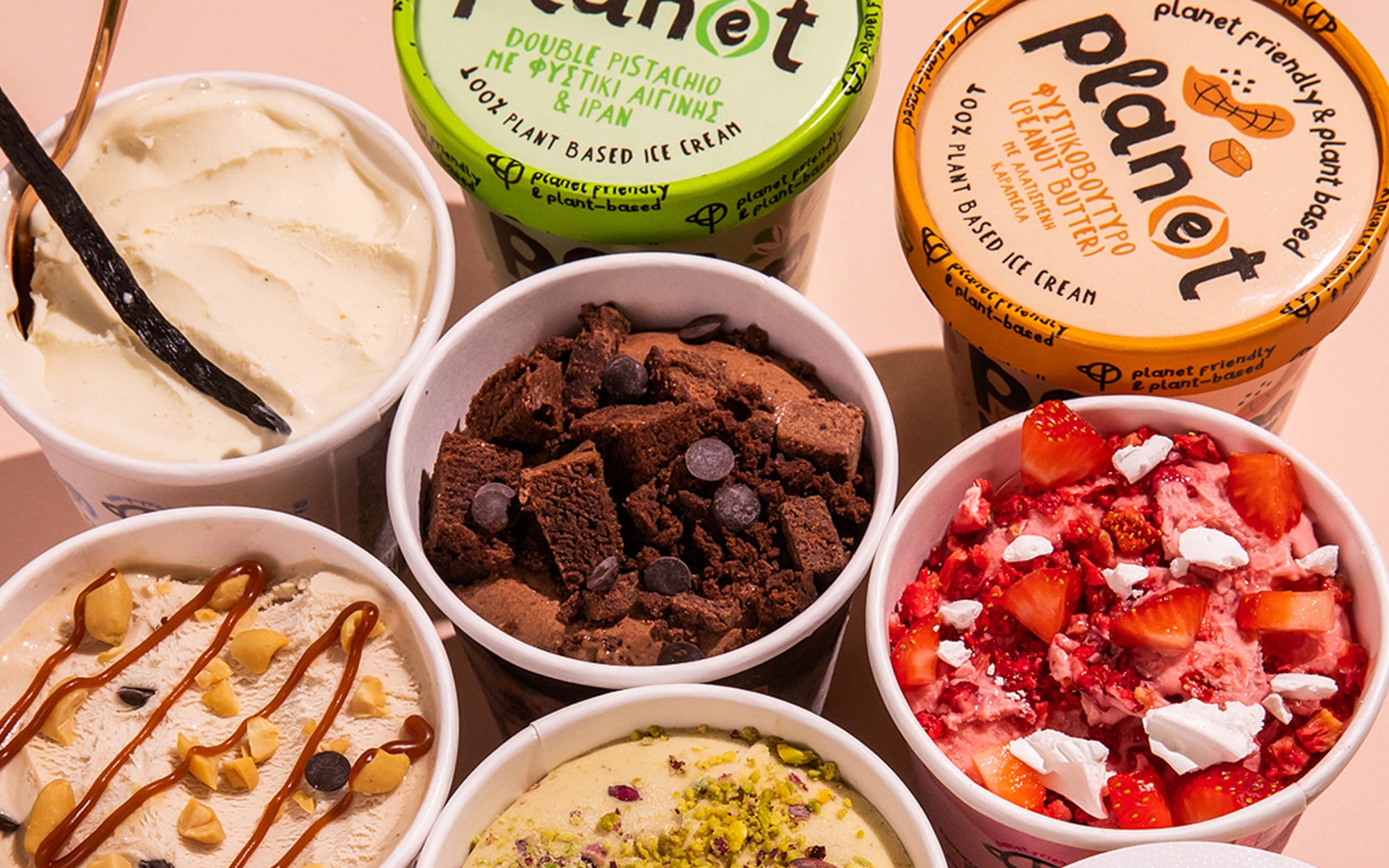
The packaging aims at highlighting the brand’s efforts toward protecting the planet. Bright color palettes, chunky typeface, and primal brushstrokes work together to highlight the naturalness of the brand.

“We start with the brand name with the chunky typeface that dominates the pack, creating an overwhelming desire to try the stuff now! This is supported by the broad, primal brushstrokes of raw power. Add to these the (e) that turns ‘plant’ into ‘planet’ through the use of the parentheses – looking like protecting hands holding a seed, suggesting care for the Earth. On the top of these, we have the mark created by the coming together of a planet and open hands. The end-result looks like a tree but is also reminiscent of the peace sign – denoting care/ethics and purity/naturalness at the same time. The brand is now ready to do a little good to our planet, one splendid spoonful at a time. New Flavors!” 

Get the latest packaging design inspiration in your inbox:

Popular designs

The Bra Guru

Most women are wearing the wrong size bra and that is a fact. The Bra Guru® is the first and only professional

Over the wave

This Kombucha originates in Lombok, Indonesia, where its paradise beaches attract hundreds of surfers eager to ride the waves. When you surf,

Designed by: PepsiCo Design & Innovation
Country: United States

Plan(e)t Plant-Based Ice Cream Packaging Design

11-min

Designed by: Sophia Georgopouloulan | Design | Country: Greece

Consumers are growing more and more health conscious every day. Gone are the days when brands could attract customers by glamorizing their products through TV and print commercials. Today, brands have to do more to attract customers. Health-conscious customers today prioritize brands that are sustainable and environmentally friendly.

The food sector has seen a massive shift in recent years. The growing trend of customers relying on healthy food products has grown massively. While “the food universe witnesses a massive shift towards sustainability and ethics,” the ice cream category has remained largely unaffected.

Sophia Georgopouloulan | Design, the creative agency behind the branding and packaging of Plan(e)t Ice Cream, mentions the following about the food category remaining unaffected:

One of the main reasons: it’s really hard to crack the combo of planet-friendliness and pleasure – the core driver behind ice cream. Plan(e)t Foods though have managed to do exactly that: 100% plant-based ice cream, a carbon-negative footprint and natural flavors to die for. Just wow! The tagline says it all: Dairy-free, pleasure-full. The eco-packaging derived exclusively from sugarcane, perfectly complements their proposition.
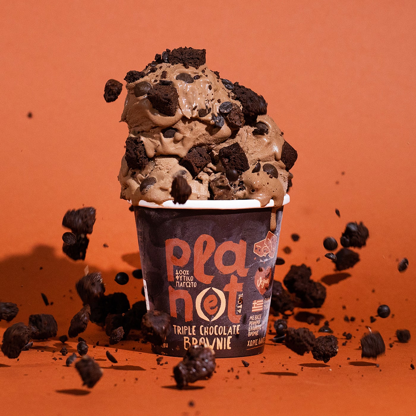
Plan(e)t Plant-Based Ice Cream Packaging Design

The packaging aims at highlighting the brand’s efforts toward protecting the planet. Bright color palettes, chunky typeface, and primal brushstrokes work together to highlight the naturalness of the brand.

“We start with the brand name with the chunky typeface that dominates the pack, creating an overwhelming desire to try the stuff now! This is supported by the broad, primal brushstrokes of raw power. Add to these the (e) that turns ‘plant’ into ‘planet’ through the use of the parentheses – looking like protecting hands holding a seed, suggesting care for the Earth. On the top of these, we have the mark created by the coming together of a planet and open hands. The end-result looks like a tree but is also reminiscent of the peace sign – denoting care/ethics and purity/naturalness at the same time. The brand is now ready to do a little good to our planet, one splendid spoonful at a time. New Flavors!” 

Previous slide
Next slide

Explore more great package design

Get the latest on packaging design in your inbox: