Designed by: PepsiCo Design & Innovation
Country: United States

Quinta Da Vacaria Packaging Design

Designed by: RitaRivotti | Country: Portugal

Located on the banks of the River Douro, close to Régua city, and “in the heart of the oldest Demarcated Region in the world,” Quinta da Vacaria sits proudly as the “oldest property” in the area. The first registration of the farm dates back to 1616.

For four centuries, the wines produced at the farms of Quinta da Vacaria traveled the world “without anyone knowing their true origin.” The Rabelo boats took the wines from the farm to Gaia, “where they were sold in bulk to the whole world.”

“At the destination, the wine was bottled and labeled with the brand of the foreign traders who acquired it, and some of them gained considerable prestige as legitimate possessors of a quality that did not belong to them.

The new laws changed everything for farmers and owners. According to the law, farmers could keep one-third of the production. However, it was not until 2016 that port wines were allowed to be bottled at the origin.
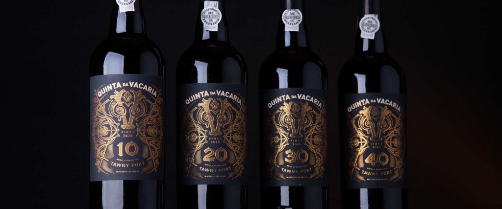
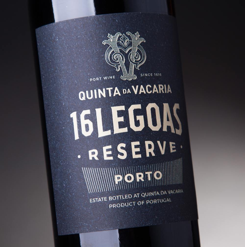
Quinta Da Vacaria Packaging Design

The packaging

Branding and packaging design agency RitaRivotti “wanted it to evoke the legacy of 400 years of history traveling the world with false identities.”

The design agency mentions:

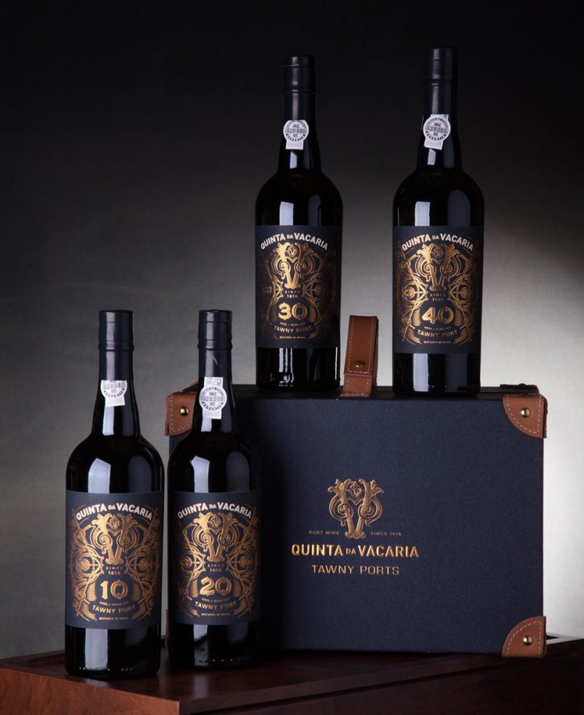
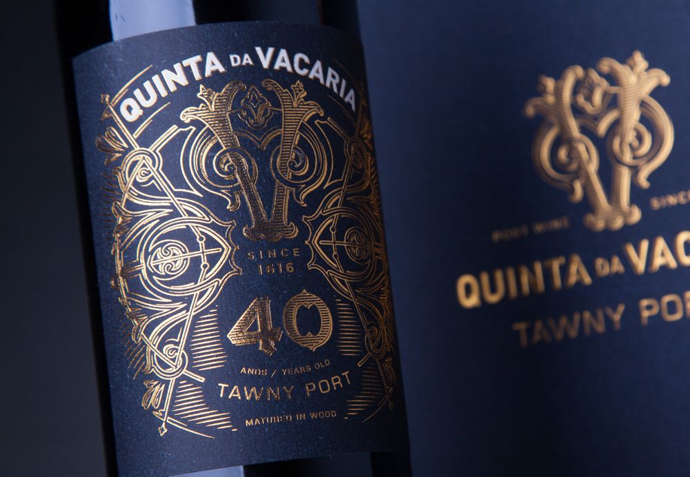
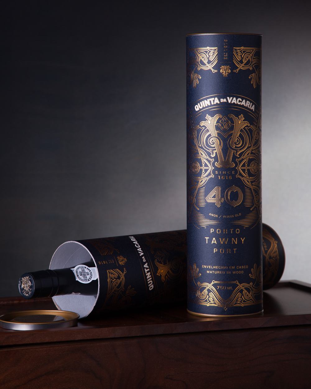
“Inspired by ancient maps, compasses, astrolabes and compass roses, we created a powerful V (for Vacaria) surrounded by highly detailed graphic elements, where the richness of gold contrasts with the texture of navy blue craft paper.

“The collection of four bottles of 10, 20, 30 and 40 years is carried in a case inspired by an old suitcase, in a clear allusion to its past and its traveller spirit.

Get the latest packaging design inspiration in your inbox:

Popular designs

Wanderers Vodka: A Blend of Nomadic Heritage and Modern Design

The spirit of freedom and adventure is encapsulated in the design of the Wanderers Vodka. Infused with steppe herbs, the complex flavor and unique aroma transport us straight to the vast plains of the Qazaqstan steppe, where nomad tribes traversed the land for thousands of years, shaping its history.

Mar de Anemonas – Underwater Aged Wine

Discover the unique packaging design of this underwater-aged wine, featuring a vintage label tied with a rope and a small book. Each bottle gains originality as marine life adheres to it during sea-bottom aging.

Designed by: PepsiCo Design & Innovation
Country: United States

Quinta Da Vacaria Packaging Design

packaging-design-qta-da-vacaria-porto

Designed by: RitaRivotti | Country: Portugal

Located on the banks of the River Douro, close to Régua city, and “in the heart of the oldest Demarcated Region in the world,” Quinta da Vacaria sits proudly as the “oldest property” in the area. The first registration of the farm dates back to 1616.

For four centuries, the wines produced at the farms of Quinta da Vacaria traveled the world “without anyone knowing their true origin.” The Rabelo boats took the wines from the farm to Gaia, “where they were sold in bulk to the whole world.”

“At the destination, the wine was bottled and labeled with the brand of the foreign traders who acquired it, and some of them gained considerable prestige as legitimate possessors of a quality that did not belong to them.

The new laws changed everything for farmers and owners. According to the law, farmers could keep one-third of the production. However, it was not until 2016 that port wines were allowed to be bottled at the origin.
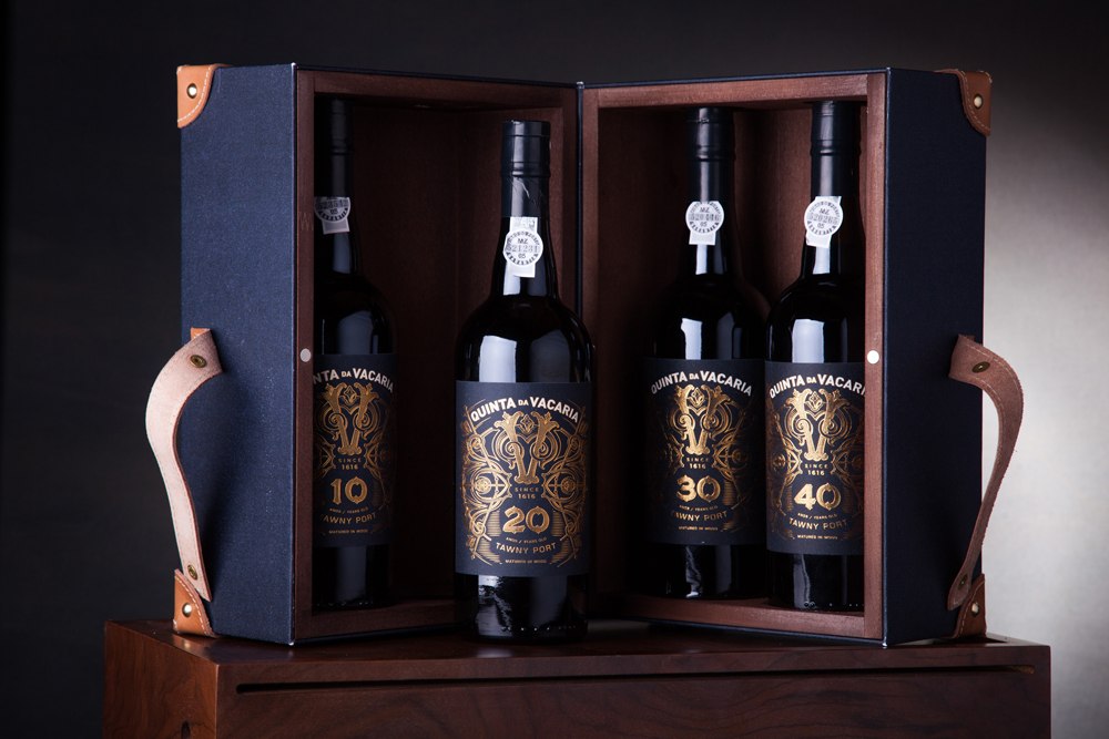
Quinta Da Vacaria Packaging Design

The packaging

Branding and packaging design agency RitaRivotti “wanted it to evoke the legacy of 400 years of history traveling the world with false identities.”

The design agency mentions:

“Inspired by ancient maps, compasses, astrolabes and compass roses, we created a powerful V (for Vacaria) surrounded by highly detailed graphic elements, where the richness of gold contrasts with the texture of navy blue craft paper.

“The collection of four bottles of 10, 20, 30 and 40 years is carried in a case inspired by an old suitcase, in a clear allusion to its past and its traveller spirit.

Previous slide
Next slide
Get the latest on packaging design in your inbox: