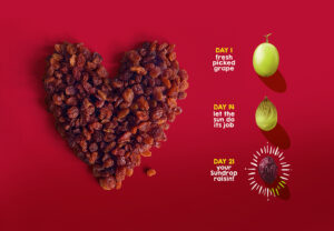
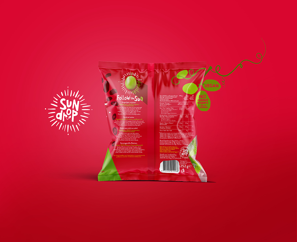
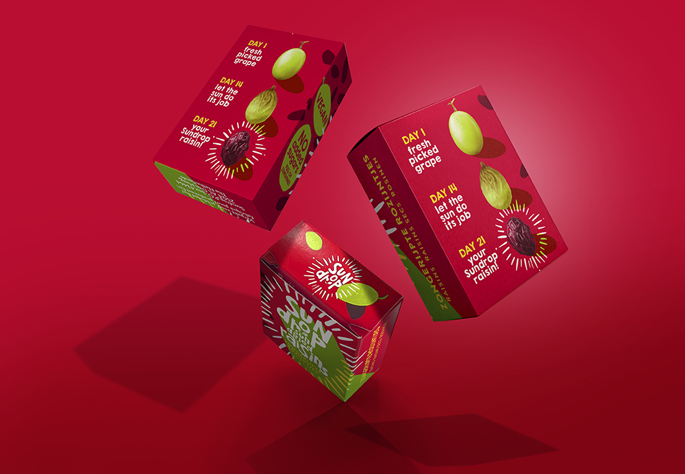
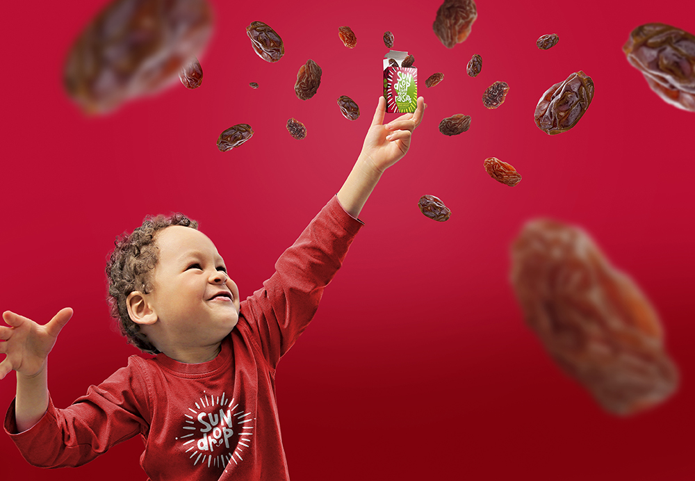
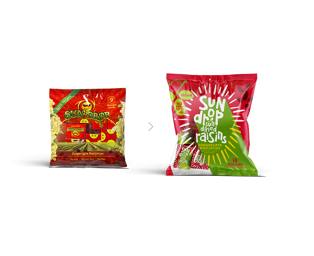
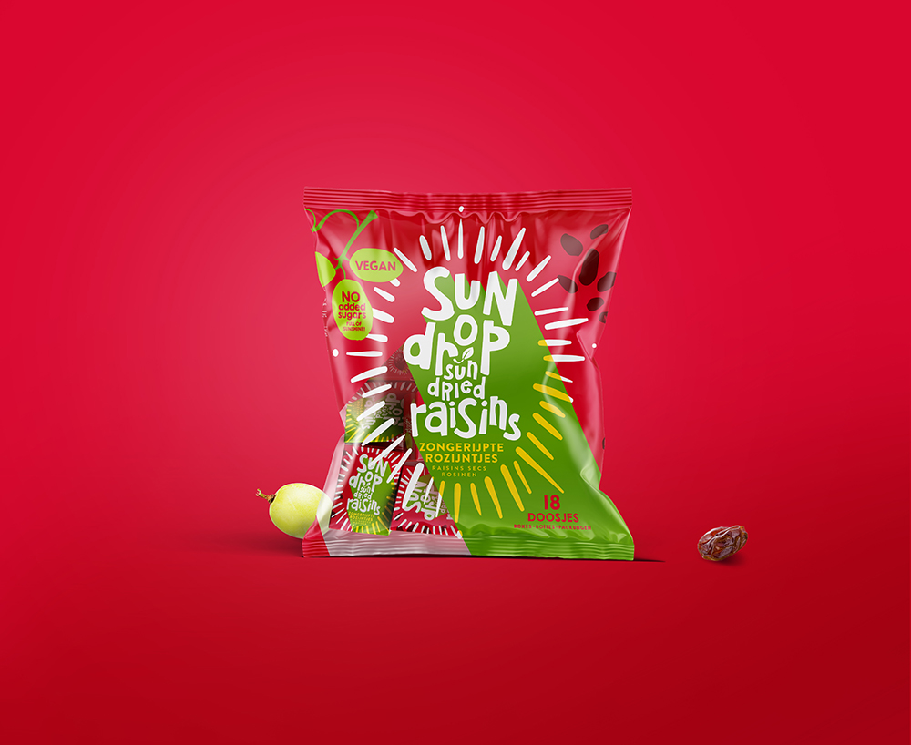
This concept by Joost Identities underlies the redesigned packaging for Sundrop Raisins. In this design, the grape acts as the central point of a sundial, symbolizing the magical transformation into a raisin as time and sun work their wonders. The iconic green and red color scheme has been preserved for its strong brand identity. The red not only highlights the vibrant green of a fresh grape but also enriches the deep tones of the raisin, making it even more enticing. This metamorphosis from grape to raisin is illustrated on our packages, adding an educational element that captivates children.
Designed by: PepsiCo Design & Innovation
Country: United States
Radiant Redesign of Sundrop Raisins Packaging
Get the latest packaging design inspiration in your inbox:
Popular designs
Designed by: PepsiCo Design & Innovation
Country: United States
Radiant Redesign of Sundrop Raisins Packaging
- by Christiaan Huynen
- 46069
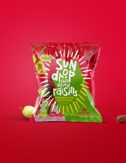
This concept by Joost Identities underlies the redesigned packaging for Sundrop Raisins. In this design, the grape acts as the central point of a sundial, symbolizing the magical transformation into a raisin as time and sun work their wonders. The iconic green and red color scheme has been preserved for its strong brand identity. The red not only highlights the vibrant green of a fresh grape but also enriches the deep tones of the raisin, making it even more enticing. This metamorphosis from grape to raisin is illustrated on our packages, adding an educational element that captivates children.
Explore more great package design
Get the latest on packaging design in your inbox:

