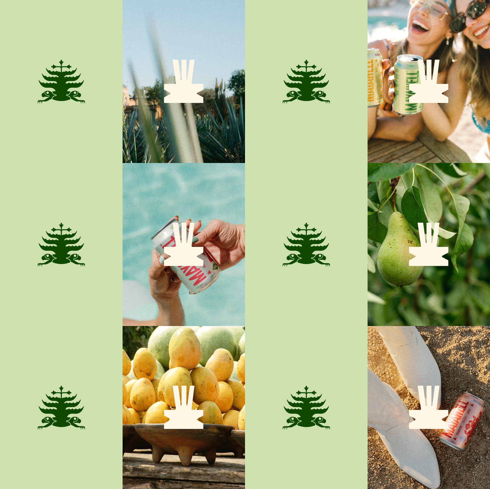


Mayawell, a proudly Mexican-owned, Austin-based beverage company, is making waves in the market not just with its unique prebiotic beverages but also with its innovative packaging design. More than just a soda, Mayawell is a tribute to Mexican heritage, a celebration of its culture, and a commitment to healthy living. It offers a refreshing and guilt-free alternative to traditional sodas.
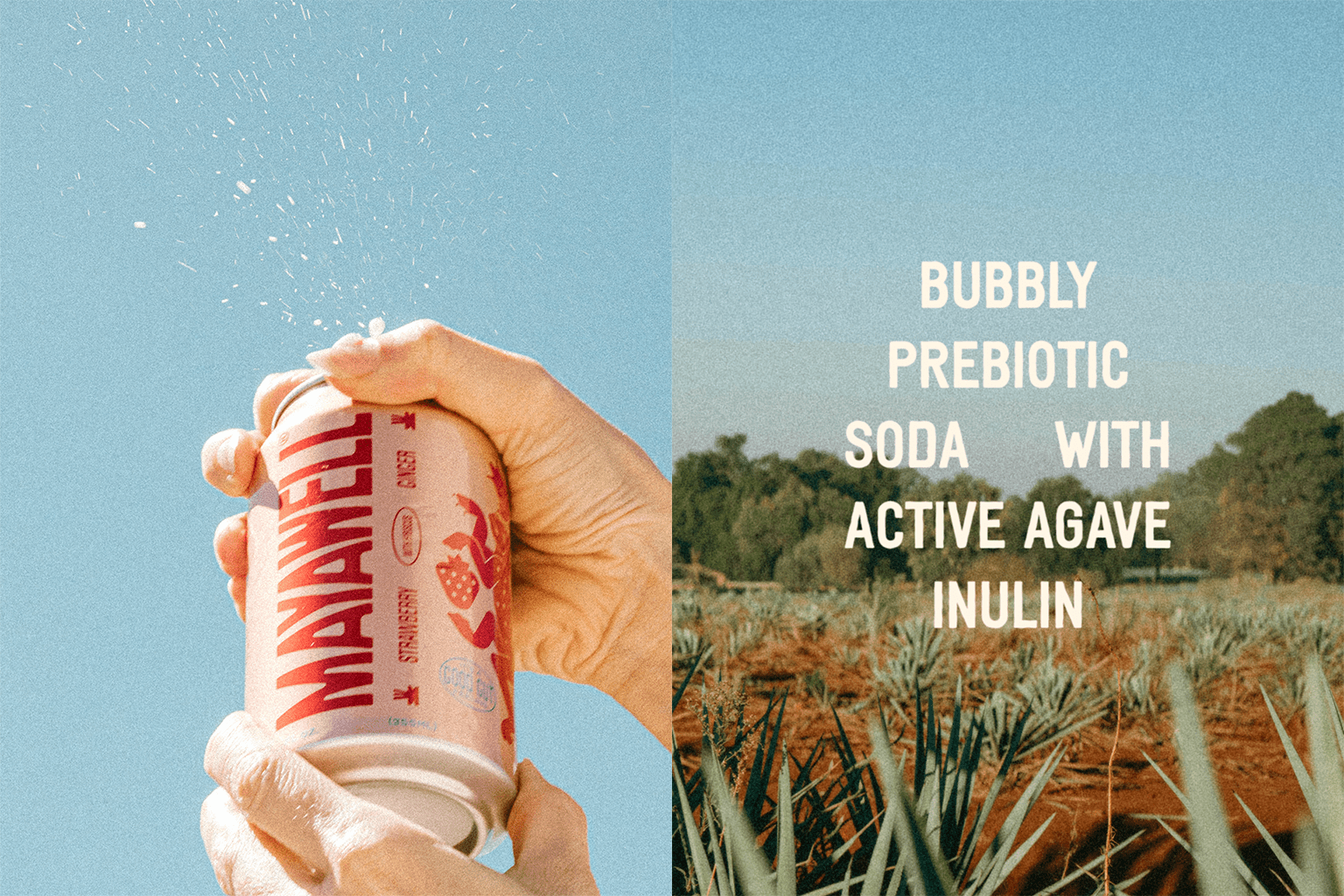
The company carefully crafts its beverages using sustainably sourced Active Agave™ inulin along with flavorful botanical ingredients to boost gut health. The end product is a crisp, refreshing drink that your taste buds — and your gut — will thank you for.
The primary aim of Mayawell’s rebranding was to showcase the Mexican identity behind the brand in an authentic and respectful manner. Striving for a balance that honors Mexican heritage without falling into clichés or appearing outdated was a key challenge. In a market crowded with competitors, the company needed its branding to be distinctive and memorable.
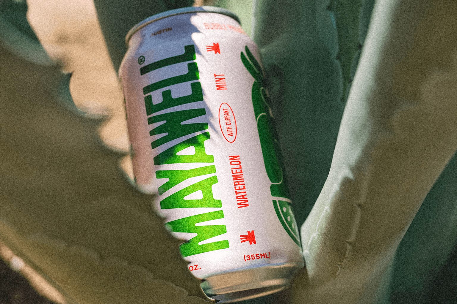
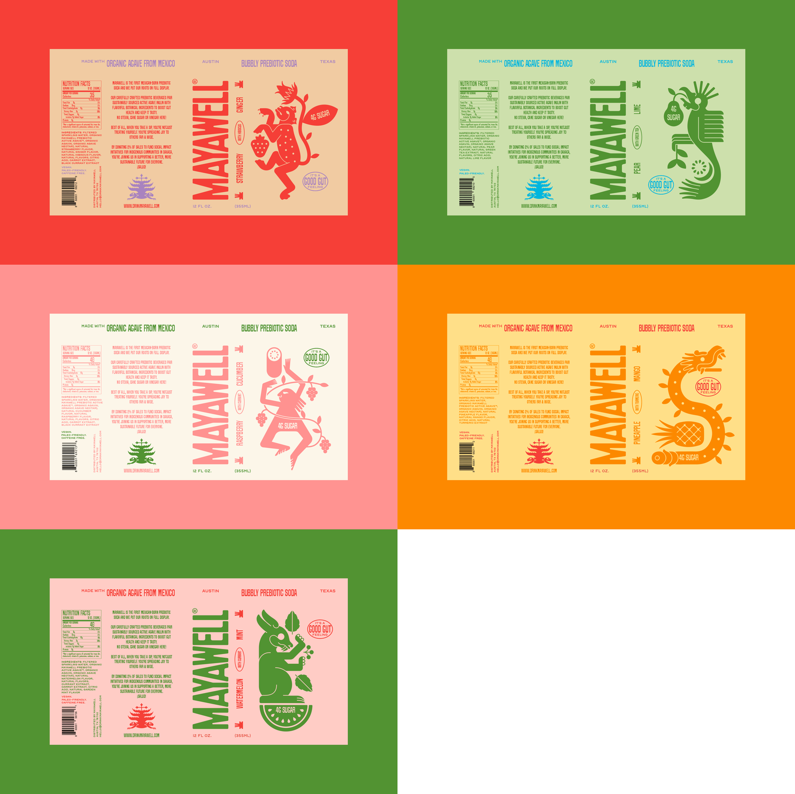
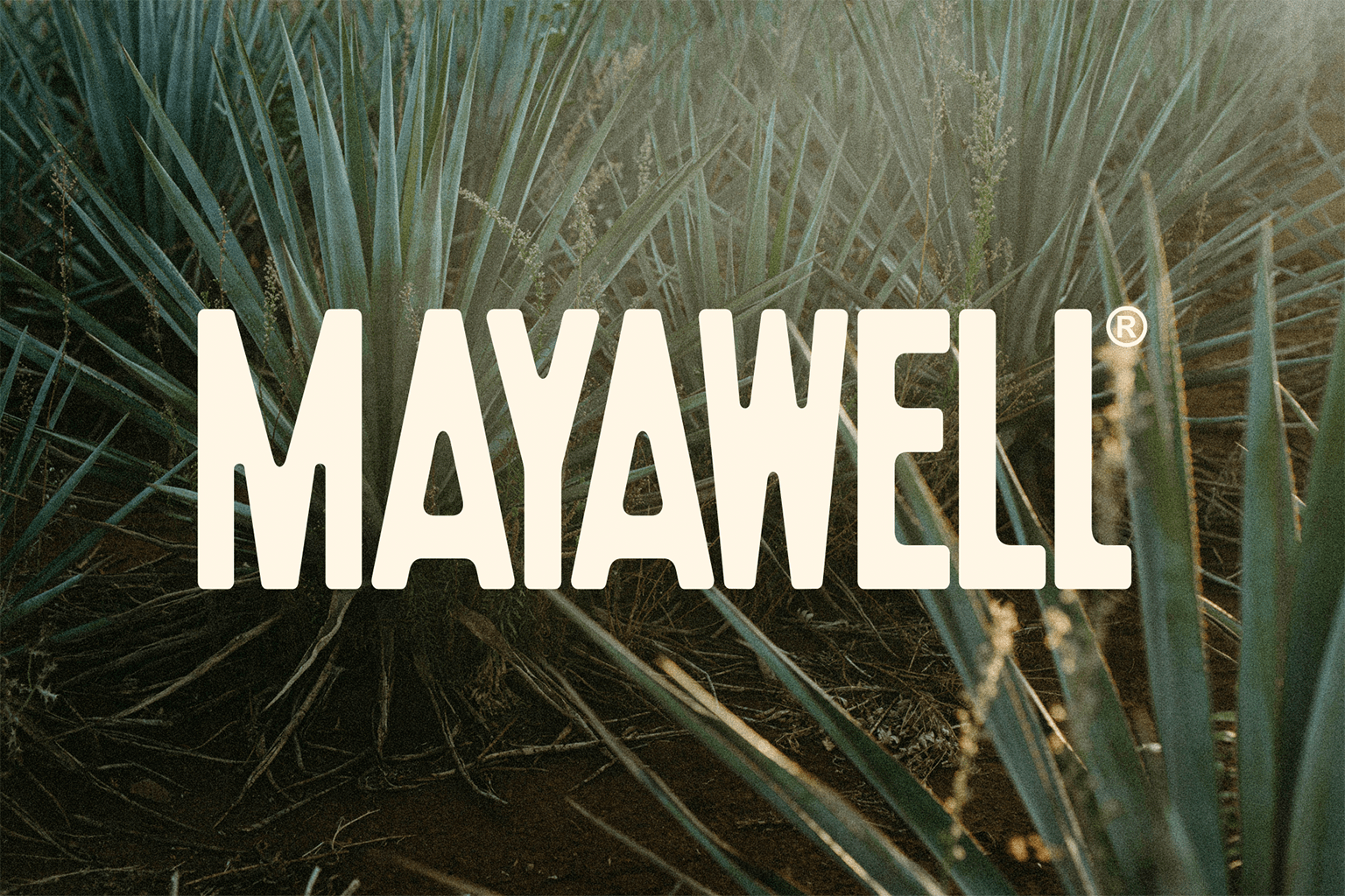
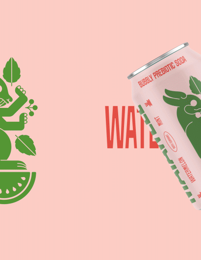
The rebranding strategy focused on reflecting the Mexican heritage behind the brand and its ingredients. The design team drew inspiration from mid-century fonts and prehispanic codices for illustration. They used a common type motif from across Mexico, where condensed fonts are used in tight rectangular compositions. This approach helped the brand name to stand out distinctly on the can.
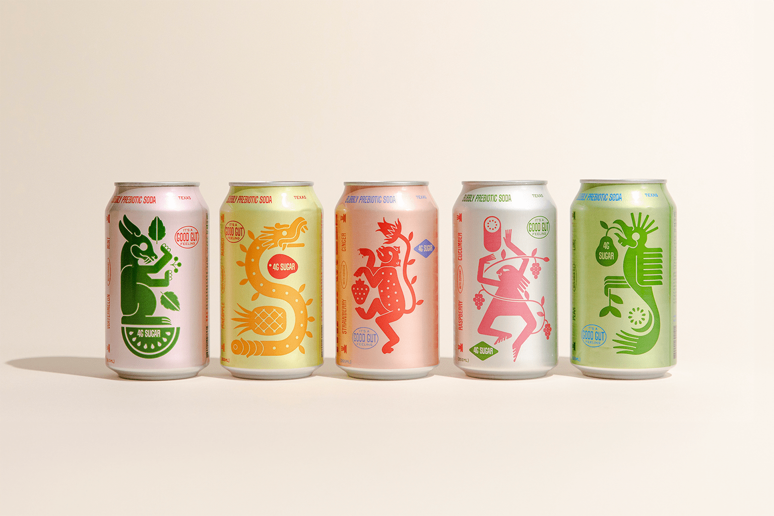
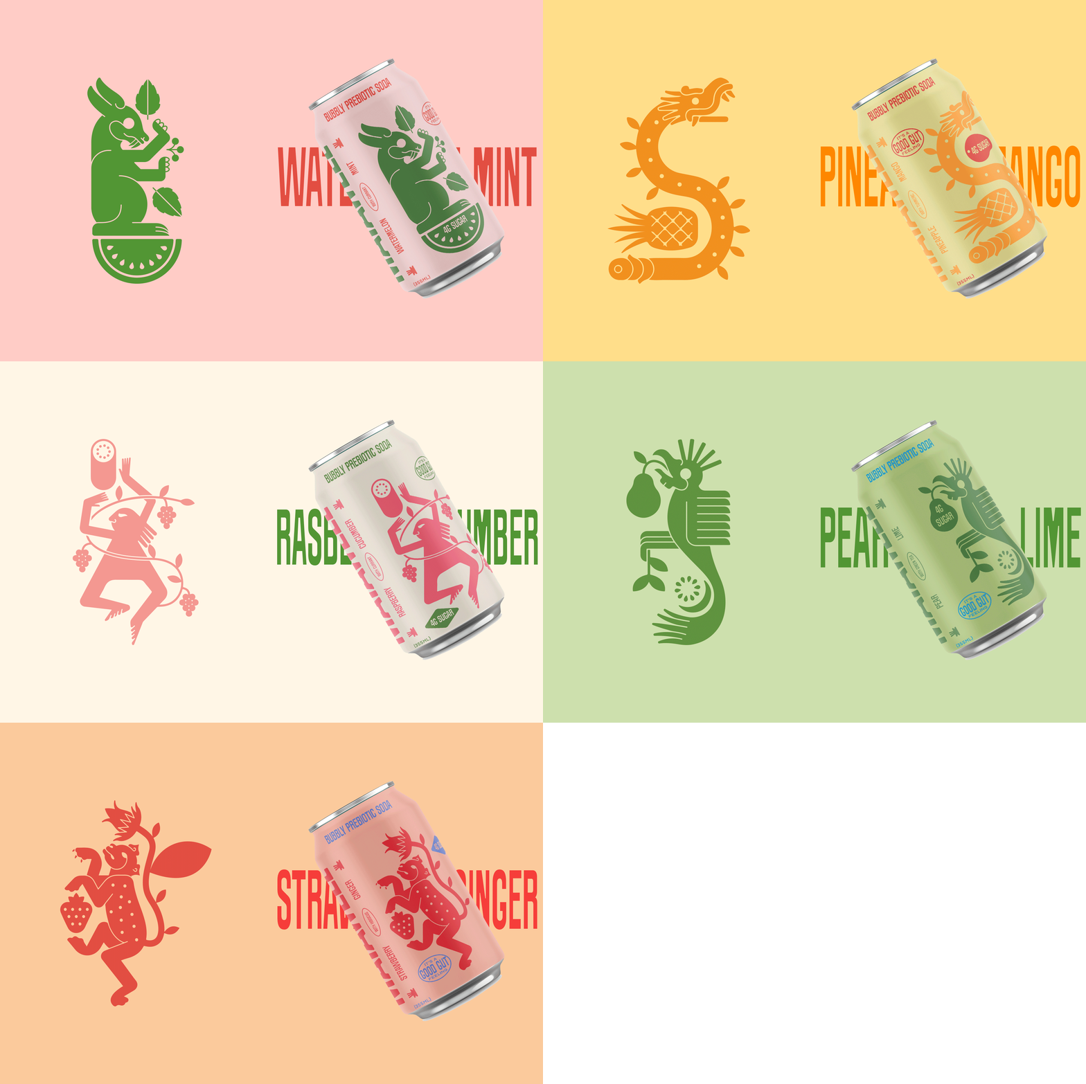
The team also created unique illustrations for each flavor, depicting classic prehispanic animals and elements paired with the flavors’ fruits. They were careful to ensure that the style was contemporary and visually inspired by the reference material, but not an exact replica.
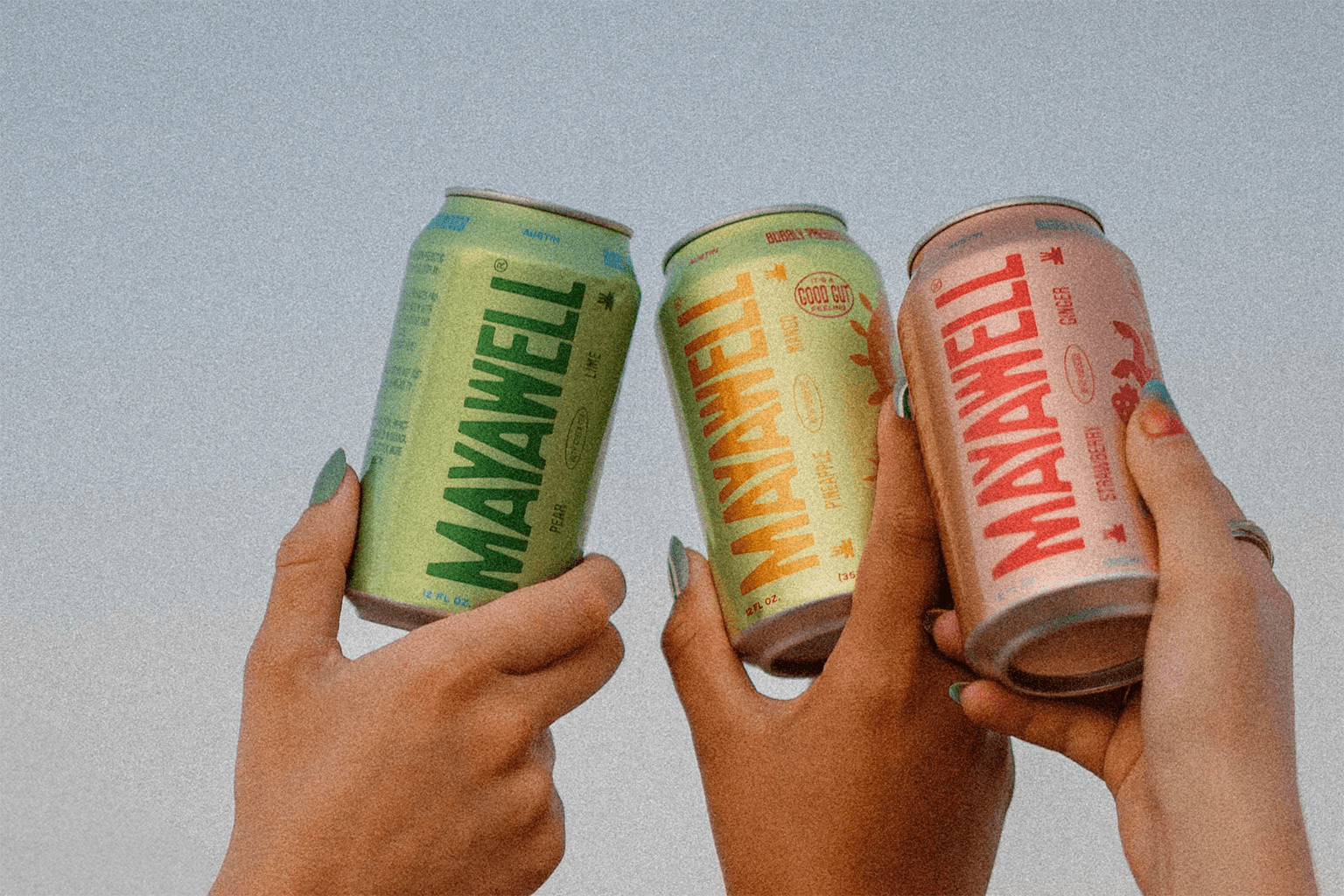
The result? A visually striking packaging design that communicates both the health benefits and the delightful experience behind Mayawell’s products. 