Designed by: PepsiCo Design & Innovation
Country: United States

Recession Bites

recession2

Designed by FRESHTHRILLS | Country: United States

“It’s an annual tradition, which began long, long ago: The spread of holiday cheer to everyone you know. A celebration, if you will, of a good year that’s past and the hopes for an even better one to come. But this year we found ourselves wondering how we could spread holiday cheer during a time when cheer was in short supply. This was the year where it seemed like bad news was everywhere; Unemployment hit an almost all-time high, and morale, an all-time low. Advertising spending went down, unemployment benefits, up. We knew it was bad when even the president admitted that not only were we approaching a recession, but we were deep smack in the middle of one. ‘This bites!’ a voice yelled.

And from there…an idea was born.”

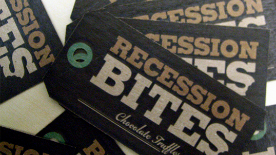
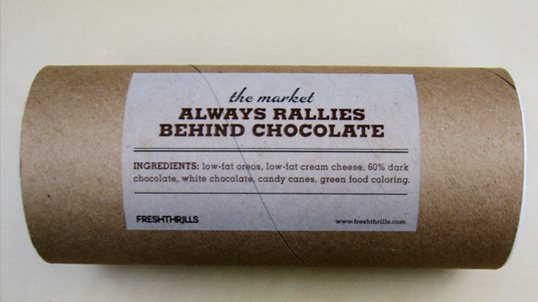
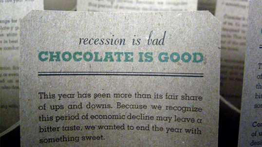
We drew our creative inspiration from the depression era. For typography, we wanted to evoke a no frills, tough times feeling, and after reviewing a few options we decided on a typeface called Memphis as the primary font for the identity. Memphis is a classic Slabserif designed in 1930 by Rudolf Wolf.

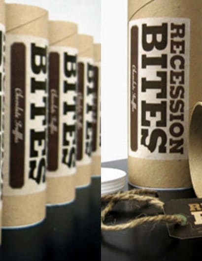
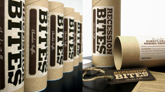
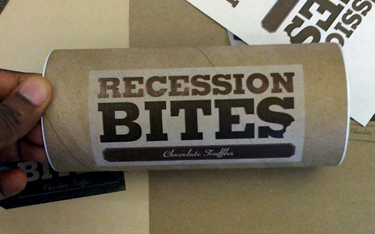
Graphically, we drew our inspiration from the age-old newspaper headline design, with the use of double ruled lines and justified text. For packaging, we stayed true to our ‘no-frills’ concept, using leftover assets from previous projects. Thus, the Recession Bites “brand” was established.

We tasked our copywriter with creating a language that acknowledged the difficulties of the past year, yet showed our upbeat and playful mentality towards the future.  Poking fun at both recession era language and recent events, we created copy that matched the aesthetic look of our design with tongue-in-cheek wordplay.

From the start we felt that it was important to find a way to reduce waste, but as with any print project, we printed dozens of designs, most of which were printed and discarded. When it came time to pack and ship our Recession Bites, rather than create more waste we shredded the rejected designs, and thus got our packing material.Not only did this add a great finishing touch to the Recession Bites concept, it also helped to make it our greenest project to date, something we hope to continue to do for the future.

Oh yes, the ‘bites.’, Chocolate truffles made fresh by our team. Consisting of an Oreo center and covered with dark chocolate, they were topped with a green icing made from white chocolate and candy canes.”
recession11

recession3

recession4

recession5

Get the latest packaging design inspiration in your inbox:

Popular designs

Innovative Design and Packaging of Teeling Whiskey Crystal Malt

Explore the innovative packaging design of Teeling Whiskey Crystal Malt. A dark screen printed bottle with a Marque™ aluminum label, textural dimension, and a seamless diamond pattern, embodies the brand’s commitment to unconventional expressions.

D’eyras – Medrono & Olive Oil

What connects D´EYRAS, Medronho, and Olive Oil? They all hail from the same country: Portugal. These trees are indigenous to the region, serving as a testament to the bountiful and diverse Mediterranean flora.

Designed by: PepsiCo Design & Innovation
Country: United States

Recession Bites

recession2

recession2

Designed by FRESHTHRILLS | Country: United States

“It’s an annual tradition, which began long, long ago: The spread of holiday cheer to everyone you know. A celebration, if you will, of a good year that’s past and the hopes for an even better one to come. But this year we found ourselves wondering how we could spread holiday cheer during a time when cheer was in short supply. This was the year where it seemed like bad news was everywhere; Unemployment hit an almost all-time high, and morale, an all-time low. Advertising spending went down, unemployment benefits, up. We knew it was bad when even the president admitted that not only were we approaching a recession, but we were deep smack in the middle of one. ‘This bites!’ a voice yelled.

And from there…an idea was born.”

We drew our creative inspiration from the depression era. For typography, we wanted to evoke a no frills, tough times feeling, and after reviewing a few options we decided on a typeface called Memphis as the primary font for the identity. Memphis is a classic Slabserif designed in 1930 by Rudolf Wolf.

Graphically, we drew our inspiration from the age-old newspaper headline design, with the use of double ruled lines and justified text. For packaging, we stayed true to our ‘no-frills’ concept, using leftover assets from previous projects. Thus, the Recession Bites “brand” was established.

We tasked our copywriter with creating a language that acknowledged the difficulties of the past year, yet showed our upbeat and playful mentality towards the future.  Poking fun at both recession era language and recent events, we created copy that matched the aesthetic look of our design with tongue-in-cheek wordplay.

From the start we felt that it was important to find a way to reduce waste, but as with any print project, we printed dozens of designs, most of which were printed and discarded. When it came time to pack and ship our Recession Bites, rather than create more waste we shredded the rejected designs, and thus got our packing material.Not only did this add a great finishing touch to the Recession Bites concept, it also helped to make it our greenest project to date, something we hope to continue to do for the future.

Oh yes, the ‘bites.’, Chocolate truffles made fresh by our team. Consisting of an Oreo center and covered with dark chocolate, they were topped with a green icing made from white chocolate and candy canes.”
recession11

recession3

recession4

recession5

Previous slide
Next slide
Get the latest on packaging design in your inbox: