AGENCY: Studio Boam
Creative director: Alexandre Arzuman
Creative director: Andy Migevant
Graphic designer: Lucie Thomas
COUNTRY: France
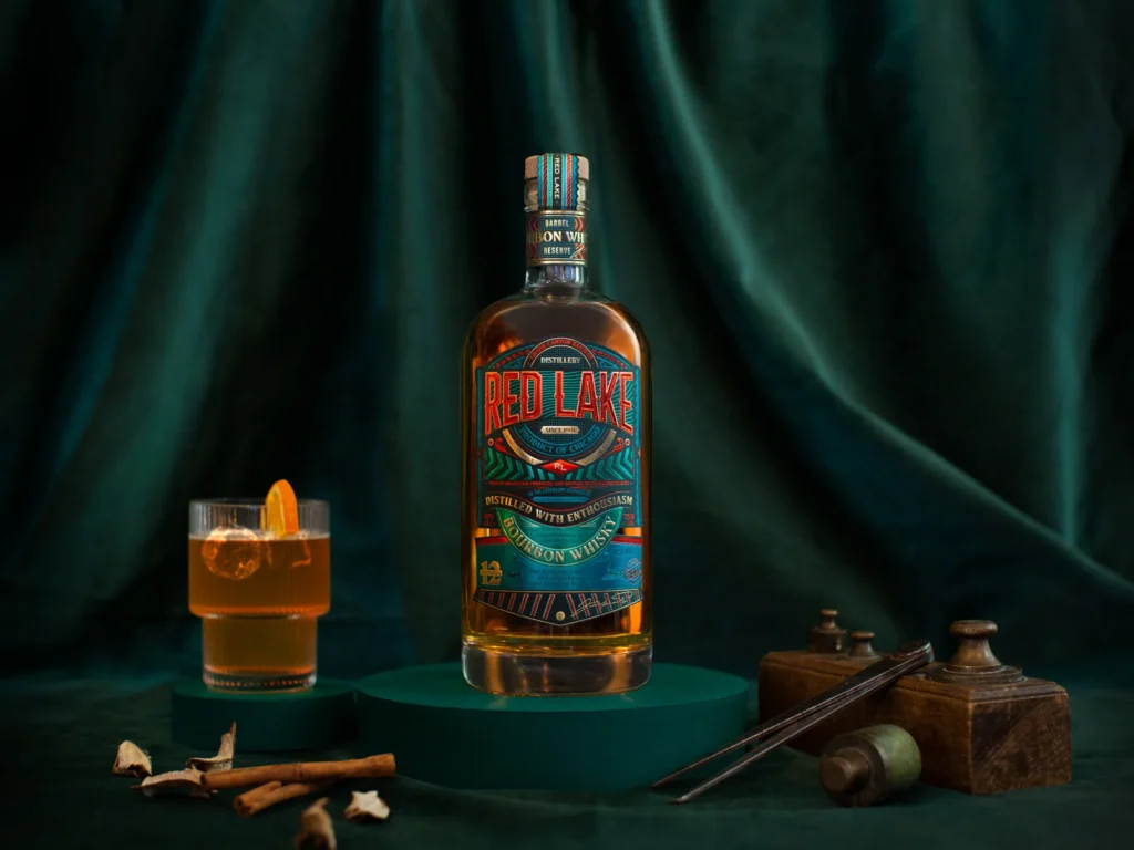
Red Lake whiskey, a creation by Studio Boam, represents a harmonious blend of classic American whiskey aesthetics and a symbolic homage to the late 19th-century Industrial Revolution in the United States.
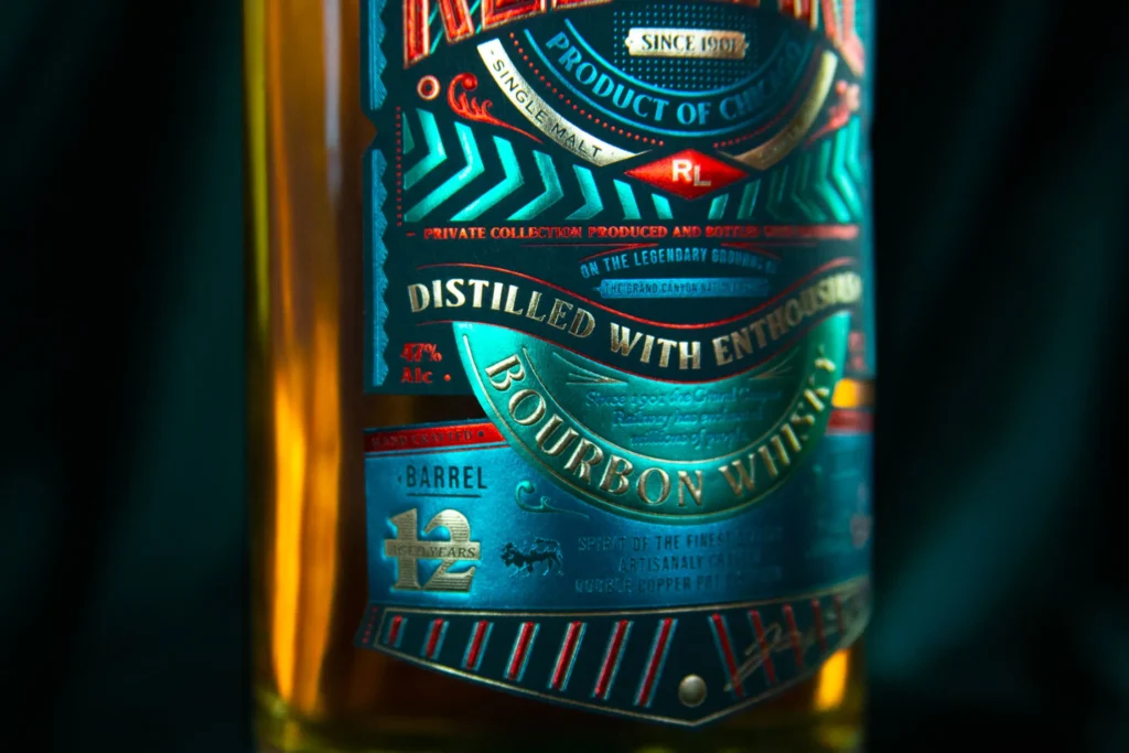
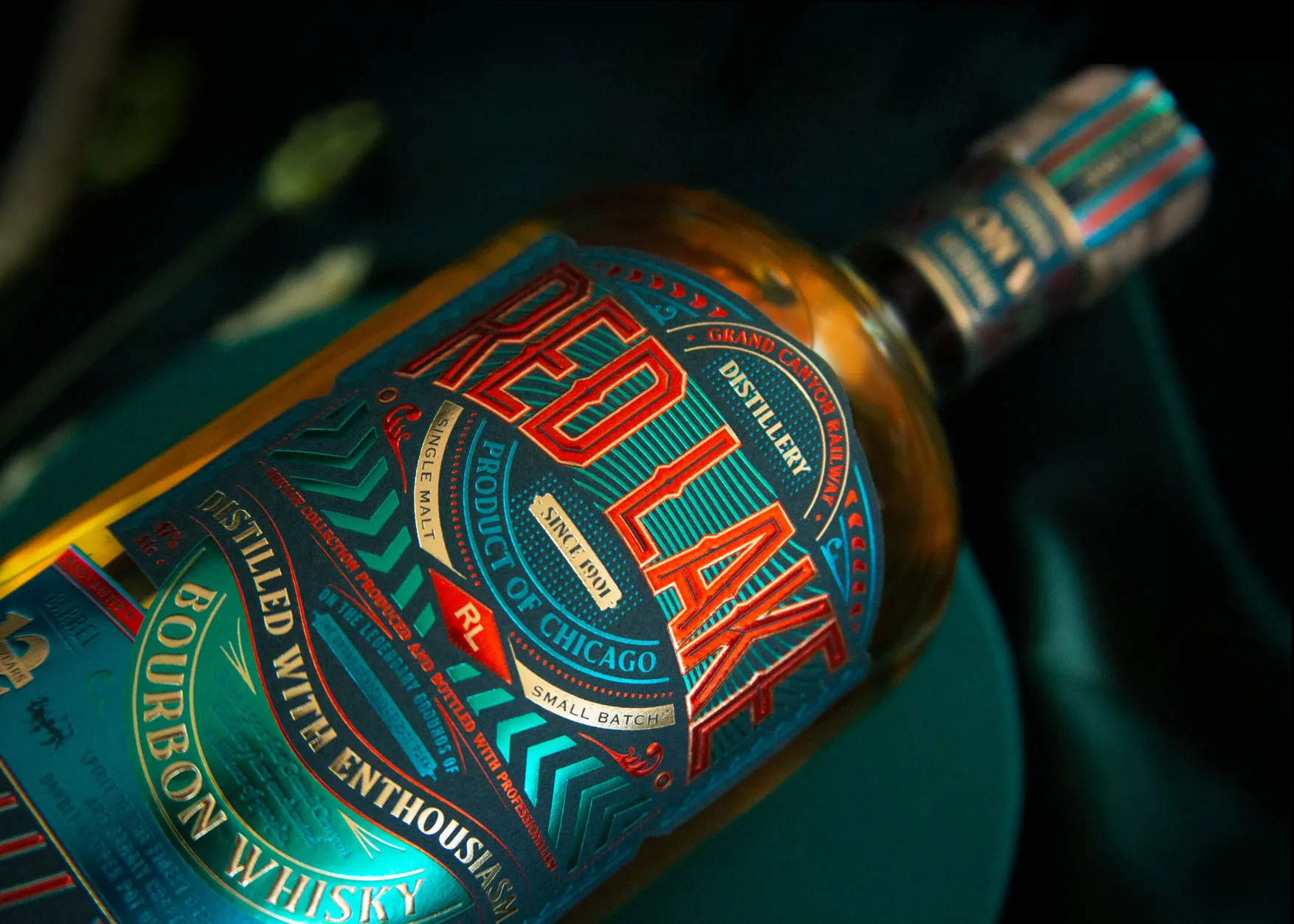
In history, Red Lake held a crucial role as a key stopover along the Grand Canyon Railway, renowned for its luxurious transportation during that era. The locomotive, an emblem of significant technological progress, now takes center stage in Red Lake’s branding, discreetly gracing its bottle label. This nod to speed beckons us to embark on an exploratory journey. The design transports us to a vibrant and festive era, with a dynamic label drawing inspiration from the kinetic energy of moving objects and the artistic flair of Futurism.
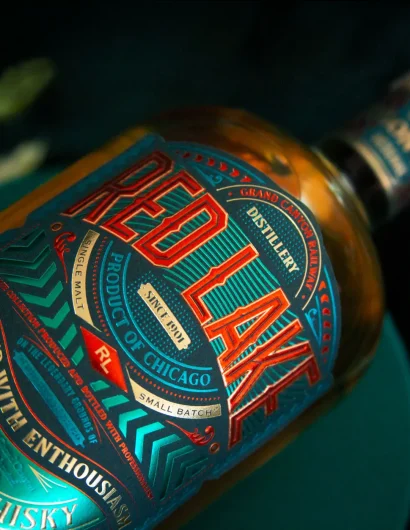
The label’s arrangement evokes the image of a dazzling casino facade along Las Vegas Boulevard, radiating an enchanting allure. The repetition of lines and luminous bands captivates the viewer’s gaze, directing it towards the textual elements and the multitude of intricate design details.
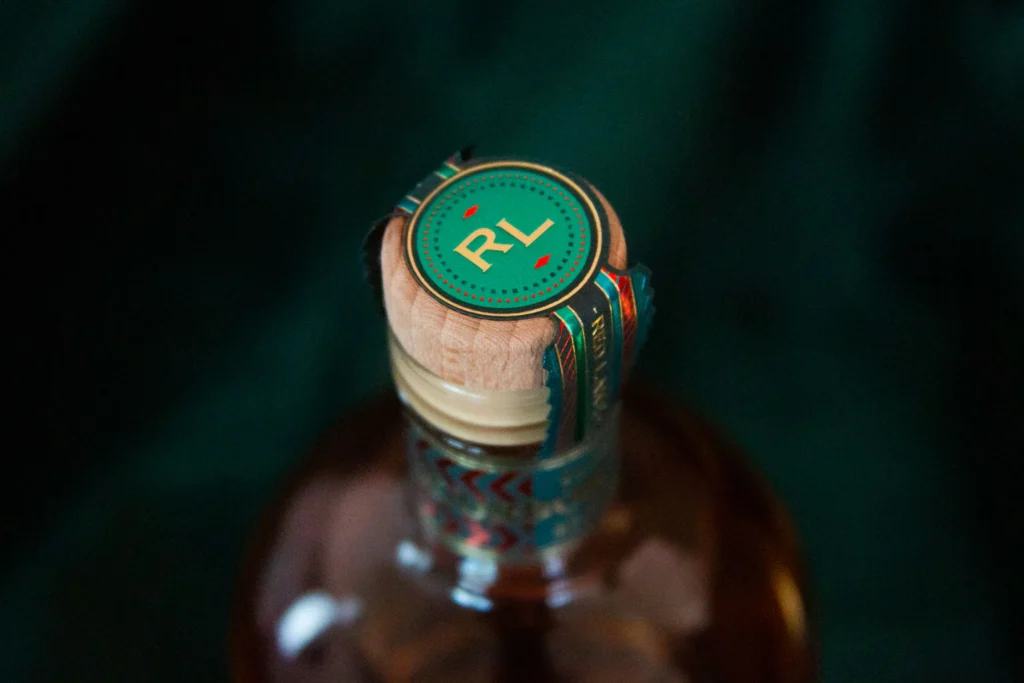
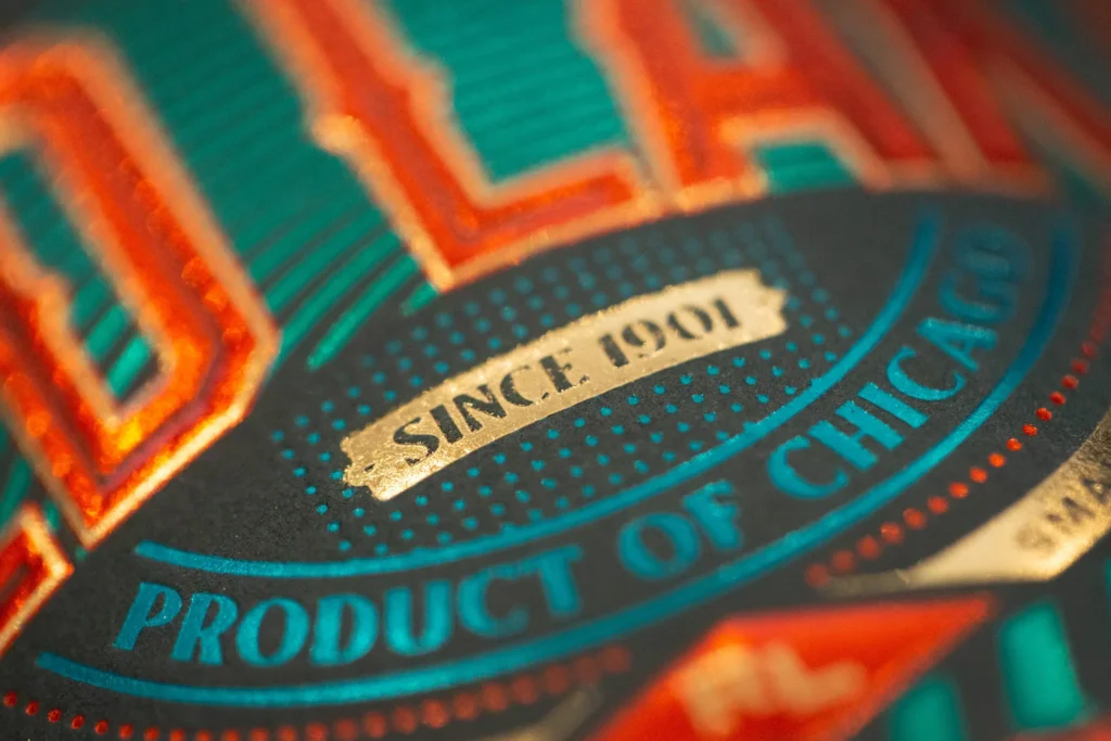
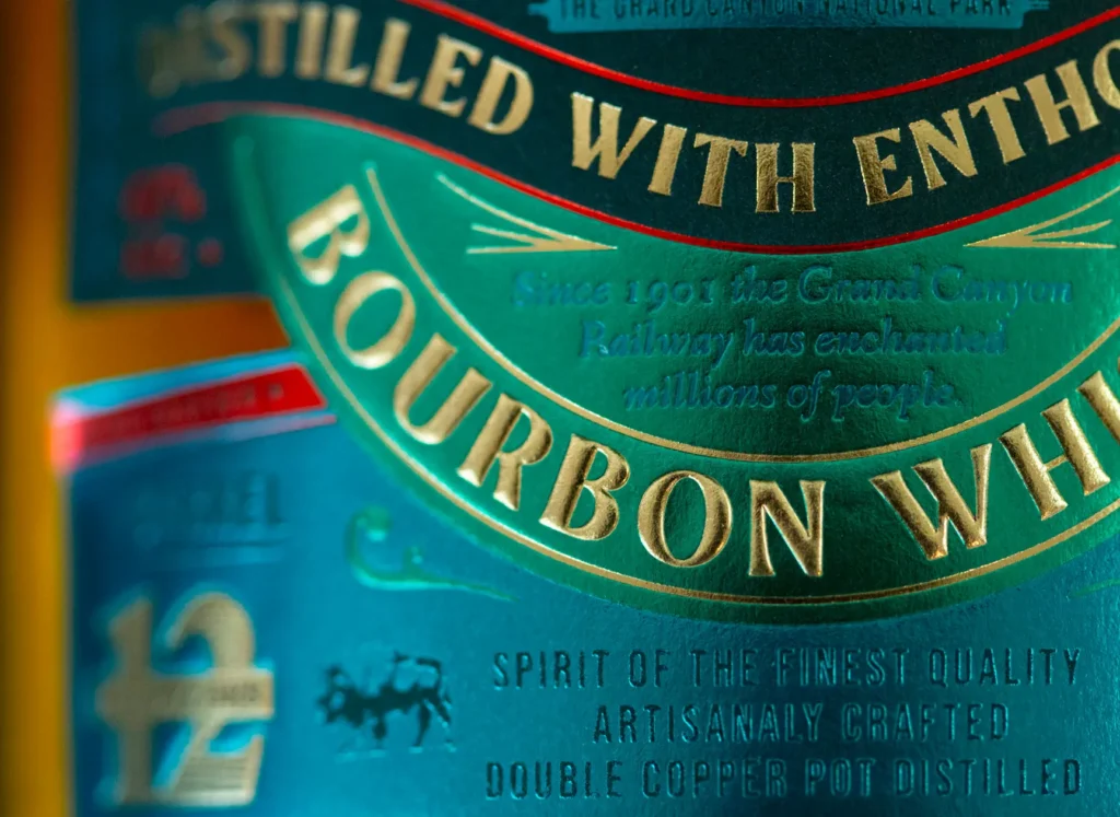
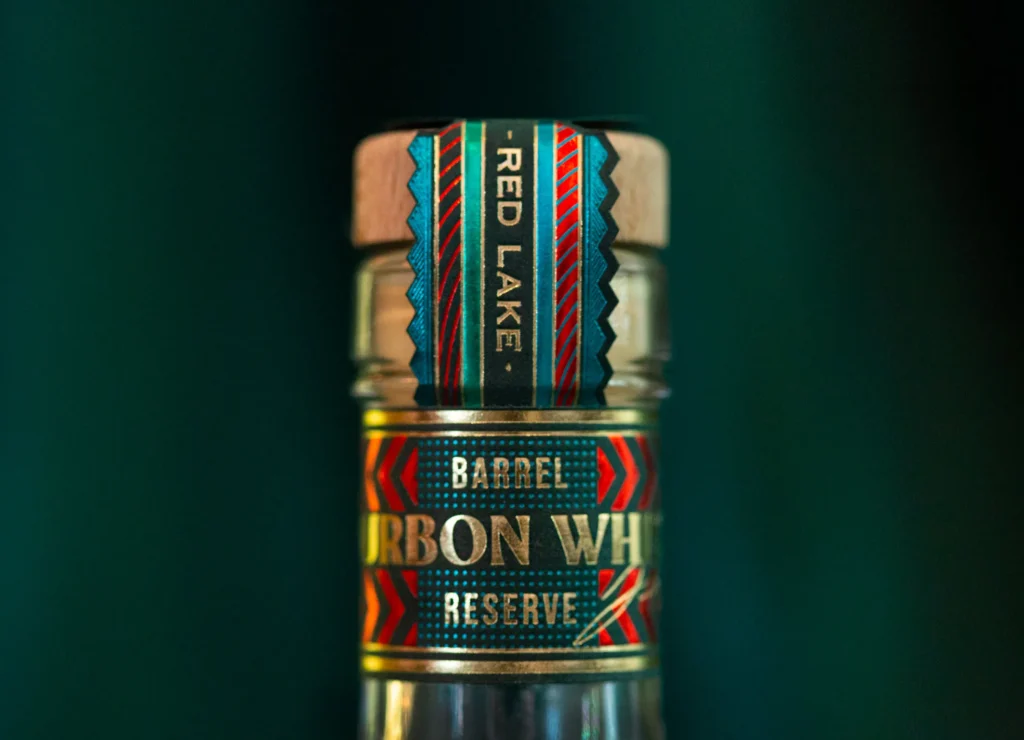
The addition of gilding and colored metallization disrupts the conventional expectations associated with a drink often pigeonholed in the realm of Wild West cowboys.
Red Lake reimagines the conventional and somewhat stagnant perception of the American Wild West. It introduces a lively and exuberant packaging, symbolizing the excitement of emerging technologies, effectively countering the dusty and masculine typography of the past.

