Designed by: PepsiCo Design & Innovation
Country: United States

Red Lake Whiskey Packaging Design

Designed by: Studio Boam | Country: US

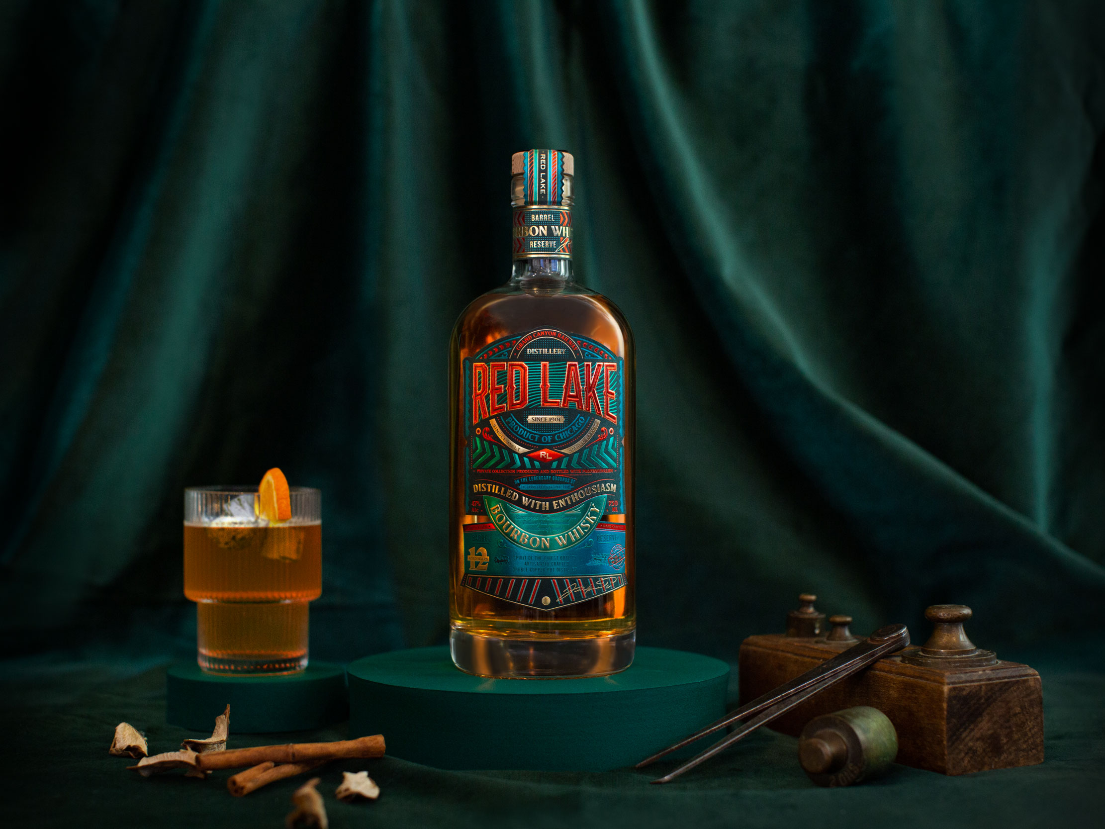
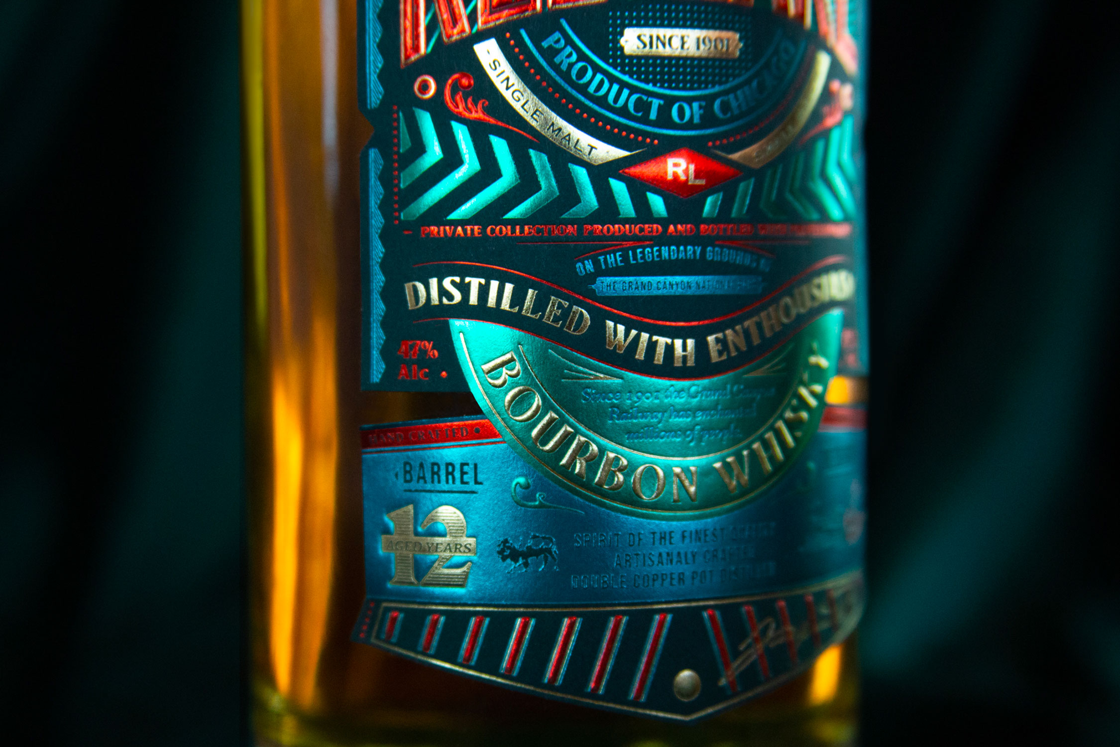
The Grand Canyon Railway originally ran between the town of Williams and Grand Canyon National Park. Red Lake was a stopover between the town and National Park. Inspired by the history of the American railway, the packaging of Red Lake whiskey was designed.

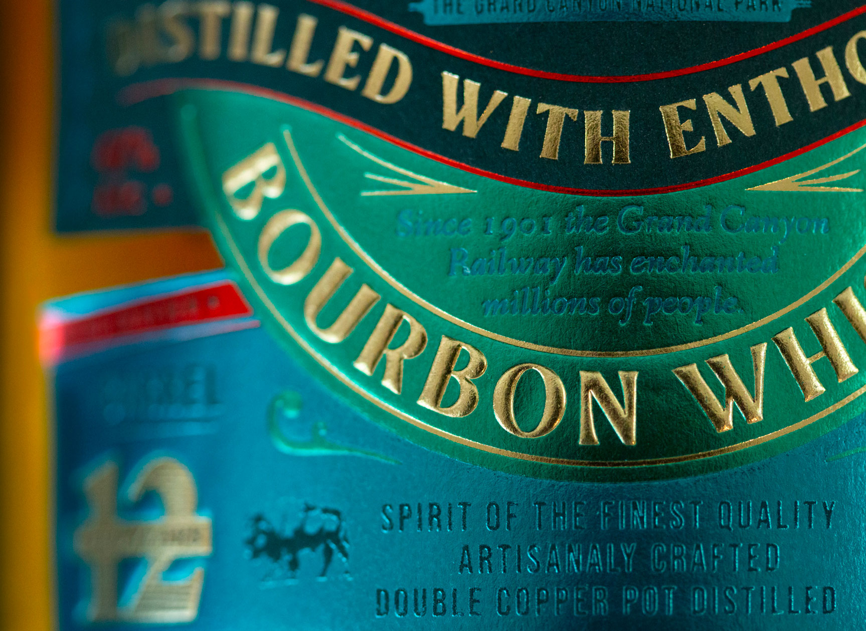
The locomotive, a historic symbol of major technological evolution, is now the emblem of the new Red Lake reference product, with its discreet appearance on the bottle labeling. This nod to speed acts as an invitation to travel and discovery. The world evoked by this design carries us away to a place and a time with a vibrant, colorful and festive atmosphere, with a dynamic label design that refers to the dynamism of a moving object and to the artistic movement of Futurism.”  
Red Lake Whiskey Packaging Design

The packaging

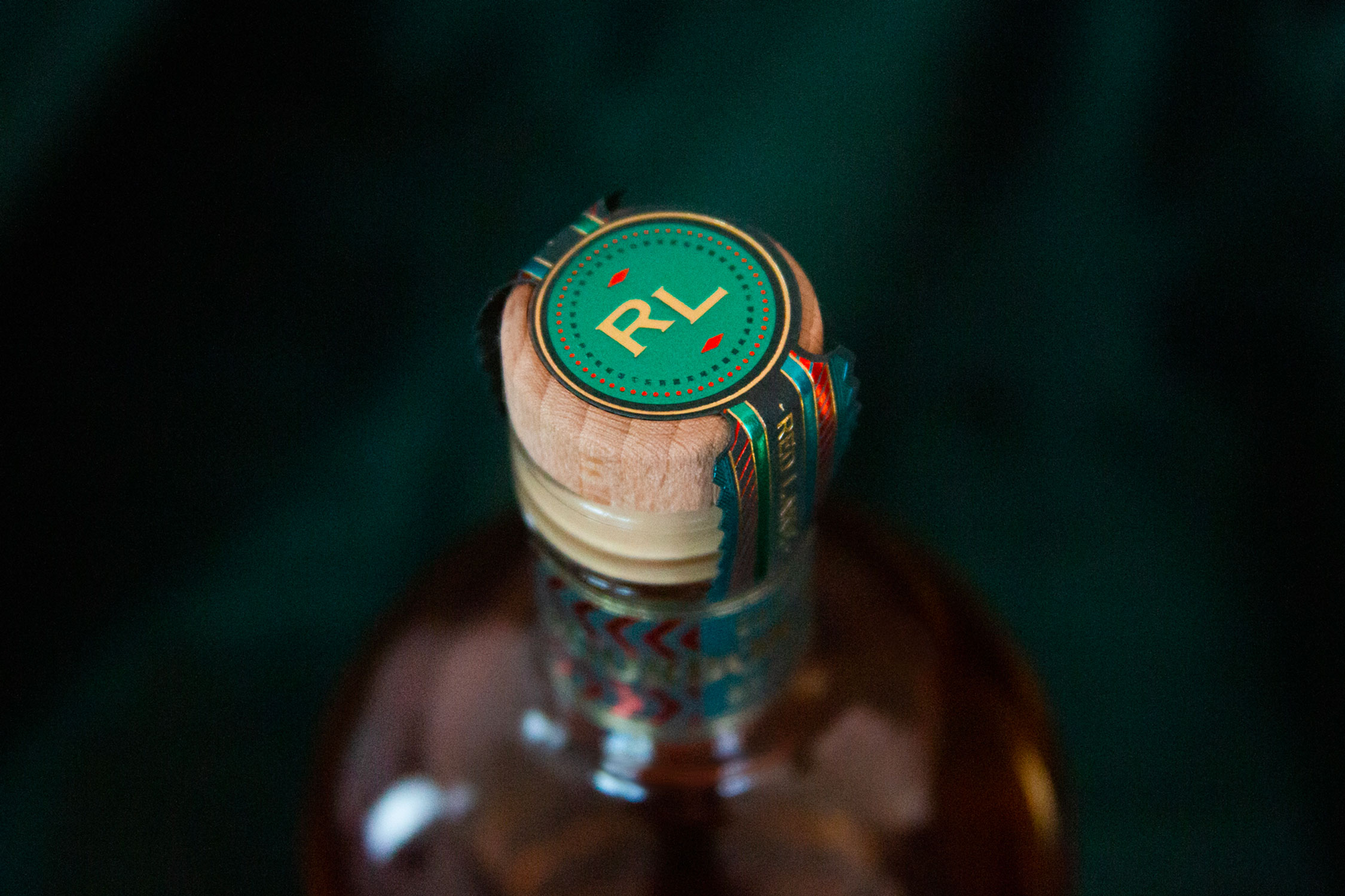
Red Lake partnered with Studio Boam, a Paris-based ad agency, to create packaging designs focused on highlighting the “world of the Wild-West cowboy.” The design studio created illustrations that reinterpret the “static vision of a dusty American Far West.”

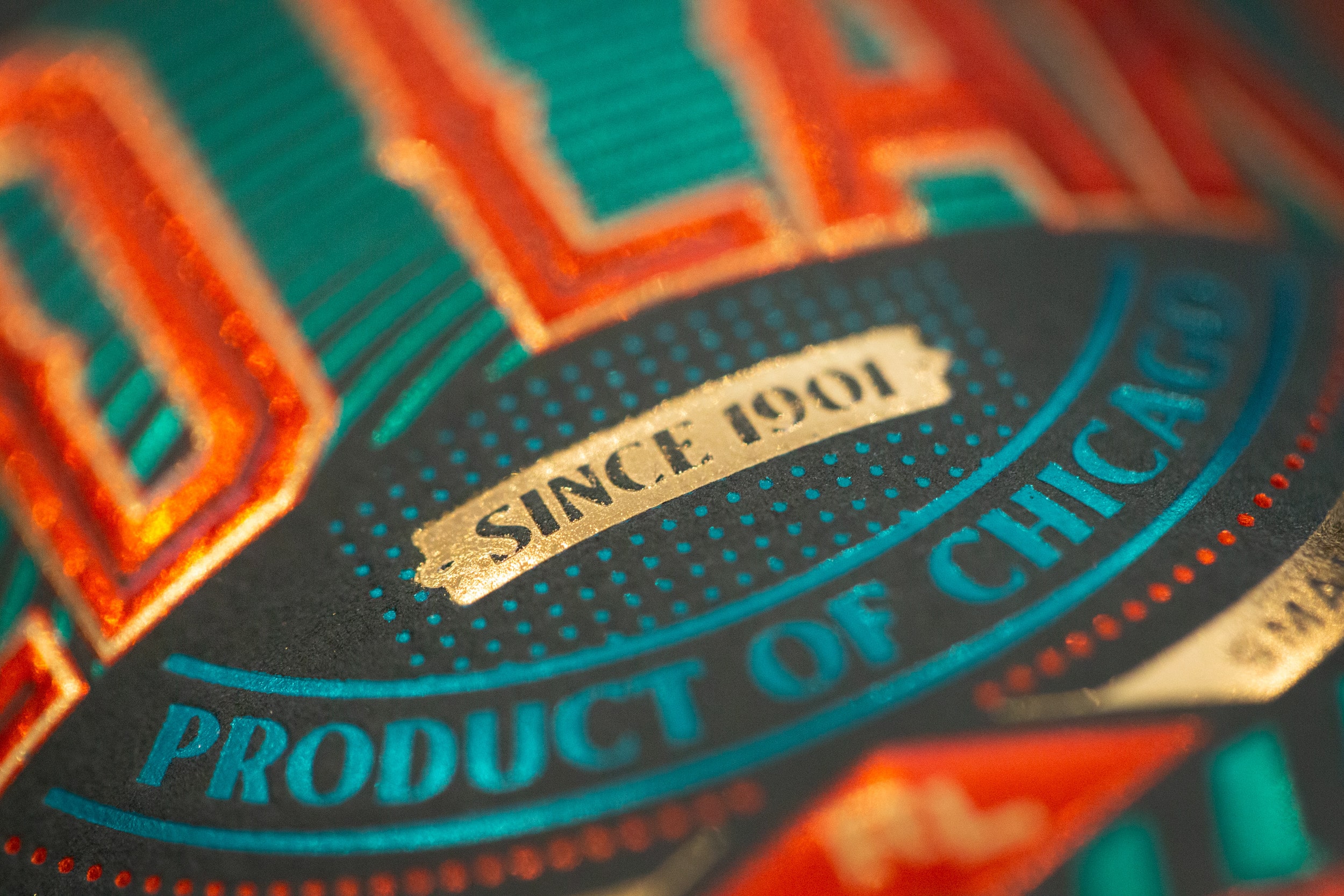
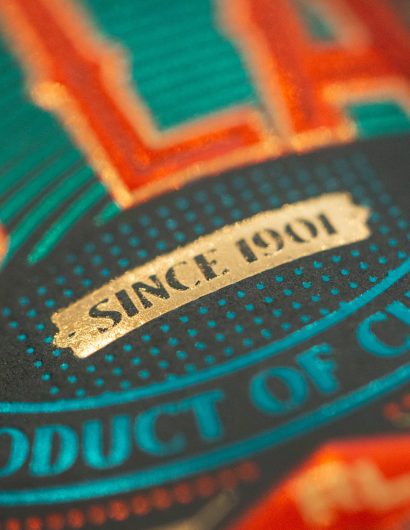
The composition of the label’s sub-spaces evokes a casino storefront on a Las Vegas Boulevard, luminous and hypnotic. The repetition of lines and almost luminous bands appeal to the consumer’s eye and directs the gaze towards the text areas and the multiple details and finishes of the design.

Get the latest packaging design inspiration in your inbox:

Popular designs

The Port Vodka Lemon Water

Overview: In response to my client’s vision for a Cape Cod themed beverage brand, I embarked on the journey to create The Port

Far Out Bar

Description: Far Out Bar is a cutting-edge packaging design project created for High Life Farms’ macrodose THC chocolate bars. This project involved

Designed by: PepsiCo Design & Innovation
Country: United States

Red Lake Whiskey Packaging Design

Red lake 6

Designed by: Studio Boam | Country: US

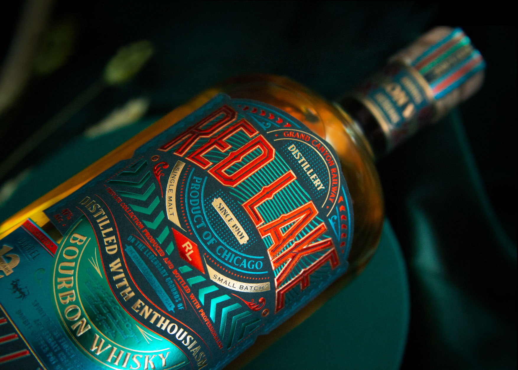
The Grand Canyon Railway originally ran between the town of Williams and Grand Canyon National Park. Red Lake was a stopover between the town and National Park. Inspired by the history of the American railway, the packaging of Red Lake whiskey was designed.

The locomotive, a historic symbol of major technological evolution, is now the emblem of the new Red Lake reference product, with its discreet appearance on the bottle labeling. This nod to speed acts as an invitation to travel and discovery. The world evoked by this design carries us away to a place and a time with a vibrant, colorful and festive atmosphere, with a dynamic label design that refers to the dynamism of a moving object and to the artistic movement of Futurism.”  
Red Lake Whiskey Packaging Design

The packaging

Red Lake partnered with Studio Boam, a Paris-based ad agency, to create packaging designs focused on highlighting the “world of the Wild-West cowboy.” The design studio created illustrations that reinterpret the “static vision of a dusty American Far West.”

The composition of the label’s sub-spaces evokes a casino storefront on a Las Vegas Boulevard, luminous and hypnotic. The repetition of lines and almost luminous bands appeal to the consumer’s eye and directs the gaze towards the text areas and the multiple details and finishes of the design.

Previous slide
Next slide

Explore more great package design

Get the latest on packaging design in your inbox: