Designed by: PepsiCo Design & Innovation
Country: United States

Regal Rogue

Regal Rogue

Designed by Squad Ink | Country: Australia

“Regal Rogue is the first native Australian aromatic vermouth in the market.

Squad Ink was brought into the mix to create the brand identity, packaging and launch material for this innovative small batch vermouth. Vermouth is mostly a European tradition. Regal Rogue turns this upside down with a daring blend of native aromatics to flavour fortified Hunter Valley Semillon (Australian wine region) with bush lemons, finger limes, vanilla, basil and thyme: a new world vermouth that is thoroughly Australian.”

Regal Rogue

“Fact: Vermouth is the most overlooked and misunderstood drink around.

Our job: To make vermouth cool again while creating an attractive package for this brilliant drop of fortified aromatic wine at the same time as educating and exciting the consumer.”

Regal Rogue

“We knew that the handcrafted nature of this small batch vermouth was a key selling point, and more than that: its unique flavour. How can we let the world know just how good this drink is and how do we bring to light the story of the first native Australian vermouth?”

The Regal Rogue brand has received an amazing response, rejuvenating a dusty alcohol category with a fresh and innovative approach.”

Regal Rogue

Regal Rogue

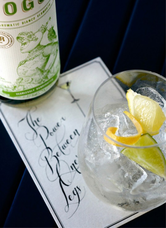
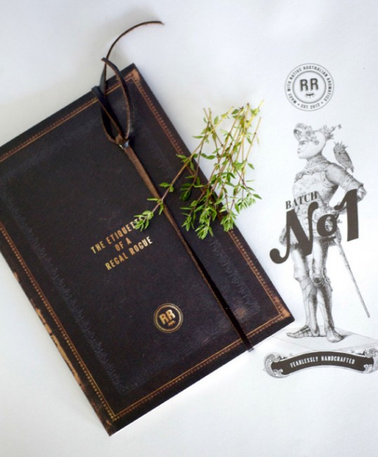
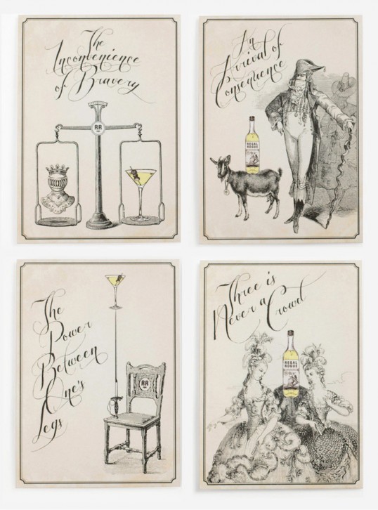
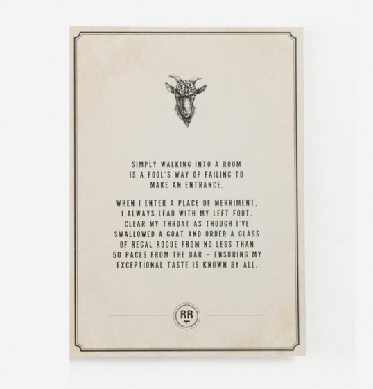
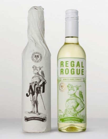
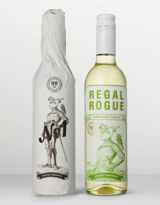
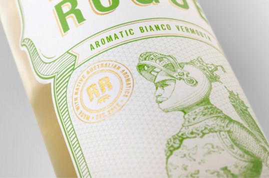
“We adopted a traditional etching style to give a ‘new’ brand a sense of history and credibility. The ‘Regal’-themed illustrations were the start of a greater story – of a rogue knight and his roguish ways – that provided the opening to develop it further through supporting material, such as the “Etiquette of a Regal Rogue” launch booklet.”

Regal Rogue

Regal Rogue

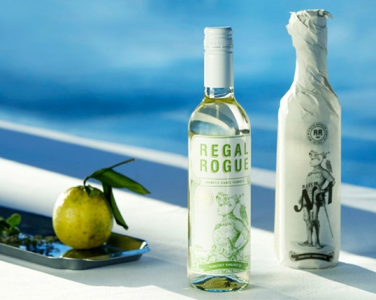
“Regal Rogue packaging is environmentally sustainable, from its downsized glass bottle to its paper wrap, printed on 100% recycled carbon-neutral stock. This conveniently lends itself to the key message of its handcrafted style which is an integral part of the brand story, and something that fits perfectly with today’s commitment to sustainability: handmade not mass-produced; small not gigantic; and natural not artificial.”

Get the latest packaging design inspiration in your inbox:

Popular designs

Burma Love Rebrand

Love at First BiteAs an extension of the Burma Superstar restaurant in San Francisco, Burma Love Foods gives diners an opportunity to

The Bra Guru

Most women are wearing the wrong size bra and that is a fact. The Bra Guru® is the first and only professional

Pure Persian Honey

When we look closely at honey packaging, they are almost all in the usual format, and the ultimate in creativity is that

Far Out Bar

Description: Far Out Bar is a cutting-edge packaging design project created for High Life Farms’ macrodose THC chocolate bars. This project involved

Designed by: PepsiCo Design & Innovation
Country: United States

Regal Rogue

lovely-package-regal-rogue-1

Regal Rogue

Designed by Squad Ink | Country: Australia

“Regal Rogue is the first native Australian aromatic vermouth in the market.

Squad Ink was brought into the mix to create the brand identity, packaging and launch material for this innovative small batch vermouth. Vermouth is mostly a European tradition. Regal Rogue turns this upside down with a daring blend of native aromatics to flavour fortified Hunter Valley Semillon (Australian wine region) with bush lemons, finger limes, vanilla, basil and thyme: a new world vermouth that is thoroughly Australian.”

Regal Rogue

“Fact: Vermouth is the most overlooked and misunderstood drink around.

Our job: To make vermouth cool again while creating an attractive package for this brilliant drop of fortified aromatic wine at the same time as educating and exciting the consumer.”

Regal Rogue

“We knew that the handcrafted nature of this small batch vermouth was a key selling point, and more than that: its unique flavour. How can we let the world know just how good this drink is and how do we bring to light the story of the first native Australian vermouth?”

The Regal Rogue brand has received an amazing response, rejuvenating a dusty alcohol category with a fresh and innovative approach.”

Regal Rogue

Regal Rogue

“We adopted a traditional etching style to give a ‘new’ brand a sense of history and credibility. The ‘Regal’-themed illustrations were the start of a greater story – of a rogue knight and his roguish ways – that provided the opening to develop it further through supporting material, such as the “Etiquette of a Regal Rogue” launch booklet.”

Regal Rogue

Regal Rogue

“Regal Rogue packaging is environmentally sustainable, from its downsized glass bottle to its paper wrap, printed on 100% recycled carbon-neutral stock. This conveniently lends itself to the key message of its handcrafted style which is an integral part of the brand story, and something that fits perfectly with today’s commitment to sustainability: handmade not mass-produced; small not gigantic; and natural not artificial.”
Previous slide
Next slide

Explore more great package design

Get the latest on packaging design in your inbox: