Designed by: PepsiCo Design & Innovation
Country: United States

Revamping Double-Barrelled Brewery: A Brand and Packaging Transformation by Kingdom & Sparrow

4
Double-Barrelled’s brand, first developed in 2017, has been a journey of consistent evolution. The brand has successfully positioned itself as one of the UK’s most influential and productive craft breweries.

In early 2024, Double-Barrelled was offered an opportunity to partner with a major UK retailer. Recognizing the chance to further enhance their brand and compete on-shelf in supermarkets, Double-Barrelled collaborated with Kingdom & Sparrow to amplify their branding and packaging.

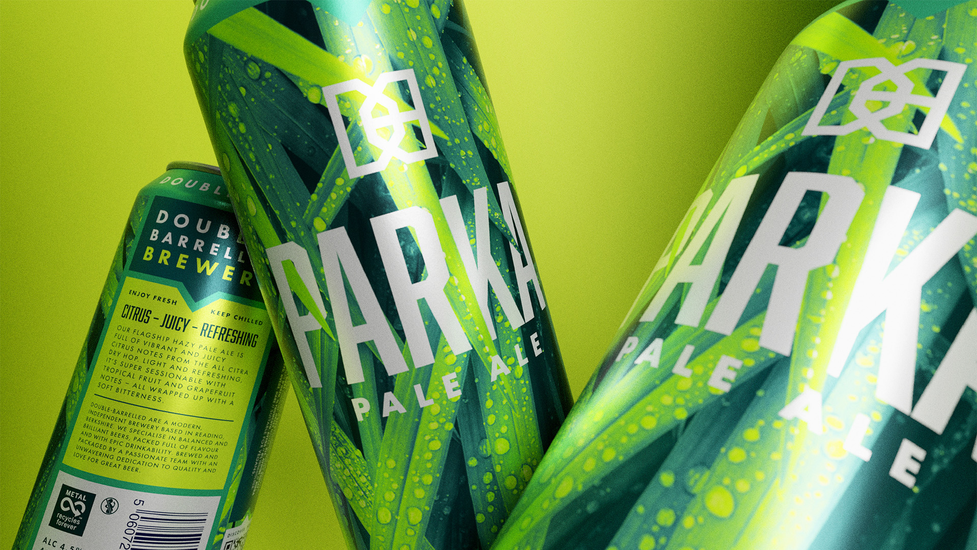
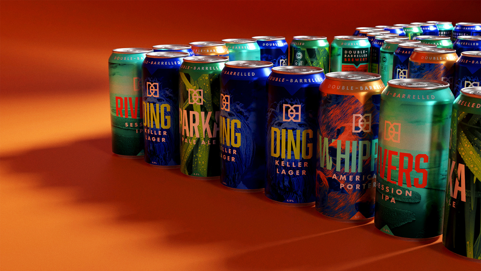
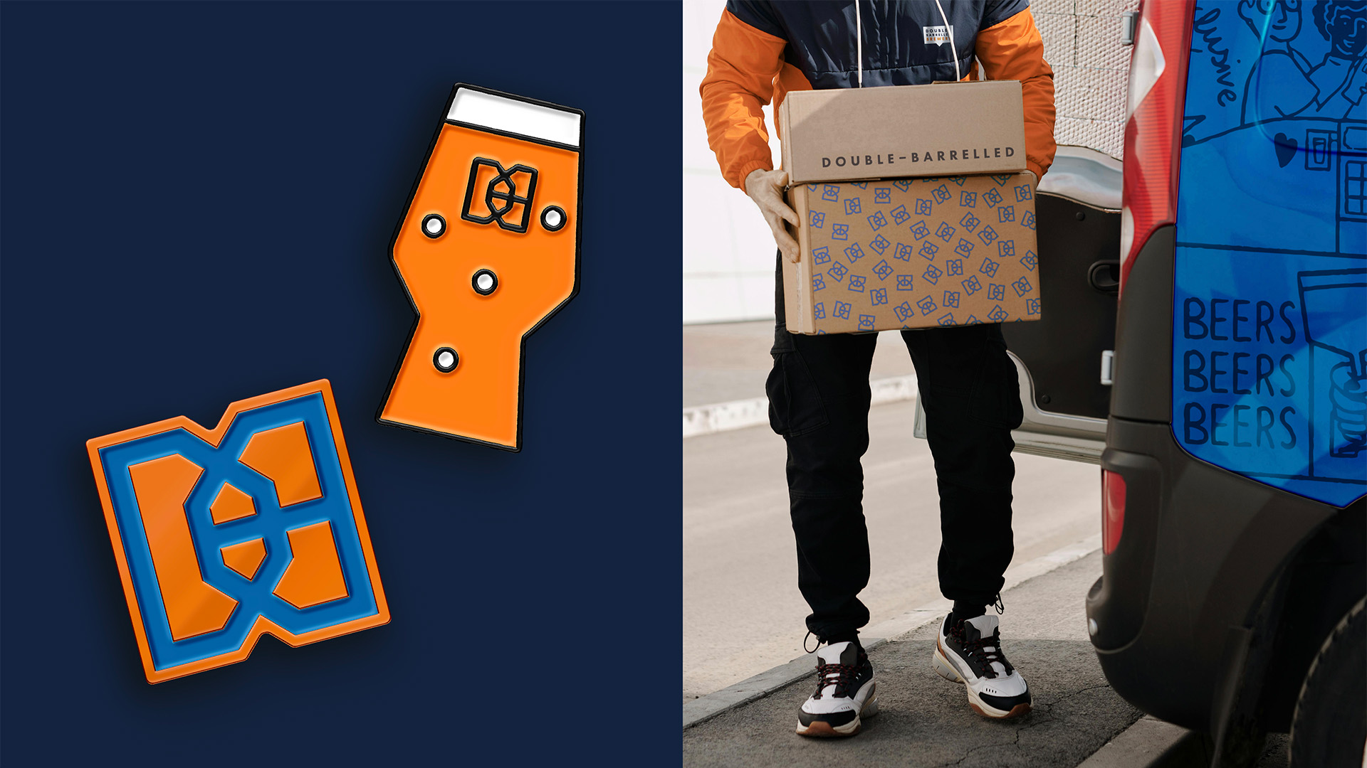
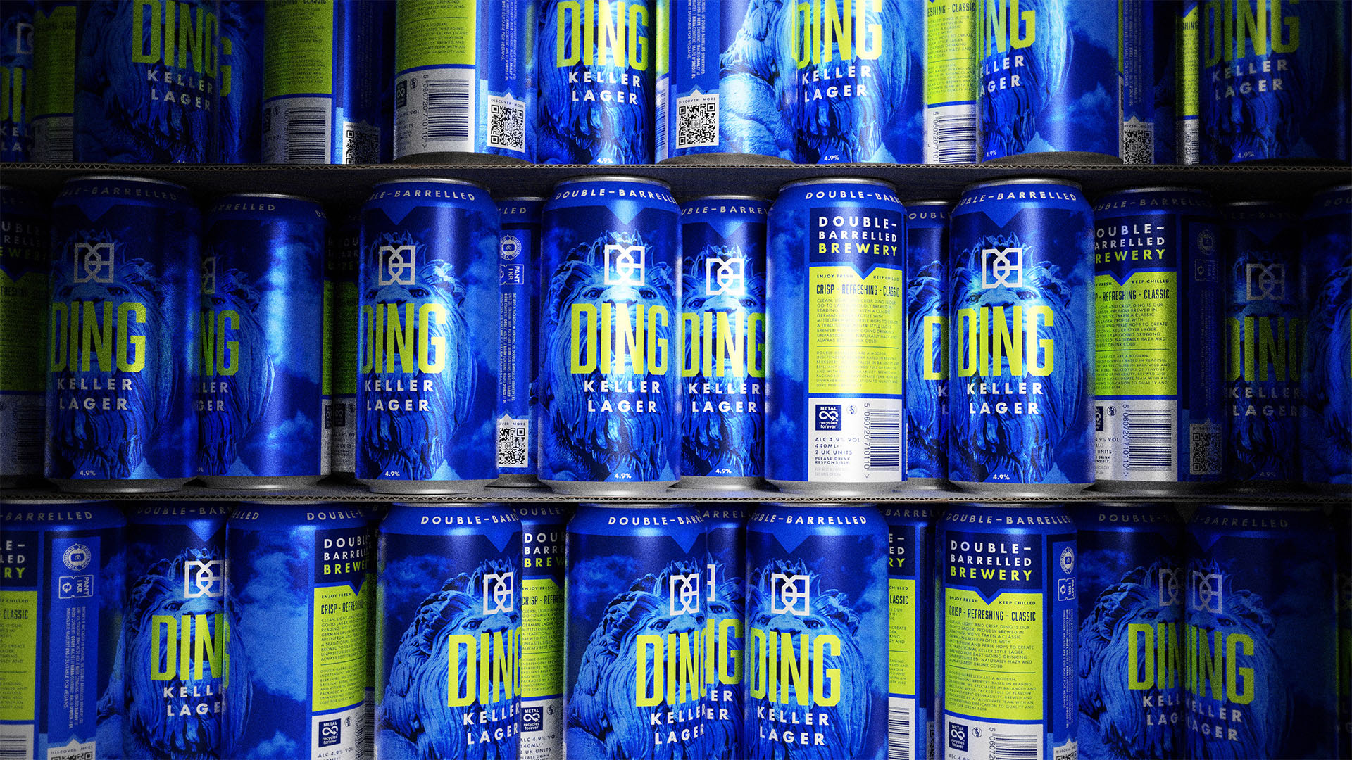
With the aim of making a bold statement in the bustling supermarket craft beer category, Double-Barrelled’s packaging underwent a significant transformation. The refresh involved strengthening their iconic logo-mark with a heavier line weight, and the introduction of a new typeface with angled corners.

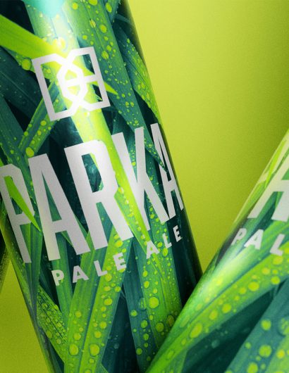
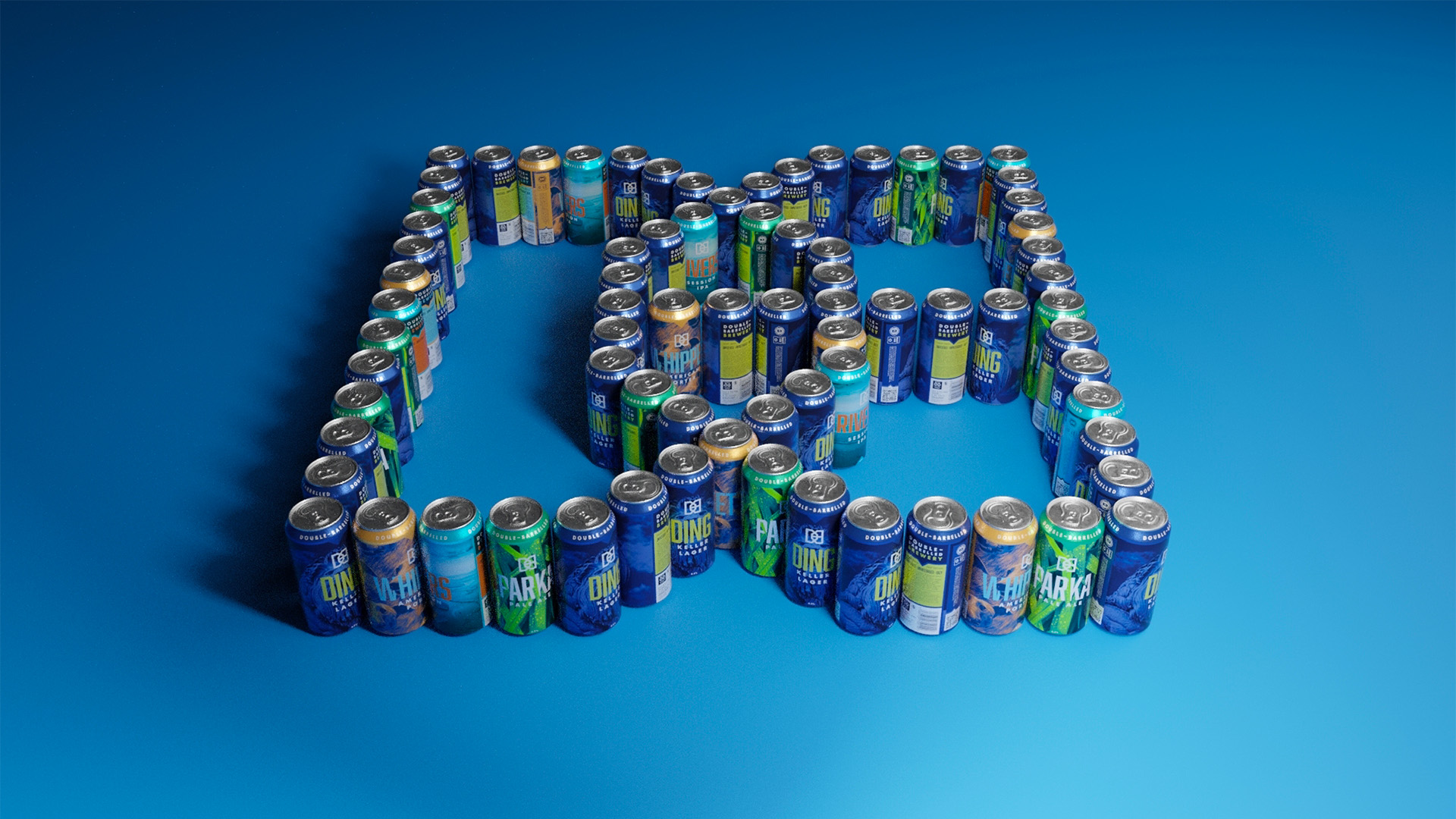
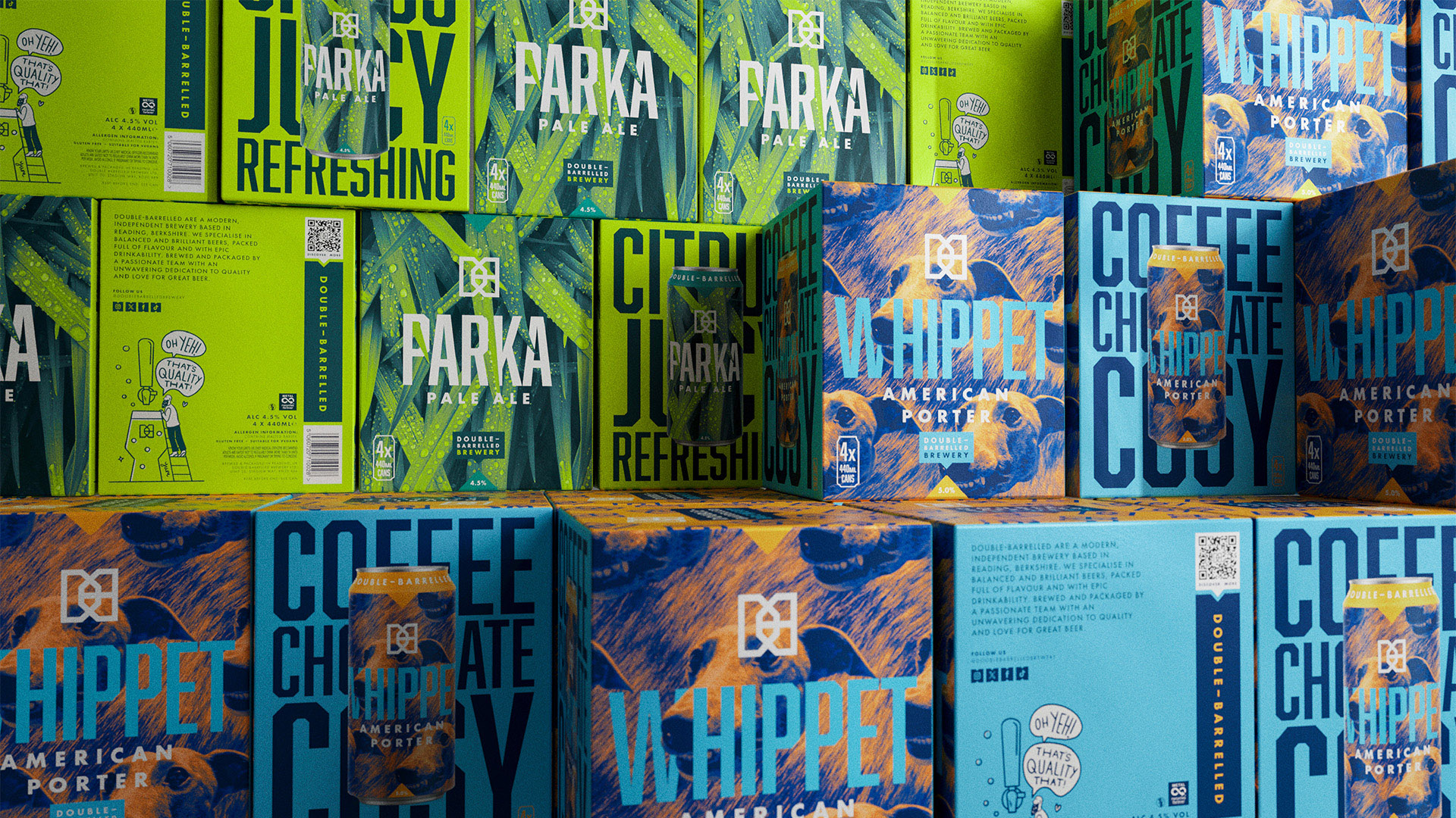
In collaboration with the Double-Barrelled team, the naming system was enhanced with single word product names for the core range. This gave each beer variant a punchier impact and improved shelf stand-out. Full-print cans were introduced to elevate the brand from the ‘small craft’ world and present a sense of ‘big brand’. The color palette was also amplified to ensure vibrant shelf stand–out, allowing the brand to compete with its supermarket contemporaries.

Revamping Double-Barrelled Brewery: A Brand and Packaging Transformation by Kingdom & Sparrow

Revamping Double-Barrelled Brewery: A Brand and Packaging Transformation by Kingdom & Sparrow

Revamping Double-Barrelled Brewery: A Brand and Packaging Transformation by Kingdom & Sparrow

Revamping Double-Barrelled Brewery: A Brand and Packaging Transformation by Kingdom & Sparrow

Revamping Double-Barrelled Brewery: A Brand and Packaging Transformation by Kingdom & Sparrow

Revamping Double-Barrelled Brewery: A Brand and Packaging Transformation by Kingdom & Sparrow

Revamping Double-Barrelled Brewery: A Brand and Packaging Transformation by Kingdom & Sparrow

Revamping Double-Barrelled Brewery: A Brand and Packaging Transformation by Kingdom & Sparrow

Revamping Double-Barrelled Brewery: A Brand and Packaging Transformation by Kingdom & Sparrow


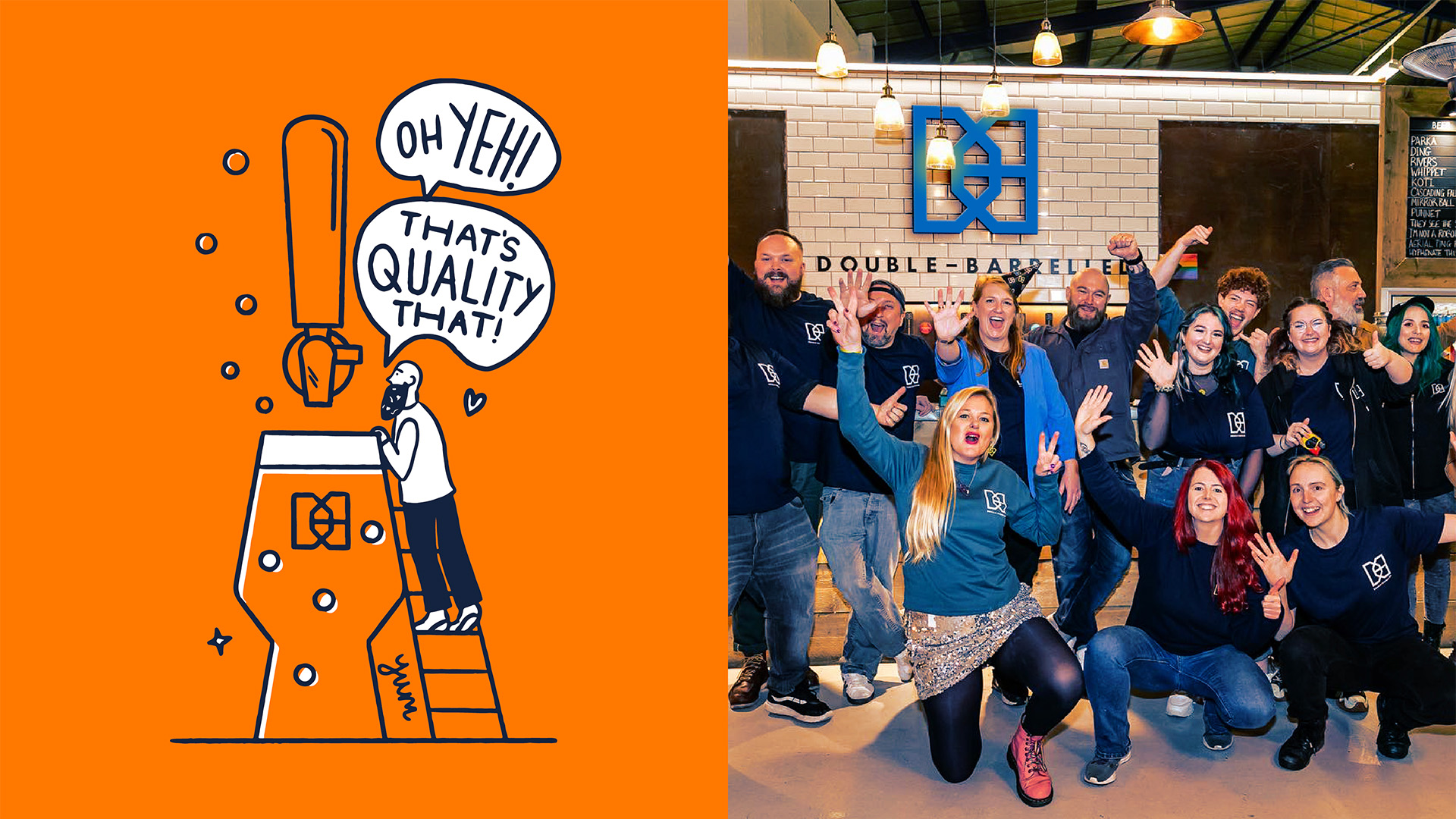
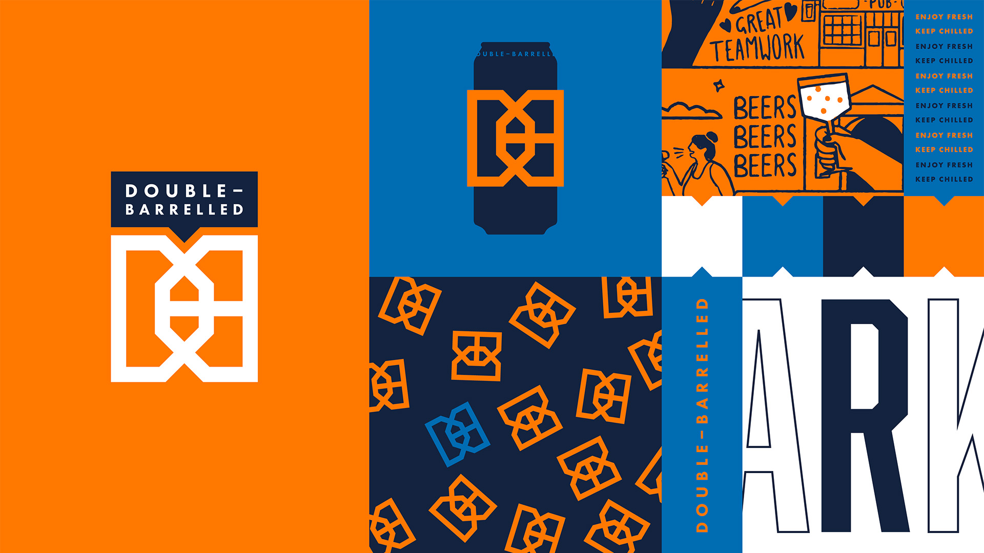
A layout structure and design system was established to build brand salience across the range, facilitating the easy introduction of new beers. The use of waymarking in the off-pack world harks back to the notch shape, which has become synonymous with the Double-Barrelled brand – a feature from their original packaging, now integrated into their new can designs.

The project is a testimony to the power of smart design and creative collaboration, resulting in a refreshed identity that not only resonates with the brand’s core values but also empowers it to stand tall amidst competition.
4

Get the latest packaging design inspiration in your inbox:

Popular designs

Tropicana’s Branding & Packaging Redesign by Sunhouse

Tropicana rejuvenates its brand with Sunhouse, blending modern iconicity and heritage. The redesign emphasizes Tropicana’s legacy, highlighting its unique story and craftsmanship, making it stand out as the original, superior orange juice.

Designed by: PepsiCo Design & Innovation
Country: United States

Revamping Double-Barrelled Brewery: A Brand and Packaging Transformation by Kingdom & Sparrow

4
Revamping Double-Barrelled Brewery: A Brand and Packaging Transformation by Kingdom
Double-Barrelled’s brand, first developed in 2017, has been a journey of consistent evolution. The brand has successfully positioned itself as one of the UK’s most influential and productive craft breweries.

In early 2024, Double-Barrelled was offered an opportunity to partner with a major UK retailer. Recognizing the chance to further enhance their brand and compete on-shelf in supermarkets, Double-Barrelled collaborated with Kingdom & Sparrow to amplify their branding and packaging.

With the aim of making a bold statement in the bustling supermarket craft beer category, Double-Barrelled’s packaging underwent a significant transformation. The refresh involved strengthening their iconic logo-mark with a heavier line weight, and the introduction of a new typeface with angled corners.

In collaboration with the Double-Barrelled team, the naming system was enhanced with single word product names for the core range. This gave each beer variant a punchier impact and improved shelf stand-out. Full-print cans were introduced to elevate the brand from the ‘small craft’ world and present a sense of ‘big brand’. The color palette was also amplified to ensure vibrant shelf stand–out, allowing the brand to compete with its supermarket contemporaries.

Revamping Double-Barrelled Brewery: A Brand and Packaging Transformation by Kingdom & Sparrow

Revamping Double-Barrelled Brewery: A Brand and Packaging Transformation by Kingdom & Sparrow

Revamping Double-Barrelled Brewery: A Brand and Packaging Transformation by Kingdom & Sparrow

Revamping Double-Barrelled Brewery: A Brand and Packaging Transformation by Kingdom & Sparrow

Revamping Double-Barrelled Brewery: A Brand and Packaging Transformation by Kingdom & Sparrow

Revamping Double-Barrelled Brewery: A Brand and Packaging Transformation by Kingdom & Sparrow

Revamping Double-Barrelled Brewery: A Brand and Packaging Transformation by Kingdom & Sparrow

Revamping Double-Barrelled Brewery: A Brand and Packaging Transformation by Kingdom & Sparrow

Revamping Double-Barrelled Brewery: A Brand and Packaging Transformation by Kingdom & Sparrow


A layout structure and design system was established to build brand salience across the range, facilitating the easy introduction of new beers. The use of waymarking in the off-pack world harks back to the notch shape, which has become synonymous with the Double-Barrelled brand – a feature from their original packaging, now integrated into their new can designs.

The project is a testimony to the power of smart design and creative collaboration, resulting in a refreshed identity that not only resonates with the brand’s core values but also empowers it to stand tall amidst competition.
4
Previous slide
Next slide
Get the latest on packaging design in your inbox: