Designed by: PepsiCo Design & Innovation
Country: United States

Reviving the Sardinian Aperitif: A Look at Cantina Pippia’s Vernaccia Wine Packaging Design

14
Nestled in the southern area of Italy on the island of Sardinia, Cantina Pippia is a small local winery with a rich history dating back to 1943. The winery specializes in the production of Vernaccia, a native variety of wine that has been a staple of Sardinian aperitifs for centuries. However, despite its longstanding heritage, the Vernaccia has experienced a decline in cultural popularity, prompting a need for a revitalization of its image.

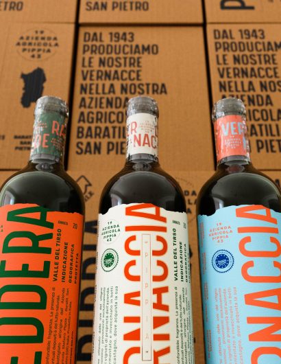
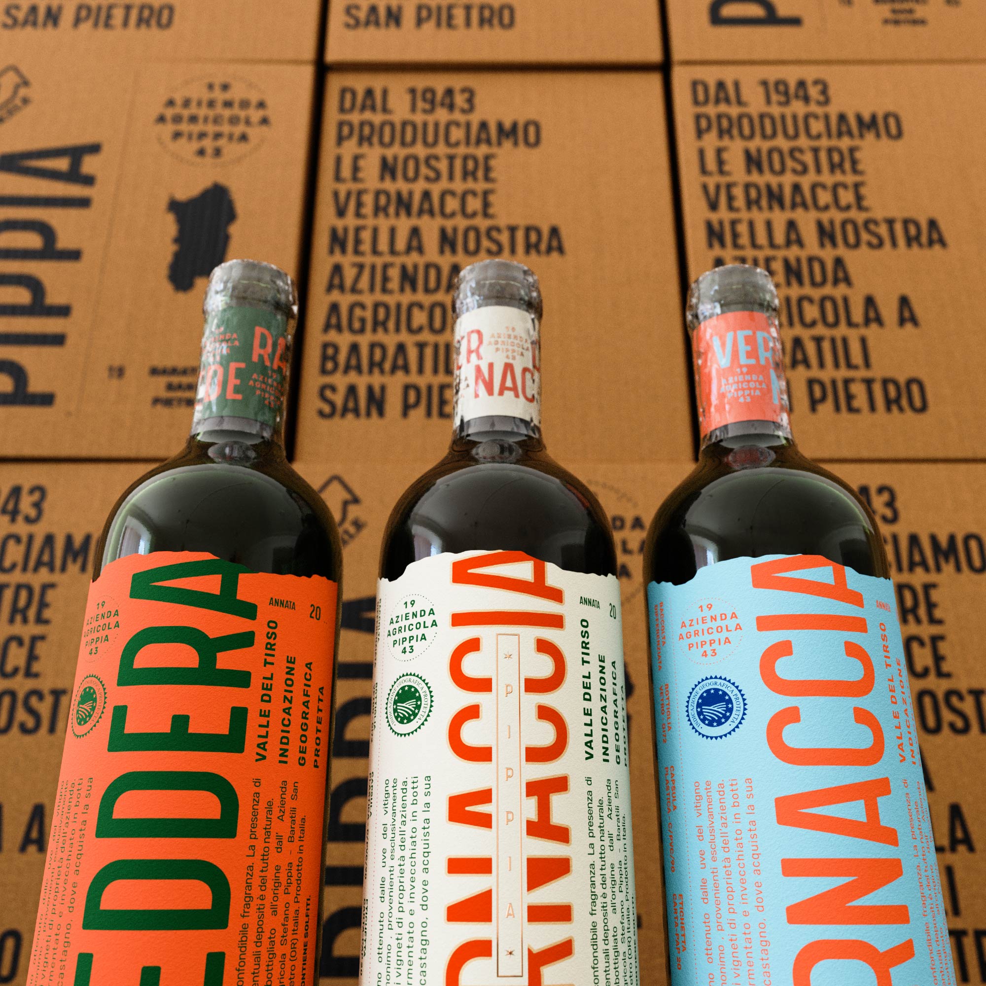
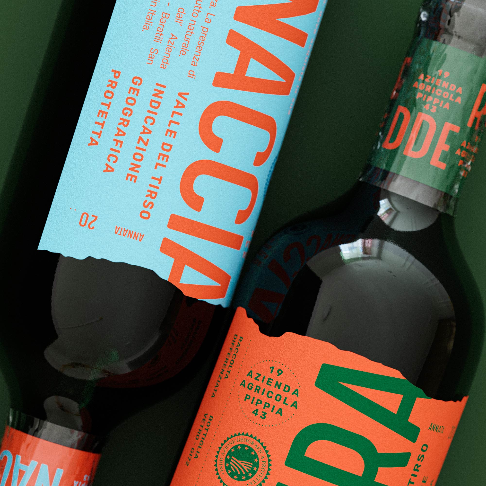
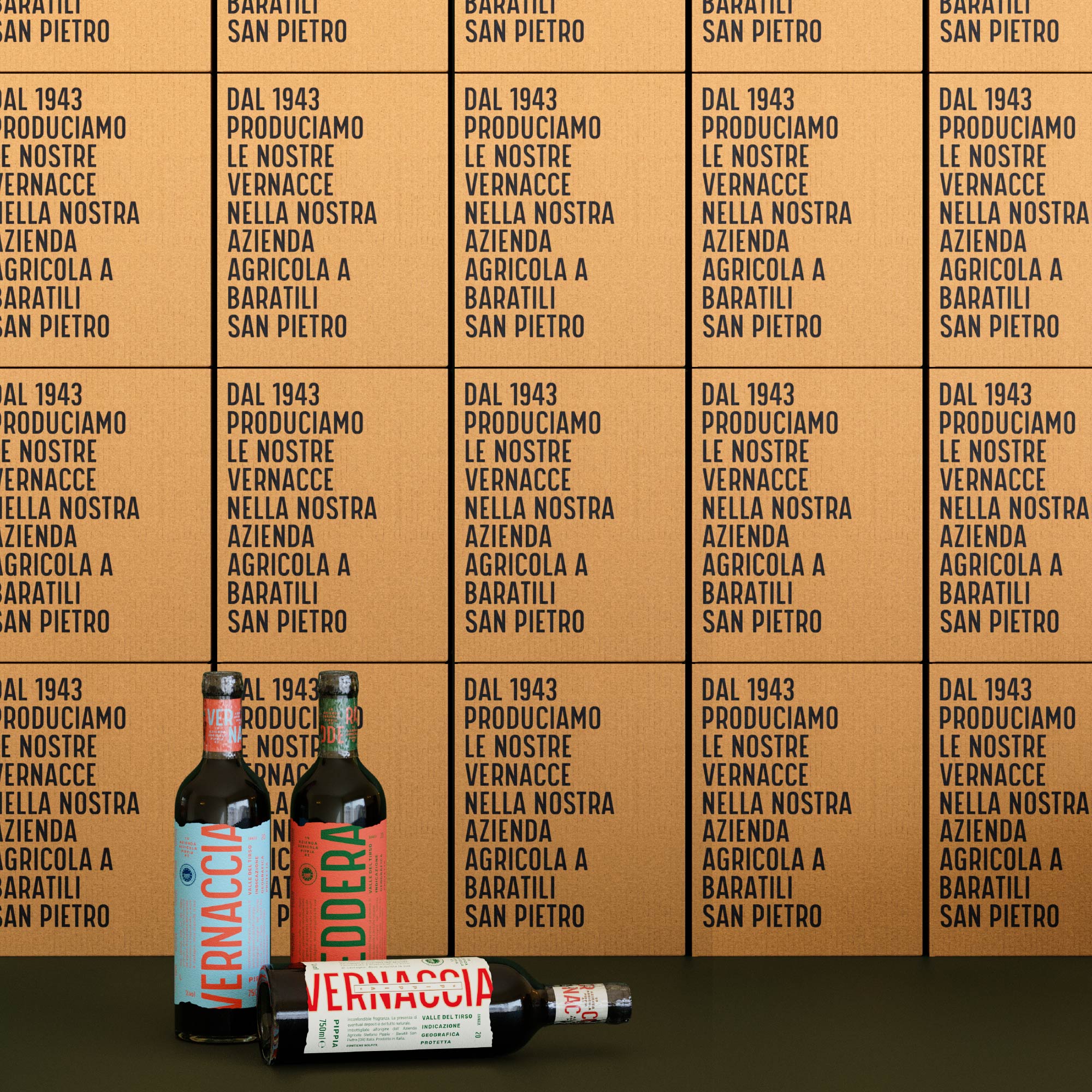
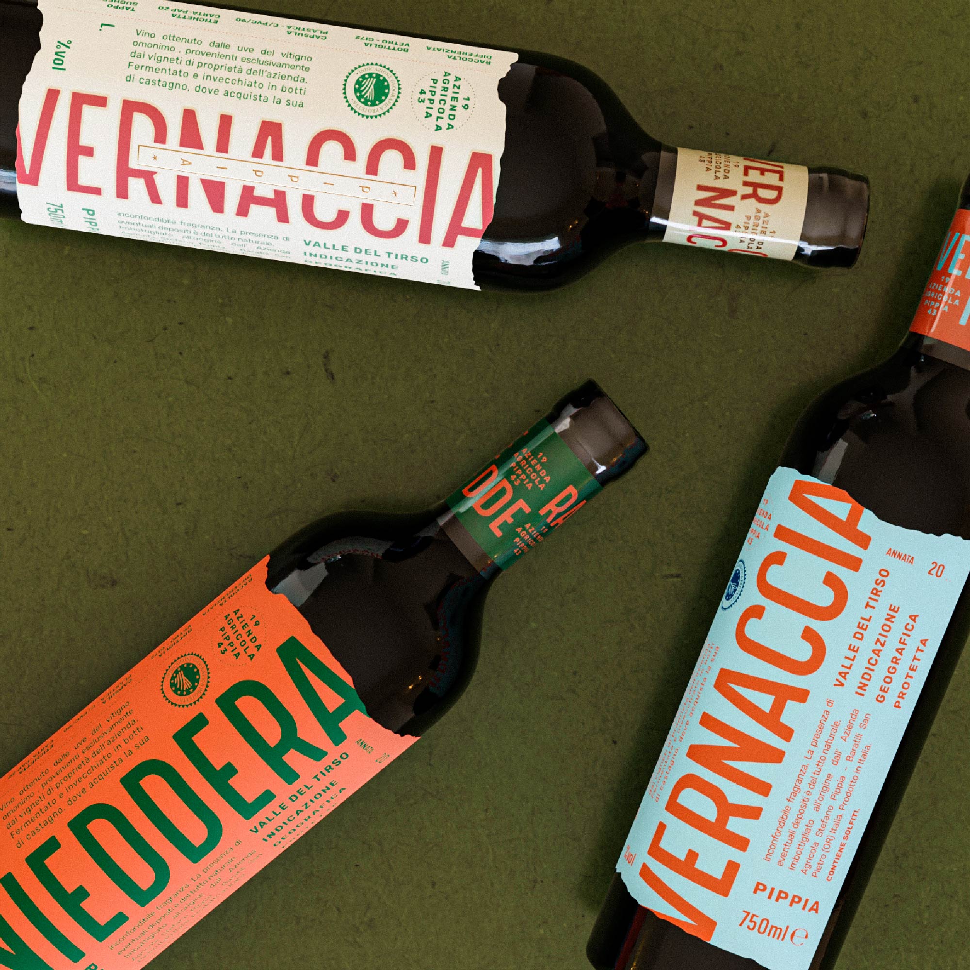
The packaging design for Cantina Pippia strives to re-establish the Vernaccia’s cultural status, infusing an industrial/folk character into the bottle with a sophisticated twist. The design draws heavily on a strong typographic element, a color palette that echoes the hues of the island, and the use of rough paper and a jagged dieline to convey a ‘down to earth’ taste to the product identity.

The Vernaccia aged variant, distinguished by its light cream label, is a premium product of Pippia’s winery. To enhance its elegance, the label features an embossed foil finish that complements the folk aesthetic of the wine. Each label is hand-filled and signed by the operator to indicate the vintage and lot number, underscoring the personal care taken with each bottle due to its short and limited production.

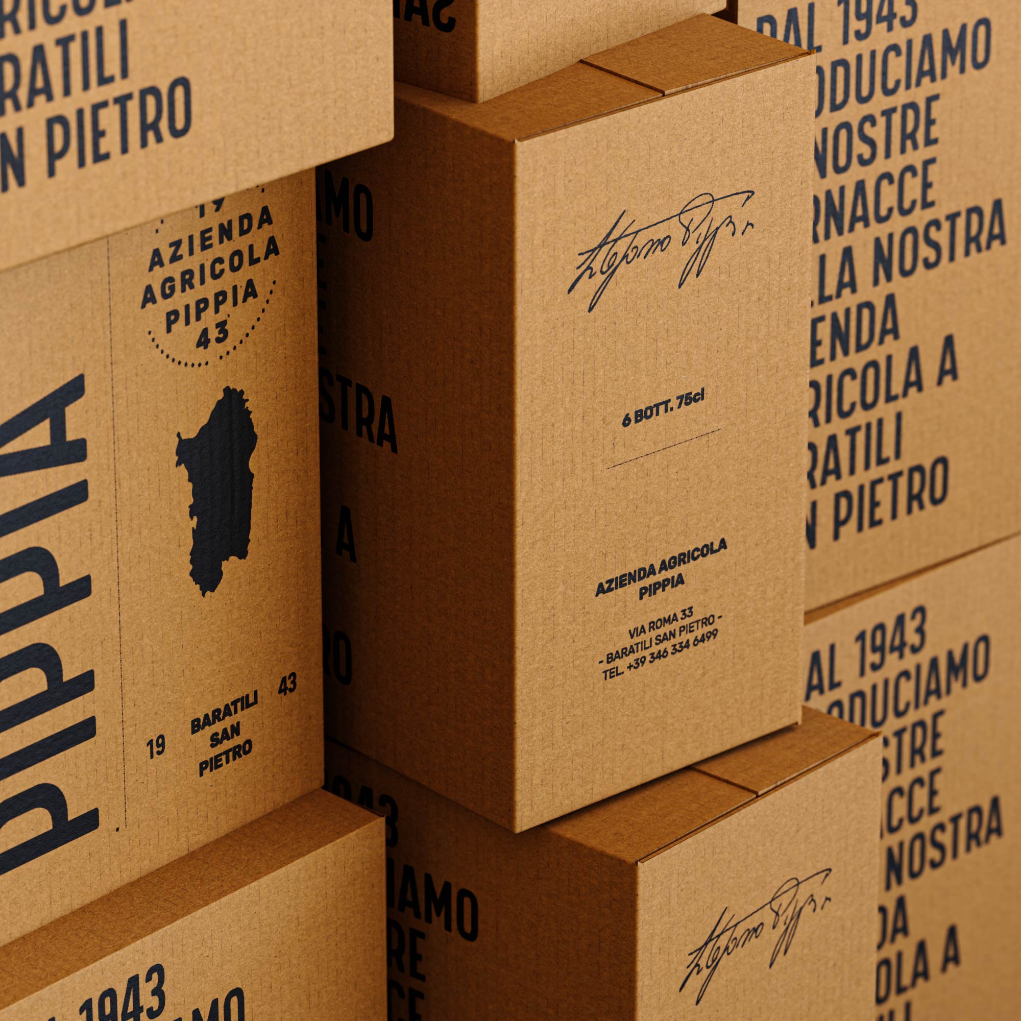
The packaging design also extends to a simple but impactful cardboard box for the bottles. The Havana box maintains a clear and minimal design, with a strong typographic element that communicates the brand’s mission and underscores its Sardinian heritage and pride – a sentiment that resonates deeply with the people of the land and the owner of the winery, Mr. Pippia.

Reviving the Sardinian Aperitif: A Look at Cantina Pippia's Vernaccia Wine Packaging Design

Reviving the Sardinian Aperitif: A Look at Cantina Pippia's Vernaccia Wine Packaging Design

Reviving the Sardinian Aperitif: A Look at Cantina Pippia's Vernaccia Wine Packaging Design

Reviving the Sardinian Aperitif: A Look at Cantina Pippia's Vernaccia Wine Packaging Design

Reviving the Sardinian Aperitif: A Look at Cantina Pippia's Vernaccia Wine Packaging Design


The packaging design for Cantina Pippia was crafted by Mood Packaging Studio, based in Cagliari, Italy. The project delivers a range of design aspects including 2D Design, 3D Modelling, 3D Motion, Brand Design, Graphic Design, and Packaging Design. The creative team behind the project includes Creative Director Maurizio Serrenti, Graphic Designer Simone Pisano, and 3D artist Michele Puddu.
14

Get the latest packaging design inspiration in your inbox:

Popular designs

The Port Vodka Lemon Water

Overview: In response to my client’s vision for a Cape Cod themed beverage brand, I embarked on the journey to create The Port

Pure Persian Honey

When we look closely at honey packaging, they are almost all in the usual format, and the ultimate in creativity is that

Designed by: PepsiCo Design & Innovation
Country: United States

Reviving the Sardinian Aperitif: A Look at Cantina Pippia’s Vernaccia Wine Packaging Design

14
Reviving the Sardinian Aperitif: A Look at Cantina Pippia's Vernaccia
Nestled in the southern area of Italy on the island of Sardinia, Cantina Pippia is a small local winery with a rich history dating back to 1943. The winery specializes in the production of Vernaccia, a native variety of wine that has been a staple of Sardinian aperitifs for centuries. However, despite its longstanding heritage, the Vernaccia has experienced a decline in cultural popularity, prompting a need for a revitalization of its image.

The packaging design for Cantina Pippia strives to re-establish the Vernaccia’s cultural status, infusing an industrial/folk character into the bottle with a sophisticated twist. The design draws heavily on a strong typographic element, a color palette that echoes the hues of the island, and the use of rough paper and a jagged dieline to convey a ‘down to earth’ taste to the product identity.

The Vernaccia aged variant, distinguished by its light cream label, is a premium product of Pippia’s winery. To enhance its elegance, the label features an embossed foil finish that complements the folk aesthetic of the wine. Each label is hand-filled and signed by the operator to indicate the vintage and lot number, underscoring the personal care taken with each bottle due to its short and limited production.

The packaging design also extends to a simple but impactful cardboard box for the bottles. The Havana box maintains a clear and minimal design, with a strong typographic element that communicates the brand’s mission and underscores its Sardinian heritage and pride – a sentiment that resonates deeply with the people of the land and the owner of the winery, Mr. Pippia.

Reviving the Sardinian Aperitif: A Look at Cantina Pippia's Vernaccia Wine Packaging Design

Reviving the Sardinian Aperitif: A Look at Cantina Pippia's Vernaccia Wine Packaging Design

Reviving the Sardinian Aperitif: A Look at Cantina Pippia's Vernaccia Wine Packaging Design

Reviving the Sardinian Aperitif: A Look at Cantina Pippia's Vernaccia Wine Packaging Design

Reviving the Sardinian Aperitif: A Look at Cantina Pippia's Vernaccia Wine Packaging Design


The packaging design for Cantina Pippia was crafted by Mood Packaging Studio, based in Cagliari, Italy. The project delivers a range of design aspects including 2D Design, 3D Modelling, 3D Motion, Brand Design, Graphic Design, and Packaging Design. The creative team behind the project includes Creative Director Maurizio Serrenti, Graphic Designer Simone Pisano, and 3D artist Michele Puddu.
14

Explore more great package design

Get the latest on packaging design in your inbox: