Designed by: PepsiCo Design & Innovation
Country: United States

Rock Paper Rum Packaging Design

1

Designed by: Firstbase | Country: India

Rock Paper Rum, the flagship Indian spirit from Good Barrel Distillery, is all set to rock the global markets.

India is rapidly changing, and at the forefront of the change stands a new generation of nation-builders. Taking inspiration from the new risk-takers who are shaping the country, Good Barrel Distillery launched its first product.

Cresting a new wave of nation-builders and world-shapers, there’s a new nation rising. Far from the past, it’s making roads where none exist and becoming a north star to the world. The bold new India is throbbing with life, playing its game to the hilt. From serious and studied strategies to fun and spontaneous swings, it is doing both with a rare confidence, that’s revealing itself, one layer at a time.

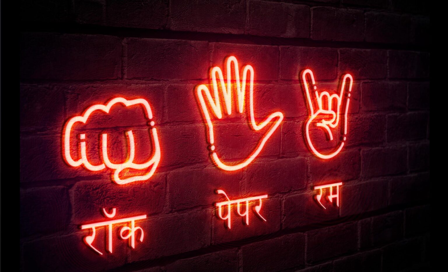
Rock Paper Rum, styled after that classic game of taking a chance and taking the lead, is a tribute to these risk-takers that are changing India.

Craft fully made with locally-sourced sugarcane; an ingredient so native to India that it is the second largest producer in the world. Artfully blended with rare botanicals, this proudly Indian artisanal brand is made in small batches.”
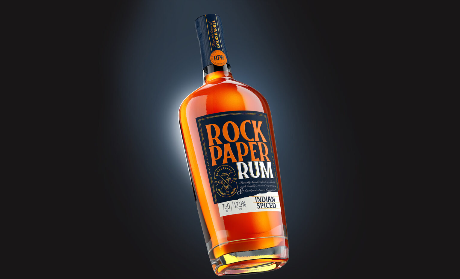
Rock Paper Rum Packaging Design

The packaging

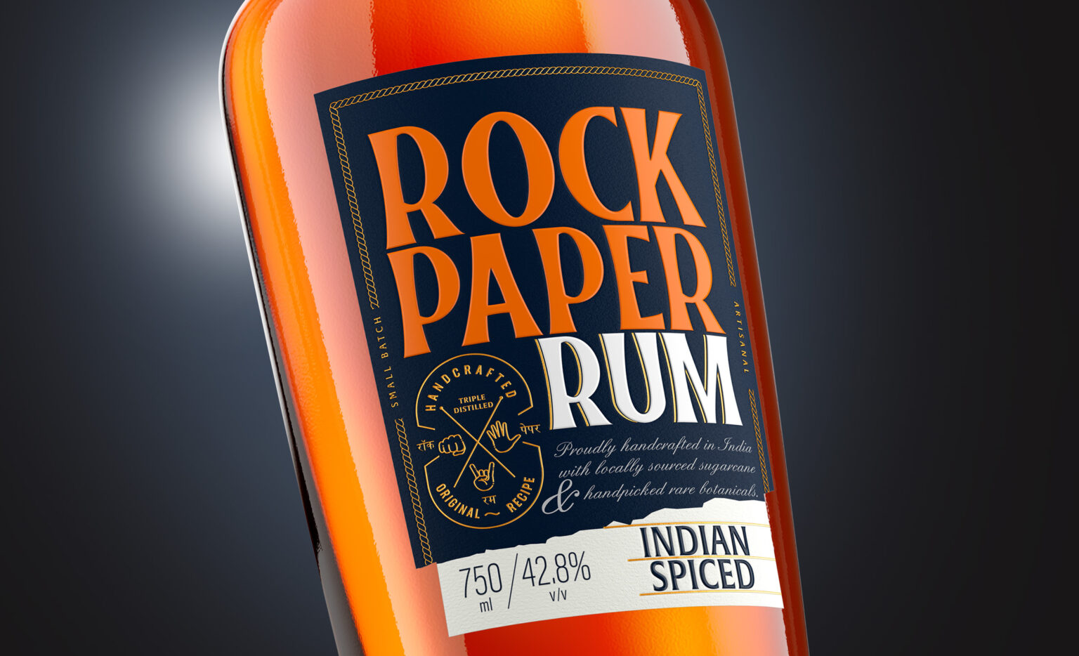
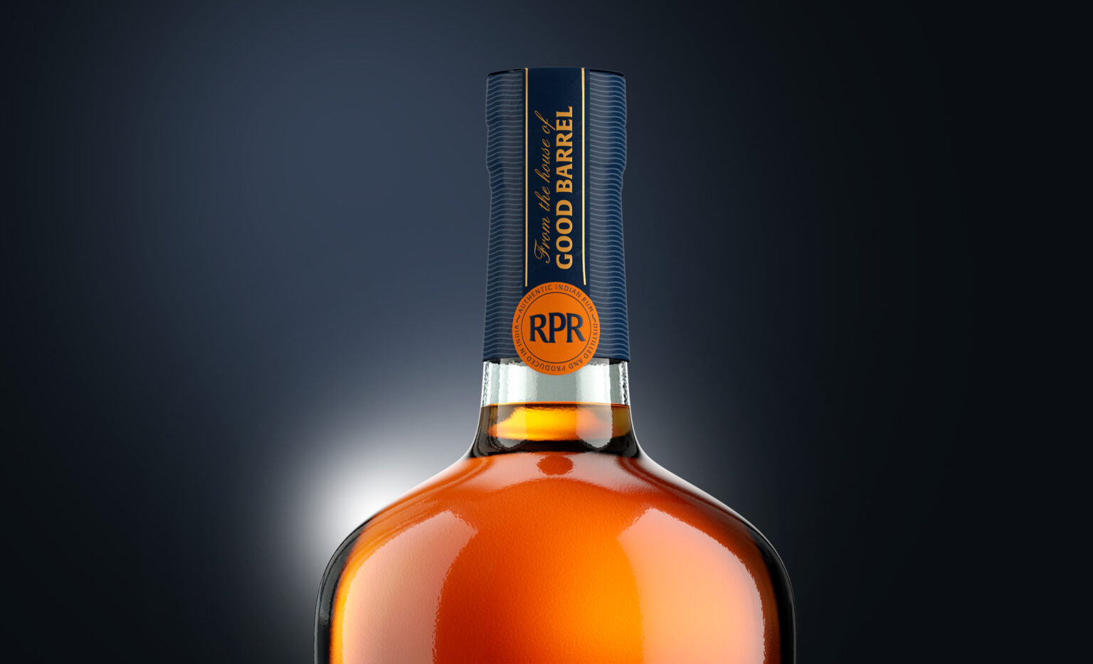
Good Barrel Distillery teamed up with Firstbase, a Delhi-based branding agency, to create packaging designs that would highlight India’s new wave of thinkers and risk-takers. The branding agency used orange and deep blue to add sophistication to the product. The typography adds class to the packaging design.

“The robust bottle stands tall in the shelves with a very bold packaging. The use of deep blue and orange adds to the class. RPR is not a brand that is going to eulogize about its provenance, its history, its master distiller’s vision or a quirky brand myth. It’s a great liquid with straight-to-the-point, no-nonsense personality. It’s disruptive and it’s attitude is bold (#takeachance), playful and punchy. The same reflects in the branding and packaging of the product with colors and the typography used.

1

Get the latest packaging design inspiration in your inbox:

Popular designs

Designed by: PepsiCo Design & Innovation
Country: United States

Rock Paper Rum Packaging Design

1
Rum_Brand_Packaging_Design_Whisky_Delhi_Mumbai_India_World_Best_1-1536x934

Designed by: Firstbase | Country: India

Rock Paper Rum, the flagship Indian spirit from Good Barrel Distillery, is all set to rock the global markets.

India is rapidly changing, and at the forefront of the change stands a new generation of nation-builders. Taking inspiration from the new risk-takers who are shaping the country, Good Barrel Distillery launched its first product.

Cresting a new wave of nation-builders and world-shapers, there’s a new nation rising. Far from the past, it’s making roads where none exist and becoming a north star to the world. The bold new India is throbbing with life, playing its game to the hilt. From serious and studied strategies to fun and spontaneous swings, it is doing both with a rare confidence, that’s revealing itself, one layer at a time.

Rock Paper Rum, styled after that classic game of taking a chance and taking the lead, is a tribute to these risk-takers that are changing India.

Craft fully made with locally-sourced sugarcane; an ingredient so native to India that it is the second largest producer in the world. Artfully blended with rare botanicals, this proudly Indian artisanal brand is made in small batches.”
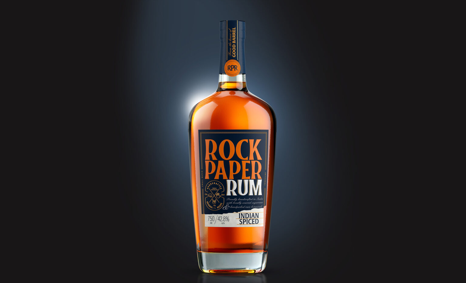
Rock Paper Rum Packaging Design

The packaging

Good Barrel Distillery teamed up with Firstbase, a Delhi-based branding agency, to create packaging designs that would highlight India’s new wave of thinkers and risk-takers. The branding agency used orange and deep blue to add sophistication to the product. The typography adds class to the packaging design.

“The robust bottle stands tall in the shelves with a very bold packaging. The use of deep blue and orange adds to the class. RPR is not a brand that is going to eulogize about its provenance, its history, its master distiller’s vision or a quirky brand myth. It’s a great liquid with straight-to-the-point, no-nonsense personality. It’s disruptive and it’s attitude is bold (#takeachance), playful and punchy. The same reflects in the branding and packaging of the product with colors and the typography used.

1

Explore more great package design

Get the latest on packaging design in your inbox: