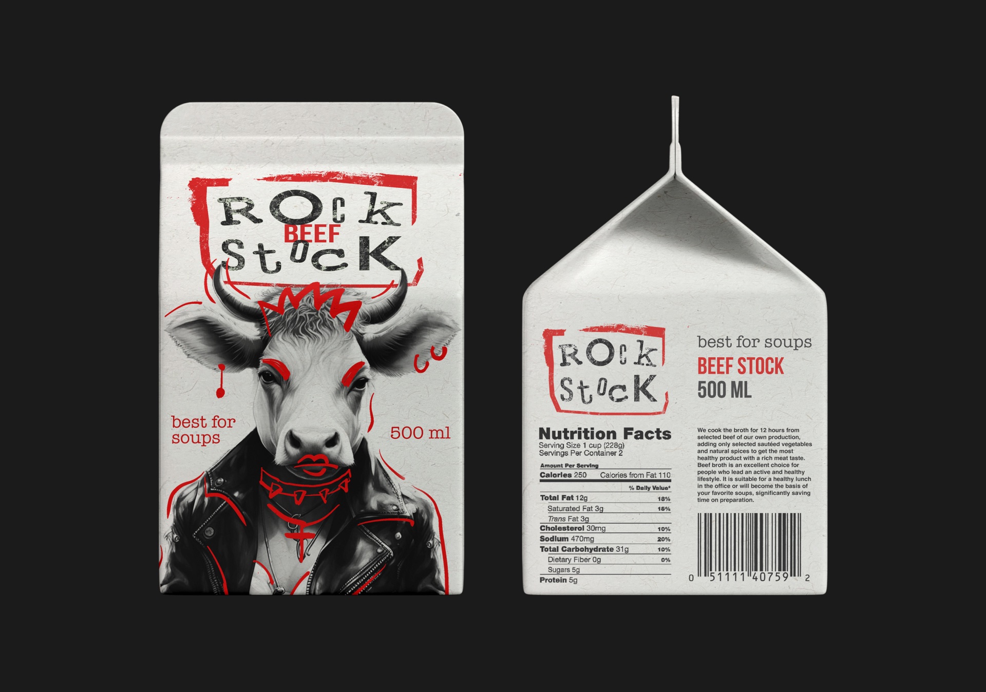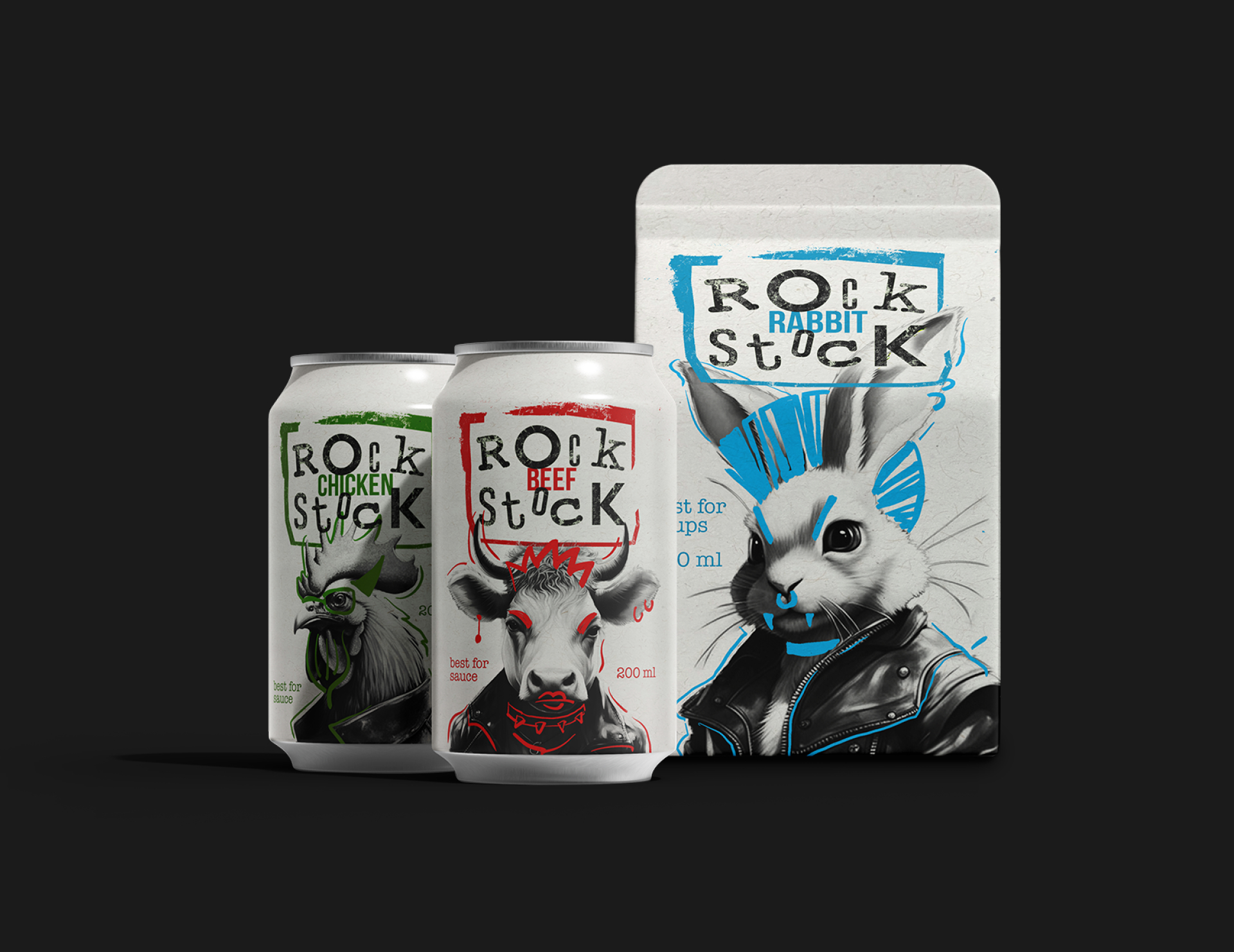


This student work was designed by Liana Bubnova. The objective was to develop a packaging design line inspired by a music style. Any product category requiring packaging could be selected for this design task.
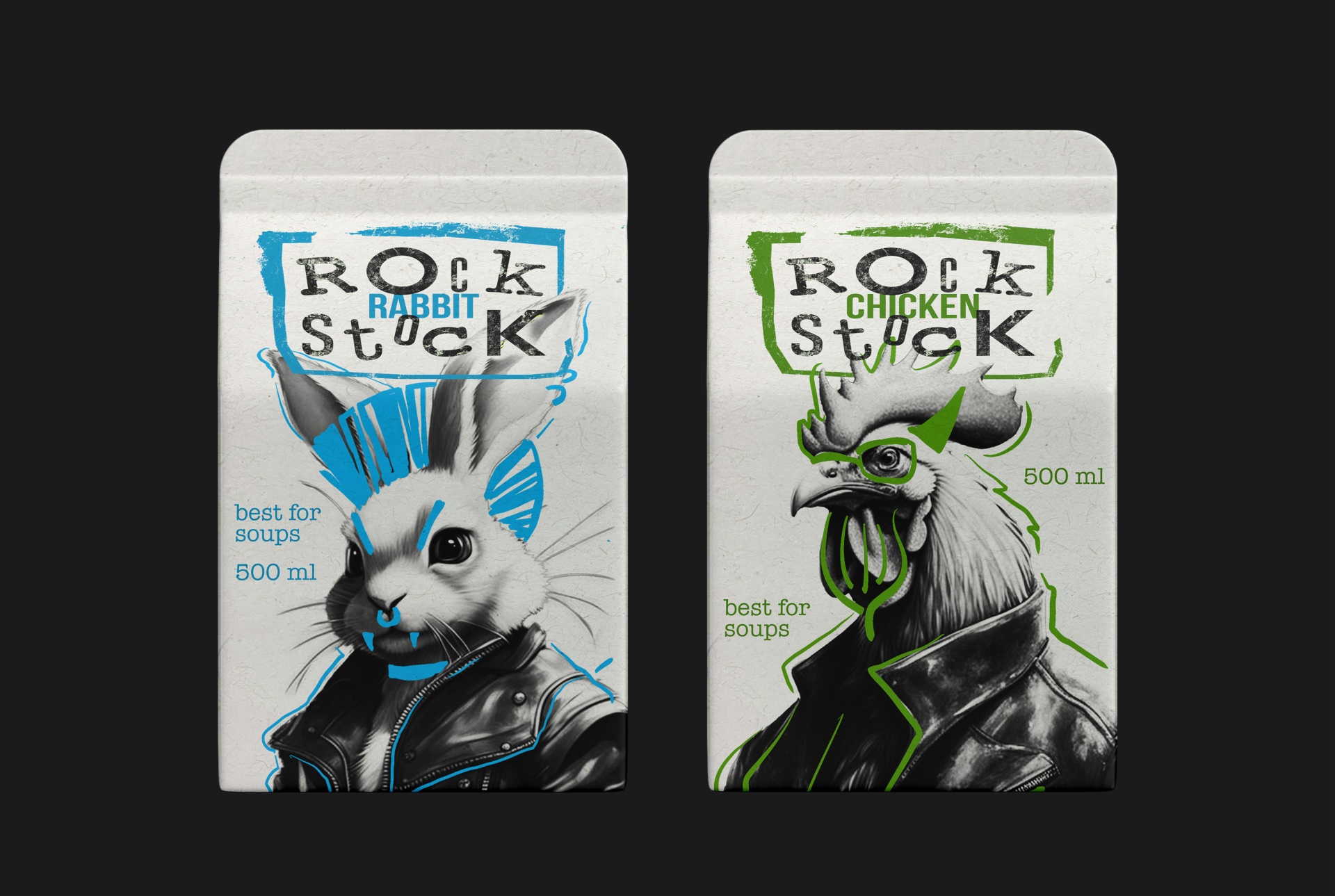
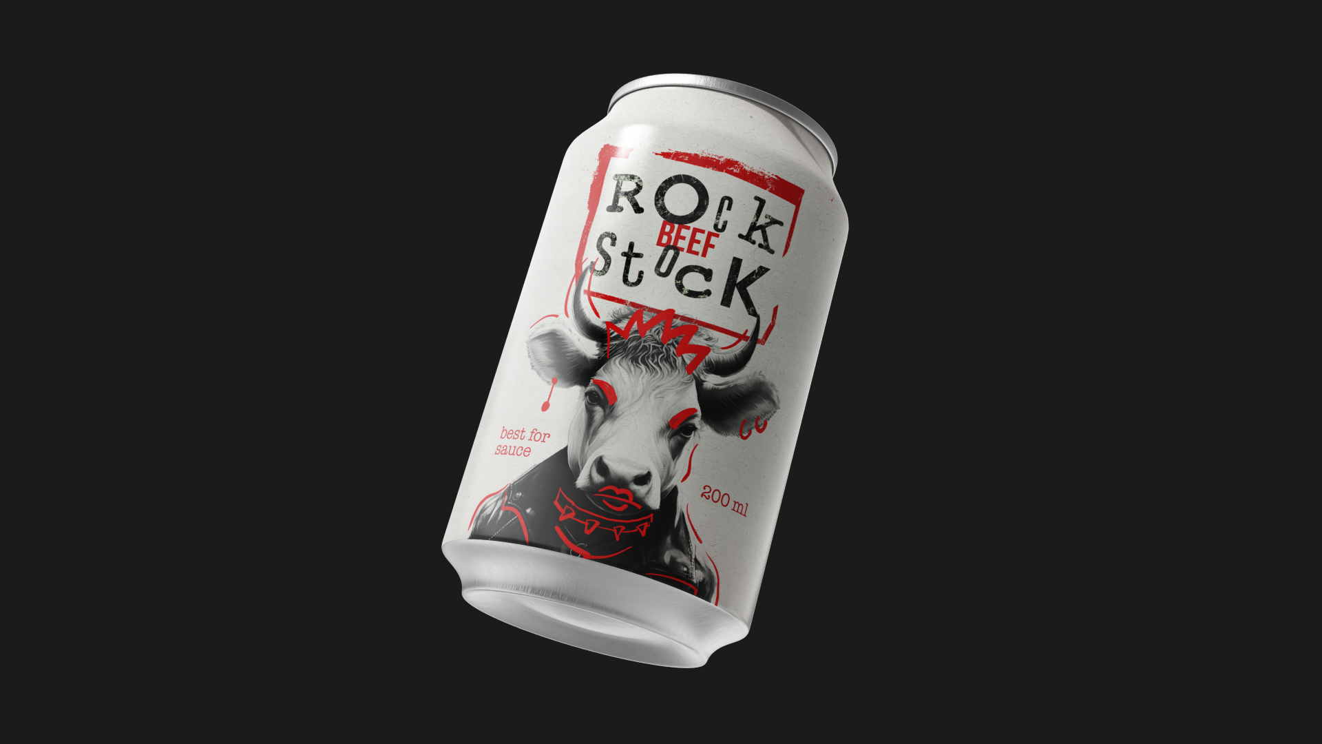
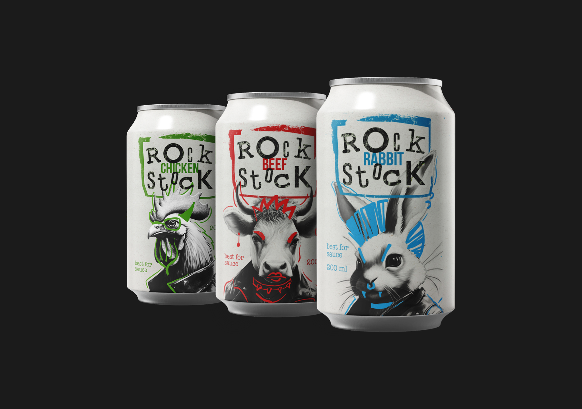
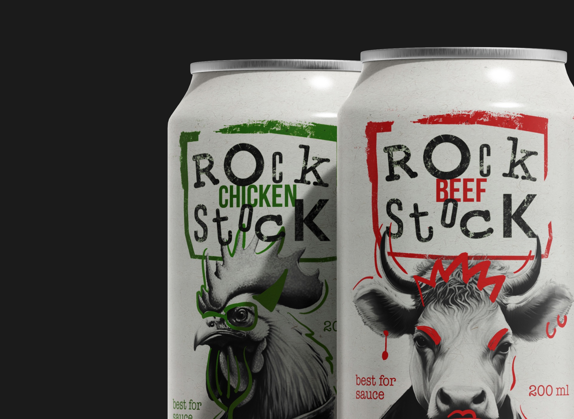
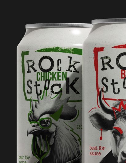
The chosen theme revolved around rock music and featured animals in leather jackets. These characters were initially generated by the Kandinsky 3.0 AI and then meticulously hand-drawn. The name “Rock Stock” emerged serendipitously, owing to the rhyme between “rock” and “stock.” Consequently, the logo adopted a grunge style fitting perfectly into the “Rock Stock” brand identity.
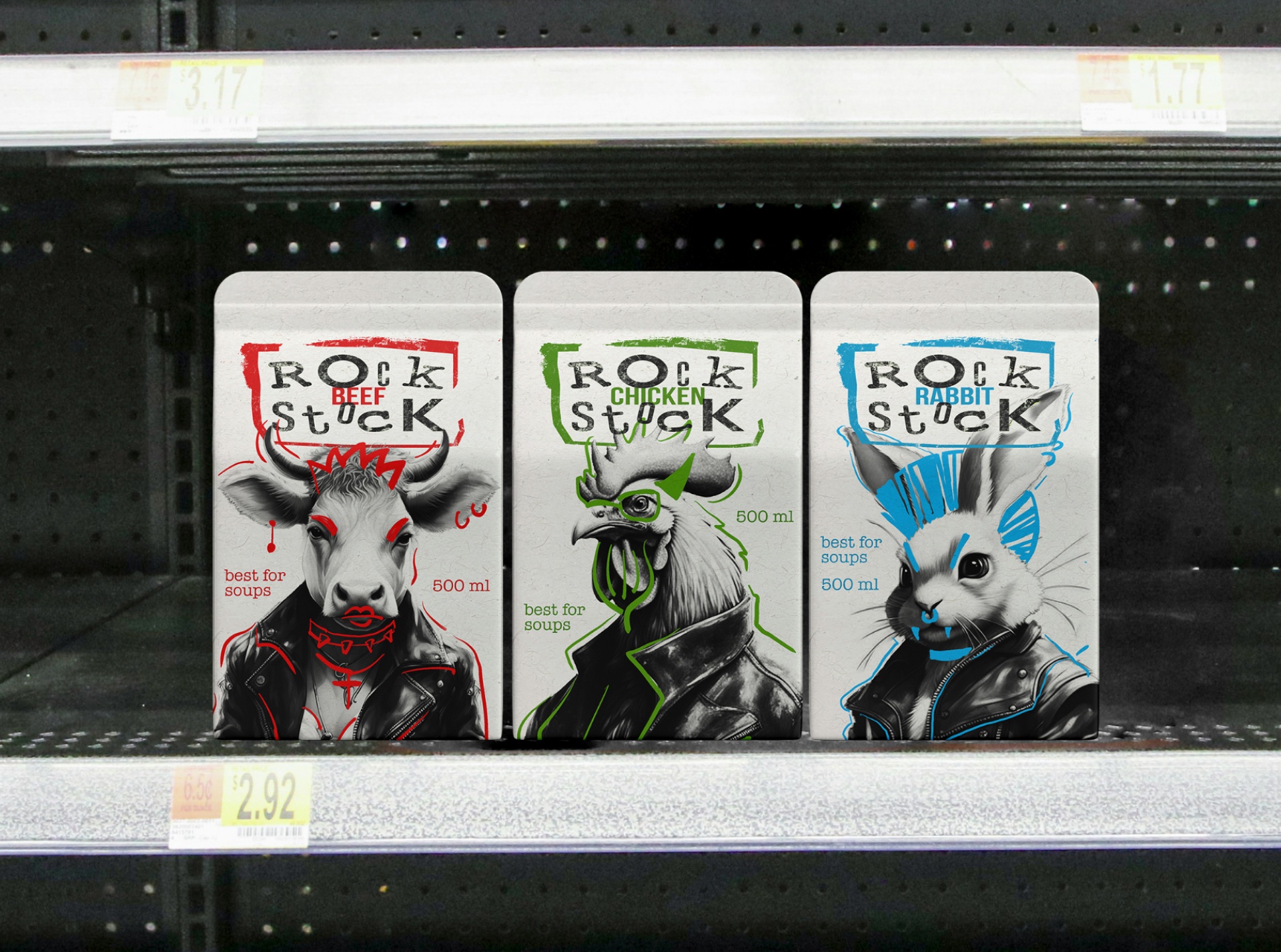
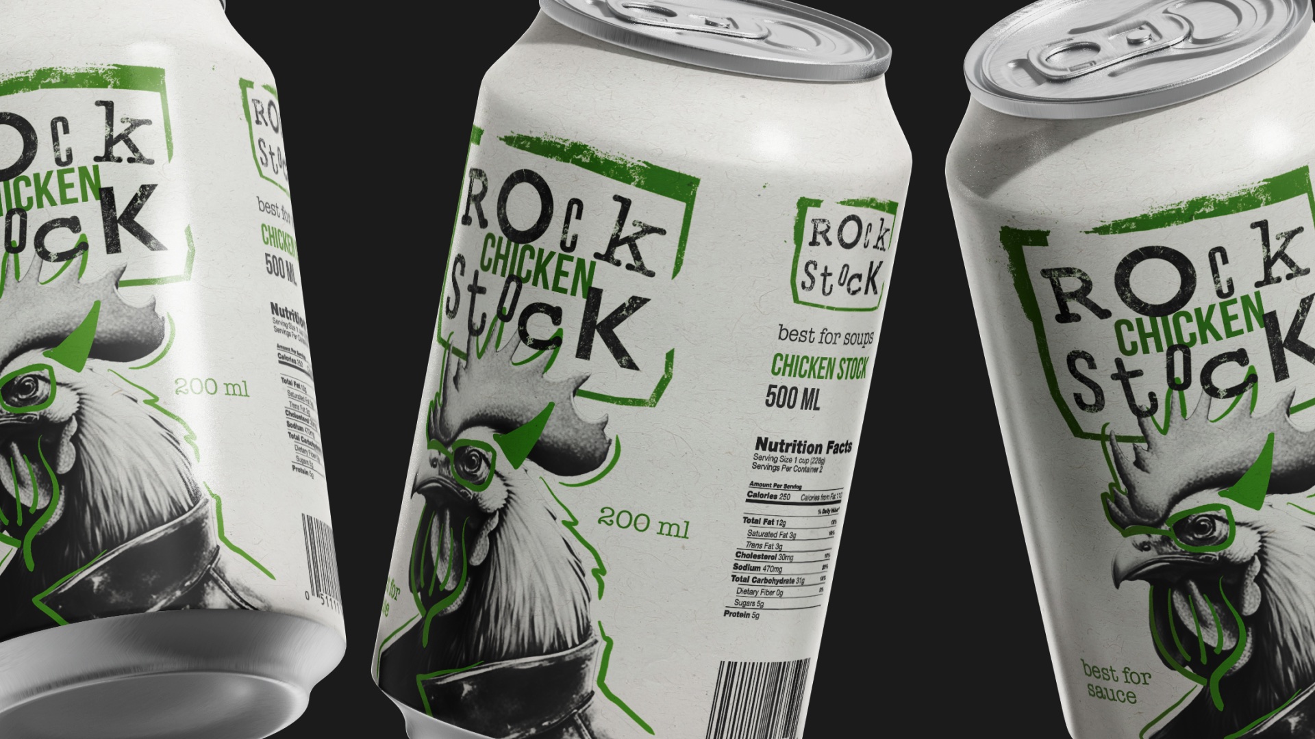
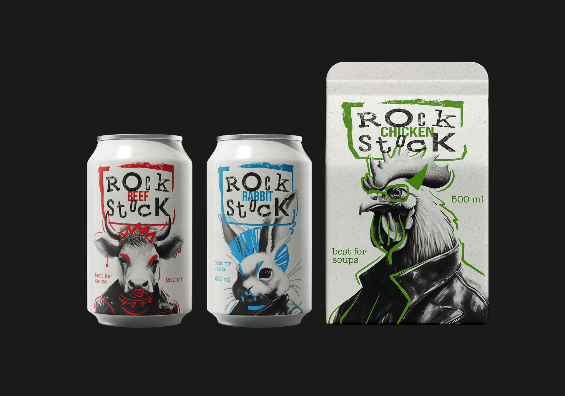
Product Line: The result is a line of natural meat stock available in two packaging types – a bag and an aluminium can. These formats were selected based on their practicality for users. The product line includes three stock varieties: beef, chicken, and rabbit. While beef and chicken are popular choices in culinary products, rabbit stock offers a unique option for dietary dishes. The colors were chosen to clearly differentiate between flavors, adhering to common perceptions (green for chicken and red for beef).
The interplay between the characters and the logo, along with the product itself, creates a design that is both eye-catching and cohesive. This packaging line stands out on the market shelf and holds its own against other stock design solutions.
