Designed by: PepsiCo Design & Innovation
Country: United States

Rojalet

lovely-package-rojalet-1

Designed by Atipus | Country: Spain

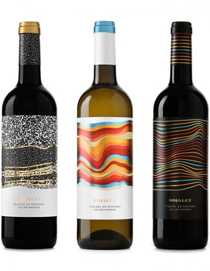
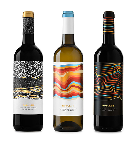
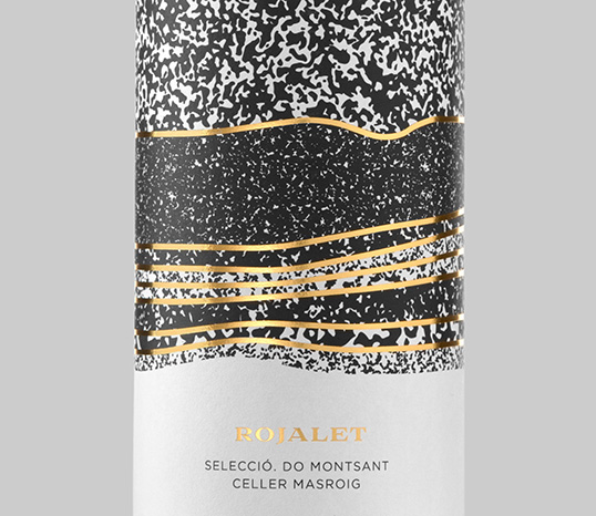
“The thirsty vines stretch their roots downwards through the earth, opening up little paths through the red clay, our clay, the clay of El Masroig.

For the label design we were inspired by the name of the product itself (Rojalet sounds similar to red in catalan) and the unique red strata of the soil where the grapes are grown.

The strata tell the story of the soil, its composition and thus the character of the grape.In the labels, more than representing one type of soil, we aim to communicate through an abstract vision of this layer the wine you´ll find in the bottle: fresh, fruity, dense, wood, etc.”
lovely-package-rojalet-2

Get the latest packaging design inspiration in your inbox:

Popular designs

Studio La Regina Revamps Packaging Design for 7 Colli Amaro

Studio La Regina has transformed the packaging of 7 Colli, an artisan amaro with a loyal following, to support its distribution expansion. The new design features a sleek cylindrical bottle and a striking label with a deep black background, gold foil text, and a distinctive, multi-colored number 7.

Creating a Strong Brand Identity: The Journey of Living Things Packaging Design

“Developing Living Things packaging involved multiple design stages, feedback, and refinement. With extensive market research, collaboration with brand strategist Jose Debate and design agency Studio Nari, we created a strong, recognizable brand identity appealing to health-conscious, trend-setting millennials and Gen Z.”

Unique Whisky Packaging Design Celebrates 40-Year Legacy

Stckmn crafted ‘The Only Drop,’ a unique whisky packaging celebrating liquid and cask unity. Featuring handcrafted paper pulp sculptures and transparent bottle designs, the project fetched £18,750 at auction, aiding Scottish youth.

Designed by: PepsiCo Design & Innovation
Country: United States

Rojalet

lovely-package-rojalet-1

lovely-package-rojalet-1

Designed by Atipus | Country: Spain

“The thirsty vines stretch their roots downwards through the earth, opening up little paths through the red clay, our clay, the clay of El Masroig.

For the label design we were inspired by the name of the product itself (Rojalet sounds similar to red in catalan) and the unique red strata of the soil where the grapes are grown.

The strata tell the story of the soil, its composition and thus the character of the grape.In the labels, more than representing one type of soil, we aim to communicate through an abstract vision of this layer the wine you´ll find in the bottle: fresh, fruity, dense, wood, etc.”

lovely-package-rojalet-2

Previous slide
Next slide
Get the latest on packaging design in your inbox: