Designed by Robot Food | Country: United Kingdom
“Juicing has taken the UK by storm and new company, Roots & Bulbs, has responded with London’s first cold pressed juice bar. Their first shop recently opened on Thayer Street (off Marylebone High Street) with branding and packaging by renowned branding agency, Robot Food.
Stories of celebrity juice diets and the health benefits of juicing are widespread, and with John Lewis reporting a 1000% increase in sales of juicers from 2012 to 2013, it seems juicing is here to stay.”


“With many high street chains now offering vegetable based juice products, Roots & Bulbs declares, “We’re different because we cold press”. Cold pressing is an artisanal technique, which preserves more nutrients for juices brimming with natural goodness and flavour.
As nutrients diminish over time, all the juices are made fresh on site each day, and the deliciousness doesn’t end there. They also make superfood smoothies to order and fabulously wholesome organic meals.”


“Robot Food created the brand tone and designed the branding, packaging, printed material, signage and in-store advertising. A logo was also developed for ‘The Smoothie Bar’ with a neon sign commissioned to Leeds neon artist, Neoncraft.
“Working closely with our architects, K-studio, Robot Food has created a unique branded experience. The design blends minimalism with natural materials and contemporary graphic elements for exactly the confident, uncontrived feel we were hoping for.” Sarah Cadji, Director at Roots & Bulbs.
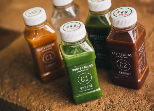
The packaging and in-store messaging is simple and informative, with categories such as ‘G’ for Greens, ‘C’ for Carrot and ‘A’ for Almond Milk. Numbers have been added to the initials to signify sweetness in the style of a periodic table, and staff proclaim their own juice choice on the back of their T-shirt.”


“I’ve been juicing for a while and it’s great working with Sarah because she’s so passionate about what she does. It’s always fun to see your packaging on shelf, but nothing beats walking in to an environment you’ve helped shape.” Simon Forster, Creative Director at Robot Food.”