Designed by: PepsiCo Design & Innovation
Country: United States

Sagobe Beer Packaging Design

Designed by: Bracom Agency | Country: Vietnam

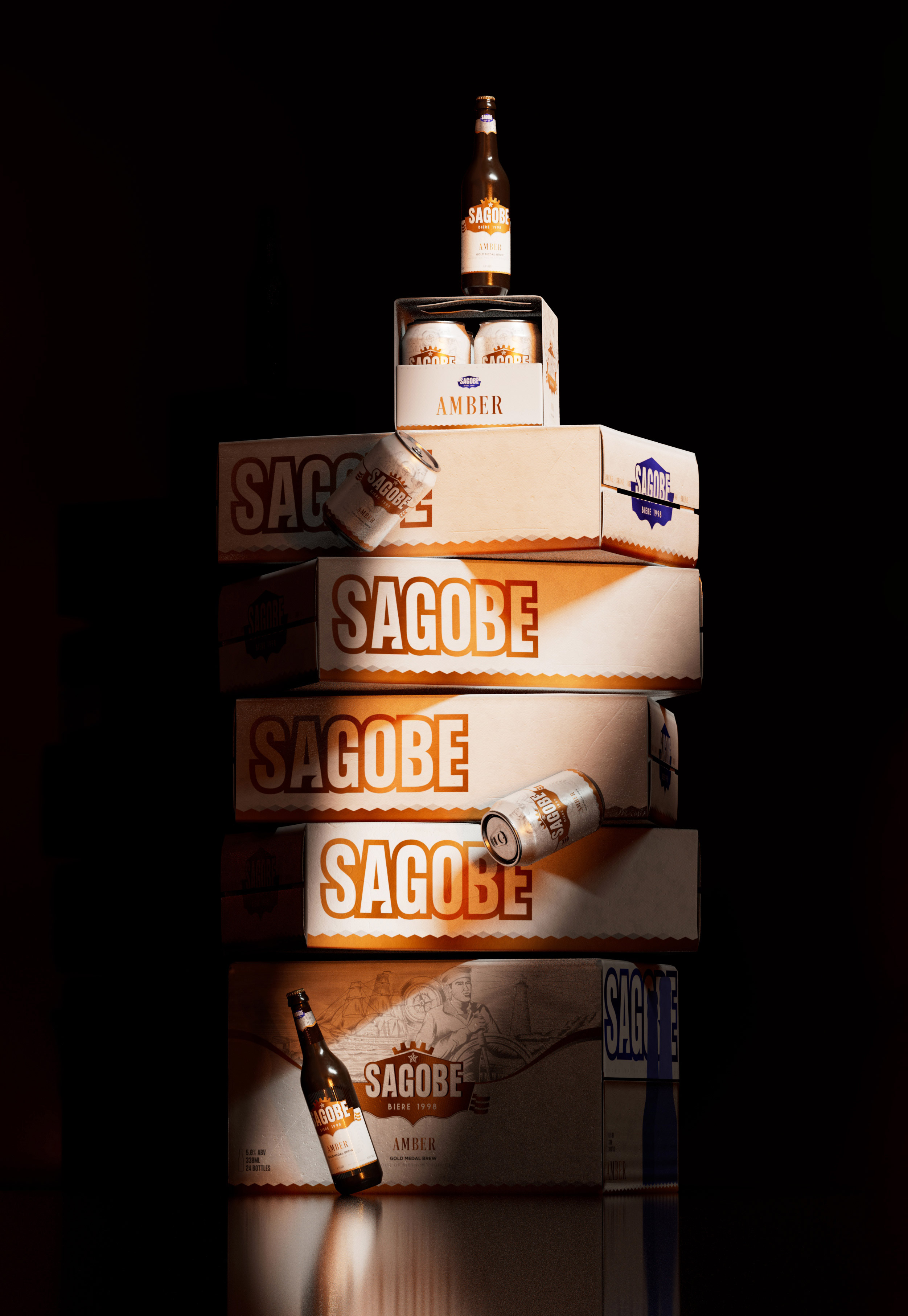
Sagobe, a cold brew beer brand, is extremely popular with Russian navy sailors who spend a good part of their lives on long sea voyages. Sagobe Beer is made using craft recipes from Vietnam and enhanced using cold brewing techniques. The beer is known for its multilayered flavors: cool in the throat, bitter when you take the first sip, and a long-lasting “sweetness on the palette.”

That taste brings interesting experiences and could be combined as a journey across the sea of the sailors to explore new lands on the other side of the ocean. For this reason, Bracom team used beautiful images of naval soldiers strutting on ships at sea to draw the main picture for the overall packaging design of the product. We hope to share a little taste of the sea to the drinker every time they take a sip of Sagobe beer.”
Sagobe Beer Packaging Design

The packaging

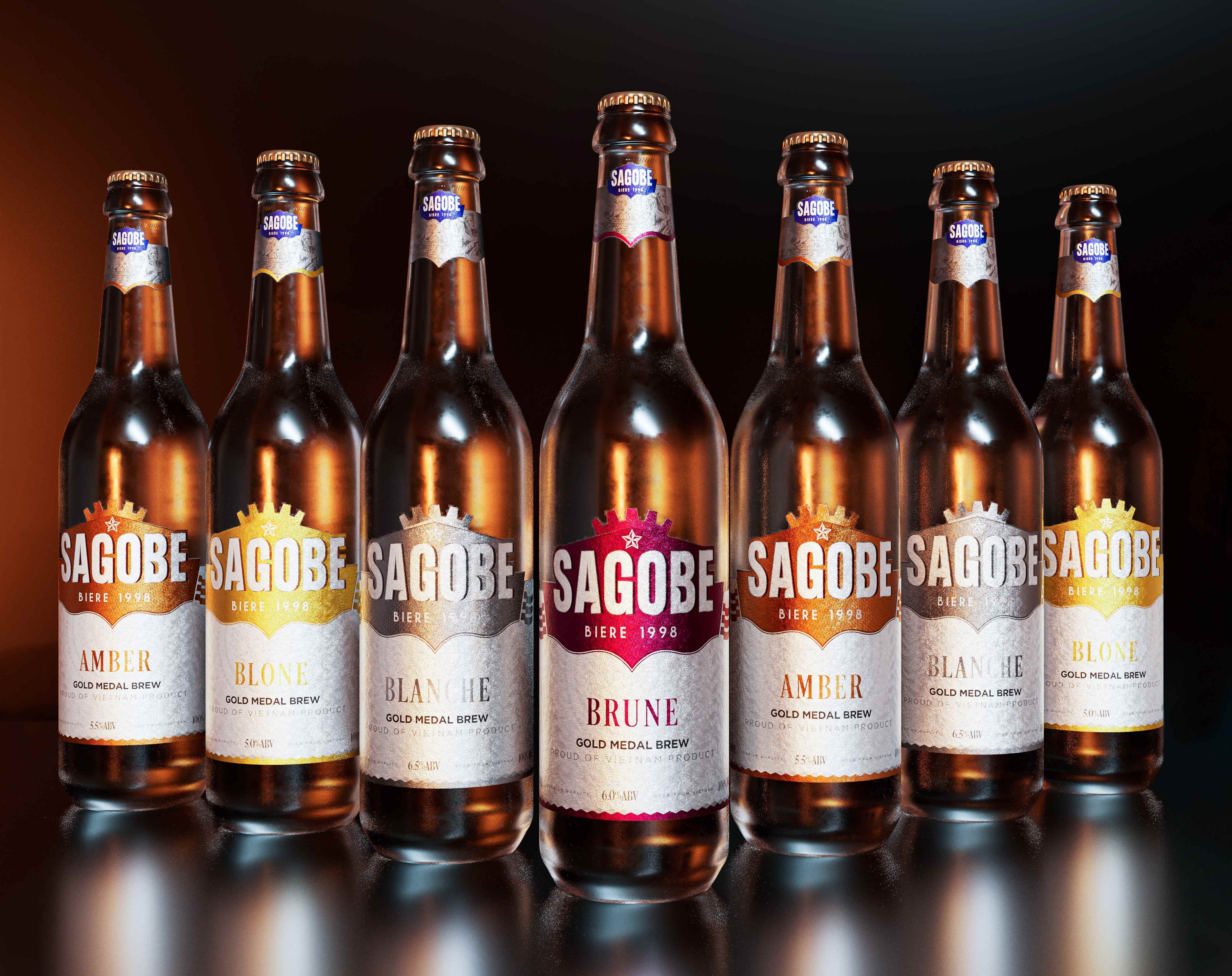
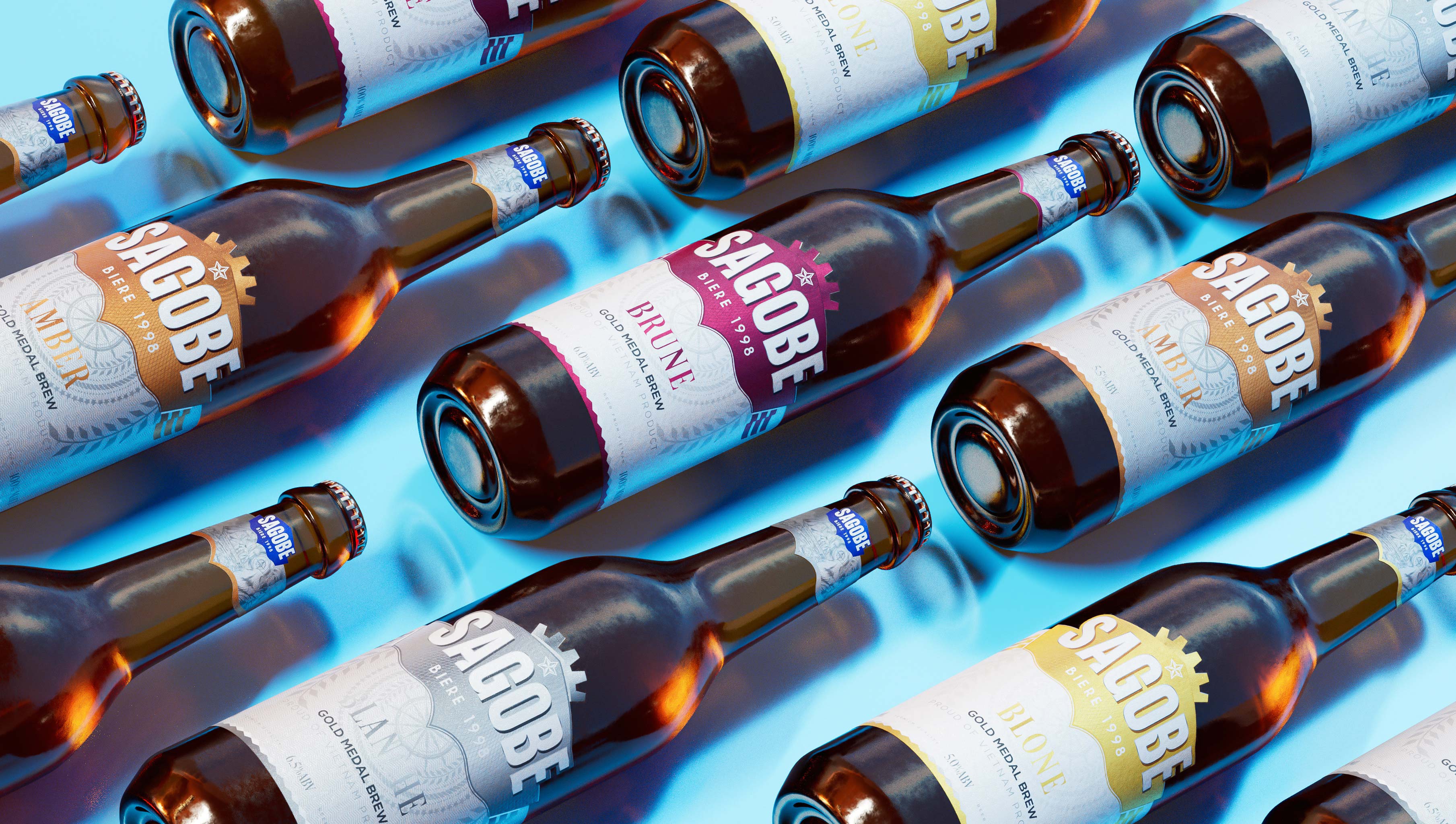
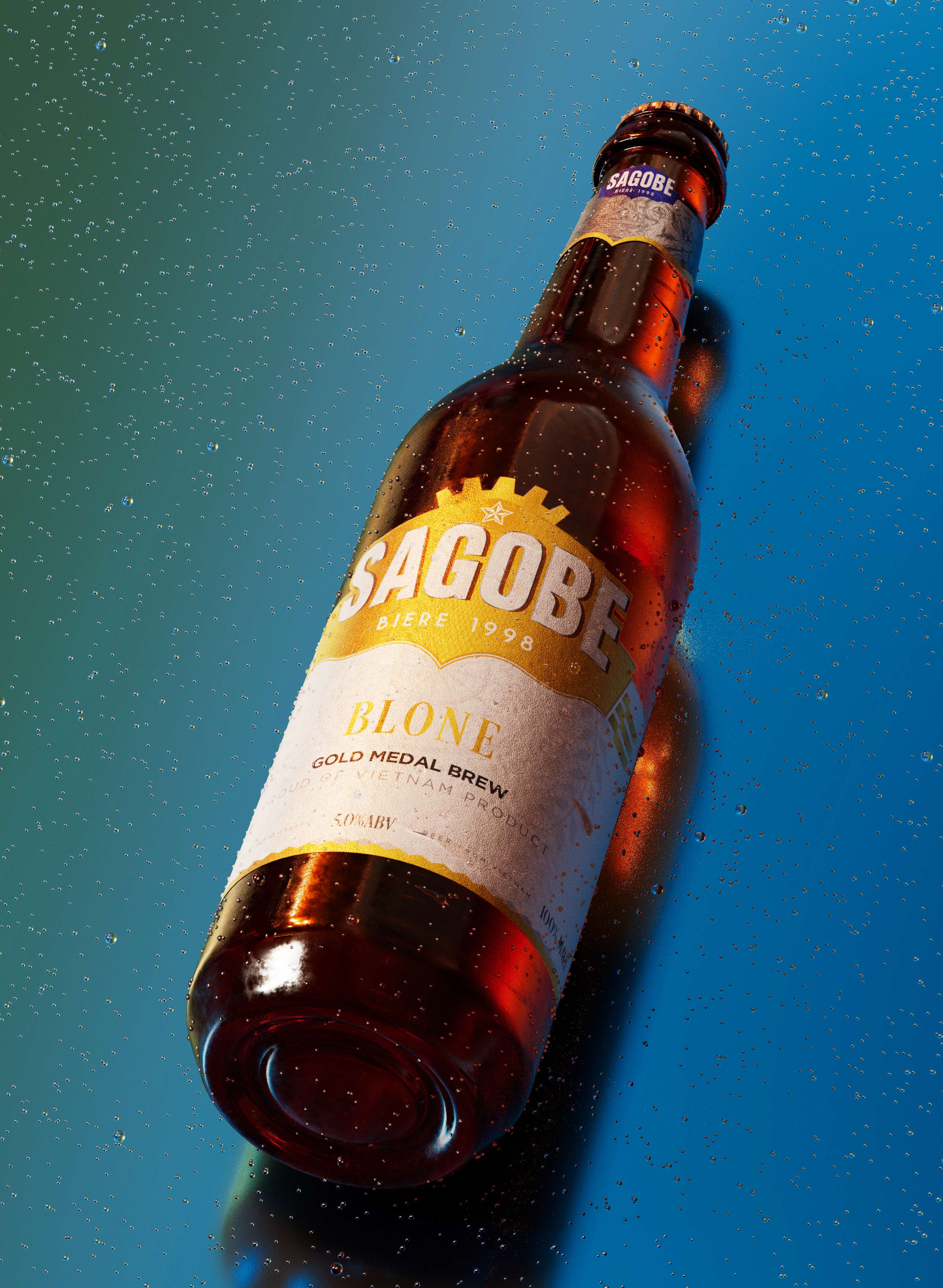
Sagobe combined its forces with the Ho Chi Minh City-based creative company, Bracom Agency, to create packaging designs that would easily communicate the brand identity to the customers. Each flavor is assigned a unique color that lets the customers know about the kind of beer they are about to consume. The simple packaging design is attractive and enhances the shelf value.

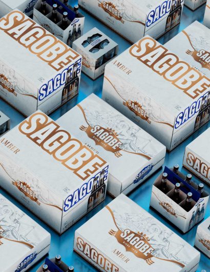
As the main touchpoint to connect with consumers, Sagobe’s packaging was raised up to be the spotlight of the whole identity. Turning the constraint of fixed material into advantage, so much effort has been put on to create the eco-friendly and yet user-friendly packaging. Every decision on using any key visual was seriously considered to make the packaging look cool and booming from the outside. The full set of products includes 4 kinds of boxes to hold: 4 cans, 4 bottles, 24 cans and 24 bottles, all dedicated to Sagobe’s consumers.


Get the latest packaging design inspiration in your inbox:

Popular designs

Studio La Regina Revamps Packaging Design for 7 Colli Amaro

Studio La Regina has transformed the packaging of 7 Colli, an artisan amaro with a loyal following, to support its distribution expansion. The new design features a sleek cylindrical bottle and a striking label with a deep black background, gold foil text, and a distinctive, multi-colored number 7.

Designed by: PepsiCo Design & Innovation
Country: United States

Sagobe Beer Packaging Design

7a

Designed by: Bracom Agency | Country: Vietnam

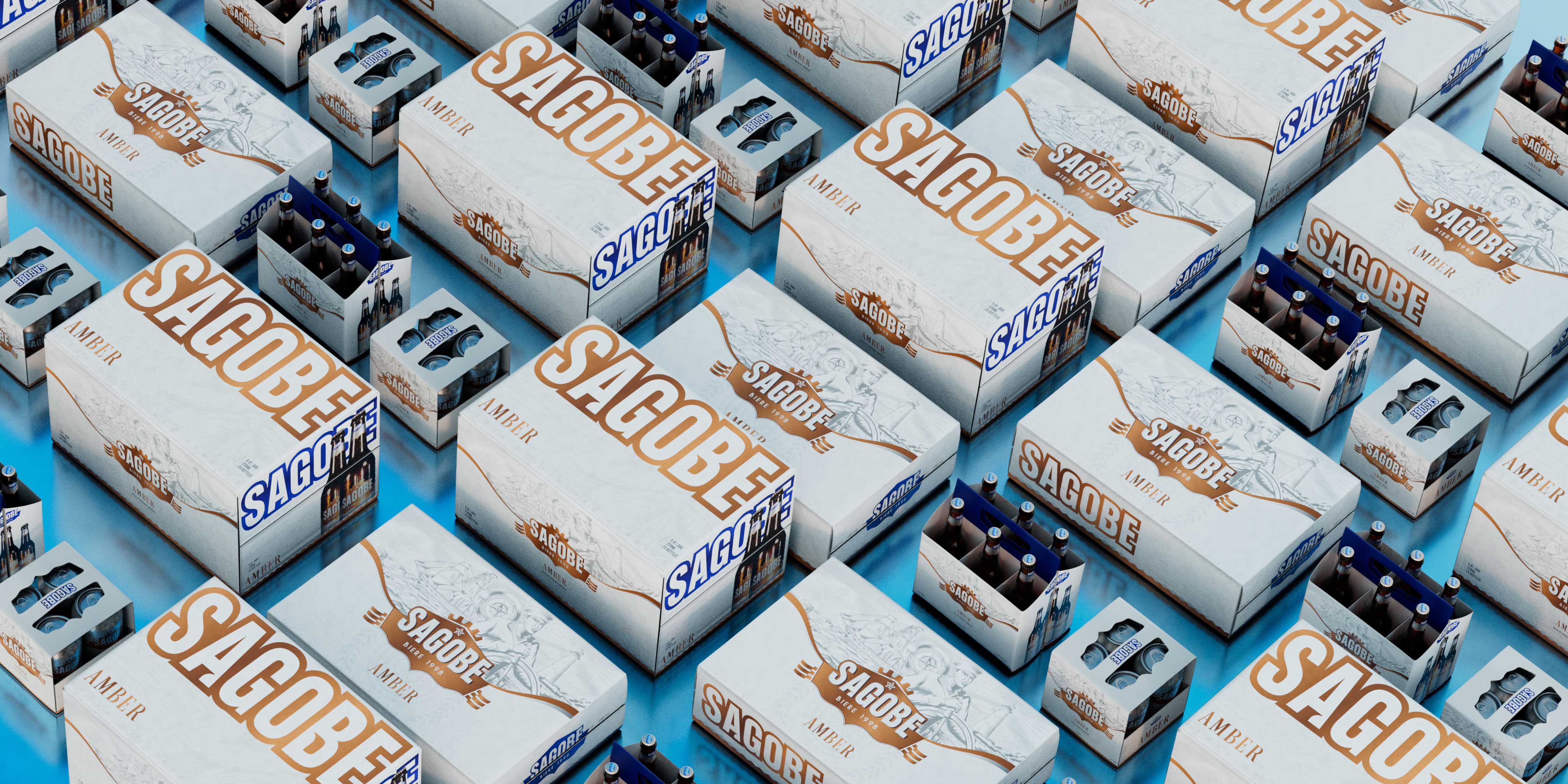
Sagobe, a cold brew beer brand, is extremely popular with Russian navy sailors who spend a good part of their lives on long sea voyages. Sagobe Beer is made using craft recipes from Vietnam and enhanced using cold brewing techniques. The beer is known for its multilayered flavors: cool in the throat, bitter when you take the first sip, and a long-lasting “sweetness on the palette.”

That taste brings interesting experiences and could be combined as a journey across the sea of the sailors to explore new lands on the other side of the ocean. For this reason, Bracom team used beautiful images of naval soldiers strutting on ships at sea to draw the main picture for the overall packaging design of the product. We hope to share a little taste of the sea to the drinker every time they take a sip of Sagobe beer.”
Sagobe Beer Packaging Design

The packaging

Sagobe combined its forces with the Ho Chi Minh City-based creative company, Bracom Agency, to create packaging designs that would easily communicate the brand identity to the customers. Each flavor is assigned a unique color that lets the customers know about the kind of beer they are about to consume. The simple packaging design is attractive and enhances the shelf value.

As the main touchpoint to connect with consumers, Sagobe’s packaging was raised up to be the spotlight of the whole identity. Turning the constraint of fixed material into advantage, so much effort has been put on to create the eco-friendly and yet user-friendly packaging. Every decision on using any key visual was seriously considered to make the packaging look cool and booming from the outside. The full set of products includes 4 kinds of boxes to hold: 4 cans, 4 bottles, 24 cans and 24 bottles, all dedicated to Sagobe’s consumers.

Previous slide
Next slide
Get the latest on packaging design in your inbox: