Designed by: PepsiCo Design & Innovation
Country: United States

Sainsbury’s Tea Packaging Design

Designed by: 3rd Floor | Country Netherlands

The British love their tea and birds. Clear blue skies above, birds chirping in the garden, and a cup of English tea with their beloved: nothing could beat that experience! The idea for the packaging design of Sainsbury’s came from the British sense of romanticism.

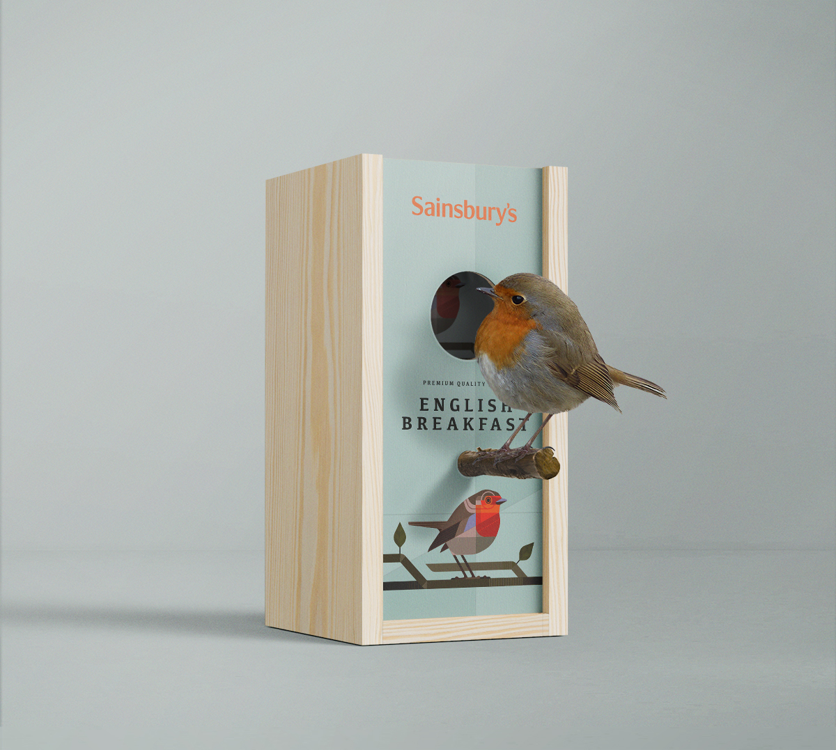
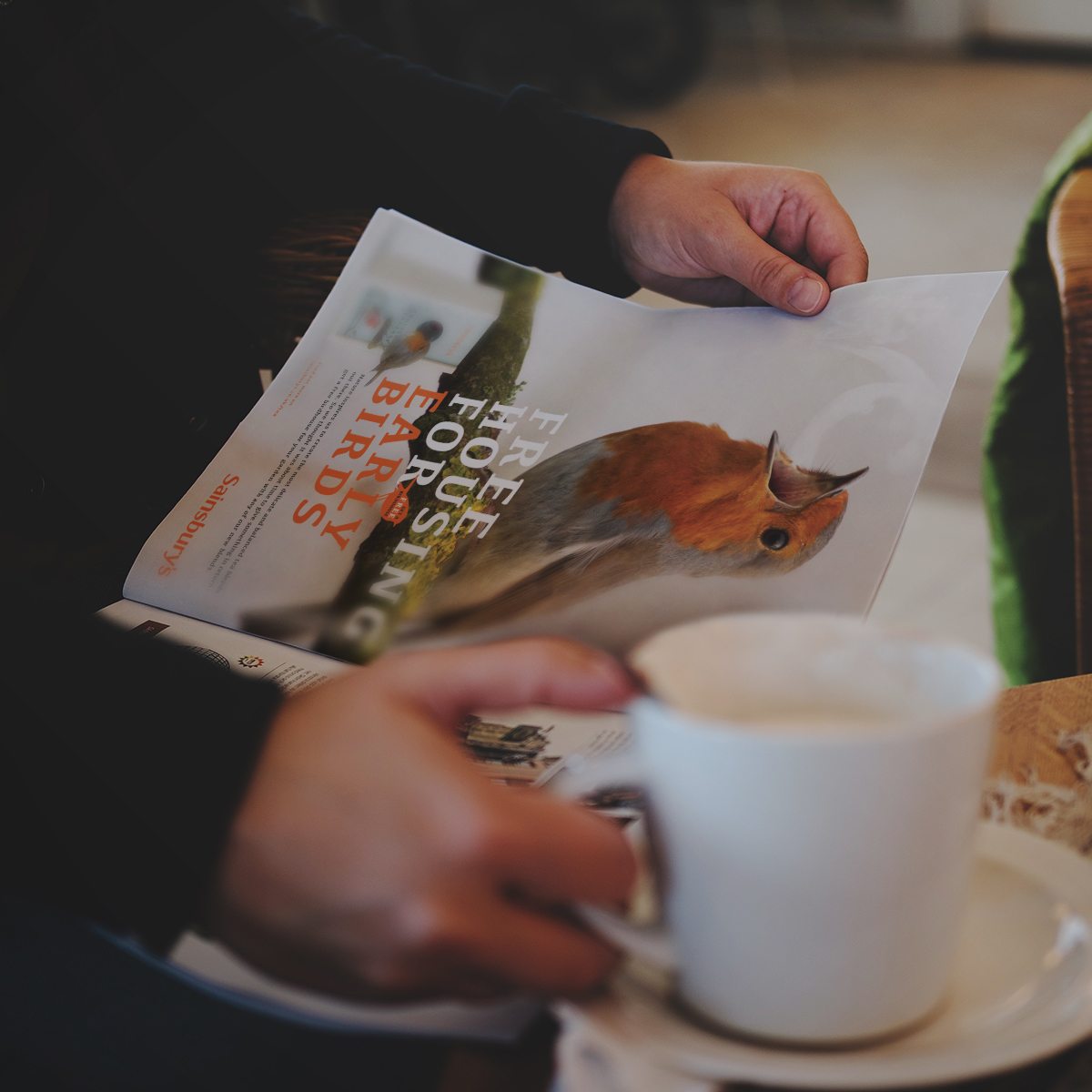
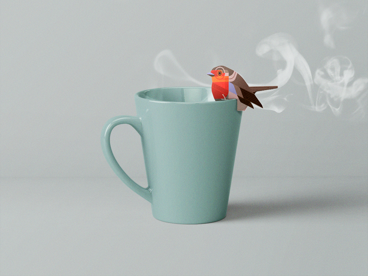
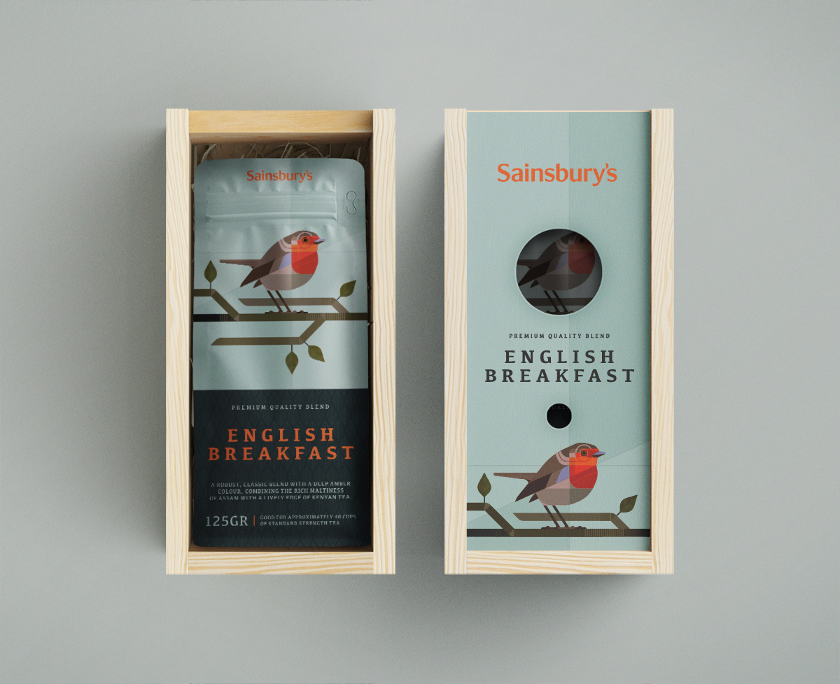
“So what started out as a set of experimental illustrations of birds based on geometrical shapes and a limited color pallet evolved into a set of packaging designs for tea. Next to those I’ve also designed the little labels that goes on the actual teabags and a give-away; a basic bird feeder; that doubles as a gift box for the packaging similar to the ones that are used for wine bottles. A simple advert and poster complete the set.”
Sainsbury’s Tea Packaging Design

The packaging

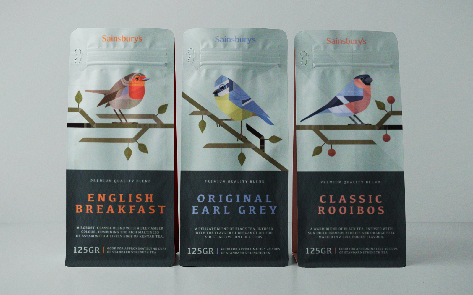
Created by Breda-based design agency 3rd Floor, the central theme of the packaging design are birds. The geometrically patterned birds with different color schemes signify the various flavors the fictional tea brand manufactures. The color palette and the geometrical patterns set the brand apart from its competitors when sitting on a shelf.

“Different flavors can be added to the series as long as more native birds can be depicted. Based on this first set of three we should be able to add at least a dozen more before we will run into an issue and need to derive to more obscure/lesser known species. The fact that this design can be executed using basic materials and proven constructions with minimal adjustments ensures an effective and relatively cheap solution to help this classic product stand out.

Get the latest packaging design inspiration in your inbox:

Popular designs

Designed by: PepsiCo Design & Innovation
Country: United States

Sainsbury’s Tea Packaging Design

05_Tea

Designed by: 3rd Floor | Country Netherlands

The British love their tea and birds. Clear blue skies above, birds chirping in the garden, and a cup of English tea with their beloved: nothing could beat that experience! The idea for the packaging design of Sainsbury’s came from the British sense of romanticism.

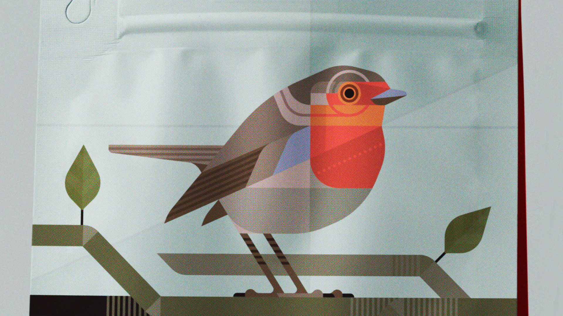
“So what started out as a set of experimental illustrations of birds based on geometrical shapes and a limited color pallet evolved into a set of packaging designs for tea. Next to those I’ve also designed the little labels that goes on the actual teabags and a give-away; a basic bird feeder; that doubles as a gift box for the packaging similar to the ones that are used for wine bottles. A simple advert and poster complete the set.”
Sainsbury’s Tea Packaging Design

The packaging

Created by Breda-based design agency 3rd Floor, the central theme of the packaging design are birds. The geometrically patterned birds with different color schemes signify the various flavors the fictional tea brand manufactures. The color palette and the geometrical patterns set the brand apart from its competitors when sitting on a shelf.

“Different flavors can be added to the series as long as more native birds can be depicted. Based on this first set of three we should be able to add at least a dozen more before we will run into an issue and need to derive to more obscure/lesser known species. The fact that this design can be executed using basic materials and proven constructions with minimal adjustments ensures an effective and relatively cheap solution to help this classic product stand out.

Previous slide
Next slide
Get the latest on packaging design in your inbox: