Designed by: PepsiCo Design & Innovation
Country: United States

Salomon Exo III Calf

Salomon Exo III Calf

Designed by Petar Pavlov | Country: Macedonia

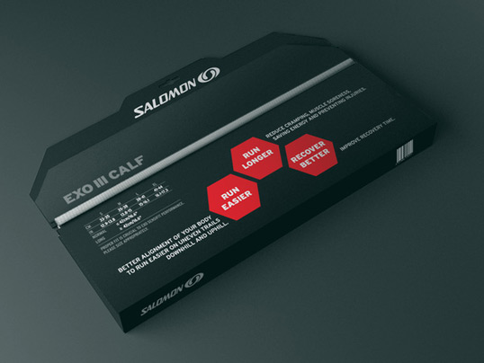
“After seeing my Doritos Packaging Concept, Salomon gave me an opportunity to create a packaging design for one of their new products Exo III Calf (Compression tights for calves) and an In-Store Display for the entire Exo Sensifit Range.”

Salomon Exo III Calf

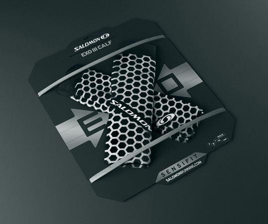
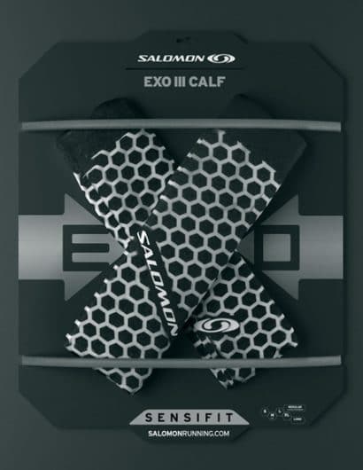
The compression tights were placed in such a manner to represent the letter “X” in the EXO logo. The product was kept in place by two knitted elastic bands.

Salomon Exo III Calf

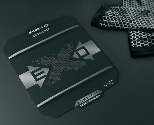
When the product is removed, a hidden “X” becomes visible.

Salomon Exo III Calf

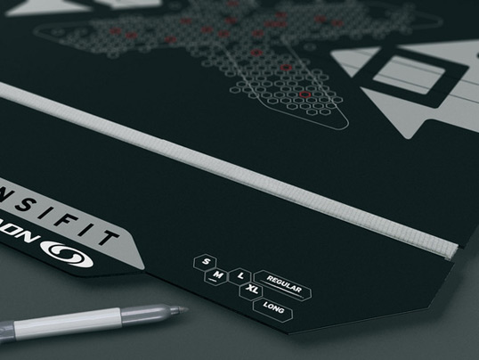
Many packagings have their size labeled on the back of the packaging. This makes it hard for the customer to find the right size instantly. That’s why I decided to place it on front. The proper size is underlined with a silver marker.

Salomon Exo III Calf

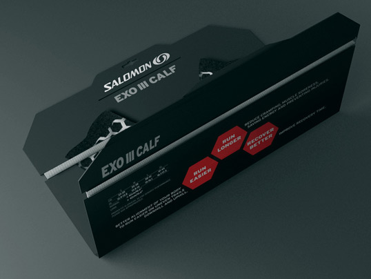
The dieline construction allows for the packaging to be folded and neatly closed upon purchase.

Salomon Exo III Calf

Get the latest packaging design inspiration in your inbox:

Popular designs

Pure Persian Honey

When we look closely at honey packaging, they are almost all in the usual format, and the ultimate in creativity is that

Burma Love Rebrand

Love at First BiteAs an extension of the Burma Superstar restaurant in San Francisco, Burma Love Foods gives diners an opportunity to

The Bra Guru

Most women are wearing the wrong size bra and that is a fact. The Bra Guru® is the first and only professional

Designed by: PepsiCo Design & Innovation
Country: United States

Salomon Exo III Calf

salomon1

Salomon Exo III Calf

Designed by Petar Pavlov | Country: Macedonia

“After seeing my Doritos Packaging Concept, Salomon gave me an opportunity to create a packaging design for one of their new products Exo III Calf (Compression tights for calves) and an In-Store Display for the entire Exo Sensifit Range.”

Salomon Exo III Calf

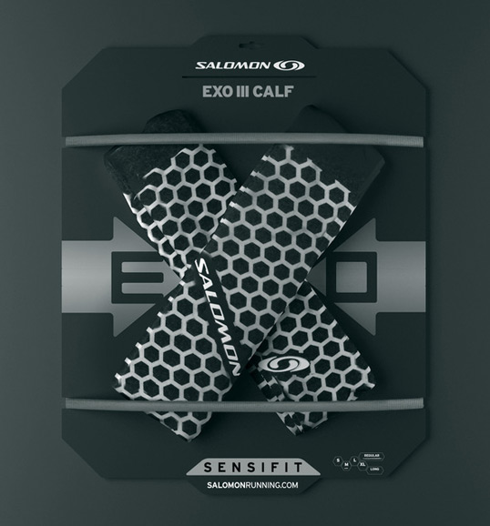
The compression tights were placed in such a manner to represent the letter “X” in the EXO logo. The product was kept in place by two knitted elastic bands.

Salomon Exo III Calf

When the product is removed, a hidden “X” becomes visible.

Salomon Exo III Calf

Many packagings have their size labeled on the back of the packaging. This makes it hard for the customer to find the right size instantly. That’s why I decided to place it on front. The proper size is underlined with a silver marker.

Salomon Exo III Calf

The dieline construction allows for the packaging to be folded and neatly closed upon purchase.
Salomon Exo III Calf

Previous slide
Next slide

Explore more great package design

Get the latest on packaging design in your inbox: