Designed by: PepsiCo Design & Innovation
Country: United States

Santini for Selfridges

Santini for Selfridges

Designed by Purpose | Country: United Kingdom | Fonts used: Helvetica Inserat

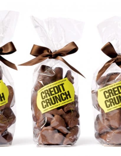
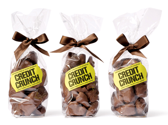
“Selfridges wanted a special chocolate, to coincide with National Chocolate Week 2008, and the fact that – due to world events – people are spoiling themselves with little ‘treat’ purchases.

Purpose worked with restaurateur and Food Writer Laura Santini, and The Chocolate Society to produce some Hokey Pokey with a topical twist.”

Get the latest packaging design inspiration in your inbox:

Popular designs

D’eyras – Medrono & Olive Oil

What connects D´EYRAS, Medronho, and Olive Oil? They all hail from the same country: Portugal. These trees are indigenous to the region, serving as a testament to the bountiful and diverse Mediterranean flora.

Art Meets Craftsmanship in BrewBeak Beer Series Packaging Design

“BrewBeak Beer Series Packaging Design artfully fuses craftsmanship and art, reflecting the brand’s philosophy and the beauty of nature. Through minimalist design and bird-themed illustrations, each package uniquely represents different beer varieties, creating a memorable and sophisticated brand identity.”

Designed by: PepsiCo Design & Innovation
Country: United States

Santini for Selfridges

creditcrunh

Santini for Selfridges

Designed by Purpose | Country: United Kingdom | Fonts used: Helvetica Inserat

“Selfridges wanted a special chocolate, to coincide with National Chocolate Week 2008, and the fact that – due to world events – people are spoiling themselves with little ‘treat’ purchases.

Purpose worked with restaurateur and Food Writer Laura Santini, and The Chocolate Society to produce some Hokey Pokey with a topical twist.”

Previous slide
Next slide
Get the latest on packaging design in your inbox: