Designed by: PepsiCo Design & Innovation
Country: United States

Sarotti Cherry Packaging Design

1

Designed by: Hajok Design | Country: Germany

Sarotti, a German brand known for its sugar-coated cherry, has “three different types of alcoholic pralines with whole cherries in its line-up.” The brand wanted to develop a packaging system that would connect with the customers emotionally and highlight its premium quality.

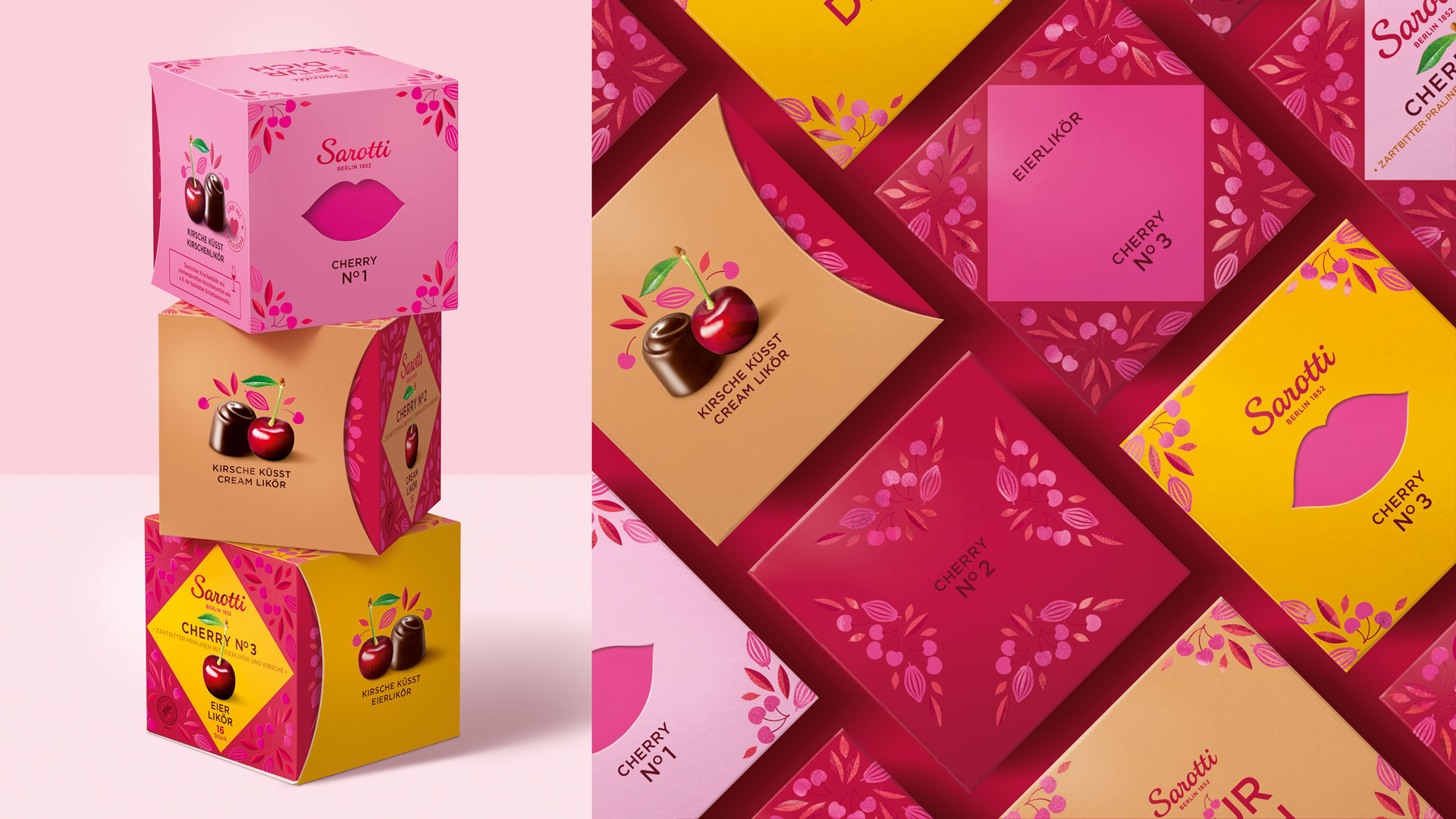
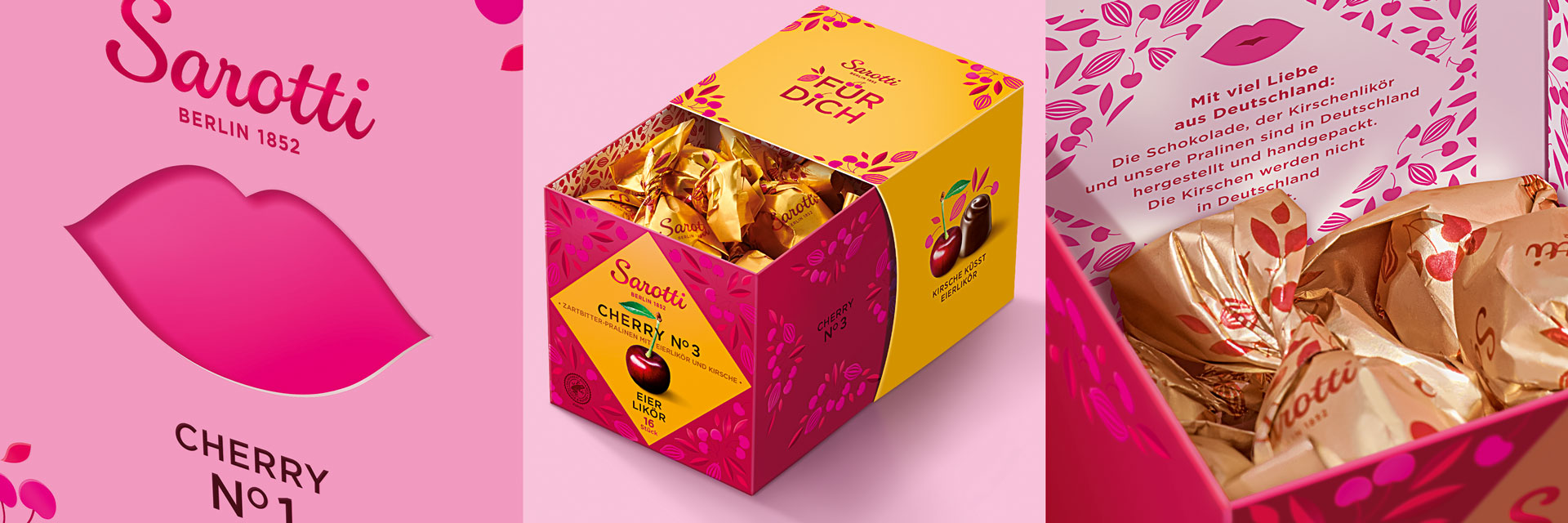
“The aim was to develop a modern, emotional packaging design that reflects the premium quality of the chocolates and also appeals to a younger target group. In addition, the packaging should encourage people to buy them as a gift. The intention was for the pack to be a visual highlight on any dining table to be eaten straight out of the box. The two-part cardboard box with an innovative opening mechanism complete with a vent cut-out was to be embellished with loving details to heighten the emotional appeal of the product.

Sarotti Cherry Packaging Design

The packaging

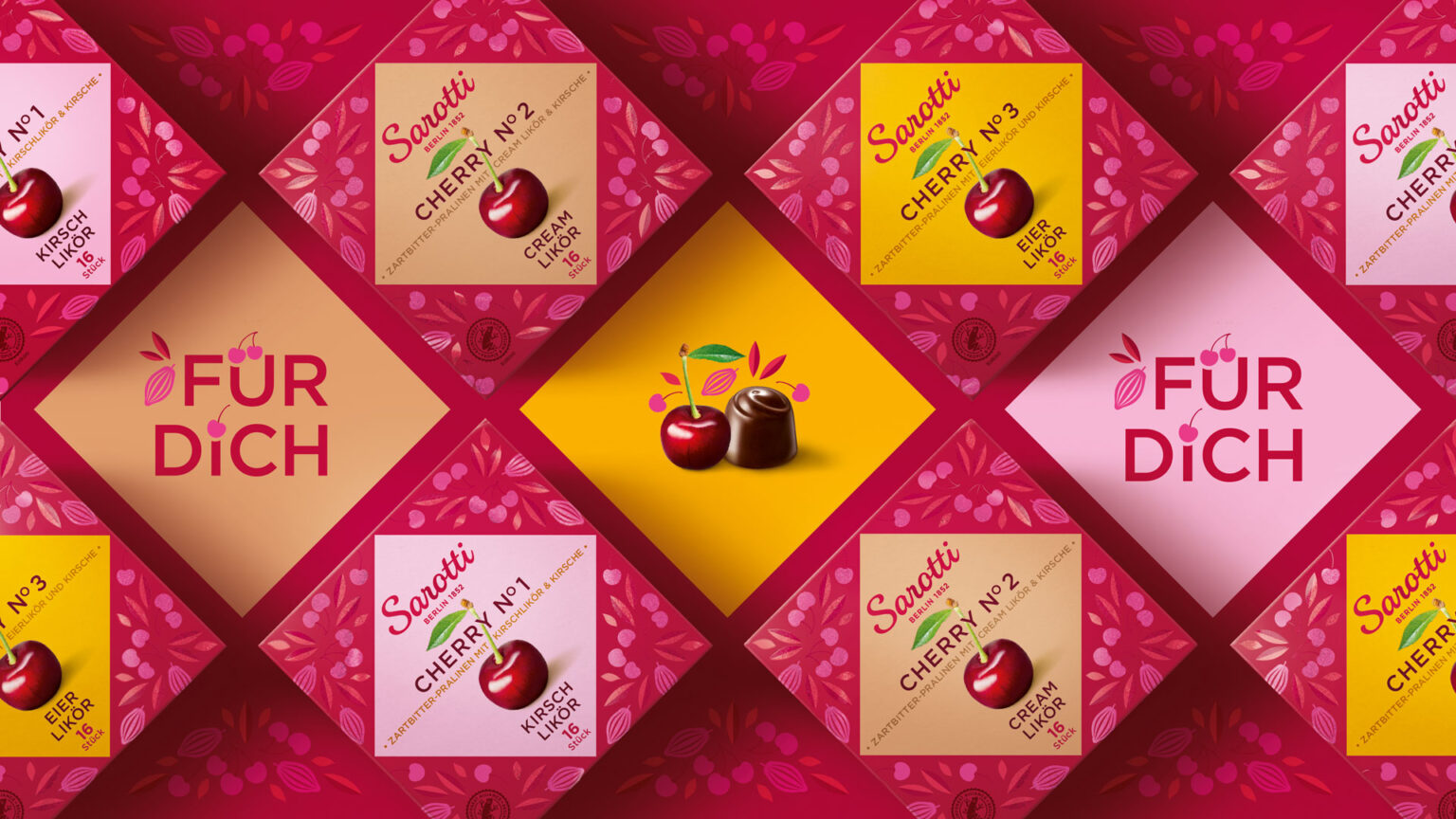
Sarotti teamed up with Hajok, a Hamburg-based design agency, to create packaging illustrations that would enhance the shelf value of the products. Hajok used a combination of red and pink along with cocoa-bean and cherry illustrations to attract customers.

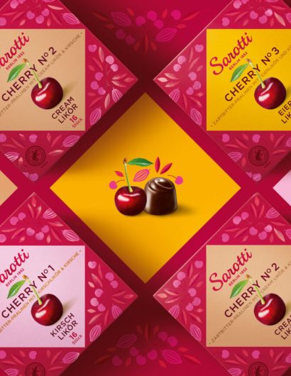
“The HAJOK team really looked forward to the 360° storytelling! Both the interior as well as the exterior of the two-piece box are intrinsic parts of the on-pack design. Die-cut elements, cherry and cocoa-bean illustrations and the red and pink color scheme all combine to create an on-shelf presence that immediately catches the eye. The diamond shape is in a color that boldly contrasts to the background. This serves to stage the brand while the color coding stands for the respective flavor. This attention to detail reflects the premium quality of the pralines and the stylish and refreshingly different design makes CHERRY N° a real gem!

1

Get the latest packaging design inspiration in your inbox:

Popular designs

Laphroaig’s Wellington Boot-Inspired Gift Packaging Design

Laphroaig leverages story-telling to engage new drinkers, transforming the iconic green wellies into a giftable, reusable packaging for their single malt whisky. The wellie-inspired design disrupts traditional Scotch packaging, adding a playful touch to the brand’s history.

Designed by: PepsiCo Design & Innovation
Country: United States

Sarotti Cherry Packaging Design

1
verpackungdesign-sarotti-cherry-hajok-1536x864

Designed by: Hajok Design | Country: Germany

Sarotti, a German brand known for its sugar-coated cherry, has “three different types of alcoholic pralines with whole cherries in its line-up.” The brand wanted to develop a packaging system that would connect with the customers emotionally and highlight its premium quality.

“The aim was to develop a modern, emotional packaging design that reflects the premium quality of the chocolates and also appeals to a younger target group. In addition, the packaging should encourage people to buy them as a gift. The intention was for the pack to be a visual highlight on any dining table to be eaten straight out of the box. The two-part cardboard box with an innovative opening mechanism complete with a vent cut-out was to be embellished with loving details to heighten the emotional appeal of the product.

Sarotti Cherry Packaging Design

The packaging

Sarotti teamed up with Hajok, a Hamburg-based design agency, to create packaging illustrations that would enhance the shelf value of the products. Hajok used a combination of red and pink along with cocoa-bean and cherry illustrations to attract customers.

“The HAJOK team really looked forward to the 360° storytelling! Both the interior as well as the exterior of the two-piece box are intrinsic parts of the on-pack design. Die-cut elements, cherry and cocoa-bean illustrations and the red and pink color scheme all combine to create an on-shelf presence that immediately catches the eye. The diamond shape is in a color that boldly contrasts to the background. This serves to stage the brand while the color coding stands for the respective flavor. This attention to detail reflects the premium quality of the pralines and the stylish and refreshingly different design makes CHERRY N° a real gem!

1
Previous slide
Next slide
Get the latest on packaging design in your inbox: