Designed by: PepsiCo Design & Innovation
Country: United States

Sasaki

Sasaki

Designed by Rice Malarney | Country: United States

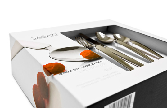
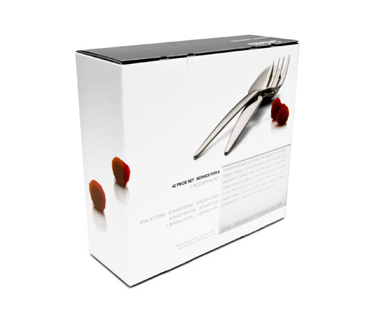
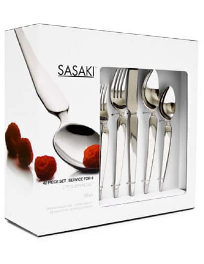
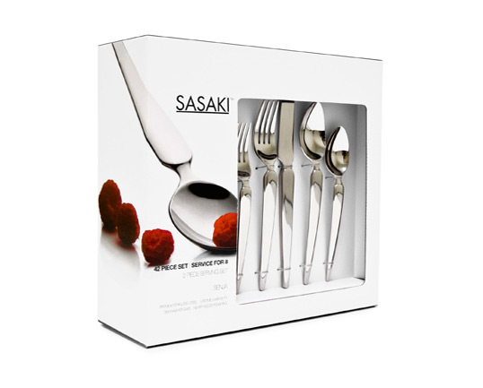
“Sophisticated simplicity in design, Sasaki flatware defines refined contemporary living. With Asian inspiration, the flatware is designed to almost become art, very simple and organic in both shape and style.

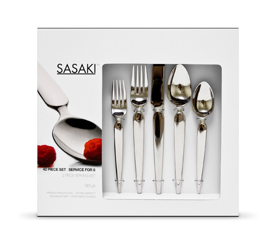
In coming up with the design of the packaging I felt that it was important to focus on the shape and style of the flatware and to try and celebrate the designers craft. The packaging is minimal and straight forward while at the same time showcasing a beautiful product. The overall box is black and white with a peppering of a bold colored fruit which enhances the focus onto the product. This becomes important so that the packaging is able to separate the product from all others and put it on a different, more sophisticated level.”

Sasaki

Sasaki

Sasaki

Get the latest packaging design inspiration in your inbox:

Popular designs

The Port Vodka Lemon Water

Overview: In response to my client’s vision for a Cape Cod themed beverage brand, I embarked on the journey to create The Port

Pure Persian Honey

When we look closely at honey packaging, they are almost all in the usual format, and the ultimate in creativity is that

Far Out Bar

Description: Far Out Bar is a cutting-edge packaging design project created for High Life Farms’ macrodose THC chocolate bars. This project involved

Burma Love Rebrand

Love at First BiteAs an extension of the Burma Superstar restaurant in San Francisco, Burma Love Foods gives diners an opportunity to

Designed by: PepsiCo Design & Innovation
Country: United States

Sasaki

sasaki1

Sasaki

Designed by Rice Malarney | Country: United States

“Sophisticated simplicity in design, Sasaki flatware defines refined contemporary living. With Asian inspiration, the flatware is designed to almost become art, very simple and organic in both shape and style.

In coming up with the design of the packaging I felt that it was important to focus on the shape and style of the flatware and to try and celebrate the designers craft. The packaging is minimal and straight forward while at the same time showcasing a beautiful product. The overall box is black and white with a peppering of a bold colored fruit which enhances the focus onto the product. This becomes important so that the packaging is able to separate the product from all others and put it on a different, more sophisticated level.”
Sasaki

Sasaki

Sasaki

Previous slide
Next slide

Explore more great package design

Get the latest on packaging design in your inbox: