Designed by: PepsiCo Design & Innovation
Country: United States

Sassy Sparkling

sassy1

Designed by Public Creative | Country: Australia

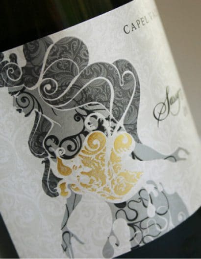
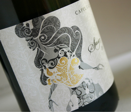
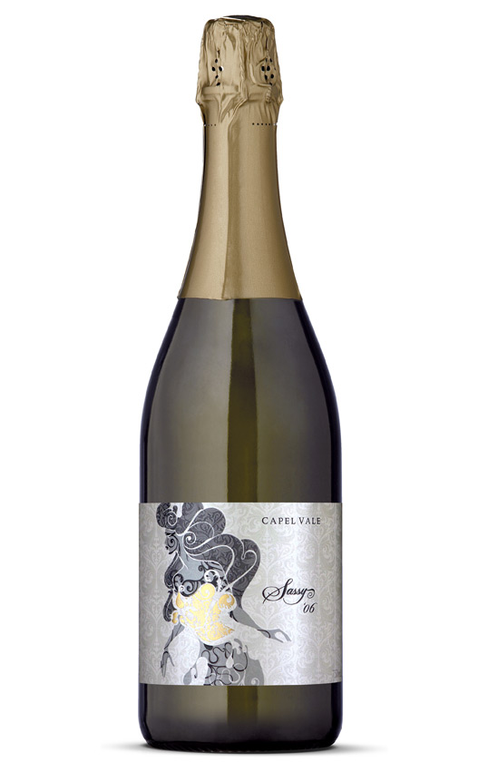
“Capel Vale Wines is a pioneer in the Western Australian wine industry and amongst the first to be established with vines planted in 1974. PublicCreative was engaged by Capel Vale in 2007 to re-brand the entire company’s communications and packaging. Sassy is the last in a long line of ‘re-invention’ projects for Capel Vale.  The breif was to create a new stand alone brand for their Sparkling product.

The new Sassy Sparkling design draws it’s inspiration from a champagne culture which is fashion/design aware. Retail impact for this label was a major consideration and the use of the lusterous Manter Constellation Jade Raster Ultra stock, special high rise screen printing, metallic inks and foils combined with an unorthodox design approach has resulted in a sophisticated and contemporary label which speaks to a very niché market.

We understand the new design has rejuvenated a tired brand that was about to be discontinued and secured a long term position in Capel Vale’s range of wines.”
sassy2

Get the latest packaging design inspiration in your inbox:

Popular designs

Designed by: PepsiCo Design & Innovation
Country: United States

Sassy Sparkling

sassy1

sassy1

Designed by Public Creative | Country: Australia

“Capel Vale Wines is a pioneer in the Western Australian wine industry and amongst the first to be established with vines planted in 1974. PublicCreative was engaged by Capel Vale in 2007 to re-brand the entire company’s communications and packaging. Sassy is the last in a long line of ‘re-invention’ projects for Capel Vale.  The breif was to create a new stand alone brand for their Sparkling product.

The new Sassy Sparkling design draws it’s inspiration from a champagne culture which is fashion/design aware. Retail impact for this label was a major consideration and the use of the lusterous Manter Constellation Jade Raster Ultra stock, special high rise screen printing, metallic inks and foils combined with an unorthodox design approach has resulted in a sophisticated and contemporary label which speaks to a very niché market.

We understand the new design has rejuvenated a tired brand that was about to be discontinued and secured a long term position in Capel Vale’s range of wines.”

sassy2

Explore more great package design

Get the latest on packaging design in your inbox: