


Designed by: SCD | Region: North America
Located in Quindío, Colombia, Salento is a town known for its picturesque landscapes, rare species of birds, and coffee. The multi-colored houses against the backdrop of clear blue skies make this peaceful town a treat for the eyes.
Salento Organics approached SCD, a Bogota-based creative agency, for a brand makeover. Salento shared their origins, “their love for natural ingredients,” and “their mission to help local farmers.”
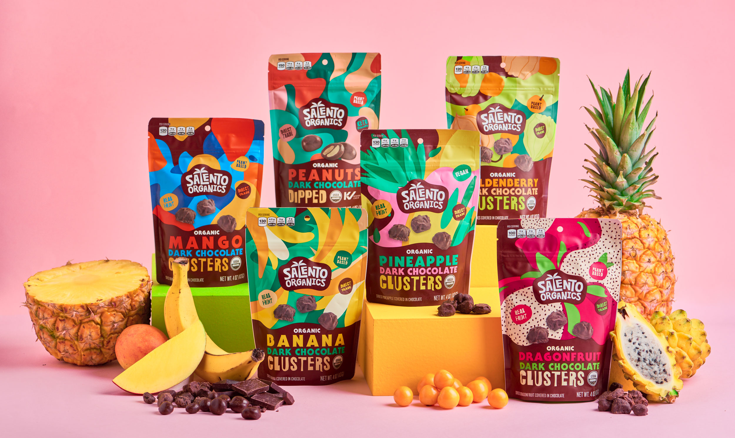
“We started by examining what SO already had: an institutional-looking logo on a sticker. On one side, the logo felt way too serious for a brand that wanted to talk about natural ingredients and fair trade products from exotic lands. It was also full of elements, making it noisy and convoluted, without any reduction power. On the other hand, the packaging was practically non-existent: logo and legal texts were piled on an adhesive label placed on the doypack. The brand was in dire need of intervention.”


Salento had “6 products that would be released with the rebrand. 5 of them are chocolate-covered fruit clusters: Dragonfruit, Mango, Pineapple, Banana, and Goldenberry. The sixth one is Peanuts dipped in chocolate.”
The packaging was focused on highlighting the unique flavors of the organic ingredients mixed in chocolate.
“…we kept in mind the conceptual and categorical importance of vivid, explosive colors and quirky, fun fonts. We designed the package structure to show the process and making of the final product; a combination of exotic, natural fruits with the sweet, simple, tasty dark chocolate. All 6 of these designs would have their front face divided into 2 parts. The lower part would serve as the descriptive half of the packaging; product description in the three main colors, over a dark, chocolate brown background that would undulate to represent liquid cocoa, the unifying ingredient of all 6 members. The upper part would be the main differentiator, and would be an explosive, colorful feast that contrasts with the bottom half…”


