Designed by: PepsiCo Design & Innovation
Country: United States

Shis Sushi Take Away

shis

Designed by MPFXDESIGN | Country: Portugal

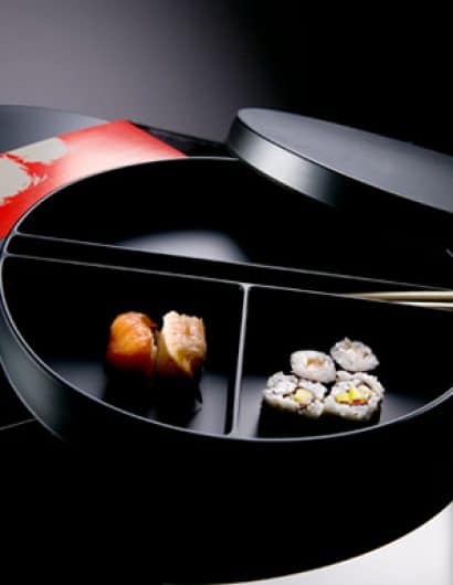
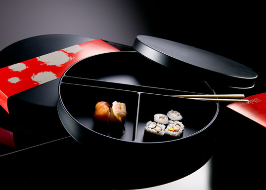
“Shis Sushi it’s part of Shis Restaurant for which was developed sub graphic codes. Inspired in the oriental culture, red was the chosen chromatic color for the artwork applied in the circular package. This was inspired in the oriental geometry and in the restaurant logo. From the drawing mold to the graphic design and production, the package (in thermo-molded pvc for food), it  was thought to be resistant and practical for take away purposes. Inside it has different compartments to put the sushi, accompanied by chopsticks. Outside the package is sealed by belt of paper that identifies the content and the brand of the restaurant . The mentioned restaurant is situated by the sea in Porto, Portugal. All communication elements where designed by MPFXDESIGN, from a chromatic choice inspired in the sea.”

Get the latest packaging design inspiration in your inbox:

Popular designs

The Bra Guru

Most women are wearing the wrong size bra and that is a fact. The Bra Guru® is the first and only professional

Pure Persian Honey

When we look closely at honey packaging, they are almost all in the usual format, and the ultimate in creativity is that

The Port Vodka Lemon Water

Overview: In response to my client’s vision for a Cape Cod themed beverage brand, I embarked on the journey to create The Port

Over the wave

This Kombucha originates in Lombok, Indonesia, where its paradise beaches attract hundreds of surfers eager to ride the waves. When you surf,

Designed by: PepsiCo Design & Innovation
Country: United States

Shis Sushi Take Away

shis

shis

Designed by MPFXDESIGN | Country: Portugal

“Shis Sushi it’s part of Shis Restaurant for which was developed sub graphic codes. Inspired in the oriental culture, red was the chosen chromatic color for the artwork applied in the circular package. This was inspired in the oriental geometry and in the restaurant logo. From the drawing mold to the graphic design and production, the package (in thermo-molded pvc for food), it  was thought to be resistant and practical for take away purposes. Inside it has different compartments to put the sushi, accompanied by chopsticks. Outside the package is sealed by belt of paper that identifies the content and the brand of the restaurant . The mentioned restaurant is situated by the sea in Porto, Portugal. All communication elements where designed by MPFXDESIGN, from a chromatic choice inspired in the sea.”

Previous slide
Next slide

Explore more great package design

Get the latest on packaging design in your inbox: